10 things print designers need to know about screen design
The transition from design for print to design for screen can be a tricky one, but follow these 10 pro tips and you'll soon be on your way to pixel perfection.
Sign up to Creative Bloq's daily newsletter, which brings you the latest news and inspiration from the worlds of art, design and technology.
You are now subscribed
Your newsletter sign-up was successful
Want to add more newsletters?
Making the move from designing for print to designing for screen, and particularly for the web, can be a frustrating process. It feels like everything should be straightforward and simple; you’ve got design skills so these should just translate like-for-like... right?
Unfortunately, while the fundamental aspects of good design very much apply - size, colour, position, white space, typographical best practice and so on - there are many unique characteristics that make transitioning from print to screen a challenge.
Here we boil down the primary differences between designing for print and designing for the screen into seven general principles. Get your head around these and you'll soon be on the way to pixel perfection...
Article continues below01. Space is unlimited

When you’re designing for print, you’re limited by the amount of page space you can use. This tends to mean that you need to get all your key messages communicated on a single spread, leading to heavier marketing that isn’t always subtle and refined.
On the web, you can use the medium to tease out your marketing messages across a virtually unlimited amount of space, allowing you to refine your approach. Crucially, don’t automatically assume that the same copy will work equally well on screen as it does in print; attention spans are shorter on the web, but you can spread your copy out to become more refined and subtle. You can also take advantage of analytics to see the path your reader takes, allowing you to adapt and improve your copy.
02. You can use rich media
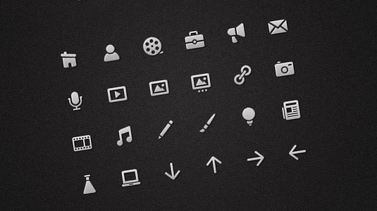
One of the biggest differences between designing for print and the web is that in print you’re limited to words and pictures, while on the web you have the opportunity to use a variety of different media to help tell a story, engage the reader and demand their attention. Clever use of video, audio and user interaction can help you to establish a relationship with your visitor (reader), causing them to spend more time on your website, spend more money in your online shop or recommend your content to more people.
That’s not to say that you should automatically shoehorn every kind of media you can lay your hands on into a page; content of any sort should add value to the user experience, offering them an experience or content they can’t get elsewhere. If you achieve the right balance, you’ll have not only moved beyond what you could have achieved in print, but you’ll also develop loyal visitors.
Sign up to Creative Bloq's daily newsletter, which brings you the latest news and inspiration from the worlds of art, design and technology.
03. Collaboration is key

Whereas print designers tend to be a pretty solitary bunch of people, on the web there’s a lot more collaboration - and for good reason: it’s difficult to have every skill necessary to create a complete web experience. You might be good at designing engaging layouts and writing tight copy, but without the ability to code PHP and JavaScript your website will be static and unintelligent, or it may be that you can code HTML with the best of them, but you’re not so hot on designing user interface controls.
Most successful websites combine a number of different technologies, requiring disparate skills. Don’t be scared of asking experts for help. It can be a worthwhile investment, and is part of what makes the web such a vibrant community.
04. One size doesn't fit all

When you design for print everything can be reliably measured in inches, picas, and points. When you design for screens, the basic unit of measurement is a pixel - but a pixel might be a different size between two different screens. That's an idea that many print designers struggle with when making the transition.
Don’t assume that because you see 300px rendering as one inch on your retina MacBook, everyone else will. The most common approach is to assume 72px to occupy an inch, but that’s entirely nominal - on screen, everything is flexible.
05. Your designs aren't set in stone
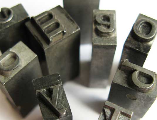
To expand on the previous point, one of the biggest challenges is letting go of the idea that your design is set in stone and fixed in appearance. On the web, different browsers will render your content slightly differently. Text settings can be overridden by your visitors, and depending upon the screen and window size being used your site may render completely differently (in fact, it’s now accepted best practice that it should render responsively to the screen/window size).
Don’t spend time trying to get a pixel-perfect match between browsers - you’ll never achieve it, and one of the strengths of design for is that it’s a fluid medium.
06. User experience is everything
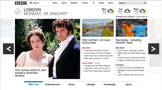
Unlike print, the web is an interactive medium that can provide instant feedback to a user. As such, designing a website is much more like creating a user experience than a designing a brochure. You need to consider how the reader can move around your content, navigating from page to page.
Keep in mind that a website is often also acting as a brand ambassador, so it needs to convey all the values of the business it represents. Focus on usability, making interactive areas (such as links navigation bars, image galleries and videos) simple to spot and use.
07. The 'fold' is irrelevant
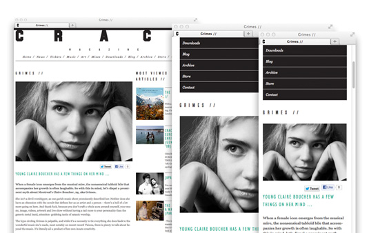
In print you’re always taught to design so that the most important content is 'above the fold' - the part of a newspaper that’s shown when the paper has been folded into its stack.
On the web, there’s still a fold; the area outside the immediately visible portion of the screen that you need to scroll to view; but unfortunately as a web designer you have no way of knowing where that fold is on any given browser’s screen.
The problem is that there are so many different screen resolutions across devices, and users can resize their browser windows, such that what you see as the fold on your computer will almost certainly differ substantially from what everyone else sees.
Instead of worrying about where the fold is, take comfort in the fact that web users know how to scroll, and are quite comfortable with the concept. Make like Fiasco Design and focus instead on designing compelling, attractive and engaging content that encourages your visitors to want to scroll to view more!
08. Layouts are fluid, not fixed
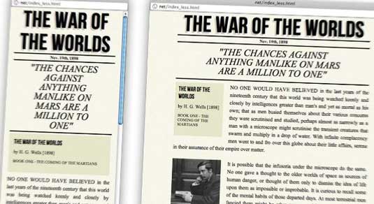
One of the most difficult things for print designers to learn is that web pages can be fluid in their layout. Instead of prescribing fixed sized content areas, on the web, individual text boxes, images and columns can be sized according to the width of the browser window (the viewport). This difference does mean you need to let go of the idea that you can completely control how your design is going to render, but it also has benefits.
09. Knowing the basics helps enormously
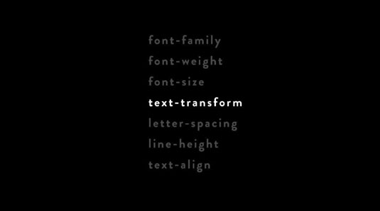
Even if you've got someone else to write the code, understanding how the web’s building blocks work helps to overcome a lot of the frustrations associated with designing a website.
Taking the time to learn HTML (the basic building block of the web) and CSS (the method by which we apply aesthetic attributes to content), will help you understand both the limitations and opportunities of the medium. Our article Web design training: the top online resources should help you find the appropriate learning resource to get started.
10. Web typography is fiddly
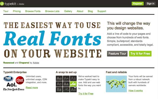
Until recently, the web was limited to a very small selection of 'web-safe' fonts, which led to a lot of homogenization of web typography. Thankfully, there are an increasing number of web fonts available through services such as Google Web Fonts and TypeKit.
These and similar services are having a revolutionary effect on the typography you’ll see on the web, but there are still some gotchas to be aware of. The degree of control over your type is far more limited on screen than in print. For example, you can still set your leading, but there’s no control over kerning whatsoever, and if you want to use ornamental glyphs you’ll need to get dirty with code to manually substitute letterforms or specialized sub-set fonts.
Further reading
The web is full of fantastic resources for designers, covering everything imaginable. We’ve picked out a few of our favourite websites that will help you get started in designing for screen.
.net magazine
CreativeBloq’s sister title, .net magazine covers the full range of website design and development options. As well as fantastic tutorials, the magazine offers a wide range of industry comment and analysis, news and features.
Smashing Magazine
Smashing Magazine features a wealth of articles and tutorials on web design and development, starting from the basic building blocks and progressing all the way to advanced JavaScript coding.
A List Apart
This online web magazine has long been considered to spearhead best-practice definition and adoption in designing for screen. A wide range of articles, including extensive archives, cover everything from font usage to layout tips and tricks.
Words: Sam Hampton-Smith
Like this? Don't forget to check out:
- The best free web fonts for designers
- Photoshop tips, tricks and fixes to try today
If you have any other tips to tell us about designing for screen rather than print, use the comments box below...

The Creative Bloq team is made up of a group of art and design enthusiasts, and has changed and evolved since Creative Bloq began back in 2012. The current website team consists of eight full-time members of staff: Editor Georgia Coggan, Deputy Editor Rosie Hilder, Ecommerce Editor Beren Neale, Senior News Editor Daniel Piper, Editor, Digital Art and 3D Ian Dean, Tech Reviews Editor Erlingur Einarsson, Ecommerce Writer Beth Nicholls and Staff Writer Natalie Fear, as well as a roster of freelancers from around the world. The ImagineFX magazine team also pitch in, ensuring that content from leading digital art publication ImagineFX is represented on Creative Bloq.
