How to dissect other people's websites
Ricardo Quintas explains the best tools and strategies to explore how your fellow developers have constructed their sites.
Sign up to Creative Bloq's daily newsletter, which brings you the latest news and inspiration from the worlds of art, design and technology.
You are now subscribed
Your newsletter sign-up was successful
Want to add more newsletters?
Trying to understand how a website has been built is often a daunting task. After all, you are looking at the end product: the built version. You're dealing with minified and concatenated code that is dynamically loaded depending on the particular agent or device you're using, which is not an easy thing to grasp.
Build your own website with these brilliant WordPress tutorials
Moreover, you are overloaded with thousands of lines of (sometimes unnecessary) code, some of it created by the developer and some of it generated automatically. This makes life difficult if you want to analyse a particular technical aspect of the site and learn from it.
So is it possible to reverse-engineer a website? And if so, is there any way to make this dissection process easier? Fortunately, the answer to the first question is: yes. As for the second ... well, that's where this article comes in.
We will pick up a website and look under the hood to try and understand what is happening and which technologies are being used. The idea here is not to copy the code but to analyse the inner workings of a site so you can learn from it, and hopefully become a better developer.
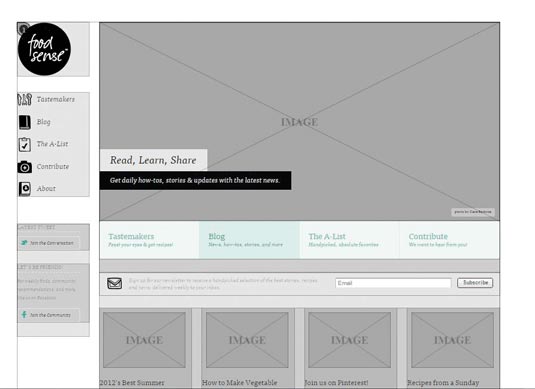
For the purpose of this article, I have chosen to focus on Foodsense, since it's a comparatively simple site. Once you've mastered the tools and techniques set out here, you can apply them to any type of site, no matter how complex it is.
01. Unwrap the structure
It's tempting to jump right into the code, but before doing that, let's try to understand the overall structure of the site and how it generally behaves. I often use Chrome during this process, since it has plenty of useful extensions.
Sign up to Creative Bloq's daily newsletter, which brings you the latest news and inspiration from the worlds of art, design and technology.
To better understand the structure of a site, I recommend a Chrome extension called Instant Wireframe. This gives you an X-ray view of the site, and is very useful if you want to understand what types of responsive tricks are taking place when you resize your browser window.
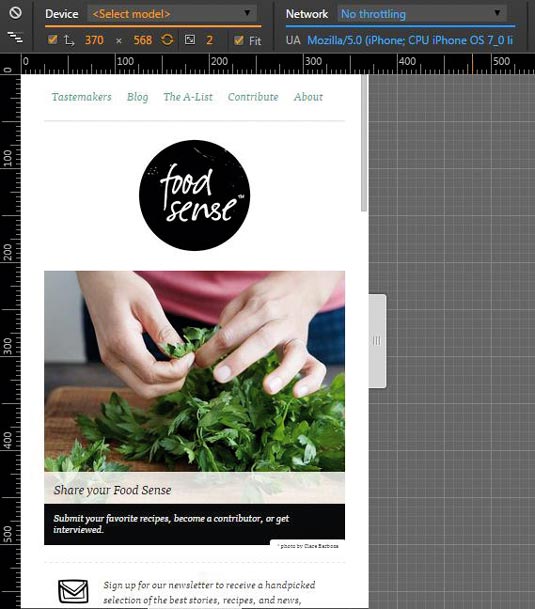
But we can go even deeper than that with Device Mode. Just open DevTools and click on the little Toggle Device Mode icon. This shows you exactly where the breakpoints are. If you resize the site using this tool, you can confirm that it has breakpoints at approximately 475px, 775px, 975px and 1,175px.
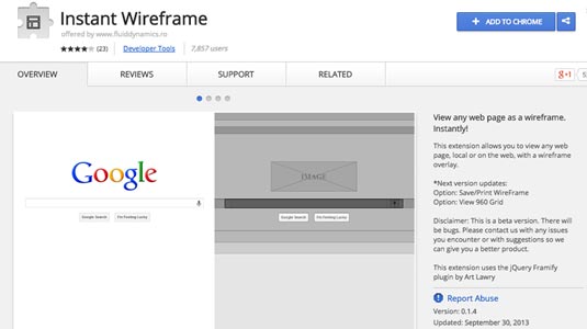
Of course, we're only checking the website through Chrome, running on a desktop. How could we check if it would behave differently if we were running it in a different browser, or on a different device?
Here too, Chrome can help you: just enter Device Mode and pick a specific device from the drop-down menu at the top of the screen. After that, all you have to do is refresh the page – try it with websites such as Twitter or LinkedIn and you will see what I mean. By using these tools, you can confirm whether you're dealing with a simple responsive site, or whether you have something a little more complex.
Finally, when resizing a website, you can also learn a lot regarding responsive images. For example, if you visit akqa.com/services and resize your browser, you will see how the images are swapped, depending on the site's breakpoints.
02. Unwrap the code
We have already learned a lot, but we haven't looked at the code yet. If you save a page locally on your machine, you will see that the CSS and JavaScript code is often compressed, making it difficult to understand. You can use online tools such as Unminify to unminify it.
If you use Sublime Text as your code editor, there are some nice plugins to help you as well. For CSS, I use CSS Unminifier, and I also use Minify to unminify or beautify CSS and JavaScript code.
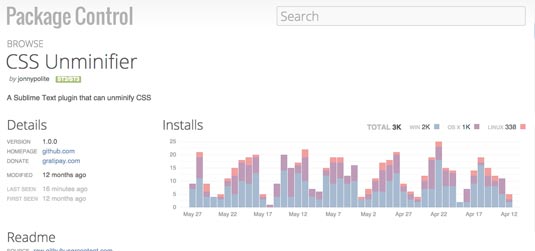
Please note that plenty of sites have their sources minified into a single file, so even when you unminify the code, it will still exist on a single file. You can try to separate the different parts of the code manually, or you can use the next tool to help you.
03. Uncover the stack
What if we need to find out which stack was used to build a website? For this, there is a very useful Chrome extension called Wappalyzer. It returns a summary of the technologies that were used to build the site.
For example, I know Foodsense uses jQuery 1.6.1, Google Analytics, Typekit fonts, Apache web server, the ExpressionEngine (CMS), the CodeIgniter PHP framework – and, of course, PHP itself. Wappalyzer tells us a lot, but not everything.
Checking out the Sources tab in Chrome DevTools provides even more information. For example, Foodsense uses the jQuery Cycle plugin for the main image carousel.
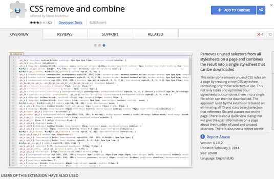
Another problem you often face when looking into the source code of a web page is that there is too much of it to understand easily. For example, a lot of websites use frameworks such as Bootstrap, but then use only 10% of the framework's code.
To remove the unused code, try UnCSS or the Chrome extension CSS Remove and Combine remove and combine. Both can clear unnecessary CSS, making it easier for you to investigate what type of stylesheet tricks are being applied to a specific page.
Try it yourself
Understanding how a site works is both a technique and an art. When you analyse a site, it is always better to focus on a specific element or widget and try to understand how it works, than to try to absorb the entire site at once.
Even though the tools covered in this article can help you on that journey, there is no real substitute to getting your hands dirty.
Words: Ricardo Quintas
Ricardo Quintas is a freelance software engineer. This article was originally published in net magazine.
Like this? Read these!
- How to start a blog
- How to build an app: try these great tutorials
- Hands-on review: Adobe Photoshop CC

The Creative Bloq team is made up of a group of art and design enthusiasts, and has changed and evolved since Creative Bloq began back in 2012. The current website team consists of eight full-time members of staff: Editor Georgia Coggan, Deputy Editor Rosie Hilder, Ecommerce Editor Beren Neale, Senior News Editor Daniel Piper, Editor, Digital Art and 3D Ian Dean, Tech Reviews Editor Erlingur Einarsson, Ecommerce Writer Beth Nicholls and Staff Writer Natalie Fear, as well as a roster of freelancers from around the world. The ImagineFX magazine team also pitch in, ensuring that content from leading digital art publication ImagineFX is represented on Creative Bloq.
