How we built MSN UK's responsive Olympics site
Governor Technology was recently tasked by MSN UK to create a responsive site for its coverage of the London 2012 Olympics. Matt Clark explains how it rose to the challenge
Sign up to Creative Bloq's daily newsletter, which brings you the latest news and inspiration from the worlds of art, design and technology.
You are now subscribed
Your newsletter sign-up was successful
Want to add more newsletters?
Three months ago, Governor Technology was tasked by MSN UK to create a responsive smartphone and tablet site for the London 2012 Olympics. We wrote this article to share the challenges we faced, and to document the methods we used to create the site. But first, let’s go over the brief for the project. You can view the site itself at http://london.msn.co.uk.
1. The brief
We received the following brief from MSN UK:
To create a responsive website for the 2012 Olympic Games as a way for users to access MSN’s Olympic content on mobile and tablet devices. The general look of the site will be following the Microsoft Metro design language; this includes use of typography, using a standardised set of margins within a grid system, and content-driven navigation. Since the site is mainly for use on a mobile connection, performance is an important consideration.
2. Designing for a responsive site
The first task was to settle on the overall design for the website. The Metro design style currently used by Microsoft lends itself very nicely to a grid-based layout, so we quickly adopted this approach for the main landing pages.
Once we had the basic style worked out, we started to sketch out the different layouts we would use. We had four main breakpoints and layouts in mind for a selection of devices:
- Smartphones in portrait: up to 440px wide, 1 column
- Smartphones in landscape: up to 580px wide, 2 columns (using squares and rectangles)
- Tablet in portrait: up to 768px wide, 3 columns (just squares)
- Tablet in landscape/desktop: up to 1024px wide, 3 columns (squares and rectangles)
Knowing there is no standard size for smartphone and tablet resolutions, we tested with an array of devices to make sure that each layout looked good at each breakpoint.
The site is broken down into eight different sections, all available from the homepage:
- News
- Highlights
- Blog
- Multimedia (photo and video galleries)
- Event guide
- Venue guide
- Athlete guide
- Live informationo Scheduleo Resultso Medal tableo Live blog
We needed these sections always to fill all of the available width (up to a maximum width of 1024px) in one-, two- or three-column configurations, as shown in the image below.
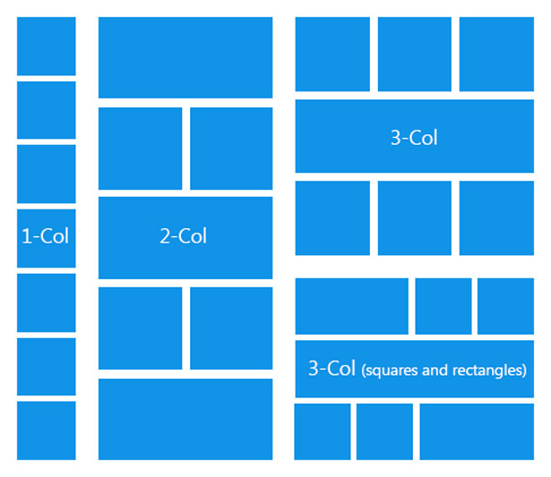
These sections are either set to be squares or rectangles, depending on the size of the viewport. We chose the first block and the last block to extend from squares to rectangles to give the page balance at the larger width. The different blocks always maintain a 10px gutter space between them, no matter how they expand to fill the browser viewport. It was decided that the different blocks would be colour-coded for ease of navigation and recognition.
Sign up to Creative Bloq's daily newsletter, which brings you the latest news and inspiration from the worlds of art, design and technology.
These sections lead to listing pages specific to each content area. The top three – Latest News, Highlights and Blog – have slideshows that show up to five stories in sequence.
The Multimedia section has unique behaviour: it is always full width, so as it gets bigger, it shows more content. Any content not visible can be seen by scrolling/swiping on the tile.
The live information menu at the top of the page collapses from a traditional menu to a drop-down as the browser width decreases. This enables users to access helpful information such as the medal table or schedule easily from any page in the site.
At the footer of the page, there are some quick links to the different sections of the site, and news by event, which takes the user to a listing page specific to a chosen sport.
3. Coding the grid system
Having got the general design and layout finalised, we moved onto the coding of the site. The first part we wanted to code was the basic grid system used on the homepage, which would also be reused on some other parts of the site.
It made sense to use percentages to set the widths of the blocks, for two reasons: to achieve the fluid layout needed for the responsive design, and to make it easy to work out how much space the blocks should take up. However, we had a problem when it came to setting the fixed 10px spacing between the blocks, because we were getting wrapping and spacing issues when trying to mix fixed spacing with percentages.
The solution was to have an outer div set to overflow: hidden, and within this an inner div with a margin-left of 10px and margin-top of 10px. This means that a gutter for 10px appears on the left-hand side and top of each block, but that we could still set the outer div to percentages (for example, 50%, 25%, 25% to create a rectangle and two squares).
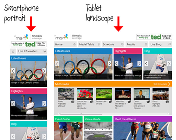
The whole page is within a wrapper div, which is also set to overflow: hidden and has a margin-right of 10px to create the gutter on the right-hand side of the page. As you shrink and expand the browser window, you can see how the blocks stretch and snap to fill the space, while maintaining the 10px gutter.
4. Building a top menu for live information
We had previously found a tutorial on Web Designer Wall that we knew would work perfectly for this site. We liked the way it created a menu that collapsed down to a drop-down at smaller screen sizes, though when more width is available it becomes a full menu. We changed some of the CSS so that the menu filled the full width of the browser with 10px gutters, and that when the space is available, icons relating to the menu items appear. We also slightly changed the behaviour so that, at its smallest size, there is a separate icon to go back to the homepage.
5. Creating the homepage carousels
The next challenge was to decide how to have the images for the content blocks fill the available space within each block. While we thought about using image tags, we decided against it, as using background images gave us greater control.
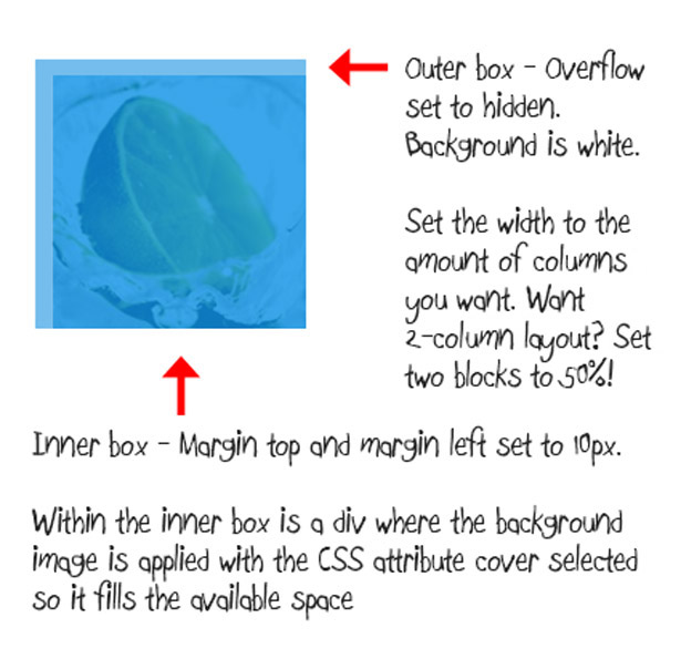
We set the background image to cover, which means it dynamically changes size with the blocks while preserving its aspect ratio. We also set the background images to background-position: center in order show the correct part of the image.
The next step was to add the dynamic functionality to the News, Highlights and Blog sections. We wanted a slide show to change slides on a timer, or be navigable using arrows. Searching around online, we found a slideshow that was almost what we wanted.
After changing some of the markup and CSS and a few small updates to the jQuery, it fitted our purpose very well. We didn’t want all three blocks to transition at the same time, so there is a one-second delay between each of them.
6. The Multimedia slider
We wanted the Multimedia block to take up the full width available, while retaining a set height. Its content would be viewable by scrolling or swiping on a mobile device. This is a relatively simple process of setting a wrapper div to a width of 100% with overflow: auto, to get a scroll bar to appear. Within the wrapper is an inner div which is floated with a large negative margin, meaning that it will only ever go as wide as the content placed within it. If we had set a fixed width, it would always go to this size and leave empty space to scroll into if not entirely filled.
One issue with scrollable blocks is that iOS removes the inertia-based native scrolling. However, this can be fixed for iOS 4 by adding: -webkit-overflow-scrolling: touch. Later Android phones work fine without this, although there is currently no solution for adding inertia scrolling for Windows Phone 7.5.
7. Creating the Multimedia gallery page
Next up was the photo gallery page. We knew there must be a must be a plethora of options out there, so we did a bit of searching and decided upon this solution.
Apart from changing the CSS, we did little to modify the code. One thing that did have to be changed was the max-height of portrait images: since they filled the available horizontal space, this created very tall portrait images which you couldn’t see without scrolling down. The solution was to use some JavaScript to find the height of the browser window, then set the portrait photo height to this value. The width changes to preserve the aspect ratio.
The image feed we were given had some very large images (up to 5MB) which needed to resized for a smoother mobile experience. We did this on the server side, using the Imageresizer plug-in.
8. The listing and article pages
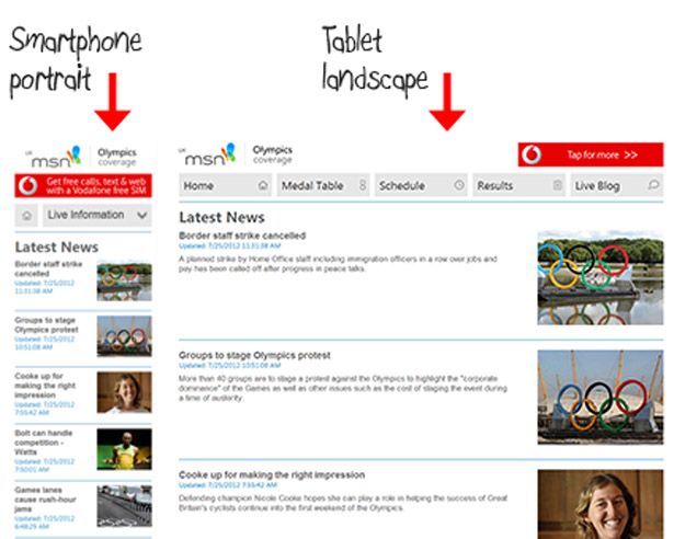
On the news listing page, each element has a title, subtitle, intro and an image, as shown below. At the smallest screen size, we decided to not show the intro as space is at a premium. As it scales up, the image floats to the right and the intro and subtitle appear.
The Event Guide, Venue Guide and Meet the Athletes have slightly different behaviour:
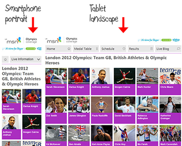
We felt a traditional listing page didn’t display the content as well as a tile-based layout using images, so we applied the same basic concepts as the homepage. Depending on the size of the screen, the number of images/tiles in each row changes, while the tiles stretch to fill the available space. The event page icons don’t expand, as they would have become pixelated, so they are centrally placed; instead, the boxes they are placed in expand.
The article page has four main elements: the title, subtitle, main text and an image. On the smallest screen sizes the image is placed below the title and subtitle but above the text:
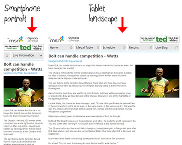
As it gets bigger, the image is floated to the right to make use of the extra space. At its maximum size, the column width of the main text is limited to increase readability. The image is then floated within this empty space on the right-hand side of the screen.
9. Size and performance of the site
The homepage of the site comes up to 665kb over 68 requests; this includes all of the images for the carousels, and the CSS and JS files used throughout the site.
Overall, we are happy with this figure. While bigger than some purely mobile sites, the MSN site offers more images and a more dynamic browsing experience, while still being slimmer than some other responsive sites.
10. Where the site fits in the responsive world
There has been a lot of discussion about the use of responsive design, and recently the Nielsen vs Clark debate has added more fuel to this fire.
We built the MSN site with a mobile-first methodology: 90 per cent of the styles in the CSS apply to the single-column layout, while the other 10 per cent merely change the sizes of the content blocks depending on how much width is offered by the device or viewport.
In our case, the site was designed mainly with mobile devices in mind to complement an existing desktop site, but we used responsive techniques to take full advantage of the device viewport, using fluid layout and media queries to adapt to the screen size available, so the result is still very much usable as a desktop website as well.
Words: Matt Clark
Matt Clark is a front-end developer at Governor Technology, a web development agency based in central London. His work has covered a wide range of areas, from responsive web design to application UI development. When not coding, he likes to watch classic boxing and make the most of the elusive English sun.

The Creative Bloq team is made up of a group of art and design enthusiasts, and has changed and evolved since Creative Bloq began back in 2012. The current website team consists of eight full-time members of staff: Editor Georgia Coggan, Deputy Editor Rosie Hilder, Ecommerce Editor Beren Neale, Senior News Editor Daniel Piper, Editor, Digital Art and 3D Ian Dean, Tech Reviews Editor Erlingur Einarsson, Ecommerce Writer Beth Nicholls and Staff Writer Natalie Fear, as well as a roster of freelancers from around the world. The ImagineFX magazine team also pitch in, ensuring that content from leading digital art publication ImagineFX is represented on Creative Bloq.
