Behind the scenes of Bowie's bold new website
We talk to Jonathan Barnbrook about how he worked with the veteran singer to redesign his online presence.
Sign up to Creative Bloq's daily newsletter, which brings you the latest news and inspiration from the worlds of art, design and technology.
You are now subscribed
Your newsletter sign-up was successful
Want to add more newsletters?
2013 promises to be a huge year for David Bowie, following the launch yesterday of his first album for a decade (on sale in March, it's available now for preorder). We've already reported on the controversial new album artwork by graphic designer and typographer Jonathan Barnbrook - but what's equally worthy of attention is his redesign of davidbowie.com, which also launched yesterday. Here we speak exclusively to Barnbrook - best known for his cover artwork for Bowie's Heathen and Reality albums - about the redesign process.
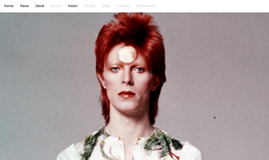
There was no project brief, Barnbrook tells us, other than a feeling that the website had suffered from neglect and needed redoing from scratch. "The tone of voice was wrong. It had no social media interaction," he explains.
He collaborated on the redesign with Jon Abbott and Dan Streat from his own studio, music promoters artistarena and Bowie himself. They all agreed the new site should be "really simple and clean, to let the content shine through," says Barnbrook. "It didn't need to be busy."
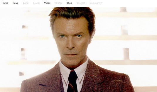
It also didn't need to shout. "You don't need to when you have such an iconic figure as the main subject," Barnbrook reasons. "So when you first arrive at the site you see his name, a full screen image and nothing else. This gives it a clarity which most musicians' sites do not have."
Meaningful content
Nor did the site need to be overly commercial, says Barnbrook. "Rather than pushing merchandise down people's throat, we wanted to have meaningful, exclusive content," he says.
"Once Mr Bowie approved the concept it was left largely up to us to create it," he continues. "Bowie then checked everything at each major stage, as he's always concerned about his audience."
Mum's the word
The turnaround needed to be fast. "We had to design the album and get the look resolved before we could proceed with the site," Barnbrook explains. "Because of the secrecy involved, everything had to be done as late as possible with the least number of people knowing. Most of the programmers had no idea there was a new album until two days before the site launch."
Sign up to Creative Bloq's daily newsletter, which brings you the latest news and inspiration from the worlds of art, design and technology.
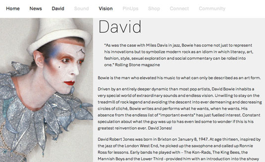
Hiding this fact from everybody on the project was quite a task. "In emails we would try never to refer to David or the album by name," Barnbrook recalls. "Once the album design was resolved, we took the main elements and based it on them, in particular with the use of the white square and the square as the basic component of the design."
Original typography
The site features a brand new font specially created by Barnbrook called Doctrine, which also features on the single and album cover artwork, and which will be released to the public within a month. "It's almost finished and comes in five weights with an italic to be added later," he explains.
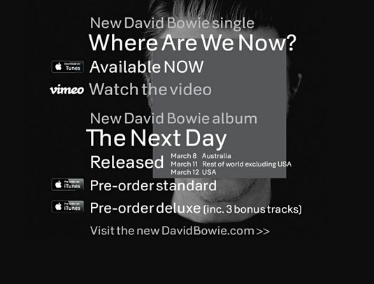
Based on the font used for North Korean Airways, it's a "very different direction in font design for us," says Barnbrook. "It's been a lot of work and great to be able to use this as its first major outing."
Designer reaction
Designer reaction to the new site has been broadly positive. "I've not delved that deep into the content but the site looks and works great," freelance designer Matt Booth told us. "Very clean, nice use of type and easy to use. The design works well for future news and historical content to be added."
Graphic designer Tom Muller added that, on first sight: "it looks nice: clean and minimal layout and nice usage of embedded fonts." While Luke ONeill, art editor for Computer Arts Collection, said: "For me its simplicity is its beauty, with a very straightforward navigation and typographically led design that puts usability and legibility at the fore."
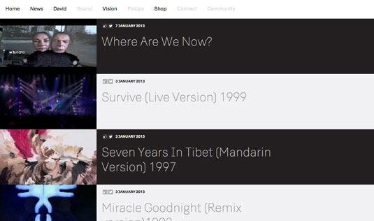
However, all felt improvements were needed. Booth suggested that "if this is to become the place for everything Bowie, some kind of content search would be useful". Both he and Muller argue that a mobile version is needed, with Muller arguing that right now, "it looks like its optimised for tablets only. The type looks too fragile on phones, not to mention the cumbersome navigation."
ONeill believes that the new site is "likely to divide opinion much in the same way that the album artwork is already doing". Noting how it's stated on the website itself that it's a work-in-progress, he concludes: "Only time will tell, once the wealth of archive content is uploaded, if this site does indeed work as the main online destination for music's greatest chameleon."
Work in progress
Barnbrook confirms that the new site is not yet finished. "Some of the menu items are not working, so stuff like the forums with all the old content will be added soon," he reveals. "We're aware that the fans who have followed Bowie for a long time will want to use their existing user names and access all their old content. This is a huge logistical task to implement but it is is the main priority now.
"We're very much at phase one," he concludes. "We want to make it a great resource for Bowie, styled in a manner that's appropriate to someone who's been at the top of music for a number of decades."
Liked this? Read these!
- The best music videos of 2012
- 10 inventive uses of typography in music videos
- 10 inspiring gig posters of 2012
What do you think of the new website? Let us know your views in the comments below!

The Creative Bloq team is made up of a group of art and design enthusiasts, and has changed and evolved since Creative Bloq began back in 2012. The current website team consists of eight full-time members of staff: Editor Georgia Coggan, Deputy Editor Rosie Hilder, Ecommerce Editor Beren Neale, Senior News Editor Daniel Piper, Editor, Digital Art and 3D Ian Dean, Tech Reviews Editor Erlingur Einarsson, Ecommerce Writer Beth Nicholls and Staff Writer Natalie Fear, as well as a roster of freelancers from around the world. The ImagineFX magazine team also pitch in, ensuring that content from leading digital art publication ImagineFX is represented on Creative Bloq.
