Podcast website benefits from the personal touch
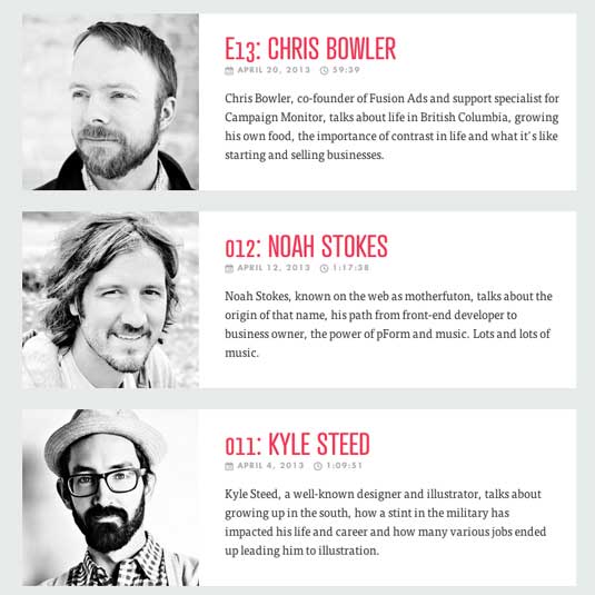
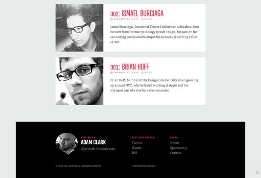
The Gently Mad podcast website assembles stories and experiences from web designers in an inspiring and inviting way.
Sign up to Creative Bloq's daily newsletter, which brings you the latest news and inspiration from the worlds of art, design and technology.
You are now subscribed
Your newsletter sign-up was successful
Want to add more newsletters?

The Gently Mad is a topic-agnostic podcast about web creators. Adam Clark, the mind behind it, stepped away from a traditional blog layout when designing it to create something with a bit more impact.
The large header and well-designed episode list conveys that there's a personal touch to this design. Clark started with 'more crazy' CSS3 transitions and fades, but removed them, he tells us. "I felt the design choices I had made (colour, layout, typography) worked much better just left alone," he says.

Clark used Sass/Compass and the Compass extension Sassy Modular Scale for setting type sizes. "Based on Tim Brown’s modularscale.com, it allows you to set a base font size and ratio and will calculate the incremental values of the scale for easy use throughout your stylesheet," he explains.
Article continues below 
It all goes to show that you don't need a ton of bells and whistles to draw attention to your podcast website - just a nice, well thought-out design that lets the content speak for itself.
This showcase was originally published in issue 240 of .net magazine.
Like this? Read these!
- The ultimate guide to designing the best logos
- Our favourite web fonts - and they don't cost a penny
- Useful and inspiring flyer templates
Have you seen an inspiring podcast website? Let us know in the comments box below!
Sign up to Creative Bloq's daily newsletter, which brings you the latest news and inspiration from the worlds of art, design and technology.

The Creative Bloq team is made up of a group of art and design enthusiasts, and has changed and evolved since Creative Bloq began back in 2012. The current website team consists of eight full-time members of staff: Editor Georgia Coggan, Deputy Editor Rosie Hilder, Ecommerce Editor Beren Neale, Senior News Editor Daniel Piper, Editor, Digital Art and 3D Ian Dean, Tech Reviews Editor Erlingur Einarsson, Ecommerce Writer Beth Nicholls and Staff Writer Natalie Fear, as well as a roster of freelancers from around the world. The ImagineFX magazine team also pitch in, ensuring that content from leading digital art publication ImagineFX is represented on Creative Bloq.
