1910 designs a more readable Wikipedia
Unhappy with Wikipedia's design, Jonas Salvador and Stellan Johansson have come up with a responsive new look that's all about the readability.
Sign up to Creative Bloq's daily newsletter, which brings you the latest news and inspiration from the worlds of art, design and technology.
You are now subscribed
Your newsletter sign-up was successful
Want to add more newsletters?
Jonas Salvador and Stellan Johansson from 1910 Design & Communication, a Swedish graphic design and art direction studio, love Wikipedia but they think that its design leaves a lot to be desired.
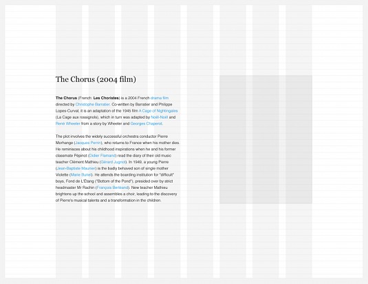
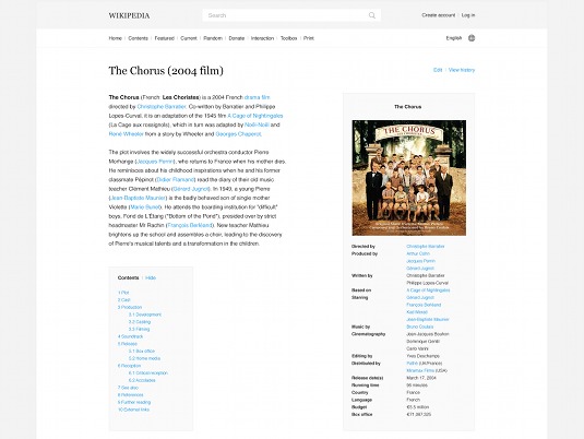
Specifically they think that while the rest of the internet has made great typographical leaps and bounds over the past few years, Wikipedia's reading experience is still stuck in the 1990s. "The text is too small, the lines are too long and the leading is too tight," they reckon. "Pictures are tiny and the general layout includes a lot of visual noise that distracts you from the actual reading."

So they've taken it upon themselves to give it a bit of a typographical refresh. Their proposed redesign makes a number of changes aimed at improving readability, including pushing the content to the centre, using a more readable text size and increasing the leading.
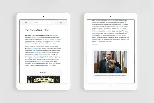
Article continues belowNaturally they decided that a responsive design was the only way to go, so they designed an eight column grid (with the body spanning the first four columns), which would scale down to four columns on tablets and two on phones, with sidebar content being shifted to below its corresponding paragraphs.

The end result is a great-looking piece of work; easy to read with plenty of white space, as opposed to the current, rather cramped, Wikipedia design. "This is the Wikipedia we ourselves would like to use," say Salvador and Johansson, "and we greatly look forward to see how Wikipedia will develop in the following years, in regards to making the site more pleasant to read."

Words: Jim McCauley
Liked this? Read these!
- Our favourite web fonts - and they don't cost a penny
- A designer's guide to the Golden Ratio
- Download these free iPhone apps for designers
Sign up to Creative Bloq's daily newsletter, which brings you the latest news and inspiration from the worlds of art, design and technology.

The Creative Bloq team is made up of a group of art and design enthusiasts, and has changed and evolved since Creative Bloq began back in 2012. The current website team consists of eight full-time members of staff: Editor Georgia Coggan, Deputy Editor Rosie Hilder, Ecommerce Editor Beren Neale, Senior News Editor Daniel Piper, Editor, Digital Art and 3D Ian Dean, Tech Reviews Editor Erlingur Einarsson, Ecommerce Writer Beth Nicholls and Staff Writer Natalie Fear, as well as a roster of freelancers from around the world. The ImagineFX magazine team also pitch in, ensuring that content from leading digital art publication ImagineFX is represented on Creative Bloq.
