3 ways to design for extensibility
Forget static, pixel-perfect layouts. Today's multi-device internet demands that we design more flexibly. Bearded's Matt Griffin and Patrick Fulton outline three practical strategies for doing so.

Did you guys notice something? The internet seems different now. What's amazing, though, is that it hasn't changed at all – we have. Responsive web design has opened our eyes to the flaws in our processes that were already there. And now, like it or not, we need to address them. The internet is flexible and we need to be as well if we want to create good solutions. We need to call off the quest for pixel perfection. We must plan, design and build for extensibility. And just so you know we're not hyperbolising, let's take a quick look at the current online landscape.
Get me that data
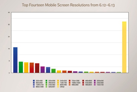
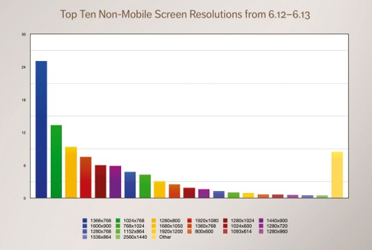
Among the top 10 non-mobile screen sizes and the top 14 mobile screen sizes used to browse websites between June 2012 and June 2013, no single screen size has more than 25 per cent of the market share, according to StatCounter Global Stats. That means there's no dominant screen size. Not your iPhone, and not your cousin's Android device, either. The sizes of the things people are using to access your websites are all over the place, and we're hurtling towards more fragmentation. In other words: shit's getting weird.

As well as using more screen sizes, more and more people are relying on their mobile devices for the majority of their internet use. According to Pew Internet, 42 per cent of smartphone owners between the ages of 18 and 29 consider their phone as their primary way to access the internet. As Karen McGrane eloquently points out in her article, 'The Alternative Is Nothing', the mobile internet is the only internet to many people. And to pretty much everyone else, mobile use has become an important part of their internet experience. How do we deal with all of these unknowns; all of these new devices and screen sizes? Sure, there are resources out there to help us, but where to begin? We need a battle plan.
Article continues belowLet's get flexible
First, we need to let go of any 'pixel perfect' thoughts that may still be lingering in our minds. When you acknowledge that you're not fully in control, specificity becomes less valuable than flexibility. At Bearded, we like to say that we'd rather have our designs be 80 per cent awesome 100 per cent of the time than 100 per cent awesome 20 per cent of the time. That means thinking about flexible, adaptive layouts from the very beginning. It probably means getting into code faster, and building native responsive layouts in the browser.

And yes, designers, that probably means it's time to learn some code. Truly great design work requires you to understand your medium, and when you really get down to it, the web is code. But have no fear, HTML and CSS are, technically, code – but they aren't the hard stuff. No one's asking you to go learn C# or even PHP. With the right books and other resources, and a few weeks' time, you'll start understanding your work like you never did before.
Once we dived into the great unknown of responsive design, many of us found that it was necessary to develop new working processes. Not surprisingly, we also found that those processes tend to take more work. So how do we counteract the need for extra labour? How do we get more efficient and make our code more maintainable?
Strategy: create a starter kit
Rule number one: stop repeating yourself unnecessarily. We can look at multiple projects and start to identify reusable patterns and structure, and from that, we can build what amounts to the most generic version of all of our sites. And that, my friends, is a starter kit. Bearded's starter kit is called (wait for it) Stubble. Inside Stubble, we've collected our most-often-used code patterns, and put them under source control so that we can iterate over them to make them better, and fix problems when they arise.
Sign up to Creative Bloq's daily newsletter, which brings you the latest news and inspiration from the worlds of art, design and technology.
Once you've established your starter kit, go over it with your team. Sit down and discuss the parts you've included, and make sure that everyone is using a shared vocabulary. This way, if there are parts of the kit that can be improved upon, thrown out, or refactored, you'll all know why, and can team up to resolve the issue. Then, when it's time to spin up a new site, you start from – you guessed it – the starter kit! We've found we can now throw together a responsive, in-browser wireframe in under three hours. And when we're ready to start designing, we just layer on top of those same files.
It's important to get all the people working with the kit together periodically to review changes in the code. These code reviews give your team a chance to better understand different approaches, and to fully vet new techniques before trying them out on client sites. When everyone agrees that the new code is good to go, you can merge it back into the starter kit so it's ready and waiting for you next time.
Fix a bug once? Fix it forever. Create a useful new feature? Have it ready out of the box for every other site. Hey, you know what that sounds like? Being kind to your future self. No one deserves your help more than the future you. Have you ever started looking at an old project and poked around for a while thinking, "Man, who is the asshole that wrote this code?" Then after a while you realise: "Hey, wait a minute. I'm that asshole! This is my code!" That is what we're trying to avoid.
Strategy: use a preprocessor
You've probably heard a lot about preprocessors over the past year or so, and for good reason: they can be a huge win for your workflow. Our preprocessor of choice is Sass, along with Compass. Preprocessors are great because they give you all sorts of sorely needed capabilities that CSS is lacking, but at the end of the day they just spit out plain old vanilla CSS for the browser. No compatibility issues, no worries. Here are our big, easy wins:
Variables
With linked style sheets, we reduced thousands of colour specifications down to hundreds. With Sass? Just one. In Sass, variables let you abstract values. You define a colour as follows:
$text-color: #888;Every time you need that colour, you simply say something like:
p { color: $text-color;}
h1 { color: $text-color;}
Need to change the text colour of everything on the site? Done. You can have even more fun with math functions like:
$link-color: #ed5513;
$link-color-hover: darken($link-color, 15%);
The hover state colour for links is whatever your link colour is, but 15 per cent darker. Changing $link-color itself updates both.
Mixins
Mixins are fantastic portable chunks of CSS that can be applied wherever they're needed. For example, you may have styles you use to make links behave like buttons, packaged as a mixin:
@mixin button {
padding: 0.5em 1em;
text-decoration: none;
color: $background-color;
background-color: $link-color;
@include border-radius(4px);
&:hover,
&:focus {
text-decoration: none;
background-color: $link-color-hover;
}
}
Whenever you want to apply the button styles it's as simple as:
a.button { @include button; }Ta-da! That link now looks like a button, hover state and all.
Notice we used a Compass mixin for border radius inside our own mixin. Compass provides a lot of ready-made mixins that, among other things, take care of all relevant browser extensions for you. @include border-radius(4px) outputs the following CSS:
-webkit-border-radius: 4px;
-moz-border-radius: 4px;
-khtml-border-radius: 4px;
border-radius: 4px;
Strategy: use atomic design
And while we're making our code more portable, why not make our designs more portable, too? Brad Frost recently outlined his thinking regarding what he's calling 'atomic design' on his blog. His ideas get to the heart of the matter; if we really want to create flexible systems rather than exacting (but marginally useful) page designs, we need to start thinking about our designs as different configurations of components that exist at different levels of granularity.
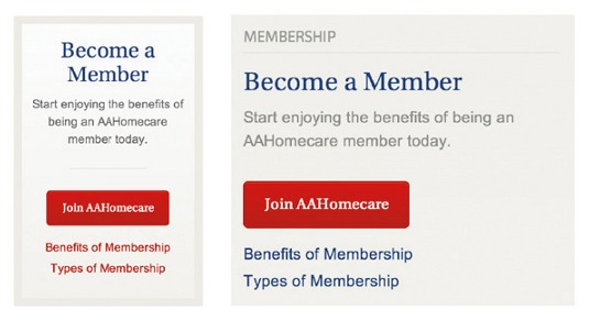
An example of this is the 'Become a Member' block on the site we built for the American Association for Homecare. On the left of the image, you'll see how this information is styled on the homepage; on the right, you can see how it's styled on interior pages. It's the same HTML with slightly different visual treatment. That block, in Frost's terminology, is an 'organism'. That organism is made up of 'molecules', like the button and two links that follow it. That molecule is made up of 'atoms'. For instance, the button itself. The organism can be reused, and the molecular and atomic elements within the organism can shift and reposition as their context requires.

The trick is to prevent an attachment to one specific pixel-perfect configuration and, instead, expect change and flux. You may not even know exactly what your design will look like for a given user on their device, but you shouldn't be overly surprised when you see it. It should fit in with the system you've designed.
This isn't to say that page layouts aren't still useful: they are! As designers, we need to know the context for our design elements as much as the elements themselves. But for large sites, a few responsive page layouts could be paired with a HTML/CSS style guide (such as this style guide for Flat UI) to great effect. In other words, once we know the context (the page layouts), we have enough understanding of how to assemble the parts (the style guide) in whatever new situations we encounter when building the site.
OMG, what are we doing?
At Bearded, we have a 1940s Vandercook printing press. It's the culmination of roughly 500 years of technological innovation. The web, in contrast, just had its 20th birthday. People have been working on software, in general, for less than 100 years. We're all making this up as we go along, trying new things, keeping what works and throwing it all out at a moment's notice when the ground beneath our feet shifts. Like our designs, we have to be adaptable. We should take risks, learn from our failures, and keep rolling each new bit of knowledge back into our ever-evolving processes and products.

These, my friends, are exciting times. There will always be better ways to do things, and we'll just have to figure them out as we go. Let's keep our eyes and ears open, keep trying, keep making mistakes, and – bit by bit – get better at what we do.
Words: Matt Griffin and Patrick Fulton
Matt Griffin is a designer, speaker and writer. He's founder of design and development agency Bearded. Patrick Fulton is a frontend developer at Bearded and manages the web design speaker series Refresh Pittsburgh. This article originally appeared in net magazine issue 249
Liked this? Read these!
- Our favourite web fonts - and they don't cost a penny
- Inspiring ecommerce website designs
- How to build an app: try these great tutorials

The Creative Bloq team is made up of a group of art and design enthusiasts, and has changed and evolved since Creative Bloq began back in 2012. The current website team consists of eight full-time members of staff: Editor Georgia Coggan, Deputy Editor Rosie Hilder, Ecommerce Editor Beren Neale, Senior News Editor Daniel Piper, Editor, Digital Art and 3D Ian Dean, Tech Reviews Editor Erlingur Einarsson, Ecommerce Writer Beth Nicholls and Staff Writer Natalie Fear, as well as a roster of freelancers from around the world. The ImagineFX magazine team also pitch in, ensuring that content from leading digital art publication ImagineFX is represented on Creative Bloq.
