Tips for choosing vibrant colours for web projects
We outline how to experiment in the post-web-safe colour era, and look at some great examples of sites that pop.

One of the best things about recent website layouts and user experience design is how much more of a role is played by colour. The days of web-safe colours are gone, and we can focus on colour as a crucial design tool.
Here are a few things to keep in mind as you choose colours for your projects: first, go for colour contrast. Multiple system settings, plugins and glare protectors mean users today have total control over how their screens look – so it's vital to keep contrast in our designs.
But there's another reason why this is key: colour-blindness. There are plenty of types of this common impairment, and the more contrast between content and background colours, the less likely it is viewers will become unable to see content.
Article continues belowThe days of web-safe colours are gone
Second, stray away from black and white. Warmer or cooler shades of dark greys and off-whites still provide ample contrast, can work better with monochromic tones or palettes, and look a bit more interesting.
Also avoid primary colours, which can give off an elementary school art class or 1990s web design vibe. With rgba() as a colour option (including transparencies) in CSS we can experiment a lot more!
Finally, use colour to draw the user's eye. Bold or unique colours can be used as a way to draw attention to actions (like buttons, clicks and so on) or to must- see and must-read content.
Similarly, colour hierarchy can come into play to set secondary content back so it supports (but doesn't distract from) the primary purpose of a page, section or module.
Sign up to Creative Bloq's daily newsletter, which brings you the latest news and inspiration from the worlds of art, design and technology.
01. Pycon 2016
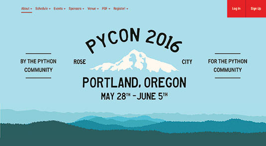
The site for Pycon 2016 is based around several inviting, bright shades of blue. The slate colour used for the darkest areas is a fresher look than black.
02. Details
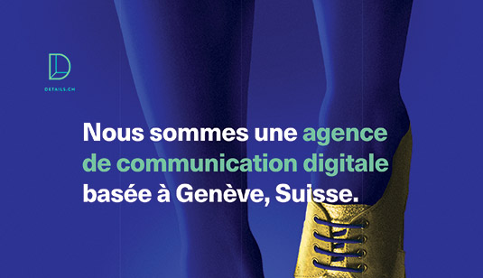
Digital communications agency Details has gone for an unexpected colour palette full of vibrant, contrasting shades.
03. In Space We Trust
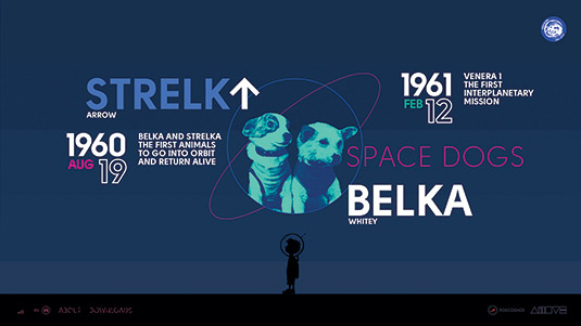
The site for art project In Space We Trust makes use of monochromatic gradients, paired with bright white, bold typography. Accent colours create interest.
This article was originally published in net magazine issue 280. Buy it here.

Sam is a designer living in Austin, Texas, who speaks and writes extensively about web and product design, diversity, inclusion, and equity. In 2011, she wrote the first university course on the topic of Responsive Web Design. She is currently Design Director at thoughtbot, and serves on several design advisory boards in Austin.
