The pro's guide to CSS layout
CSS’s next big challenge is to make flexible, dynamic page layouts that work across our ever-broadening range of devices. With solutions proposed and under discussion, Peter Gasston offers a snapshot of the future for CSS layout.
Developments in CSS layout are taking the way we display website elements into a new dimension – literally, in some cases. We can rotate and scale elements; animate and transition them; make pages that respond to the capabilities of the device they’re being viewed on. And we still can’t make a decent grid without unnecessary markup or a lot of trickery.
While the web has grown, expanded and multiplied, the most fundamental aspects of CSS layout haven’t changed since CSS1.
But CSS3 is finally catching up. Now we have dedicated work on making new ways to construct pages, to create rich, dynamic CSS layouts that can take influence from, and improve upon, the best of print and graphic design.
This article is about those new CSS layout methods. About properties that are well implemented and that you can use now; properties that are beginning to appear in experimental builds; properties that are merely proposed, highly subject to change, and may never appear at all. Such is the rapid rate of change that I expect there to be some updates to some specs by the time you read this (to see how much has changed already, check out my post from 2011).
01. Multi-column CSS layout
Stable and well-implemented, the Multi-column Layout module isn’t the most flexible or powerful of the new CSS layout modules, but it does one job very well: flowing content into multiple columns. It’s very straightforward to use: you apply the rule to a containing element, and all of the content within will be flowed into the generated columns:
E { column-count: 5; }
In this example I’ve set the content of element E to flow into five columns, which will be automatically and evenly spaced across its width. Using column-width is an alternative approach:
E { column-width: 10em; }
This would create as many 10em-wide columns as could fit the width of E; for example, eight on an element 90em wide (because of the gaps between columns). Multi-columns suit long blocks of text, such as the long lists of references on Wikipedia, but can be put to less obvious uses such as laying out an image gallery.
As mentioned, this module is well implemented: fully and without prefix in IE10 and Opera, prefixed in Chrome and Safari, and almost complete (and prefixed) in Firefox.
Daily design news, reviews, how-tos and more, as picked by the editors.

02. Regions
CSS Regions extends the overflowing text idea from multi-columns: rather than flowing content into a series of columns, you can flow it into many different elements – regardless of their position on the page. This concept, originally proposed by Adobe, is borrowed from the world of print, and opens the door to flexible, responsive, print-inspired CSS layouts.
Implementation is extremely simple: you just select the element that’s going to be the source of the content, and you provide that element with a unique identifier using the flow-into property:
E { flow-into: hello_mum; }
Then you choose the targets – the elements that the content is to flow into – and let them know which source to use, using the flow-from property with the previously defined identifier:
F,G,H { flow-from: hello_mum; }
In the above example, element E will be removed from the document and its content will be flowed into element F; any overflow will flow into G, and so on into H – depending on the quantity of the source content as well as the dimensions of each target.
CSS Regions are in IE10, with the proviso that the source must be in an iframe. Chrome 25+ also has support but it's currently disabled by default; you can enable it by typing about:flags into the URL bar and toggling Enable in the "Enable experimental WebKit features" setting. Once you’ve done that, head to Adobe’s project page for links to examples.

03. FlexBox
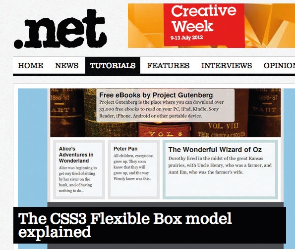
The Flexible Box Layout module, commonly known as FlexBox, has been around for years and is already quite well implemented in different browsers, but has changed syntax many times. The latest revision of the spec is hopefully the last, because it’s a module that would be very useful to be able to call on.
FlexBox is really designed for laying out user interfaces – in fact, its roots lie in XUL, the language used to lay out Firefox’s UI – but it’s also handy for CSS layouts that are not too complex.
The way it works is by automatically resizing elements to better fit their containers, without the need for you to calculate percentages. To initialise it you use the flex value on the display property of a parent element, then set certain parameters:
E { display: flex; }
But how does the titular flexibility happen? It’s set on each child element, using the flex property. It’s a little hard to explain how this works, but I’m going to have a crack at it.
Imagine that the container element, E, is 300px wide and has two child elements, F and G, which have no explicit width. In the following example code I’m going to set different values for flex on each child:
E F { flex: 3 1 100px; }
E G { flex: 1 2 100px; }
The flex property is a shorthand for (respectively) flex-grow, flex-shrink, and flex-basis. Each child in this example would be considered to be 100px wide – the value of flex-basis – so there would be 100px ‘spare’ between their combined width and that of their parent, E. In this case, the flex-grow value would be used as a ratio to distribute this spare width – so of the 100px, element F would get 75px and element G, 25px – the ratio 3:1.
Clear? I hope so – but I’m going to plough on regardless. Now imagine E is only 170px wide, so the sum of the children’s width is 30px greater. In this case the flex-shrink value comes into play, so the 30px is taken from the child elements in the ratio 1:2; element F would be reduced by 10px, element G by 20px, until their total width was 170px, matching E.
Honestly, that’s about as clear as I can make it without drawing pictures. Like anything new, it just takes a little time to bend your noggin around, but it will become second nature soon – and you’ll be thankful for it the next time you’re building the UI for a web app.
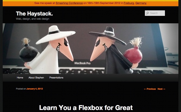
However, in case my explanation doesn’t work for you, Stephen Hay has written a more detailed one that uses a slightly outdated syntax but works the same conceptually.
Chrome and Safari support Flexbox with the -webkit- prefix; Opera has it implemented without prefix, as will Firefox from version 20. IE10 has it implemented with the -ms- prefix, and using a slightly outdated syntax.
04. Grid layout
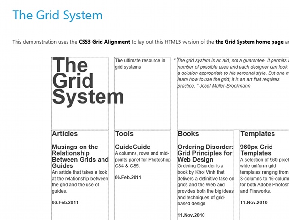
For years web designers have been extolling the virtues of designing to a grid, but the tools to actually make grids in code have been found wanting. Along the way there have been many valiant efforts, but these have mostly involved extraneous markup and an inability to be as flexible as true grid design demands.
The solution, a dedicated CSS Grid Layout module, was proposed by Microsoft – and the company was also the first to implement it, in IE10. The Grid Layout module works by setting a container to act as the grid element, and dividing it into a series of rows and columns known as tracks:
E {
display: grid;
grid-columns: 1fr 3fr 2fr;
grid-
In the above example I’ve outlined a 3×3 grid, in which the columns are set to a width 1:3:2 ratio – the new fr unit refers to ‘a fraction of the available length’, which in this instance would be equivalent to 16.67%, 50%, 33.33% – and the height of the rows would be (in order) 10em, automatic, and 50px.
Where these tracks cross, a series of cells is created. Child elements – known as grid items – can be placed on the grid by specifying the co-ordinates of the cell, in the form of a column and row number that mark the cell where the item should be placed:
E F {
grid-column: 2;
grid-row: 2;
}
Here we’re placing an element in the cell on the second column, second row of the grid.
Very simple grids can be created speedily, and having the opportunity to create them in CSS rather than markup means it’s going to be much easier to make truly responsive grid patterns that aren’t bound by DOM order.
IE10 is currently the only browser to have implemented grids (using the -ms- prefix), but work is underway in WebKit browsers.
05. Grid Template layout
An alternative way to lay out grids is using the proposed Grid Template Layout module. This uses a series of strings of characters to create what are known as slots, as in this example:
E { grid-template: 'aaa' 'bcc' 'bdd'; }
Each of the strings represents a row, and each character in a given string, a column. In this example we have one row of three columns, which forms slot a; next, slot b spans one column over the second and third rows; slot c spans the second and third columns on row two; and slot d the same on row three. If this doesn’t immediately make sense, it might be more helpful if we lay out those strings like this:
'aaa'
'bcc'
'bdd'
To place an item on the grid you can use the new flow property to name the slot you want your element to occupy in the grid:
E F { flow: c; }
This would put element F in slot c, the second column of the second row, spanning two columns.
The Grid Template module began as a standalone, before being adopted into Grids with a modified syntax. It has recently returned to being standalone, albeit now fully compatible with the Grids module.
No browsers have implemented the module at the time of writing.
06. Exclusions and Shapes
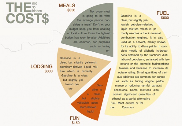
Exclusions, which are determined in the Exclusions and Shapes module, are perhaps best thought of as in terms of extended floats. Whereas content can only – at present – flow around the left or right side of a floated element, with Exclusions you can wrap text in such a way that it completely surrounds any positioned element.
E F { wrap-flow: both; }
In this example, if element F were positioned in the centre of element E (using one of the many hot new CSS layout properties), the content surrounding it would flow around every side, leaving element F like an island in the middle of a sea of words.
But you’re not restricted to box-shaped elements. You can define custom element shapes and have content flow around either the inside or outside of it, as in this example:
E F { shape-inside: circle(50%,50%,50%); }
In the above instance, a circle would be drawn with its centre corresponding to the dead centre of the selected element, and having a radius of 50% – and the content inside it would flow around the limits of the shape. The circle() function employs SVG syntax, and is one aspect of a larger drive under way, with the aim of creating better interaction between the CSS and SVG syntaxes.
Exclusions are in IE10 (using the -ms- prefix), and work is underway to implement them in WebKit.
07. Box alignment
Many of the CSS layout modules repeat concepts and approaches, and one of the most common of these is the alignment of elements within a container. To address this a common syntax has been proposed in the Box Alignment module.
The basic idea is that each element has two axes: the axis of the content direction (by default, the horizontal) is called inline, and the cross-axis (by default, vertical) is called stacking. The inline alignment is controlled using the justify-* set of properties, and the stacking alignment with the align-* set.
Picture two elements, a parent and child, where the child is smaller than the parent in both dimensions. To centre the child within its parent on both axes, you would use these properties:
E {
align-items: center;
justify-items: center;
}
The *-items property values are inherited by all child elements; if you want to change values on individual child elements, use the *-self properties:
E F {
align-self: end;
justify-self: end;
}
These properties mean ‘only on this element’, and the end values mean ‘align to the end of the axis in the direction it’s going’ – unless otherwise set, content goes from left to right and top to bottom, so the two values refer to bottom and right, respectively.
It’s a concept that takes a moment or two to grasp, but is quite intuitive once you’ve got it. No browsers currently support this syntax, except where FlexBox is applied.
08. Positioning
Last, a small but crucial addition in the proposed Positioned Layout module is a new value for the position property:
E F { position: center; }
This amendment, as you might have figured out, horizontally and vertically centres the element within its parent – something that’s still very hard to do in CSS2.1, here made incredibly simple thanks to just one small change to an existing property. (OK, it actually only looks simple; in fact it relies on the Exclusions module also being implemented, in order to take advantage of the updated wrapping options.)
This is not currently implemented in any browser, and its future is uncertain - as I write this, the module hasn't been updated for almost a year.
09. The end bit
This has been, out of necessity, a very fast and superficial look at some of the work being undertaken around CSS layouts for the future. Each of the modules I’ve mentioned in this article contains a great deal more detail and offers more possibilities than I’ve been able to show. And the really interesting thing is, they’re all going to work together perfectly.
I can’t predict with any certainty what the web of the near future is going to look like or how it will behave, but I can state one thing with total conviction: it’s going to be a hell of a lot more fun to develop for.
This article first appeared in .net magazine.
Peter Gasston is the author of The Book of CSS3 and a freelance web developer who blogs at Broken Links and enjoys speaking at web meetups.
Liked this? Read these!
- Examples of CSS
- Download the best free fonts
- The best free web fonts for designers
- Discover what's next for Augmented Reality

Thank you for reading 5 articles this month* Join now for unlimited access
Enjoy your first month for just £1 / $1 / €1
*Read 5 free articles per month without a subscription

Join now for unlimited access
Try first month for just £1 / $1 / €1

The Creative Bloq team is made up of a group of art and design enthusiasts, and has changed and evolved since Creative Bloq began back in 2012. The current website team consists of eight full-time members of staff: Editor Georgia Coggan, Deputy Editor Rosie Hilder, Ecommerce Editor Beren Neale, Senior News Editor Daniel Piper, Editor, Digital Art and 3D Ian Dean, Tech Reviews Editor Erlingur Einarsson, Ecommerce Writer Beth Nicholls and Staff Writer Natalie Fear, as well as a roster of freelancers from around the world. The ImagineFX magazine team also pitch in, ensuring that content from leading digital art publication ImagineFX is represented on Creative Bloq.
