How to blend coloured pencils
Learn to blend coloured pencils to make your drawings more complex and dynamic.
Learning how to blend coloured pencils will help you get more from your tools. Rather than relying on the individual, flat colour of each pencil, we can mix them together to make things more dynamic.
Having some knowledge of colour theory can be useful, but this is also a great opportunity to experiment! In this article, I'll show you how to blend coloured pencils in a drawing of a pear. I'll be using a complementary red applied over greens to darken and slightly neutralise the tone.
If you need to get hold of some pencils before you start, then see our best coloured pencils list, and for more advice, explore our essential pencil drawing techniques.
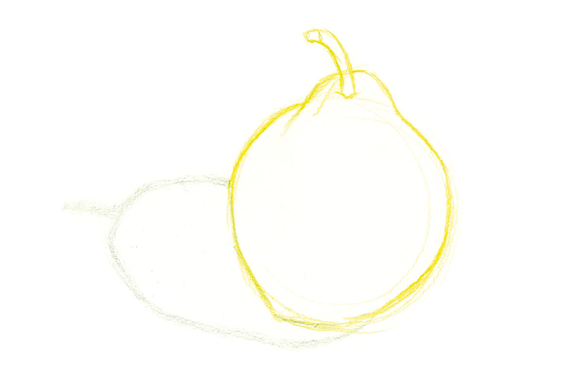
01. Draw the contour

Start by drawing the contours of your subject in a light colour. It's a good idea to use the local colour on the pear, to hide the original drawing – graphite lines can remain visible and dirty the colour.
Here, I'm working on a white vellum Bristol surface. When selecting your paper, aim for a weight of at least 250gsm, with a medium texture surface and a consistent grain. Smoother paper surfaces won't always take multiple layers of colour.
02. Hit the lights

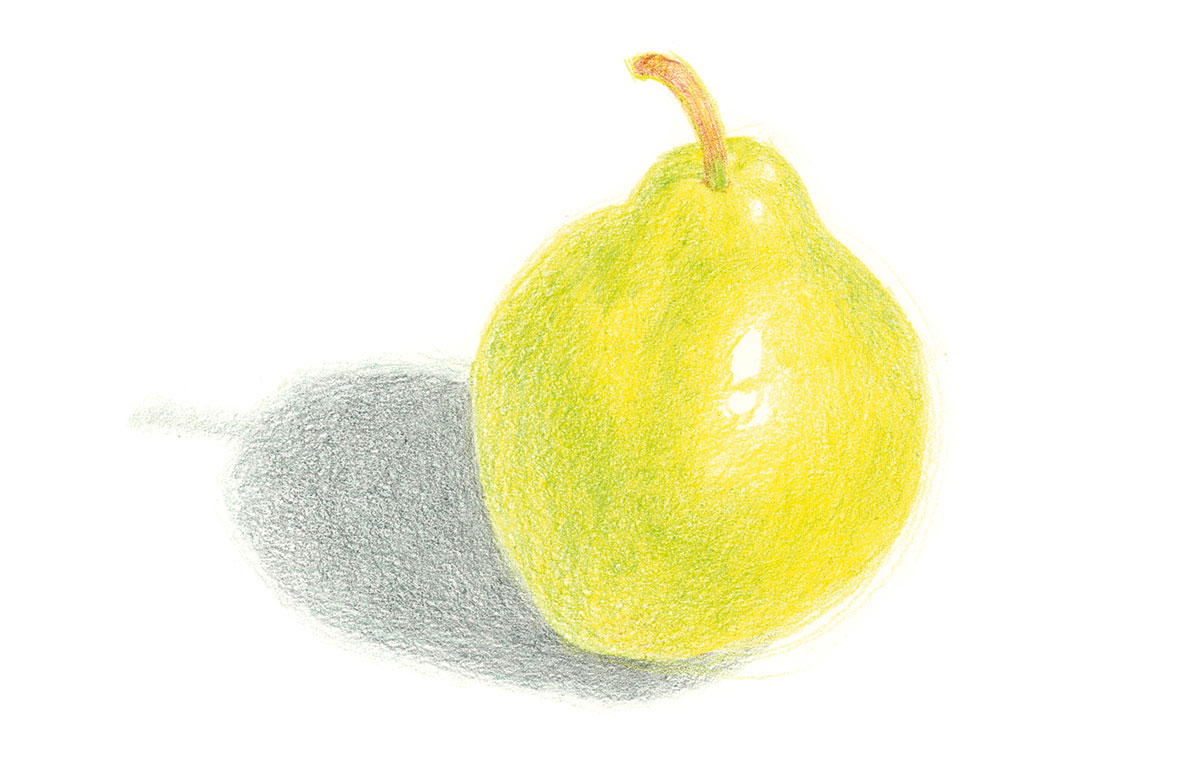
We're working from light to dark, so the first stage is to identify the highlights and lightest tones, and establish a base colour that will mix with the layers applied on top. With light pressure and a sharp point, lay a warm yellow over all the pear except for the highlights. I've chosen a cool grey for the shadow at this stage.
Avoid pressing so hard that the paper texture gets smoothed out, because this can effect how additional layers will go down.
Daily design news, reviews, how-tos and more, as picked by the editors.
03. Establish the local colour

Continuing to work with a sharp pencil, apply the shades that will represent the pear's local colour – I'm using different shades of yellow-green and green. Looking at mid-tones, I can see the pear is a mixture of different colours, rather than a single, flat yellow-green.
I then give the shadow another layer of colour, this time a warmer steel grey that combines with the original cool grey to create a more complex shade.
04. Add shadows and finishing touches

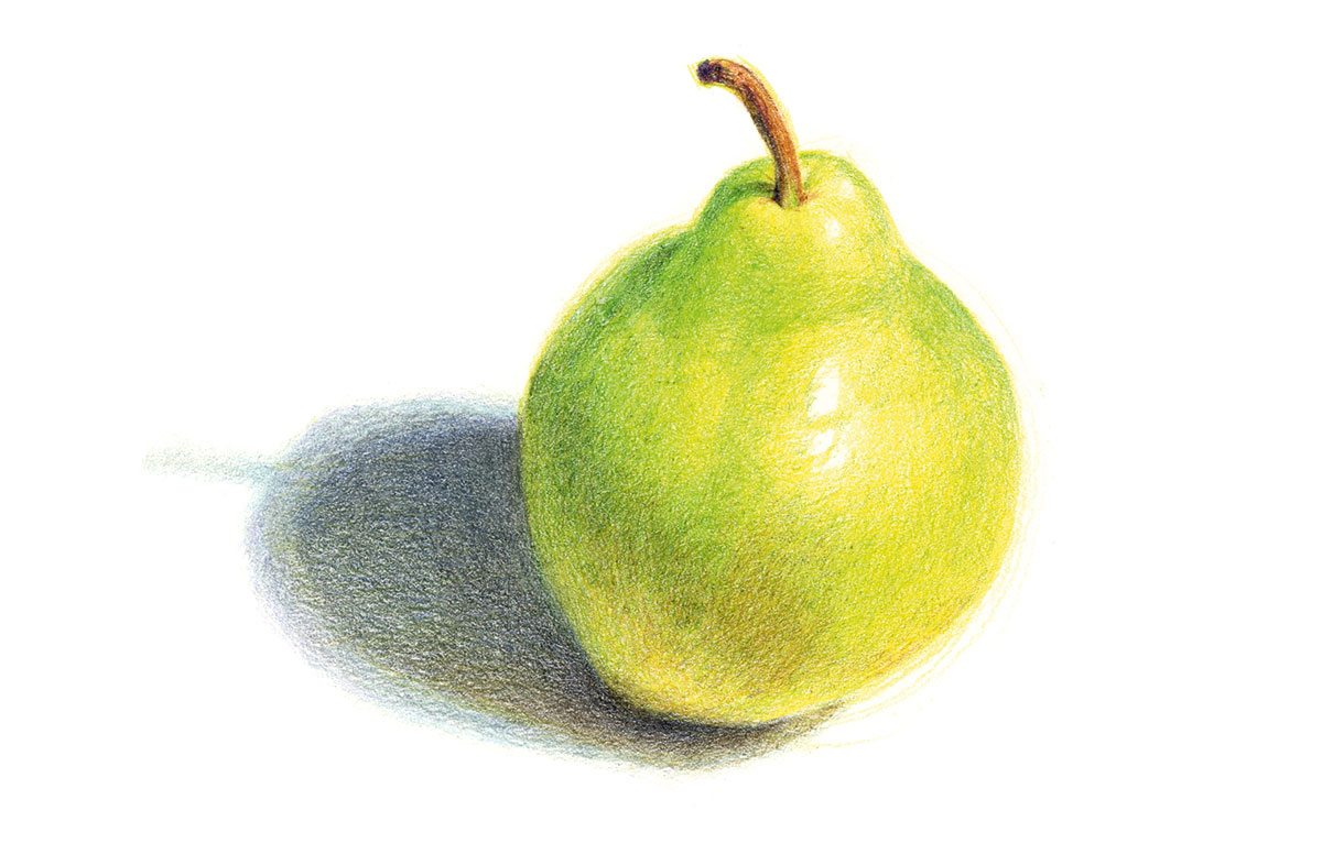
Finally, I use a darker green, brown, and red-violet to define the core shadow and darker parts of the pear, and layers of blue-violet and dark brown to darken the shadow on the ground. Lighter colours (slightly grey versions of yellow-orange, yellow-green and blue-violet) have been applied over top.
To finish, lightly use a white coloured pencil to lighten the tones. Check if any darks or mid-tones need to be reapplied in some areas.
Related articles:
- How to hold a pencil correctly
- 22 incredibly realistic pencil drawings
- How to draw: All the best drawing tutorials

Thank you for reading 5 articles this month* Join now for unlimited access
Enjoy your first month for just £1 / $1 / €1
*Read 5 free articles per month without a subscription

Join now for unlimited access
Try first month for just £1 / $1 / €1

