
For this workshop, I'd like to show you a really fun way to sketch characters from just your imagination. I'll be showing you how to create Photoshop brushes to mimic the traditional brush pen and marker techniques used by professionals.
I'll start with a texture brush to sketch in the lightest values, building the gestures and form of the character. During this early stage, I'll also go over some techniques to follow when producing cover art work and layouts. I'll then move on to the darker values, bringing in details from the lighter sketch form.
Once the details are in place I'll show how to use economical brush strokes to describe a lot of visual information in a short amount of time. And then, once we have the most information about the character down on the canvas, I'll go over quick ways to adjust colour and cool details within minutes. This is when I'll experiment with shapes within the form and silhouette. Paying attention to the overall design will make everything look unified and, quite frankly, cool!
Finally, I'll apply the final touches of quick overlay sketching to give the sketch a watercolour feel, which will introduce variety and depth to the character. Hopefully, by the end of this Photoshop tutorial you'll be inspired to create your own fun characters!
Download the custom brushes for this tutorial.
01. Bash out some thumbnails

I like to start an illustration or character concept by doing small, quick thumbnails to extract ideas out of my head. That means good and bad ideas. It's normal to have old images floating around in your head from something you once saw or inspired you. My method of leaving those mundane images or ideas behind is to bust out a bunch of little sketches, to get the best ideas possible on the canvas.
02. Narrow down the choices

For this workshop I produce just a few thumbnails because the idea is relatively simple: a woman and her dog. But if you're just starting out, I'd recommend doing a pile of thumbnails – say, 50. It may seem like a lot, but you'll be glad you did and you'll become a better artist for it. These two thumbnails have something that we're looking for so, I take pieces from both and mix them up.
03. Finalise the sketch

By taking elements that will work for the cover and combining them, I can demonstrate the general layout and idea that I'm going for. This helps to convey the attitude and overall gesture for the woman with the dogs. Now I'm ready to move on to the final illustration.
04. Start the painting stage

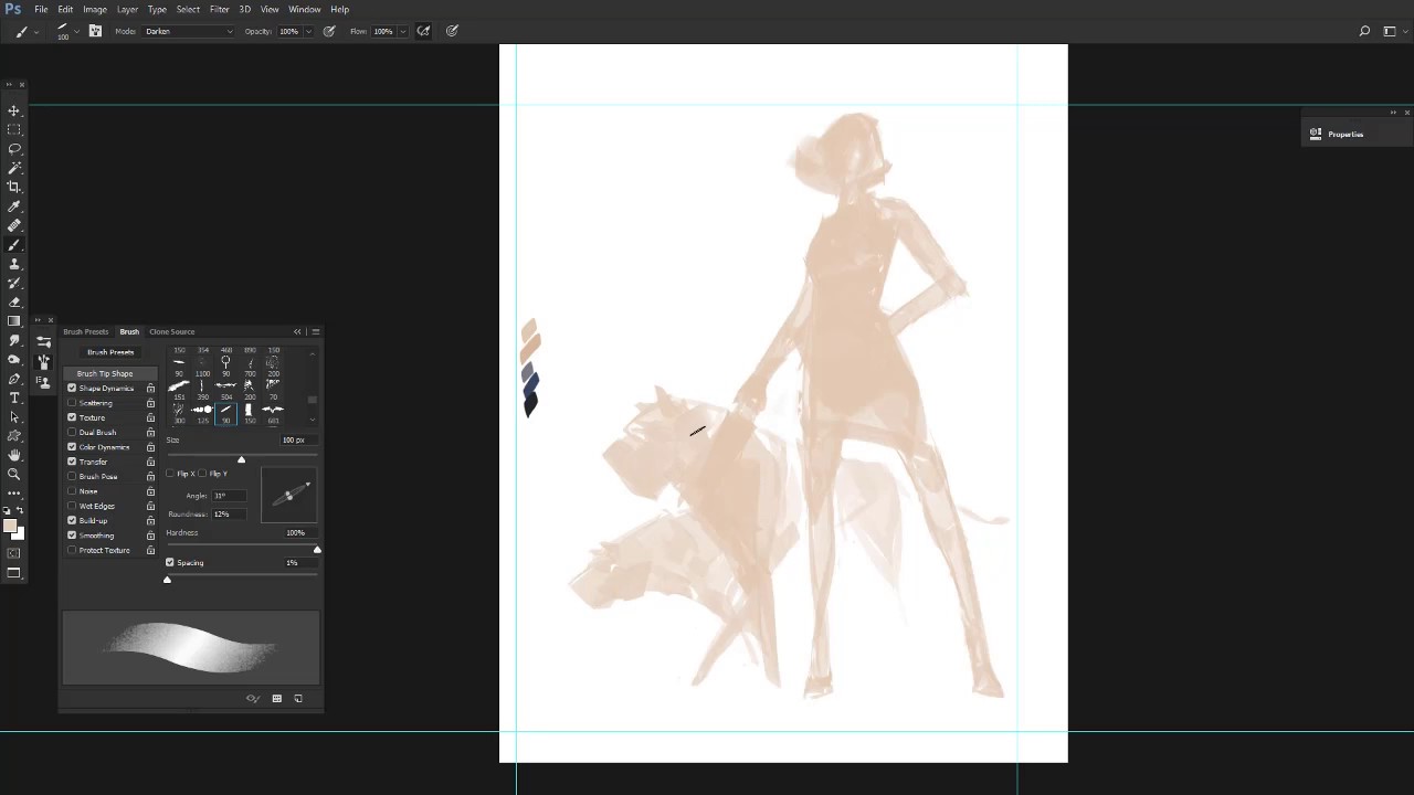
I start my final illustration by laying down a neutral skin tone. You can see on the left of my image that I have a basic value colour palette laid out within easy reach, from which I'll use the Eyedropper tool in Photoshop to pick from. I use one of my custom brushes at this stage – it's an angle brush that works like a real marker pen, and helps me achieve interesting-looking and dynamic angles.
05. Sketch in facial details

Working from light to dark is a good – and traditional – way of working. Using the previous value and shape block-in, I create a new layer above and start sketching in with a burnt sienna colour (a nice, neutral choice). This brings out the details of her eyes and smile. I restrict myself to just drawing in the smaller details for now.
06. Block in larger elements

On a new layer above the rest, I ctrl+click the layers below to make a selection. Pressing ctrl+H hides the selection outline. Then I increase the brush size and block in larger details such as her dress and boots. I'm asked to give the dogs a mechanical appearance, so I apply a grey tone to them.
07. Add darker tones for form

Just like before, I start a layer above the rest, load the selection, hide the selection and now I have a palette to erase and paint on. I'm starting to bring in the idea of the character design now. I toy with a punk rocker look, but notice that it's bringing out more of the form as well. By using the palette brush with broad strokes, I'm also able to introduce more details to the robot dogs.
08. Make the character pop

I feel that the black dress makes my character look a little dark, so using the steps before I create a new selection. With that selection I create a new layer and change the mode to Color Dodge. Using the same brush as before I put down large strokes with yellow to make her pop a bit. This technique enables me to control the amount of saturation and opacity in the piece.
09. Bring in sharp edges

Now that I'm close to finishing off this concept piece , I compress all visible layers below and press ctrl+alt+E to merge the visible layers into a new layer at the top. I turn off all lower layers, take a Round opaque brush and start cleaning up the edges, to bring in nice, sharp edges.
10. Spot errors

Now I know I have my final form and I think everything is just about done, I like to walk away for a little bit, maybe 30 minutes or so, and then come back with some fresh eyes. This helps me to look at objects anew and perhaps notice something 'off' that I didn't see previously. In this case I feel that there's too much contrast in the character, so I apply a little lighter grey value on a new layer that's set on Lighten mode.
11. Add the final touches to the concept

I'm now happy with this fun chick and her cool bot dogs. I want to add a little sketch vibe to the background to create more of a traditional look. This helps unify everything. Finally, I use these steps to apply a little film grain to the character. I create a new layer, fill it with 50 per cent grey, apply the Noise filter, set the layer to Soft Light and reduce Opacity to 15 per cent, then load the selection of the character and mask it out.
This article was originally published in ImagineFX, the world's best-selling magazine for digital artists. Subscribe to ImagineFX here.
Related articles:
