5 key animation patterns and how to use them
Explore the different types of animation and how each one works.

Sign up to Creative Bloq's daily newsletter, which brings you the latest news and inspiration from the worlds of art, design and technology.
You are now subscribed
Your newsletter sign-up was successful
Want to add more newsletters?
Animation can be a very powerful web design tool. But before animating every element of our designs, we must learn when and how to use this new tool. With great power comes great responsibility, and so forth. And as animation must vie with many other concerns for development and design time, it makes sense to spend our resources where they’ll go the furthest.
This article sets you up with some core animation patterns and shows you how animation applies to a greater system. Then you’ll learn how to spot cognitive bottlenecks and low-hanging fruit, maximising the impact of the animations you do invest in to improve the user experience.
- This is an excerpt from Rachel Nabors' Animation at Work – buy it here
If you’ve looked at as many examples of animation on the web and in-app interfaces as I have, certain patterns start to emerge. These patterns are helpful for identifying and succinctly verbalising the purpose of an animation to others.
Article continues belowHere are the categories I’ve found myself using the most: transitions, supplements, feedback, demonstrations and decorations. Let’s have a look at each of them and see how they impact the user’s experience.
01. Transitions
Transitions take users from place to place in the information space, or transition them out of one task into another. These tend to have massive impacts on the content on the page, replacing large portions of information.
The web was originally designed as a series of linked documents. Clicking on a link caused the browser to wipe the screen, often causing a telltale flash of white, before painting the next page from scratch. While this made sense in the context of linked text-based documents, it makes less sense in an era where pages share many rich design elements and belong to the same domain. Not only is it wasteful of the browser’s resources to be recreating the same page layout over and over, but it also increases users’ cognitive load when they have to reorient and reevaluate the page’s content.
Animation, specifically motion, can facilitate the user’s orientation in an information space by offloading that effort to the brain’s visual cortex. Using a transition between changes in task flow or locations in information architecture ideally reinforces where the user has been, where they are going, and where they are now in one fell swoop.
Sign up to Creative Bloq's daily newsletter, which brings you the latest news and inspiration from the worlds of art, design and technology.
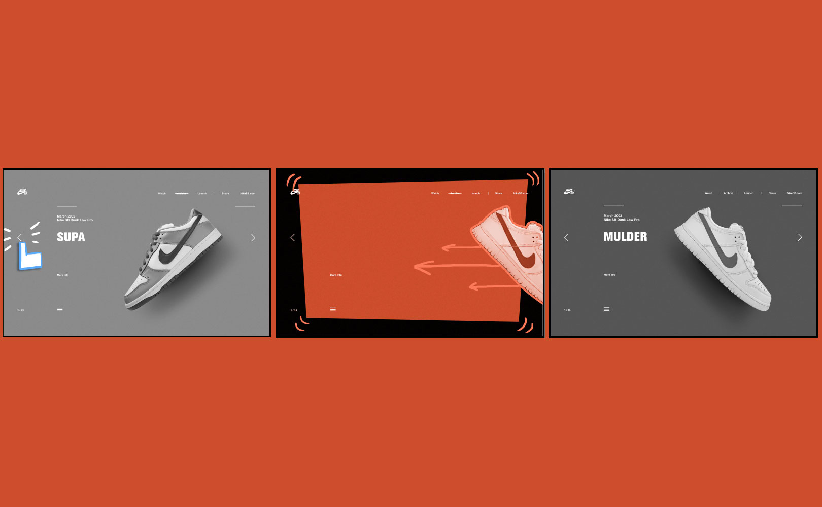
For example, on Nike’s SB Dunk page (shown above), when a user clicks a navigation arrow, the current sneaker moves out of the way while the next sneaker moves in from the opposite direction. These transitions clearly show the user how they are navigating along a linear continuum of sneakers, helping them keep track of their place and reinforcing the spatial model of perusing a real-world row of sneakers.
On another shoe site, John Fluevog, transitions move the user from task to task (see above). After a user starts typing in the search field, the results are animated on top of a darker backdrop. This transitions the user from the browsing context to refining their search results, streamlining their focus while also reassuring them that they can get back to browsing without much effort.
02. Supplements
Supplements bring information on or off the page, but don’t change the user’s 'location' or task. They generally add or update bits of additional content on the page.
While transitions move the user from state to state, supplemental animations bring ancillary information to the user. Think of times when information complementary to the main content of the page appears or disappears in view: alerts, drop-downs, and tooltips are all good candidates for a supplemental animation on entry and exit.
Remember that these animations need to respect the user’s Cone of Vision: will they be looking directly at a tooltip appearing next to their cursor, or will their attention need to be directed to an alert on the side of their tablet?
When a user adds a product to their shopping cart on glossier.com, rather than taking them to a whole new shopping cart page, the site merely updates the user as to their cart’s contents by popping it out as a sidebar (above). While a transition would snap the user out of browsing mode, this supplemental animation lets the user dismiss the shopping cart and continue shopping.
The shopping cart sidebar uses an additional supplemental animation to quickly and subtly attract the user’s eye: a progress meter gradually fills to show how much the user needs to spend to get free shipping.
This shopping cart process has a third animation pattern going on: the Add to Bag button gains a spinning icon when clicked, which gives the user feedback as to its loading state. Speaking of feedback...
03. Feedback
Feedback indicates causation between two or more events, often used to connect a user’s interaction with the interface’s reaction.
Animation can give users direct feedback about their interactions. A depressed button, a swiping gesture – both link a human action to an interface’s reaction. Or the flip side: a loading spinner on a page indicates that we’re waiting on the computer. Without visual feedback, people are left wondering if they actually clicked that 'pay now' button, or if the page is really loading after all.
On the Monterey Bay Aquarium’s site, hovering over a button causes its colour to fade from red to blue, indicating that the element is interactive and ready to react to user input. Button hovers are classic examples for this kind of animation, partly because the gain of giving users visual feedback on buttons is so measurable and important to business.
Design studio Animal’s site uses a bar of colour across the top of the page as well as an animated version of its logo to indicate the page’s loading and loaded states while providing interest and reinforcing its 'wild' branding.
04. Demonstrations
Demonstrations explain how something works or expose its details by showing instead of telling. These are my personal favorite use of animation. They can be both entertaining and insightful.
These animations put information into perspective, show what’s happening, or how something works. This makes demonstrative animations perfect partners for infographics. One thing all demonstrative animations do is tell a story, as you’ll see.
'Processing...' pages are an opportunity to explain what’s happening to users while they wait. TurboTax makes good use of these processing pages. After users submit their US tax forms, it banishes any remaining anxiety by showing them where their information is headed and what they can expect – all while reinforcing their brand’s friendliness and accessibility. (It also helps that the animation distracts users from a rather lengthy page load with something visually engaging!).
Coin famously uses demonstrative animations to explain their consolidation card’s value proposition to curious visitors as they scroll through the site – no need to press play and sit through a video ad or wade through paragraphs of expository content. This page is the very essence of 'show, don’t tell'.
05. Decorations
It’s not hard to mistake decorative animations for demonstrative animations. But there is a key difference: where demonstrations bring new information into the system, decorative animations do not. They are the fats and sugars of the animation food pyramid: they make great flavour enhancers, but moderation is key.
The best way to spot a purely decorative animation is to ask, “What can a user learn from this animation? Does this guide them or show them something they wouldn’t know otherwise?” If the answer is no, you might have a decorative animation on your hands.
Even though they get a bad rap, decorative animations can help turn the ordinary into the extraordinary. Revisionist History’s site uses decorative animations judiciously to bring flat illustrations to life. The animations add just enough interest to allow for the visual content on the page to be more austere, letting users focus on the podcast.
Polygon.com epically used animated illustrations to create centrepieces for a series of console reviews. These decorative animations may not have added new information, but they crucially reinforced the Polygon brand. They also helped each console review stand out from the competition, which at the time sported indistinguishable photographs of the same devices.
This article is an excerpt from Rachel Nabors' Animation at Work – an A Book Apart Briefs ebook that guides you through the anatomy of web animations, patterns, and communication decisions across teams. Buy it here.
Read more:
