8 ways to fail at logo design
If you want to create amazing logo designs, make sure you avoid these 8 simple mistakes.
Sign up to Creative Bloq's daily newsletter, which brings you the latest news and inspiration from the worlds of art, design and technology.
You are now subscribed
Your newsletter sign-up was successful
Want to add more newsletters?
From the redesigned and detailed Guinness harp, to the fresh summer colours of the new Instagram icon, 2016 has been an eventful year when it comes to logo design. While some of them have been better received than others, logos always provoke a strong reaction from the design community.
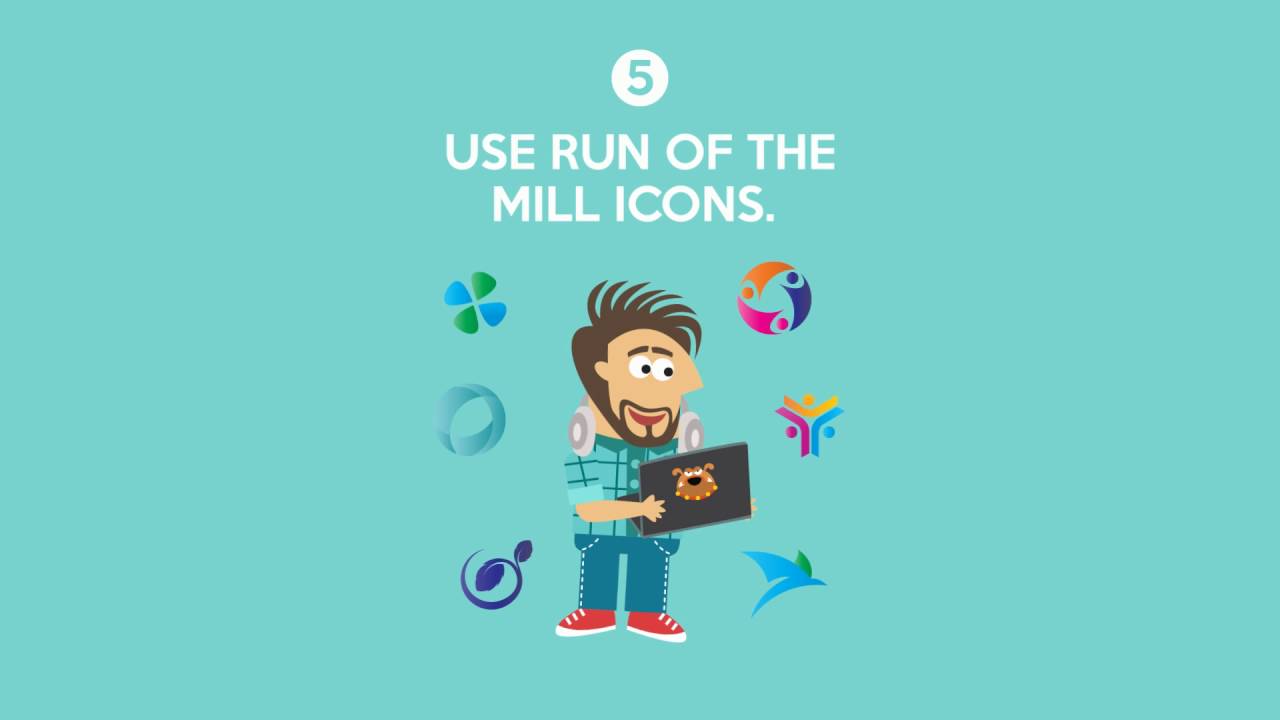
Whether they're picking on the colour scheme or the flat design, these reactions usually highlight the shortcomings of a logo design rather than focussing on the positives. To help designers avoid internet backlash, DesignMantic have put together this video which runs through the eight ways in which a logo will fail.
While some of the pitfalls might appear obvious (reading the brief is always a good place to start, no matter the project), there are sure to be plenty of designers who have committed at least one of these creative sins. To stop yourself becoming one of them (or maybe to help mend your ways), watch this video and refresh yourself on the dos and donts of logo design.
Article continues belowSign up to Creative Bloq's daily newsletter, which brings you the latest news and inspiration from the worlds of art, design and technology.

Dom Carter is a freelance writer who specialises in art and design. Formerly a staff writer for Creative Bloq, his work has also appeared on Creative Boom and in the pages of ImagineFX, Computer Arts, 3D World, and .net. He has been a D&AD New Blood judge, and has a particular interest in picture books.

