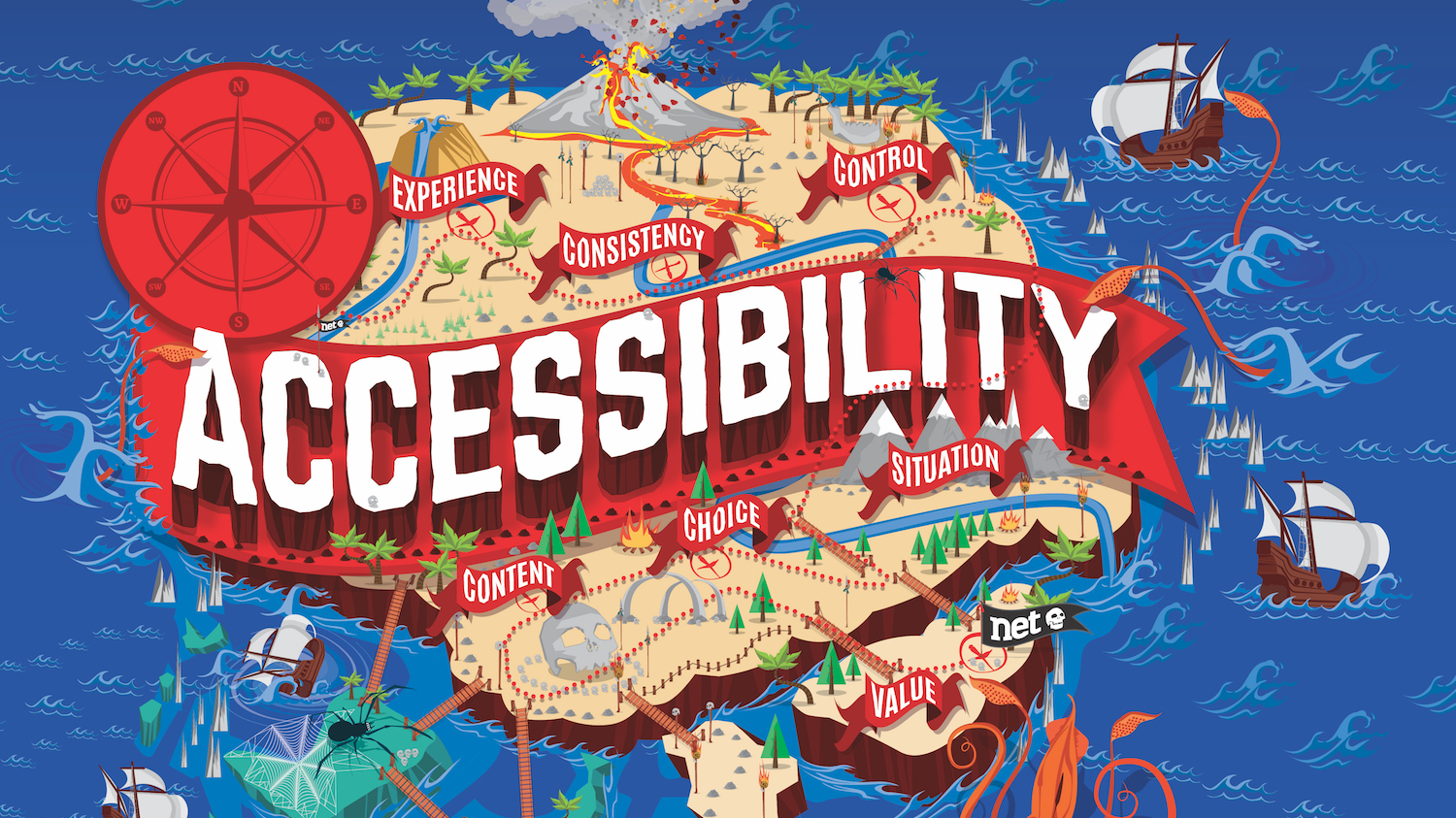
How to make your app accessible
6 steps to ensuring your app is accessible to all.

Sign up to Creative Bloq's daily newsletter, which brings you the latest news and inspiration from the worlds of art, design and technology.
You are now subscribed
Your newsletter sign-up was successful
Want to add more newsletters?
Government regulations in the UK mean that websites and apps in the public sector must now be accessible to everyone. In the digital age, mobile apps have become a widely popular platform for businesses to connect with their customers. Whether this is via a business, educational or entertainment app, the platform allows a more convenient, on-the-go approach in comparison to the likes of a website. Check out our free accessibility tool post for some quick and easy solutions.
Making your app accessible means you must consider the range of challenges a customer may face, ensuring that as many people as possible can use it. This includes those with impaired vision, motor difficulties, cognitive or learning difficulties, as well as deafness or impaired hearing.
Designing an accessible app means much more than simply making the design clearer. You must design an app that is adaptable to those throughout the spectrum and support those who need the app’s extra, accessible functions. Here we will be discussing six factors organisations need to consider when designing an app, making sure it can be accessed by everyone.
Article continues belowDesigning a website rather than an app? You'll need the best website builders and web hosting services around.
01. Create a simple, clear layout
The initial step is to ensure you have a simple layout. A cluttered design may overwhelm a user who then might give up on your app before they have even properly begun to explore it.
Elements must be visible to those who may need to magnify the screen, so your design must be responsive and adapt to various screen sizes. Text and call-to-action buttons must also appear at an appropriate size, with the option to enlarge.
02. Design a consistent navigation
You must design an easy-to-follow app with clear indicators. Navigation should have short task flows and be easy to find, as well as consistent throughout the different stages of using the app. Again, this is especially important with your call-to-action buttons. They must be clearly labelled, to smoothly guide users through your app’s goal conversion.
Sign up to Creative Bloq's daily newsletter, which brings you the latest news and inspiration from the worlds of art, design and technology.
Navigation pointers – for instance, menu bars and search boxes – should also be consistently positioned in a similar format throughout your app. This will enable users to quickly and easily explore your app in a logical order with no confusion.
03. Consider your text formatting
Text is another element that must be carefully thought out. Dyslexia can affect a person’s accuracy of reading, so you must really think about the structure of copy used on your app.
Uneven spacing, long sentences or paragraphs, italic fonts and the colour of text are just some design features you need to consider. Over-formatted text can be difficult for dyslexic users to read, as well as those with impaired vision, so make sure you keep your formatting simple and consistent throughout your design.

04. Make audio and video accessible
Creating an app that is interactive as well as accessible can be seen as a challenge, though creating a tick list of things you must consider will mean you can include media communications, for instance video and audio, where appropriate.
When incorporating these elements, users should be able to pause or stop, adjust volume and turn captions on and off. You may also need to consider adding audio description for users with visual impairments and subtitles and sign language for those who may be deaf.
If relevant, video and audio has the ability to transform any app, though if you feel it may cause accessibility concerns or be an added but unneeded extra, be sure to explore other creative options that can also add an interactive element. If you're designing an asset heavy app, it's crucial to back up your media securely with the best cloud storage options.
05. Give careful consideration to colour
Colour palettes are a top priority when designing any app, as most businesses associate certain colours with their branding. To make your app accessible to colour-blind users, it’s important to not fall in the design trap of solely relying on colour to communicate your message.
This doesn’t mean avoiding using colour at all. As already mentioned, colour can reflect a brand, so you just need to make sure that elements of your app are not purely identified based on colour. Your palette should also be carefully selected so that users can fully interpret the information displayed.
06. Don't forget to test
Following accessibility guidelines is always a good starting point but treating the development as a tick box challenge will not guarantee success. There are many methods to approach the testing phase, for instance engaging with real users at random and asking them to test elements of your app or using digital tools that can offer detailed assistance on screen reading.
Designing an app is a great opportunity for creative minds to develop a strong platform for any business. Making it accessible should not be a constraint; it will enable you to create a positive brand image that can associate with everyone.
This article was originally published in issue 325 of net, the world's best-selling magazine for web designers and developers. Buy issue 325 or subscribe to net.

Read more:
