How to design a bitcoin UX
Find out how Luno gave cryptocurrency a friendly face.

Cryptocurrency isn't typically the most accessible of industries. Those in the know are happy to get involved, but for the general public, the likes of Bitcoin and Etherium still seem futuristic and mysterious. As their popularity continues to skyrocket, more and more companies – including Luno – have started to move into the space.
Last night, Luno scooped the UK local prize at the Tech5 awards in Amsterdam (part of The Next Web conference) for its remarkable growth, and came second overall. We caught up with head of product design Lana Glass to find out how they went about designing an app that appealed to the masses.
In basic terms, what is Luno?
Luno makes it safe and easy for people to buy, store, use and learn about digital currencies such as Bitcoin or Ethereum. Users download the Luno app or go to the website, create an account, deposit money from their bank account into their Luno Wallet and buy some Bitcoin or Ethereum. Luno also allows you to send and receive digital currencies, monitor the price, set price alerts and place orders on our Exchange. In the long run, our vision is to upgrade the world to a better financial system.
What are your main aims with the design of the product?
In early 2017 we underwent a rebrand from BitX to Luno. Most Bitcoin companies have very technical names and BitX was no different. The price of Bitcoin was increasing, our customer base was growing and changing, and our app and website needed to reflect the changes we made in our brand.

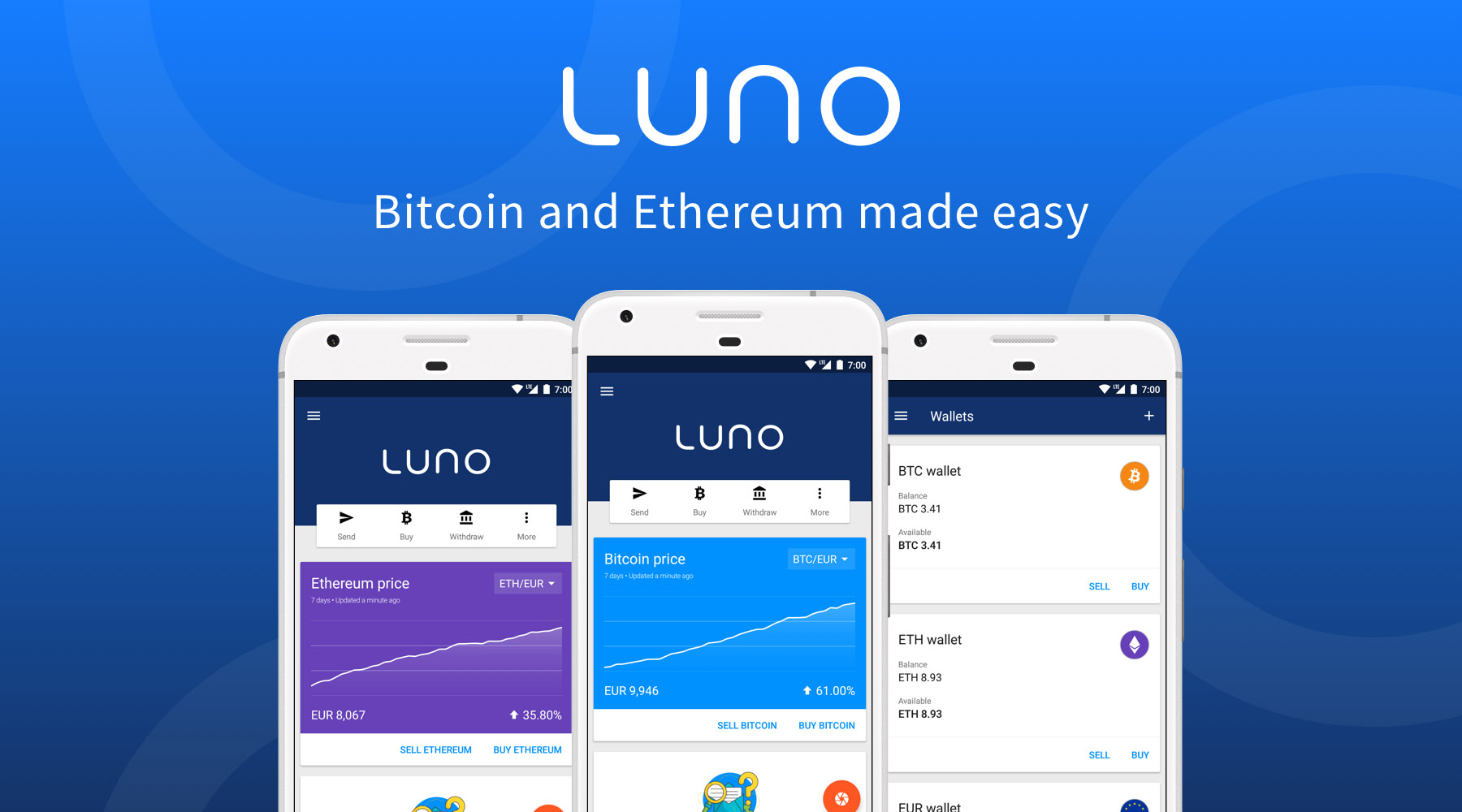
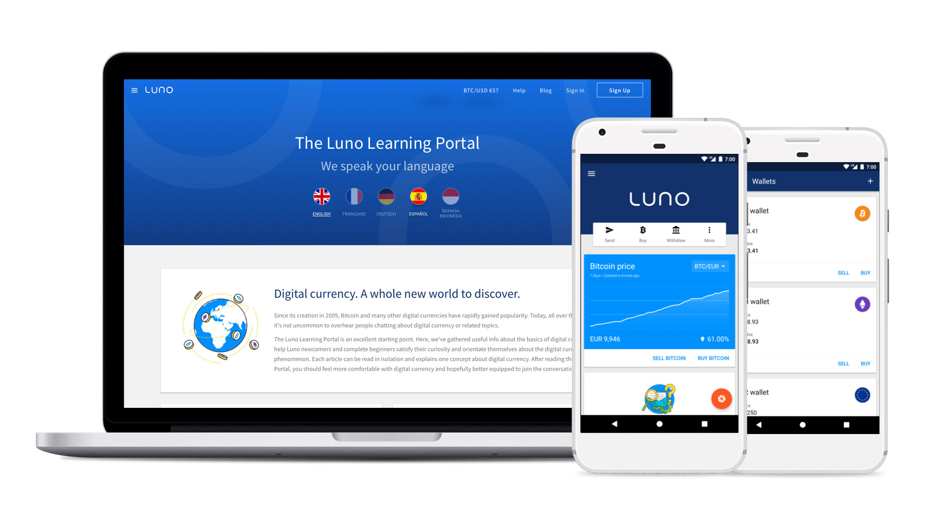
We wanted to create a friendly, trustworthy, engaging app. One of the first steps was to unify our three platforms - web, Android and iOS - as we needed to make sure that the user experience and offering were the same on each platform. By creating a design system we were able to stay as close to native patterns and elements as possible, while still making each platform look and feel like Luno.
Tell us a bit about your UX aims...
As digital currencies are still so new, and a little scary to most people, our main focus is to convey familiarity and build trust with our customers. As we grow across markets we are focusing on localising our products so that customers have the easiest journey possible into this new financial system. This includes translating our apps into multiple European languages, testing how different demographics and regions respond to the illustrations we use and conducting usability tests with potential customers on the ground.
Digital currencies are still seen as quite a futuristic, techy thing by the general public. How did you tackle this in your design?
This is definitely a concern for us. There is still a lot of negativity around digital currencies and a lot of speculation and untruths. Our challenge is to separate the facts from the fiction. There are a few things we can do to build trust with our customers, including using familiar UX patterns, our choice of colour palette, and the illustrations we use and where we use them.
Sign up to Creative Bloq's daily newsletter, which brings you the latest news and inspiration from the worlds of art, design and technology.
We also understand that we have a social responsibility to educate our customers about this new financial landscape, as well as stakeholders, investors, banks and regulators, and bring this understanding with us when designing product changes or new features.
What web technologies Luno is based on…
Our mobile-first, responsive web platform uses mostly AngularJS, Typescript and some jQuery for coding the web frontend. We use Grunt as a build tool and Sass for our stylesheet, with Git for version control and Lighthouse for performance.
We also have two native apps. On iOS we prefer not to use external libraries, meaning the base tech is all Apple. We migrated to Swift at the end of 2016 as the rebrand allowed us to review parts of our app that hadn’t had some love in a while. We have a few fans of Material Design in the office and we try to stay as close as possible to the great design system that Google has built for Android, without losing our brand voice.
We are quite excited about the recent updates to Material Design that were announced at this years I/O and look forward to seeing how Material Theming can help us balance familiarity with personality.
Luno came second in the Tech5 awards, in recognition of how fast the company has grown. Did such rapid growth raise any design problems?
The redesign from BitX to Luno happened in three months from the first announcement to the company to the day the apps went live on the app stores. That includes CI, branding, marketing, website changes and updates to the mobile applications. With such a short turnaround time we were less focused on systems and processes and just wanted to get the best product shipped as soon as possible.
This means that when we had time to catch our breath, the design team had a bit of work to do to collate libraries, clean up UI elements, make sure that the user experience was consistent and appealing, and create a design system that we can rely on for years to come.
Read more:

Ruth spent a couple of years as Deputy Editor of Creative Bloq, and has also either worked on or written for almost all of the site's former and current design print titles, from Computer Arts to ImagineFX. She now spends her days reviewing small appliances as the Homes Editor at TechRadar, but still occasionally writes about design on a freelance basis in her spare time.

