Produce a hand-drawn aesthetic in After Effects
Dylan White shows you how to process digital animation so that it appears to have been handcrafted
Sign up to Creative Bloq's daily newsletter, which brings you the latest news and inspiration from the worlds of art, design and technology.
You are now subscribed
Your newsletter sign-up was successful
Want to add more newsletters?
In this tutorial, I’ll be using native plugins to distort and roughen digital animation so that it appears more hand-drawn. In this example, my source sequence had a stroke applied as it was rendered from 3D. However, the technique can be applied to any type of digital sequence, be it from Flash, Photoshop or any other source. The only prerequisite is that it has a digital line to erode.
Also included with this video tutorial is a walk-through guide to a handy utility called CocoaPotrace, which is invaluable for quickly processing batches of images into best-quality vectors. By the end of this tutorial you’ll be equipped with a method to make your own motion work feel more hand-drawn.
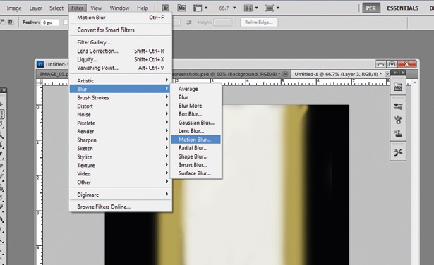
01 For this tutorial, you can use any existing sequence that features linework. My source sequence had a cartoon style render applied as it was rendered from 3D, but the techniques covered here can be applied equally to any animation sequence, as long as there’s a digital line to erode.
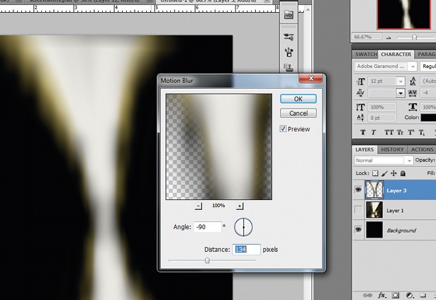
02 Vectorise your sequence via the batch process function in CocoaPotrace. The vector processing is a purely aesthetic choice: it adds imperfections to perfect linework by increasing natural-looking variation in line thickness and density, and causes the ‘ink’ to pool in corners.
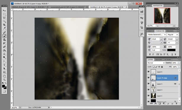
03 Back in After Effects, duplicate your vector sequence and multiply the top layer. You can blur this to soften the linework so it doesn’t feel so harsh. This will make it less likely to strobe and look more like a pen or brush line than a digital process.
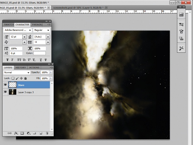
04 Precompose into a new composition and apply the Turbulent Displacement effect. The trick is to apply the effect twice. The first use of the effect will bend and warp your linework to help it feel more fluid, like a doodle. The second use is for controlling the fine detailing, imitating the stippling of brushwork.
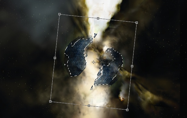
05 Once you’re happy with the line detail, duplicate the layer several times. I rarely use the Color Blend mode normally – I prefer to experiment with different colour modes and levels of opacity. In this case I’ve gone for Soft Light and Classic Color Dodge. By overlaying and also underlaying natural textures you can add different levels of sophistication to quite a simple scene.
See 10 brilliant examples of kinetic typography over at Creative Bloq.
Sign up to Creative Bloq's daily newsletter, which brings you the latest news and inspiration from the worlds of art, design and technology.

The Creative Bloq team is made up of a group of art and design enthusiasts, and has changed and evolved since Creative Bloq began back in 2012. The current website team consists of eight full-time members of staff: Editor Georgia Coggan, Deputy Editor Rosie Hilder, Ecommerce Editor Beren Neale, Senior News Editor Daniel Piper, Editor, Digital Art and 3D Ian Dean, Tech Reviews Editor Erlingur Einarsson, Ecommerce Writer Beth Nicholls and Staff Writer Natalie Fear, as well as a roster of freelancers from around the world. The ImagineFX magazine team also pitch in, ensuring that content from leading digital art publication ImagineFX is represented on Creative Bloq.
