Behind the scenes of Aardman's new website and branding
After 15 years, Aardman Animations have a new website and stationery design. Gavin Strange reveals how he created it.
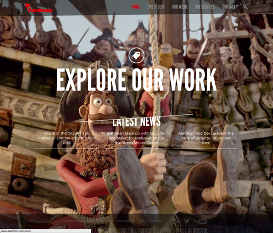
Known for their award-winning animations such as Wallace & Gromit, Aardman is a leader in their field. They've also had the same look for their website and stationery for over 15 years.
So recently they tasked senior designer and Creative Bloq favourite Gavin Strange with the job of refreshing their look. Here, he tell us about the brief, his process and the finished result.
"It started with the website – with web technology driving forward at a blinding pace, our last iteration online didn't have much content to display," he explains.
Article continues below 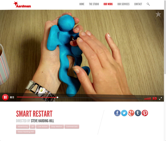
"That really was the focus for the new design – let the beautiful work that so many people spend so long creating be the centre point and let the design fall back."
But Strange was also aware that taking a minimalist approach is fraught with pitfalls.
"The danger is that it loses its soul and becomes cold," he explains. So he brought in charm and character by adding in what he calls the 'wonk' – "physically wonky angles on different sections to adding a bit of elasticity to the animation of the UI elements."

Once the website was in development and nearing its Beta phase, the company decided to pay attention to its printed branding too.
Sign up to Creative Bloq's daily newsletter, which brings you the latest news and inspiration from the worlds of art, design and technology.
"The word 're-brand' wasn't being used," Strange qualifies, "as that's a terrifying thing to say to a company, and felt like a huge undertaking.
"So what happened was a slow update to our digital documents, like PDF and PowerPoint templates which went down well with the lovely folk here at Aards."
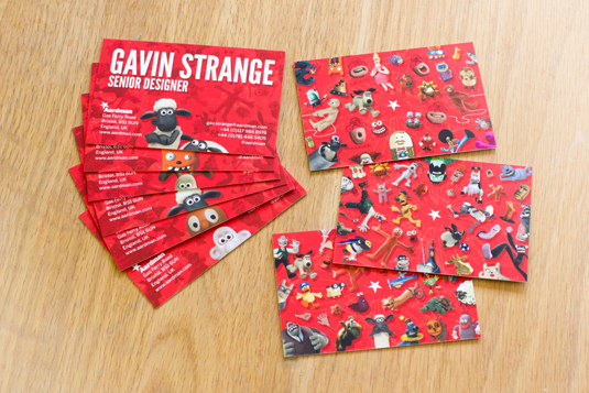
The same principles were applied here – let the work shine through but don't lose the heart and soul of Aardman, he adds. "And that was really tricky. The business cards were the most important of all the print – how do we communicate the old classic characters that everyone knows without forgetting the new creations coming out of our commercials and features department?"
After a lot of designs and experiments, Strange settled on an idea he originally didn't think would work. He describes it as "a mad explosion of all our characters, in all sorts of poses, collectively laid out in one huge pattern. To my surprise the big collage of colour and character really worked and instantly felt like 'Aardman' to me, and it did to everyone else too."
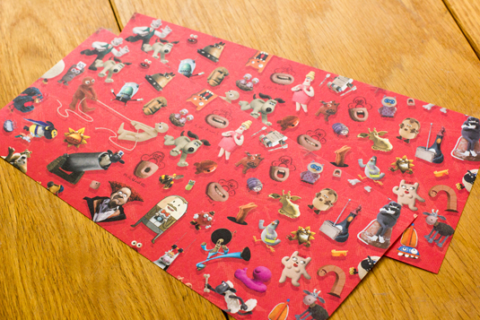
Because the company has nearly 40 years of work to draw on, they couldn't possibly fit in every character on a business card.
"So each person's pack of card actually features 18 different variations – 6 different fronts and 3 different backs," Strange explains.
"It's really nice when you have a meeting and you hand out your cards and people realise they're all different, that's a really cool feeling.
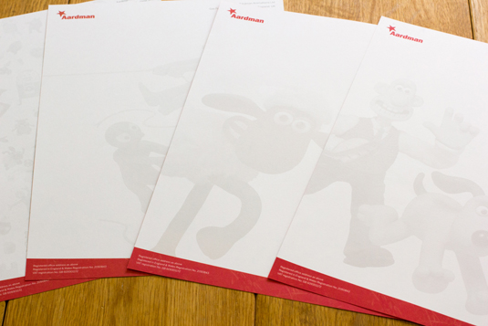
That huge collection of characters was also turned into one huge infinitely tiling pattern, which is used on the back of the letterheads and comp slips.
"This gives a lovely splash of colour. The comp slips are one of my favourite piece too, as they give you a real compliment and also feature wonky edges in the design too."
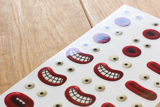
There's also sticker sheet that every employee has to brighten up any parcel they send out too. "They feature a kit of eyes and mouths that you can combine in any order to turn that parcel into a character!
"It's been the biggest honour to have had the chance to re-design and re-brand a cultural icon, a place I grew up watching their creations," Strange concludes. "I know I'm biased but man, I really do have the best job ever."
We think he's done a brilliant job at refreshing the identity whilst still keeping the classic Aardman characters at the forefront of his designs.
What do you think of Aardman's new look? Be sure to let us know in the comments box below!
Sammy Maine was a founding member of the Creative Bloq team way back in the early 2010s, working as a Commissioning Editor. Her interests cover graphic design in music and film, illustration and animation. Since departing, Sammy has written for The Guardian, VICE, The Independent & Metro, and currently co-edits the quarterly music journal Gold Flake Paint.
