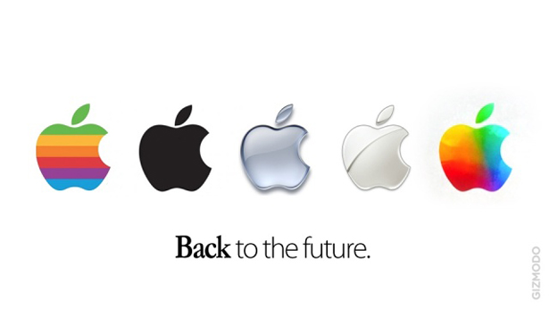
Apple goes back to the future with logo revamp
One of the highlights of yesterday's iPad keynote was a brief glimpse of a new, more colourful Apple logo. But what does it mean?
Sign up to Creative Bloq's daily newsletter, which brings you the latest news and inspiration from the worlds of art, design and technology.
You are now subscribed
Your newsletter sign-up was successful
Want to add more newsletters?
The multi-coloured logo spotted at the iPad launch looks like a modernised version of the original rainbow logo Apple sported in the 1970s and 1980s and may yet signal a new direction for the Cupertino, California company.
After late CEO Steve Jobs returned to Apple in 1995, the company progressively moved the logo to a more neutral white or grey tone. Now that the Jobs era is over, could this new more colourful logo show that Apple's trying to make a clean break with its past?

Computer Arts sister technology website Gizmodo UK certainly hopes so.
Article continues belowA new approach
Apple has historically been very careful and controlled about the image it presents to the world - something that has helped it become of one of the world's most famous and recognisable brands.
One thing's for sure, Apple has very clearly moved away from being just a computer company to a mobile devices company in the last few years - Apple sold more iOS devices in the last year alone than it sold Macs in the previous 28.
The fact that the 'new' multi-coloured logo evokes the old rainbow can only mean one thing: Apple is intent on creating a second computer revolution based around the iPad - just as it kickstarted the first.
Or maybe it's simply a reflection of the way the Yerba Buena Center was decorated ahead of the new iPad launch...
Sign up to Creative Bloq's daily newsletter, which brings you the latest news and inspiration from the worlds of art, design and technology.
What do you think of the new look Apple logo? Let us know in the comments below

The Creative Bloq team is made up of a group of art and design enthusiasts, and has changed and evolved since Creative Bloq began back in 2012. The current website team consists of eight full-time members of staff: Editor Georgia Coggan, Deputy Editor Rosie Hilder, Ecommerce Editor Beren Neale, Senior News Editor Daniel Piper, Editor, Digital Art and 3D Ian Dean, Tech Reviews Editor Erlingur Einarsson, Ecommerce Writer Beth Nicholls and Staff Writer Natalie Fear, as well as a roster of freelancers from around the world. The ImagineFX magazine team also pitch in, ensuring that content from leading digital art publication ImagineFX is represented on Creative Bloq.
