Elegant café branding is love at first bite
Creative agency Kokoro & Moi creates clean and elegant identity promoting Helsinki-based café chain Fazer.
Sign up to Creative Bloq's daily newsletter, which brings you the latest news and inspiration from the worlds of art, design and technology.
You are now subscribed
Your newsletter sign-up was successful
Want to add more newsletters?
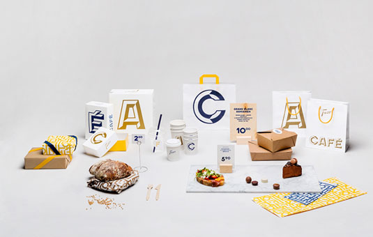
The Fazer Café was first established in 1891, in Kluuvikatu, Helsinki, by Karl and Berta Fazer. An established brand, a new batch of Fazer Cafés were opened in the summer of 2013, and with more in the pipeline, Kokoro & Moi was recently commissioned to create a new identity identity reflecting the brand's tone-of-voice.
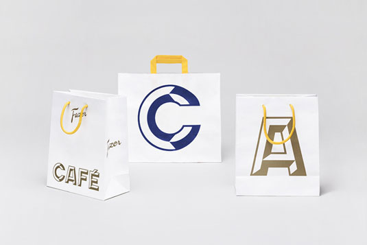
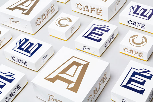
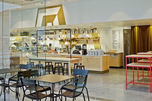
The result was this minimal, elegant concept, which has been used across the whole brand, including wallpaper, napkins and take-away packaging design. The team comments on Behance: "The visual identity is built on the custom-made typefaces, Fazer Grotesk and Fazer Chisel, which have taken their forms from the classic Fazer sign at the renowned Kluuvikatu location.
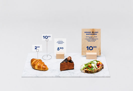
"The typefaces are used comprehensively for all the visual communication and marketing materials. They are utilised everywhere from the logo to the menu boards and price tags and with single characters that take over the packaging materials, clothing and the decor of the walls."
Article continues below 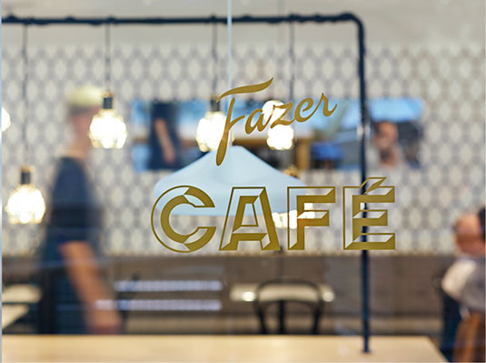
Have you seen any inspirational examples of branding recently? Let us know in the comments.
Sign up to Creative Bloq's daily newsletter, which brings you the latest news and inspiration from the worlds of art, design and technology.
Kerrie Hughes is a frequent contributor to Creative Bloq, and was once its editor. One of the original CB crew, Kerrie joined the team back in 2013 after moving from her role as staff writer on 3D World. Since then she's written regularly for other creative publications such as ImagineFX, Computer Arts and Digital Camera World. After a stint working for the police, Kerrie is back reviewing creative tech for creative professionals.
