Hershey's unveils controversial new logo
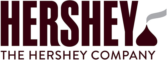
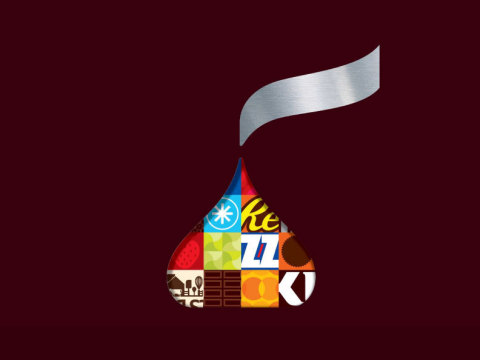
The Hershey Company, known for its Hershey's Milk Chocolate bars and more than 80 other confectionery brands, including Reese's and KitKat, has unveiled a refreshed corporate visual identity, including the new logo shown above.
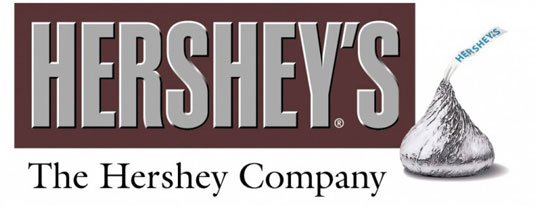
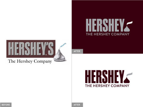
A move towards flat design and away from the 3D styling of the old logo (below), the new logo aims to reflect the company's evolution from a predominately US chocolate maker to a global confection and snack company.
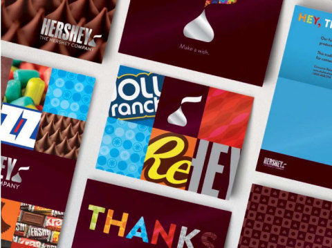
The new branding was created in-house by Hershey Global Design, with assistance from goDutch and Alexander Design Associates. It will be incorporated into all of Hershey's consumer communications and websites, as well as the interior design of its offices and retail stores.
Article continues belowMost notably, the new design features a new interpretation of the iconic shape of its Kisses brand chocolate. And, in an echo of the recent controversy over the Airbnb logo, it's attracted attention for its perceived resemblance to something other than what it's supposed to represent...
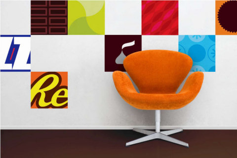
Scatalogical humour aside, here's a wider breakdown of the different elements of the company's new visual identity...

What do you think of the new logo and branding? Let us know in the comments below.
Sign up to Creative Bloq's daily newsletter, which brings you the latest news and inspiration from the worlds of art, design and technology.

Tom May is an award-winning journalist specialising in art, design, photography and technology. He is the author of the books The 50 Greatest Designers (Arcturus) and Great TED Talks: Creativity (Pavilion). Tom was previously editor of Professional Photography magazine, associate editor at Creative Bloq, and deputy editor at net magazine.
