Enhance traditional ink work digitally
Freelance illustrator Natsuki Otani shows you how to blend traditional Japanese inking methods with digital finishing to stunning effect.
Sign up to Creative Bloq's daily newsletter, which brings you the latest news and inspiration from the worlds of art, design and technology.
You are now subscribed
Your newsletter sign-up was successful
Want to add more newsletters?
When you're combining inked and hand-drawn images, it's important to balance the images and colours you use.
In this tutorial, we'll be producing a composite using a variety of sources and backgrounds in a traditional Japanese style. The main thing to consider during this process is that there are numerous ways to achieve your desired results, and that vastly different effects can be created with subtly different adjustments in layers or patterns.
Composition and tone are the key aspects to concentrate on as you experiment with this process. As you become familiar with the different digital collage techniques available, you can start incorporating bolder and more complex ink and handmade backgrounds into your illustration and graphic design projects.
Article continues belowClick here to download the support files (69.4MB)
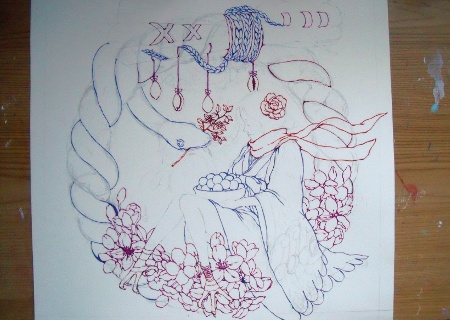
01 First, draw your image in pencil on thick watercolour paper. Make sure that you're happy with the final result and perform any alterations at this stage. Now carefully outline your drawing in a coloured ink of your choice, paying close attention to the detail. Select some areas of white space to leave for patterns and inks to be applied later.
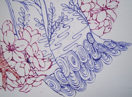
02 Add some areas of finer detail - these will give a sense of depth once they're enhanced with inks. I want to apply a pattern to the woman's kimono (a traditional Japanese garment) later in the process, so I have included some ink detail to unify it with the rest of the image.
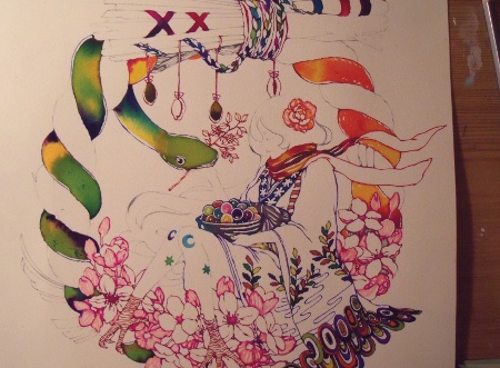
03 Carefully apply water to the image, and drop ink into it to create the desired effect of depth. Stay within the lines and pick your colours well - you'll have to do less digital alteration and clean-up later. Remember to leave some areas blank so that you can apply patterns to them later.
Sign up to Creative Bloq's daily newsletter, which brings you the latest news and inspiration from the worlds of art, design and technology.
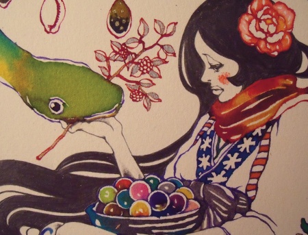
04 Add some little hand-drawn details to your figures to give them that extra bit of life. I added metallic inks and used pencils to highlight the tiny details, and add a sense of texture that would be difficult to create digitally. Treat this stage as you would your final digital render, so that when you start working in Photoshop there are fewer loose ends.
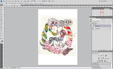
05 Scan your image at a very high resolution (at least 300dpi), and create a large document in Photoshop to work from. Make sure your scanner settings are not altering the colours - this will affect the quality of your work. I've used an A3 image: this provides all the resolution I need to capture as much texture and character as possible.
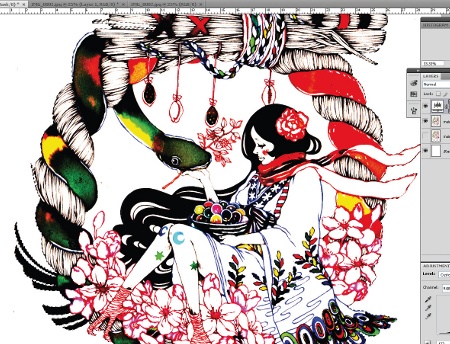
06 First create a new adjustment layer, called Levels. Use this to really ramp up the contrast, and fade the paper background against the white. Use a Contiguous setting on the Magic Wand tool with the anti-aliasing off to preserve the clarity of your line. Select the background, and then invert the selection using Ctrl/Cmnd+Shift+I. Play with the Selection tool's Tolerance settings to get the best results.
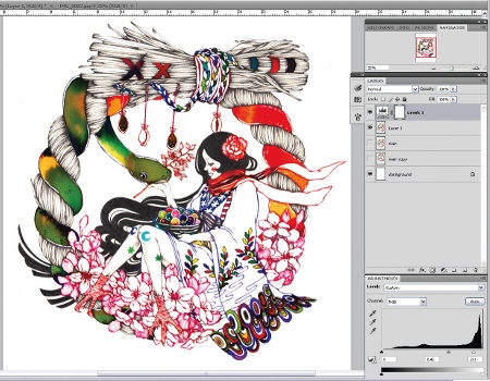
07 Now is the time to get rid of any blurs and flecks of ink or dust that may have been cut along with your image. Use the Eraser tool - set at a reasonable opacity - and check all the edges are clean and not ragged. Once you're happy, return to the Levels adjustment layer and bring the image back to your desired contrast.
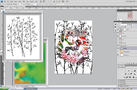
08 Bring in your images and add the background detailing. I created a pattern using a couple of layers of a bamboo texture (in the support files), combined and mirrored to give a slightly symmetrical effect to frame the central wreath. Create a plain white layer copy of the central wreath - you will need this later to provide a background for your flat colour.
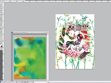
09 To add colour to the bamboo, create a new layer with the ink pattern that you're going to use as the background for the image. Turn it into a Screen layer (Blending Mode), and make sure it is above the bamboo layer. This enables the ink work to be projected through into the bamboo layer, and gives you the start of the complexity you're trying to achieve for the final image.
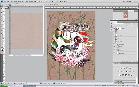
10 Next, import your base and final backdrop. I used a scan of some old, heavy duty paper, which keeps the work in touch with the hand-drawing element, and stops it losing its character during the digital workflow. Convert the bamboo layer to a Multiply layer so it takes on the character of the background.
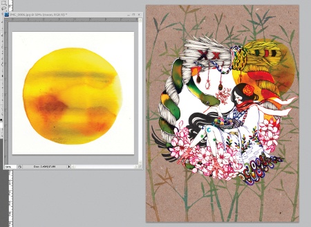
11 Drag in your moon image (in the support files), cut it out using the Magic Wand tool, and use the Invert Selection method. This works particularly well for hand drawing, as it captures all of the imperfections and inconsistencies in the lines that give non-digital work its unique appeal. Add it to the main image as a Multiply layer, and move it around until you're happy with the composition before the next stage.
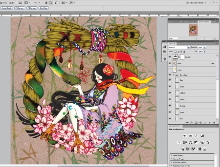
12 Convert the main layer to a Multiply layer. Create a new layer between the white background and the main layer, and add flat colour below the wreath, paying attention to the edges and lines. Use a normal brush to do this in a range of pastel colours, and ensure that you have an even, plain finish.
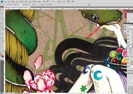
13 Now erase the white base layer that's immediately below your main layer, using a semi-opaque Eraser. Leave the white under the skin and other areas of flat colour, so that only certain areas are multiplied to show the pattern through. It can work well to smooth the edges of these areas to blend them in with the rest of the composition, but be sure to leave strong, opaque colour in the centre to ensure they stand out.
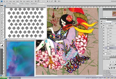
14 Import the pattern pieces that you want to assemble for the kimono pattern (in the support files), and combine them into a repeating pattern. Place the pattern into the main image. Select the areas you wish to add the pattern to with the Magic Wand, and use this selection as a template to cut out of the pattern layer. Move your new pattern layer above the kimono layer, and use a colour burn to knock back the colour slightly.
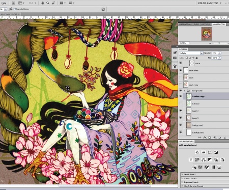
15 At this stage you need to create a lighter background within the centre of the image. Delete the background bamboo layer from the centre of the wreath. Select the now-clean area within the wreath and lighten it - it's up to you by how much. Use this opportunity to adjust the moon, and make the wreath stand out by deleting the portion of the moon that's overlaying the wreath as you did with the bamboo.
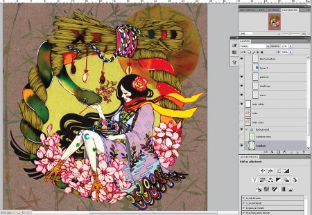
16 The image is nearly complete so perform some last little adjustments to the levels, and make sure that the image is clean. Take your time to ensure you're happy with the balance of pattern and colour before saving your high resolution flattened image. Don't forget to save out your layered PSD, so that your finished piece remains fully editable - and you can make good use of all the textures and patterns that you've created in future work as well.
Natsuki Otani
Currently freelancing in the UK, Otani is a Tokyo-born illustrator whose clients include Urban Outfitters and Sketchbook magazine, as well as various record covers. www.natsukiotani.co.uk

The Creative Bloq team is made up of a group of art and design enthusiasts, and has changed and evolved since Creative Bloq began back in 2012. The current website team consists of eight full-time members of staff: Editor Georgia Coggan, Deputy Editor Rosie Hilder, Ecommerce Editor Beren Neale, Senior News Editor Daniel Piper, Editor, Digital Art and 3D Ian Dean, Tech Reviews Editor Erlingur Einarsson, Ecommerce Writer Beth Nicholls and Staff Writer Natalie Fear, as well as a roster of freelancers from around the world. The ImagineFX magazine team also pitch in, ensuring that content from leading digital art publication ImagineFX is represented on Creative Bloq.
