Give type back its teeth
The ‘Martha Stewart’ aesthetic is everywhere. Stop looking backwards, urges Craig Ward
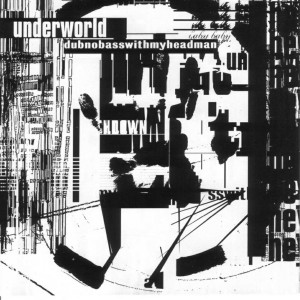
The dark, semi-coherent poetry of Underworld’s 1994 album Dubnobasswithmyheadman, accompanied by the thudding beats that held it together, calls to mind a lot of imagery for me and probably anyone who grew up in Britain in the 90s. Strobing club scenes from the movie Trainspotting, my older cousin’s Technics turntables and, of course, the iconic album artwork by Tomato where dense layers of stark, distorted typography jostled for position with no apparent hierarchy. It was a perfect interpretation of the music.

The 14-year-old me that bought the CD would have just said that it ‘looked cool’. I wasn’t aware of design in the way that I am now; unable, then, to peel away the layers of semiotics inherent in every piece of communication.
As an eager student at the very tail end of the 90s, I exposed myself to a lot of new work very quickly. Design was an unknown quantity to me at that point and I remember vividly my excitement at the discovery of work by not only Tomato but also the likes of Vaughan Oliver, Frost, Carson and Sagmeister. What I found most exciting about their work wasn’t just its stopping power, but the way the designers refused to be limited by simple matters of legibility in their pursuit of communication. They were doing things with type that I had never seen before: tearing it apart – showing you its insides in a way that befitted the zeitgeist. Arguably, often it went too far, but it was sinewy, visceral and exciting.
Article continues belowOf course that was forever ago. I recently gave a talk for the Type Directors Club here in New York about my influences and education. While putting the talk together, a group of students visited me and I asked them who they now looked up to in the world of design and typography; who they thought was doing the most exciting work. Their responses made my heart sink.
You’ll be familiar with a look that is prevalent right now. Some of you will have partaken in it and a few of you will have even made money out of it. A friend of mine calls it ‘the Martha Stewart aesthetic’ – and I really couldn’t be more diametrically opposed to something if I tried. Ribbons, banners and filigrees, flourishes, swashes and composs in a variety of polite pastels surround vintage typography that would have felt at home in movie title screens of the 40s.
It’s pleasant. Inoffensive. Mute. All bad words. And it’s everywhere. The design scene today is completely saturated with this flouncy nonsense. As an industry we love it! We throw awards at it; dedicate acres of magazine space to it and buy posters of it – this shining example of typographic excellence.
Now don’t get me wrong, no one appreciates craft and heritage more than me. I spent the latter half of my degree and the first half of my career working probably too much with letterpress. Brief after brief came in asking for headlines set in that medium, but I turned away from it when I realised that it just wasn’t appropriate for everything. Why would I set headings for a sex article in a men’s magazine in wood type? Or, for that matter, illustrate various chemical compounds with it? It’s just inappropriate.
Sign up to Creative Bloq's daily newsletter, which brings you the latest news and inspiration from the worlds of art, design and technology.
And to that point, what has this faux-vintage, overworked trend got to do with anything anyway? It’s 2011 and letterers had this kind of typography licked half a century ago. The biggest problem I have isn’t with the type itself – which can be beautiful – it’s that it’s simply a pastiche and is backwards facing, relevant to very little today. Many students perceive typography as old-fashioned and stuffy to begin with, and to celebrate this kind of work gives them the wrong idea of what constitutes good type and communication.
The work I mentioned from the 90s might have often gone too far in its pursuit of communication over legibility, but at least it was trying something new. With all the capabilities in a designer’s arsenal today, why do we instead revert to tried and tested techniques and styles? And why do we celebrate it instead of trying to push things forward? Only a few studios today turn in genuinely forward-thinking typography, the rest just seem happy to follow the herd. And that, perhaps, is the biggest crime of all.

The Creative Bloq team is made up of a group of art and design enthusiasts, and has changed and evolved since Creative Bloq began back in 2012. The current website team consists of eight full-time members of staff: Editor Georgia Coggan, Deputy Editor Rosie Hilder, Ecommerce Editor Beren Neale, Senior News Editor Daniel Piper, Editor, Digital Art and 3D Ian Dean, Tech Reviews Editor Erlingur Einarsson, Ecommerce Writer Beth Nicholls and Staff Writer Natalie Fear, as well as a roster of freelancers from around the world. The ImagineFX magazine team also pitch in, ensuring that content from leading digital art publication ImagineFX is represented on Creative Bloq.
