The Partners & The Prince's Foundation
The charity headed by Prince Charles gets a new identity marked out by a strong use of colour, and typography that's full of gravitas
Sign up to Creative Bloq's daily newsletter, which brings you the latest news and inspiration from the worlds of art, design and technology.
You are now subscribed
Your newsletter sign-up was successful
Want to add more newsletters?
The London design agency The Partners has created a new identity for the Prince's Foundation, a charity headed by the Prince of Wales. While plenty of people are aware of the Prince's Trust, which helps young people make their way in the world, the Foundation is less well-known but does equally important community-building work. It may now receive more recognition thanks to this well thought out new look.
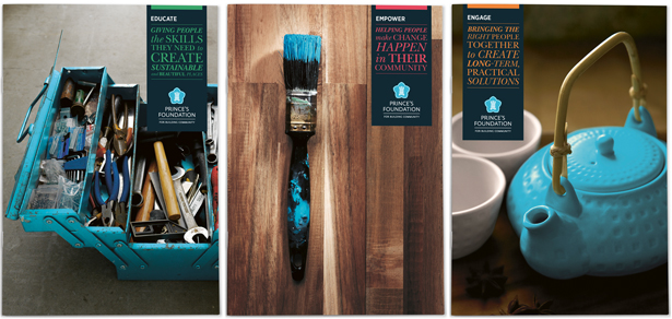
Distinguishing The Prince's Foundation from The Trust was part of the challenge and a very different interpretation was made of the Wales crest with its three plumes. Here it is set on a five-pointed flower shape. But perhaps the most powerful thing about the new identity is the strong blue which has a light-yet-deep characteristic to it. "The blue has a very specific role to play. It’s their signature colour. We are looking to build an association with the colour, whenever you see it you are seeing something positive that the Prince’s Foundation has made happen. The secondary colours are used to code their three core purposes: to engage, to educate and empower," says Sam Griffiths, senior designer at The Partners.

Then there was the whole notion of designing for a branch of the monarchy - an institution that stretches back over 1000 years, and means so many different things to people from different backgrounds. Prince Charles is associated with privilege at a time when some communities are on the verge of slipping into poverty, yet this charity is his effort to help build sustainable communities. "The main challenge was to find the right balance between gravitas and respect for tradition, and the need for the charity to be energetic, engaged and relevant," says Griffiths.
Article continues below 
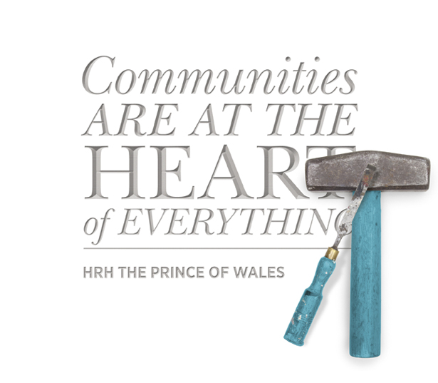
This traditional-yet-relevant feel was generated to a great extent through the typography, and the designers chose to work with two families of fonts - New Baskerville ITC Pro and Gotham Narrow. Griffiths continues: "The Baskerville family is a classic typeface. We’ve used it to demonstrate how the Prince’s Foundation is inspired by the best of the past. The Gotham Narrow is clean and contemporary. It helps show that the charity is a forward looking, progressive organisation. The life and energy in the typography is generated by the contrast, and balance between these two type families."
In addition to the logo and design guidelines, the new identity work done by The Partners has included a redesign of The Foundation's website, and various brochures and promotional material.

Sign up to Creative Bloq's daily newsletter, which brings you the latest news and inspiration from the worlds of art, design and technology.

The Creative Bloq team is made up of a group of art and design enthusiasts, and has changed and evolved since Creative Bloq began back in 2012. The current website team consists of eight full-time members of staff: Editor Georgia Coggan, Deputy Editor Rosie Hilder, Ecommerce Editor Beren Neale, Senior News Editor Daniel Piper, Editor, Digital Art and 3D Ian Dean, Tech Reviews Editor Erlingur Einarsson, Ecommerce Writer Beth Nicholls and Staff Writer Natalie Fear, as well as a roster of freelancers from around the world. The ImagineFX magazine team also pitch in, ensuring that content from leading digital art publication ImagineFX is represented on Creative Bloq.
