Control image aspect ratios with CSS3
Making media display consistently on your site can be a problem, especially with multiple content authors. Opera’s Chris Mills shows you how object-fit and object-position can solve it.
Sign up to Creative Bloq's daily newsletter, which brings you the latest news and inspiration from the worlds of art, design and technology.
You are now subscribed
Your newsletter sign-up was successful
Want to add more newsletters?

Five times a week
CreativeBloq
Sign up to Creative Bloq's daily newsletter, which brings you the latest news and inspiration from the worlds of art, design and technology.

Once a week
By Design
Sign up to Creative Bloq's daily newsletter, which brings you the latest news and inspiration from the worlds of art, design and technology.

Once a week
State of the Art
Sign up to Creative Bloq's daily newsletter, which brings you the latest news and inspiration from the worlds of art, design and technology.

Seasonal (around events)
Brand Impact Awards
Sign up to Creative Bloq's daily newsletter, which brings you the latest news and inspiration from the worlds of art, design and technology.
- Knowledge needed: Intermediate HTML and CSS
- Requires: Text editor, Opera 11+/WebKit nightly/other supporting browsers
- Project Time: Quicker than you might think
- Support file
This article first appeared in issue 214 of .net magazine.
Controlling the aspect ratio of replaced elements, such as <img> or <video>, can be a pain. For example, you might want all images occupying the same space on a page, but to not distort and lose their aspect ratio when someone uses an image file that isn’t the right size.
Resizing and letterboxing the image slightly to conserve the aspect ratio is a much more elegant solution than squashing and stretching an image to fit. Or you might want to go the opposite way, and force letterboxed items, such as HTML5 <video>s, to conform to a specific width and height. Maybe you want all videos to be a specific aspect ratio, and want a solution where ones with different aspect ratios automatically appear correctly?
This problem is even more awkward when you’re working with a CMS that has multiple content authors uploading videos and images, especially if they’re end-users as opposed to employees. You’ll want a system that processes media so it displays consistently, but this kind of thing is quite difficult, requiring JavaScript to access and manipulate sizes on the fly, lots of CSS trickery, or lots of laborious preprocessing with a server-side language such as PHP.
CSS3 offers an easy answer that’s currently close by on the horizon. The CSS Image Values and Replaced Content module working draft defines a property called object-fit, which aims to solve exactly these sorts of problems. And this module also contains a related property, object-position, which you can use to set the horizontal and vertical position of content inside the element. All you need to fully check out the examples here is a supporting browser, such as Opera 11, or a WebKit nightly. Before going on to look at some examples, let’s explore the basic syntax of the new properties.
01. Object-fit
You can successfully apply object-fit to any replaced element. (A replaced element is any one whose content and appearance is defined by an external resource such as an image, video or SVG file.) The code is as follows:
img {
height: 100px;
width: 100px;
object-fit: contain;
}
Sign up to Creative Bloq's daily newsletter, which brings you the latest news and inspiration from the worlds of art, design and technology.
Note that in the code samples and examples for this article, we set the width and height of our replaced elements in CSS. Object-fit also takes effect when the dimensions have been specified using HTML attributes; however, this is not such a good idea. In browsers that don’t support this CSS property, this would result in those replaced elements always looking squashed or stretched, unless of course you have a fallback solution in place, such as PHP preprocessing of the media dimensions. Instead, we therefore omit the dimensions and let browsers simply display them using their intrinsic sizes. The approach that works best for you will depend on your specific situation.
Object-fit has four possible values, which are as follows:
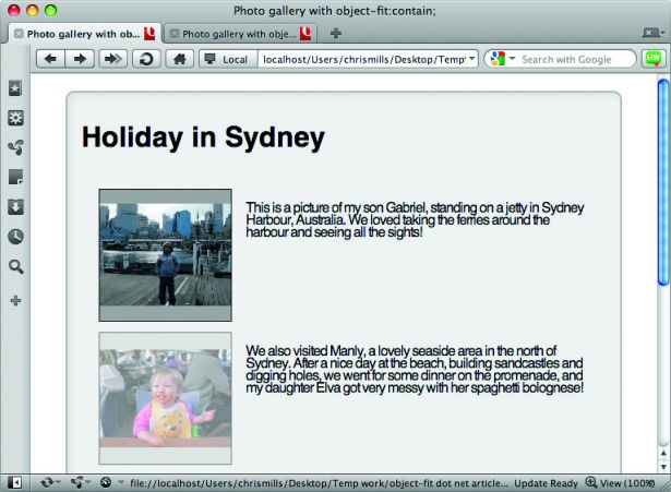
- contain: If you’ve set an explicit height and width on a replaced element, object-fit:contain; will cause the content (eg the image) to be resized so that it’s fully displayed with its intrinsic aspect ratio preserved, but it will still fit inside the dimensions set for the element.
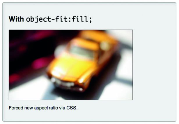
- fill: This setting causes the element’s content to expand to completely fill the dimensions set for it, even if this does break its intrinsic aspect ratio.
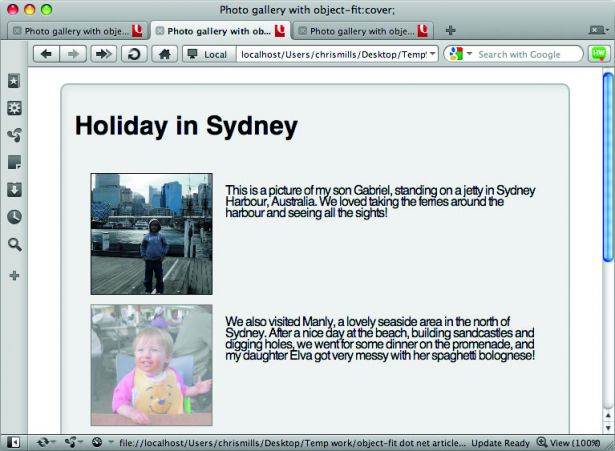
- cover: Using this setting preserves the intrinsic aspect ratio of the element content, but alters the width and height so that the content completely covers the element. The smaller of the width and height is made to fit the element exactly, and the larger dimension overflows the element.
- none: When you use the value none, the content completely ignores any height or weight set on the element, and just uses the replaced element’s intrinsic dimensions. Although the value none was in the original specification and is supported in Opera, it was then removed in a later revision of the spec. It may, however, return in a future iteration.NOTE: To see more clearly how these values affect an image’s aspect ratio, please refer to object-fit-diagram.png in the tutorial files

02. Object-position
Object-position works in exactly the same way as background-position does for background images, and can take the same values (pixels, ems, percentages, keywords, etc). It specifies the position of a replaced element’s content inside the area of that element. For example:
img {
height: 100px;
width: 100px;
object-fit: contain;
object-position: top 75%;
}
In Opera, object-fit can also take a value of auto, which is the default if the property is not specified. It only really exists to retain backwards compatibility and to enable you to override earlier settings.
03. Preserve ratio
Sometimes referred to as letterboxing, there are times when you’ll want to preserve the aspect ratio of the images on a page, and get them to fit inside the same area. For example, you might have a content management system that enables you to upload products on an ecommerce site or images for an image gallery, with lots of different content authors.

They may upload images in roughly the right size, but the dimensions are not always exact, regardless of any guidelines you may publish! In this case, you could change aspect ratio to make the images all fit in exactly the same area, but that will probably look horrible.
The other option is to letterbox the images. This looks much better, but it is quite complicated to achieve on the client-side with current browser support. You could, of course, use some kind of server-side solution to preprocess the images, but this again is complex and adds more overhead.
You can handle this problem really easily with object-fit:
img {
width: 150px;
height: 150px;
...
object-fit: contain;
}
In my example, the thumbnails are all set to be the same width and height, but object- fit:contain; forces all the images to fit inside the same area and maintain aspect ratio. An even better solution, depending on your application, might be to maintain aspect ratio, but change the size and crop of the image so it completely envelops the <img> element.
This can be done easily, by replacing object-fit:contain; with object-fit:cover; and adding overflow:hidden; to the mix:
img {
...
object-fit: cover;
overflow: hidden;
}
In this case, object-fit:cover; makes the images increase size to completely envelop the <img> elements, and overflow:hidden; then chops off the area of image that spills outside those elements (check out object-fit-cover-images.html in the sample files).
04. Overriding a video’s aspect ratio
In our next example, we’re taking a video with a broken aspect ratio, and forcing it to change aspect ratio and fit snugly into the <video> element size we’ve specified. Why would you want to do this? Maybe some of the videos your content editors upload to your CMS have a broken aspect ratio, and you want to fix them all on the fly, for example.
Object-fit:fill; enables us to do this in one fell swoop. To illustrate the point, our object-fit:fill; video example (see object-fit-fill-video.html in the code examples) uses a couple of <video> elements, as follows:
<video controls="controls" src="windowsill.webm" width="426" height="240" class="no-object-fit">
</video>
<video controls="controls" src="windowsill.webm" width="426" height="240"
class="object-fit">
</video>
Even though the <video> elements have width and height attributes specified in the markup, by default they’ll appear letterboxed, since they have a different aspect ratio.
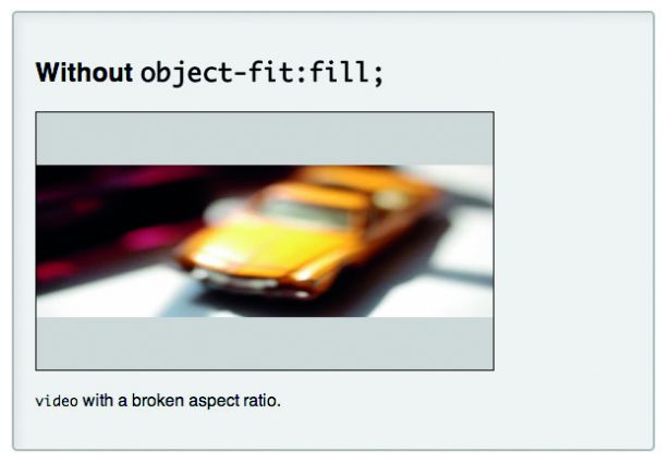
The <video> element will always attempt to maintain the source file’s intrinsic aspect ratio.
To fix this, we’ve forced all videos to conform to the width and height of the <video> elements by applying object-fit:fill;:
.object-fit {
...
object-fit: fill;
}
This makes all the videos appear at the same aspect ratio.
05. Transition effects
Combining object-fit and object-position with CSS transitions can lead to some pretty interesting effects for image or video galleries:
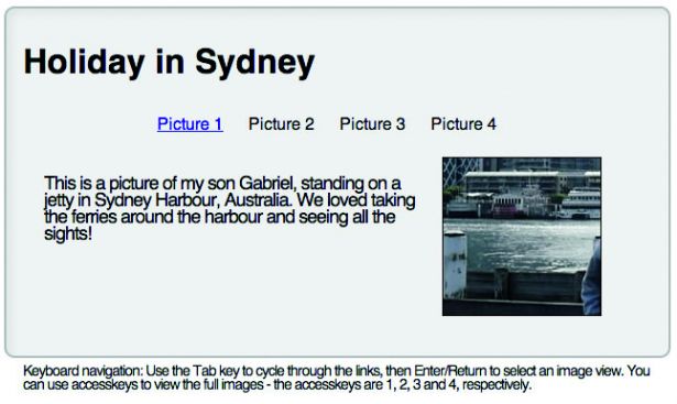
In this example (see object-fit-none-transitions.html, in the tutorials files), I’ve taken the image gallery we saw in the first example, and:
- Got rid of the centred positioning of the example and swapped the position of the images and captions to give the image more space to expand.
- Absolutely positioned all the different <divs> containing images and their captions so they all appear in the same place, and hidden them all by default using opacity: 0;.
- Added a set of navigation links at the top of the example to move between the different image/caption sets, and used the :target pseudo-class plus transitions to make them smoothly appear and disappear when the links are cycled through (yes, it’s a way to create a tabbed index without using JavaScript).
- Added tabindex and accesskeys to make the links and images accessible by keyboard-only.
- Most importantly for the purposes of this article, swapped out the object-fit:contain; CSS for the following:
img {
width: 150px;
height: 150px;
...
object-fit: none;
overflow: hidden;
object-position: 25% 50%;
transition: 1s all;
...
}
img:hover, img:focus {
...
height: 400px;
width: 400px;
}
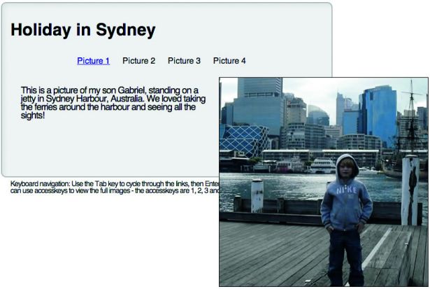
When you move over the various thumbnails, you’ll notice that the images aren’t shrunk down to fit the element.
Instead, only a small part of the image is shown, and the element grows to reveal more of the image. What gives?
By setting object-fit:none; on the <img> elements, I’m telling their content to completely ignore the width and height set earlier, and spill out of the sides of the elements.
Since the intrinsic size of the image files is a lot bigger than the dimensions specified for the <img> elements, I’ve used overflow:hidden; to crop anything that spills out.
A transition is then used to smoothly increase the size of the <img> element when it’s hovered/focused, which reveals more of the image.
And that’s not all. I’ve also used the object-position: 25% 50%; property to move the position of the image on the <img> element over to the right a bit, which creates a nice content-revealing effect.
06. Summary
This tutorial has showcased a few ideas for how to use object-fit and object-position. You can find more examples on Opera’s object-fit test suites page. We’re looking forward to seeing what examples you create, and as always let us know what you think of
our implementation.
A developer relationship manager for Opera, Chris also plays with heavy metal rock gods Conquest of Steel.
Liked this? Read these!
- How to build an app
- Free graphic design software available to you right now!
- Create a perfect mood board with these pro tips
- The ultimate guide to logo design

The Creative Bloq team is made up of a group of art and design enthusiasts, and has changed and evolved since Creative Bloq began back in 2012. The current website team consists of eight full-time members of staff: Editor Georgia Coggan, Deputy Editor Rosie Hilder, Ecommerce Editor Beren Neale, Senior News Editor Daniel Piper, Editor, Digital Art and 3D Ian Dean, Tech Reviews Editor Erlingur Einarsson, Ecommerce Writer Beth Nicholls and Staff Writer Natalie Fear, as well as a roster of freelancers from around the world. The ImagineFX magazine team also pitch in, ensuring that content from leading digital art publication ImagineFX is represented on Creative Bloq.
