10 tips for designing localised interfaces
Things don't always turn out well when web copy is translated. Joey Rabbitt outlines some measures you can take to ensure there's a smooth transition when your site is adjusted for different audiences.
Catering for international customers can significantly increase the number of variables a designer needs to consider when creating a user-friendly interface. Words and sentences can dramatically change in length and content may not be applicable in certain locales. If you’re not smart about how your designs are structured you could find your typography and layout completely fall apart in other languages. You may also have to create multiple versions of the same assets. Designs that haven’t taken localisation into account may take much longer to complete - especially if you need hooks to individually change spacing, font sizes and content for different territories. Interfaces can break or look untidy in different locales if you focus your attention too heavily on one language.
These tips should help to deliver one tidy experience to international customers without degrading the quality in any region, while also preventing unnecessary work that could eat into your budgets. The tips are focused on design but also cover practical CSS examples for developers to play an equal role. (Translated copy is provided courtesy of Google Translate for the benefit of the following examples, so please excuse any cultural inaccuracies.)
01. Use flexible heights on elements with text

A common problem is keeping elements looking tidy when text wraps onto different lines. In this example you can see the row of buttons looks nice and tidy in English. Each element is the same height and the copy is all on one line. Lovely. But here’s an example of a common issue when translated copy is simply added in.

Not such a nice experience for our Russian friends. Make sure your text is properly aligned vertically and element heights are even. In this instance, the buttons need a dynamic height that equals the tallest element. A good cheat in web design is to use the CSS property display: table-cell. Sibling elements will behave like table cells, which automatically even the heights and give you good control over the vertical alignment of the text.

02. Allow sections to gracefully shrink and grow in height

The copy in this example fits nicely over the background in the dedicated space. Varying amounts of text will push the height of the section up or down so the background graphic needs to adjust accordingly to prevent the following problem.
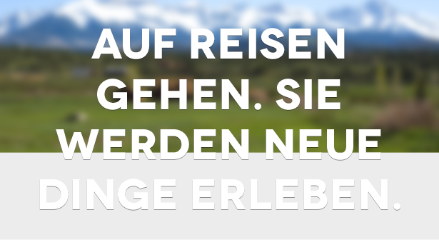
If the background is exported at the perfect height for one version then there’s no room for expansion. There are some things you can do to make sure this section is more flexible.
Include excess data that is clipped on smaller versions

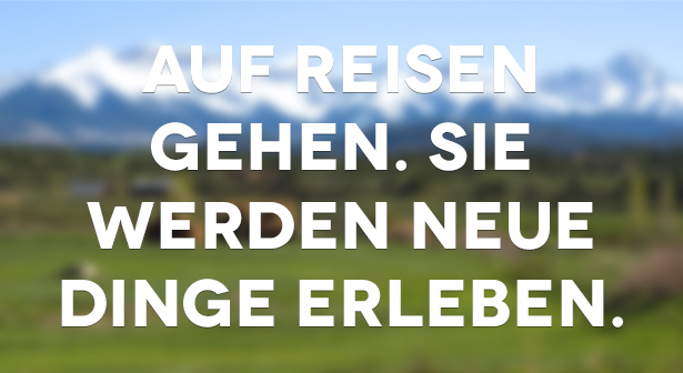
It gives your copy room to grow. You can also fade the image to a solid colour or repeating pattern to ensure an infinite length. This is what the German version looks like when it makes use of that excess data.
Include a minimum height
Sometimes copywriters won't include enough text for a section. Including a minimum height can prevent sections from being so small that they look out of place or obscure like below.
Daily design news, reviews, how-tos and more, as picked by the editors.

03. Character limits, truncation and overflow
Depending how your translation is organised, it may be possible to set character limits. This is useful to prevent blocks of copy growing too tall in areas with restricted space. Sometimes this isn’t always practical, so it’s advisable to apply a fallback such as showing a small area of copy and giving the option to reveal the full text.

This is a great technique for making sure blocks of text never go over a certain size. It’s also useful for keeping designs looking consistent across locales where copy length varies. However, it's best used sparingly to prevent the user having to constantly reveal content. Remember to consider what happens when the copy is revealed; the surrounding elements should stretch accordingly.
If revealing hidden text isn’t an option then the last resort is to truncate copy. This may be relevant for elements where space is fixed and there’s no room to reveal any more. Without truncation, the most common issue is text bleeding over its boundaries.

Truncation can help tidy up really tight areas. A handy CSS property for this is text-overflow: ellipsis, which automatically truncates text and adds three dots ‘…’ if it doesn’t fit within the defined space.

04. Use universal imagery to prevent creating multiple assets
Creating variations of images for international sites is sometimes inevitable. While it can be beneficial for a user to see region-specific imagery in their locale, it may not actually be necessary and may significantly increase your workload, especially if any variations of the image change in the future.
Let’s pretend you’re dealing with a client who is promoting vouchers for fast food outlets. One country may be targeting McDonald's, another may target Burger King, and so on. Instead of showing the specific logos for each outlet, which may require one asset to be generated per territory, it's more efficient to choose a generic asset such as a silhouette of a burger.
This would be universally understood and also doesn’t require updating should outlets and logos happen to change over time.
05. Give elements flexible widths
The buttons below represent different content filters. In this example, the region has four categories available for the user to choose from.

The widths are an even 25 per cent because it works nicely in this instance. If the copy is localised for a region that requires fewer categories, it would look something like this:

Fixing the width doesn’t account for longer copy or varying categories. You can see how it improves when the elements are flexible and the parent block fills the width of the page.

06. Allow sections to disappear gracefully
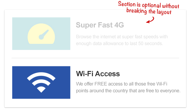
Sometimes blocks of content will only apply to certain locales. For example, if a website was listing features for a mobile phone network and a feature such as 4G was only relevant to specific countries, it's best to design the page so that section could drop out gracefully without leaving any noticeable blank space.
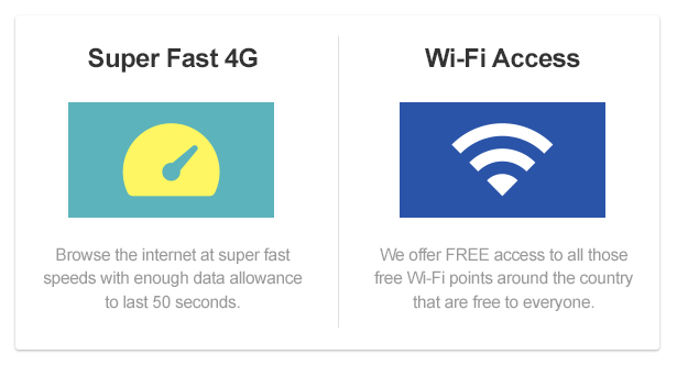
This layout wouldn’t work if you were to remove the 4G section. The wi-fi block isn't substantial enough to stretch to fit the space, so it ends up looking stretched and lost.
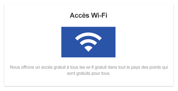
One solution would be to make sections stackable. If the sections were separated and given their own horizontal blocks, they could disappear gracefully without affecting anything around them.
07. Choose fonts with supported character sets
When you’re dealing with certain countries, you need to make sure your chosen font has the relevant character set. English speaking countries usually only need characters covered by the Latin character set, but others may need those found in Greek or Arabic sets. If your font doesn’t contain the characters required to support the language, your users will just see blank characters. Unlicensed fonts don’t usually cater for characters outside of the Latin set, so be sure to choose your fonts wisely. Using system fonts is a good way to ensure that users don’t encounter missing or blank characters as these fonts usually contain characters to support a wider range of languages. If you’re designing for iOS, iOS Fonts is a good resource for choosing a system font.
08. Test all combinations when dealing with fixed widths
If the space available to you is limited, sometimes you can make a layout decision based on the greatest potential outcome. If you know all the possible combinations of translation, it’s a good idea to lay the longest string into the container to see if you’re likely to encounter any problems.
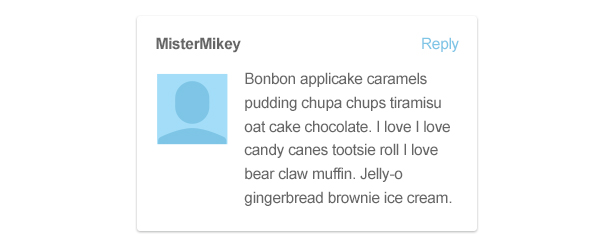
Using the example above, if I want to make sure that ‘reply’ link is in a position that will work in all regions, I have to make sure there’s no chance it will ever overlap the username. I know the maximum character width for a username is 15 characters, and we’re not using a fixed-width font, so I test the longest character (‘m’) alongside the longest translation for ‘reply’.
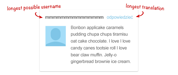
When the elements are laid side by side I can see they leave a comfortable amount of space for me to make a decision.
09. Use icons instead of text where possible
When dealing with UI elements, it’s common to see buttons represented by widely recognised shapes. Here is an example media player using text labels on the buttons.
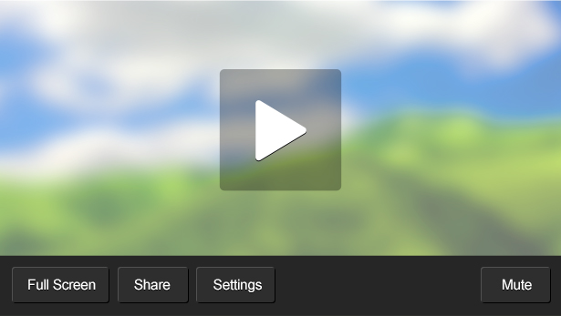
There’s the danger here for localised copy to stretch the buttons beyond the length of the media player. The beauty of using an icon instead of text is that it doesn’t require localising and always takes up the same amount of space.

10. Don’t include copy in images
Where possible you shouldn't use text within exported images and assets that require localising. Not only do you have to generate an image asset for each territory, but you may have to export them all again if the copy changes. It’s much more efficient to use dynamic markup over the top of images so you only need to generate one image. The copy can then change without the need to alter any of the assets.
Localisation can be tricky but it can also be rewarding when you know users of different cultures and nationality are sharing an equal experience. It can be easy to focus on one language when designing and often you’ll see some locales neglected because no effort was made to provide them with a working solution. It needn’t be the case if you bear localisation in mind at every step. If you spend the time making designs more flexible at the start you save time in the long run, preventing the redesign of whole sections or burning up budgets by exporting unnecessary assets.
Once you’ve designed a product to accommodate localised versions, it’s worth always testing them thoroughly to prevent any surprises you didn’t plan for. Your international users will thank you for it.
Joey has over a decade of commercial experience in web design and frontend development. He joined Sony in 2012 as a designer for PlayStation websites and apps.
Liked this? Read these!
- How to make an app
- Free graphic design software available to you right now!
- Brilliant Wordpress tutorial selection
- Create a perfect mood board with these pro tips

Thank you for reading 5 articles this month* Join now for unlimited access
Enjoy your first month for just £1 / $1 / €1
*Read 5 free articles per month without a subscription

Join now for unlimited access
Try first month for just £1 / $1 / €1

The Creative Bloq team is made up of a group of art and design enthusiasts, and has changed and evolved since Creative Bloq began back in 2012. The current website team consists of eight full-time members of staff: Editor Georgia Coggan, Deputy Editor Rosie Hilder, Ecommerce Editor Beren Neale, Senior News Editor Daniel Piper, Editor, Digital Art and 3D Ian Dean, Tech Reviews Editor Erlingur Einarsson, Ecommerce Writer Beth Nicholls and Staff Writer Natalie Fear, as well as a roster of freelancers from around the world. The ImagineFX magazine team also pitch in, ensuring that content from leading digital art publication ImagineFX is represented on Creative Bloq.
