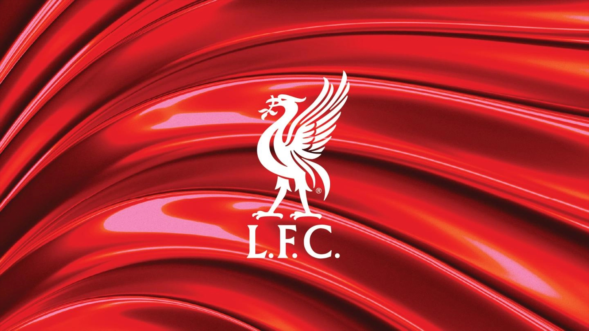
Liverpool FC debuts slick new look inspired by iconic mascot
The Liver bird’s legacy inspires unexpected design details.

Sign up to Creative Bloq's daily newsletter, which brings you the latest news and inspiration from the worlds of art, design and technology.
You are now subscribed
Your newsletter sign-up was successful
Want to add more newsletters?
Liverpool FC has unveiled a sleek new look inspired by its iconic Liver bird emblem. Embracing the spirit of the legendary symbol across its branding, the football club has revealed a revitalised brand featuring revised colour palettes, dynamic graphics and custom typography that unites its powerful identity.
Creating impactful branding is all about embracing heritage while evolving with contemporary style – something that Liverpool FC wholeheartedly embraces with its new look. Transitioning to keep up with an ever-evolving digital world, the club's fierce identity is a testament to its iconic legacy and a future defined by momentum and passion.
Liverpool FC's new identity places heritage at its heart, refining its iconic identity for a strong and authoritative brand. Variations to the club's existing colour palette have been refined to focus on Liverpool's legendary red, while new dynamic graphics inspired by the Liver bird capture the electric atmosphere of Anfield, the club's historic stadium home.
Article continues belowTwo custom typefaces accompany the new look, creating consistency throughout the brand's messaging. Inspired by the curves of the Liver bird's wings and talons, LFC Sans and LFC Serif create a slick, uniform appeal that gives the club's visuals a timeless flair.

"What we now have is a consistent look and feel across all areas of the club, from retail to LFC Foundation and everything in between," says senior vice-president of digital at LFC, Drew Crisp, on the cub's official website. "We’ve been able to do this by acknowledging and honouring our history and guaranteeing we are perfectly placed to thrive moving forward in the digital and non-digital world," he adds.
The new look has already begun to debut across Liverpool FC's touchpoints and will continue to evolve across the club's social channels, website, club app, matchday programme, digital marketing and communications. For more Liverpool FC news, take a look at the unexpected Nike logo on Liverpool FC's new kit. For more sporting design inspiration take a look at the ingenious National Football Museum logo that's brilliantly simple.
Sign up to Creative Bloq's daily newsletter, which brings you the latest news and inspiration from the worlds of art, design and technology.

Natalie Fear is Creative Bloq's staff writer. With an eye for trending topics and a passion for internet culture, she brings you the latest in art and design news. Natalie also runs Creative Bloq’s 5 Questions series, spotlighting diverse talent across the creative industries. Outside of work, she loves all things literature and music (although she’s partial to a spot of TikTok brain rot).
You must confirm your public display name before commenting
Please logout and then login again, you will then be prompted to enter your display name.

