Create a cool data visualisation
Brian Suda explains the basics of turning dry statistics into beautiful, informative data visualisations
Sign up to Creative Bloq's daily newsletter, which brings you the latest news and inspiration from the worlds of art, design and technology.
You are now subscribed
Your newsletter sign-up was successful
Want to add more newsletters?
It’s the best storytellers that history remembers. They’re the ones whose information we still have and use. Ancient Greek plays, Roman myths, Norse sagas, Arabic tales and Oriental fables all stay with us because the underlying point of the stories still rings true. They’re good stories.
This is what you need to achieve with your visualisations – you need to tell a memorable story. I’d even argue that if you’re starting by creating visualisations, you’re starting in the wrong place! You can’t write Shakespeare on your first try, so why not take a step back and focus on the basics?
Make it readable
Focus on what makes data readable. How do you tell your story without words, only using the basic, atomic types of charts and graphs? First, work with the well-established tools, such as bar charts or line graphs. Only once you understand these inside-out can you move on to more complex designs.
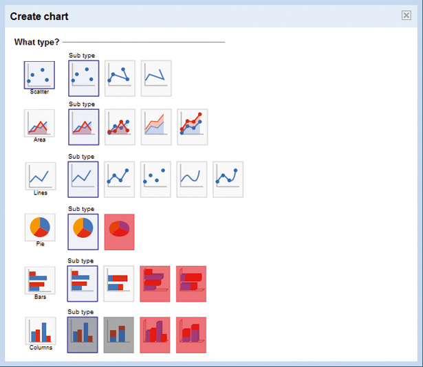
Article continues belowMost charting programs offer more options than you need. Let’s look at two popular choices, Excel and Google Docs Spreadsheet. Both enable you to convert a boring table of data into a much better chart. These charts enable your readers to get a thorough grasp of the meaning behind the data. Unfortunately, due to feature creep, competition or bad habits, many of the charts and graphs they offer actually subtract from the message you’re trying to convey to your readers.
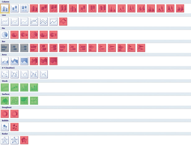
To the right is a screenshot of all the possible chart types in Excel. I’ve boxed out all of the charts that I’d advise against using in red. The ones boxed out in light grey are duplicates, which aren’t necessary as an option. The light green boxes are very rare and specific to special fields. Most people will never use or need to see these as options.
If you get stuck, there are plenty of resources online. MetaOptimize is one – here you can ask questions and get answers. Topics range from what graph is best to use in which situation, to what software and algorithms are best for mining your data.
Technical approaches
I’ve written before about how to create web-based visualisations. When rendering graphics on the web, we have a few options. The obvious one to use is the <img> element. There are certainly pros and cons with all of these approaches, so each must be looked at based on your needs.
Sign up to Creative Bloq's daily newsletter, which brings you the latest news and inspiration from the worlds of art, design and technology.

The <img> element locks up the data in pixels and lacks interactivity. Other plug-in technologies such as Flash and Java/Prototype work well, but are dependent on several other factors, such as device support. Plug-ins are better than <img>, as you can tab to elements and potentially export the source data, but custom solutions can be expensive.
Recently, there have been two new contenders for displaying charts and graphs for the web. The newest is the <canvas> element. It’s part of HTML5, but works in most major browsers now and enables you to programmatically draw via JavaScript onto the canvas area. This means you can create animations, graphs and even 3D objects.
An older solution, but one that’s now becoming viable, is Scalable Vector Graphics (SVG). The major difference between <canvas> and SVG is in how they’re structured. The <canvas> tag is a single element in the Document Object Model (DOM) where all your graphics are drawn. The browser has no idea what’s inside that element. Individual lines, arcs and graphics aren’t identifiable or clickable, which makes it harder to interact with the output. SVGs, though, are elements in the DOM tree, so you can manipulate every last item, adding click events and callbacks.
The downside of having everything as a DOM element is that things can get big quickly! The <canvas> element can be much faster in this respect, because it removes all the hard work of keeping track of the DOM tree, by ‘flattening’ all the graphics down to a single element.
Graph types
Even after you’ve chosen how you’ll be displaying your data, you still need to know which type of graph best tells your story. The go-to chart is the bar chart, which can display plenty of types of data in a format that’s easy to understand. The pie chart is often best avoided; it doesn’t do a great job of making comparisons and too many wedges can make it impossible to understand. If you’re plotting data over time, line graphs make it very clear.

Beyond these, there are hundreds of other types of graph, and it takes a long time to fully understand which will work best. I tried to explain just a few chart types in my book, Designing With Data but it only scratches the surface. If you really want to understand all the possibilities, you just need to sit down and try them using real data.
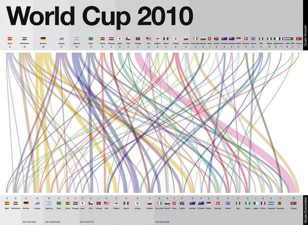
Sites such as the Guardian’s Datablog offer great data sets to play with. Using some information from the recent World Cup, we examined how many goals each country scored compared to how many they conceded. Even football is full of beautiful statistics if you know how to tease out the data.

Next time you sit down to illustrate some data, just remember that your main goal is to tell a story. We’ve all had the experience of looking in awe at a beautiful visualisation and saying: “This is incredible, but what does it mean?” At that point, it becomes an art piece rather than an informative graphic based on data-driven design. Your goal is to convey meaning. This doesn’t preclude a beautiful design, but if it’s not comprehensible, it’s not useful. You need to choose the right tool for the job: sometimes, simplicity is what’s needed.

The Creative Bloq team is made up of a group of art and design enthusiasts, and has changed and evolved since Creative Bloq began back in 2012. The current website team consists of eight full-time members of staff: Editor Georgia Coggan, Deputy Editor Rosie Hilder, Ecommerce Editor Beren Neale, Senior News Editor Daniel Piper, Editor, Digital Art and 3D Ian Dean, Tech Reviews Editor Erlingur Einarsson, Ecommerce Writer Beth Nicholls and Staff Writer Natalie Fear, as well as a roster of freelancers from around the world. The ImagineFX magazine team also pitch in, ensuring that content from leading digital art publication ImagineFX is represented on Creative Bloq.
