Grid-based web design: a beginner's guide
Dave Snyder of Firstborn explains how to redraw your layouts to accomodate different viewports while maintaining a strong design aesthetic
Sign up to Creative Bloq's daily newsletter, which brings you the latest news and inspiration from the worlds of art, design and technology.
You are now subscribed
Your newsletter sign-up was successful
Want to add more newsletters?

Five times a week
CreativeBloq
Sign up to Creative Bloq's daily newsletter, which brings you the latest news and inspiration from the worlds of art, design and technology.

Once a week
By Design
Sign up to Creative Bloq's daily newsletter, which brings you the latest news and inspiration from the worlds of art, design and technology.
Once a week
State of the Art
Sign up to Creative Bloq's daily newsletter, which brings you the latest news and inspiration from the worlds of art, design and technology.

Seasonal (around events)
Brand Impact Awards
Sign up to Creative Bloq's daily newsletter, which brings you the latest news and inspiration from the worlds of art, design and technology.
We live in an interactive world. Everything is in flux: content, viewports, the screen – all changing, all the time. Digital is dynamic – it’s ever-evolving, and it’s our job as designers and developers to keep up.

We live in an interactive world. Everything is in flux: content, viewports, the screen – all changing, all the time. Digital is dynamic – it’s ever-evolving, and it’s our job as designers and developers to keep up.
This article attempts to explore dynamic grid-systems that display content at their aesthetic and functional maximum. What makes this tutorial different, I hope, is that it explores the space behind the space and how redrawing layouts (based on device and/or viewport) is a great way to maintain a strong design aesthetic while adding utility.
However, before I dive in, I think a brief (and overly simplified) history lesson is needed. Grid systems aren’t a fad or some passing trend. They’re old: we’re talking the Late Middle Ages (13th and 14th centuries) – before movable type. At a very early stage, people saw the need to create layouts based on proportional grids. It seems that with text came an inherent need for structure. Content and the grid are inseparable.
Fast-forward 600 years to the modernist movement; more specifically, the International Typographic Style or Swiss Style (it’s the 1950s, if you’re keeping track). This period in graphic history was the dawn of the grid as we know it today – the grid as a fundamental system. A period that proposed that typography and the grid were one and the same.
Brief digression: when people preach that grids are trendy, they are probably referring to the influence Swiss Style still has on design and, increasingly, the interactive design styles being popularised now.
For me, what stands out most about this period is how timeless the design is. Clean is always in fashion and always will be. In my opinion, the resurgence of the Swiss Style we are witnessing in interactive today is because the tenets of Swiss Style unquestionably reflect what we strive for (or should be striving for) as interactive designers – cleanliness, readability and deference to content.
Massimo Vignelli famously stated, “I see design as the organisation of information that is semantically correct, syntactically consistent and pragmatically understandable. I like it to be visually powerful, intellectually elegant and, above all, timeless.” His words may have been intended towards print, but they translate to digital perfectly: both deal with a system needed to organise content.
Sign up to Creative Bloq's daily newsletter, which brings you the latest news and inspiration from the worlds of art, design and technology.
The 960px grid
Fast-forward again: 2007ish – the dawn of the 960px grid. Grids are a central discussion point in the interactive community. It seems that all of a sudden interactive designers are, for the first time in their careers, looking at print design and graphic theory for inspiration.
A new, albeit digital, grid-based movement had begun, built on the fundamentals defined by Tschichold, Mller-Brockmann, Hofmann and Ruder 60 years earlier. Downloadable templates flourished. Grid generators took off. Grid-based designs were everywhere. People were happy (I know I was). But with the “automation” and the “copy+paste” nature of the web grew a problem – people stopped thinking. People sought to automate a process that shouldn’t be automated. Apathetic complacency took root.
It went two ways: one, grids were an end to a means; two, people sought a grid design, NOT a design built on a grid. The automation took the ‘semantic’ and ‘syntactic’ side of the design process out – the ‘why’ and ‘what for’. Worse yet, people began to justify bad design because it “didn’t break the grid”. They forgot that ugly is still...ugly.
Josef Mller-Brockmann wrote: “The grid system is an aid, not a guarantee. It permits a number of possible uses and each designer can look for a solution appropriate to his personal style. But one must learn how to use the grid; it is an art that requires practice.”
All right, history lesson over. To set this up, I think it’s fair to let you know a couple of things: a) I like print-inspired/editorial-esqe layouts: I think it’s the future of interactive design. b) Horizontal flow is a good thing. c) Wider is better. d) I don’t like page refreshes. Okay, now let’s get to it.
Rethinking the liquid column
For the most part, liquid layouts look terrible. Columns are too wide, text becomes hard to read, the layout is sloppy. People (myself included) have played with proportional liquid layouts but I find you’re left with an overweight and plumpy design. Content from below the fold may or may not move up; nothing really beneficial is gained; design integrity is out the window.
I think the grid itself should remain fixed; the number of columns and layout, however, should increase as the width of the viewport increases. Let’s say we’re using a six-column grid: 145px columns and 13px gutters.
For a horizontal screen resolution of 1024, things look pretty good. But at any resolution wider, we have the opportunity for a much nicer and more functional layout. Being that the majority of people online have a resolution greater than 1024, it might be a good idea.
At a horizontal screen resolution of 1440, we have room for three more columns. That’s a lot of extra space to bring content up from below while adjusting the content on screen to better the horizontal flow.
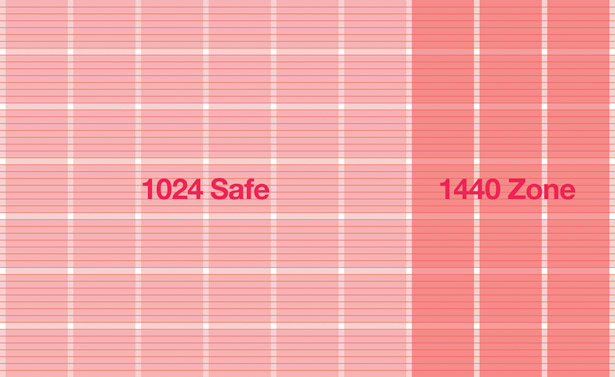
At the end of the day, the layout should respond to the width of the viewport. The term “Responsive Web Design” has been used to describe an adaptive approach to web design in targeting different devices (see Ethan Marcotte’s feature in issue 206). I think it fits nicely here too.
So how do you toggle rules based on viewport size? Here are three techniques to do just that.
Using the @media tag:
/* default rules */ #lorem{ background-color: #ccc; } /* rules that should be applied only if the viewport size is equal or larger than 1440px */ @media screen and (min-width: 1440px) { #lorem{ background-color: red; } }Loading a different CSS file based on the media query:
<link rel="stylesheet" type="text/css" media="screen" href="default.css" /> <link rel="stylesheet" type="text/css" media="screen and (min-width: 1440px)" href="wide_screen.css" />Use JavaScript to detect the viewport size and then set a className to the body element:
//get crossbrowser window inner size function getInnerWidth(){ return (window.innerWidth)? window.innerWidth : ((document.document Element.clientWidth)? document.documentElement.clientWidth : document.body.clientWidth); } //check if window is big enough if( getInnerWidth() >= 1440 ){ document.body.className += ' wide'; //add the .wide class to the body element. }All of these methods enable you to target the width of the viewport and modify the page layout accordingly. It should be noted, however, that using @media queries limits your reach significantly. Only the newest browsers (FF3.1+, Safari 3+, Chrome 1+, Opera 9.62+, and IE9) support this method, so you should view this approach as a form of progressive enhancement – better browser, better experience.
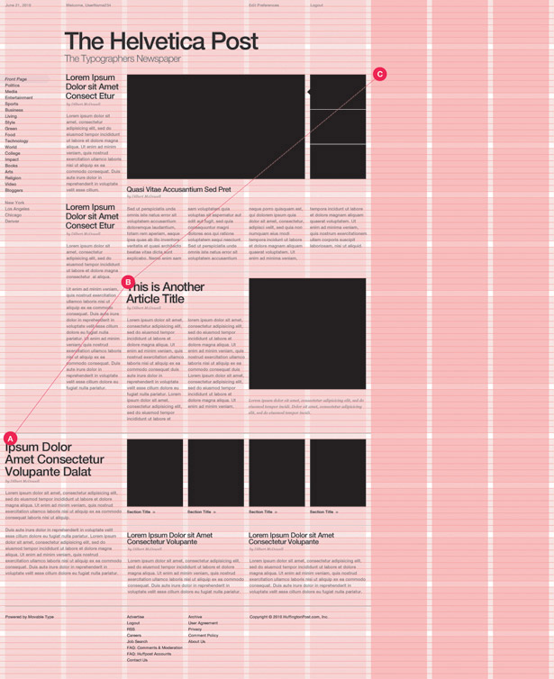
Expanding columns: grids in grids
Are new ‘pages’ always needed to house content? Often, moving existing content around offers a much cleaner solution. This is especially true with image galleries or something as basic as more copy.
There is nothing more annoying than sites that make you wade through page after page of content: for every photo, for more words, for more ads (!) – loading sucks. (By the way: if your business model revolves around conning advertising networks, this is how it’s done.)

Things like Lightbox are great, but they remove the user from the content and from the grid itself. Yes, it’s a nice fix, but let’s pretend we’re developing a solution from scratch, not shoehorning one in later. What can we do to keep people tied to the content while remaining in-grid? Two solutions:
- We can move/expand the grid, pushing less relevant content out of the way.
- We can collapse or cover columns of content that aren’t relevant to the user at that moment.
- In this scenario, I’ve decided to cover up other content. This might be a good way to temporarily hide the banner ads (which take up a lot of space).
Here’s how: the div slide can be done using any JavaScript library/framework that contains an animation module such as that of jQuery, YUI, Mootools and Prototype.
You could also use the new CSS3 transition module. But again, you’ll run into very limited support. Unfortunately, that’s not very practical.
The way the sliding code works will vary, largely based on the design and page markup. It can be done using the CSS property position: absolute, negative margins, rescaling divs, CSS3 2D transforms, and so on – there’s no universal way of doing it.
Below, we’ve pulled an example that utilises the jQuery framework.
<!-- pseudo jQuery like code $('#div_name_here').animate({marginLeft: '-400px'}, 250); -->The pagination can be achieved by simply changing the margin-left of the column’s holder.
On top of viewport width variability, there are myriad new devices we need to account for, including of course the iPad and iPhone. These two devices are radically changing how we read/browse digital content.
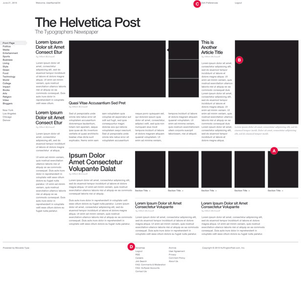
In issue 205 of .net (‘Adaptive layouts with media queries’), Aaron Gustafson tackled this very subject. I don’t plan on reiterating his points here, but I thought I could add a little extra; specifically, how to use the ‘flick’ gesture as a way to paginate or scroll through columns of content.
The iPad
At three million sales and counting, Apple’s iPad is already changing the way we think about user experience. Horizontal is now okay and flicking through content is better than clicking.
In the screengrab I demonstrate how ‘paging’ could work in-grid. For iPad users, flicking through the ‘pages’ would come in handy. Swipe can be achieved by using the jQuery Swipe plug-in or jQTouch.
<!—JavaScript code sample using jQuery Swipe plugin //setup swipe column slide $(function(){ var visibleWidth = 300; var containerWidth = $('#columnsContainer').width(); var totalPages = Math.ceil(containerWidth / visibleWidth) - 1; var curPage = 0; /** * Scroll columns * @param {Boolean} isLeft If it should scroll left */ function doScroll(isLeft){ if(isLeft && curPage < totalPages){ curPage++; }else if(!isLeft && curPage > 0){ curPage--; }else{ return; //stop execution if trying to scroll more than allowed } $(‘#columnsContainer’).animate({marginLeft: (curPage * -visibleWidth)}, 'slow'); } // add swipe event listener $(‘#columnsContainer’).swipe({ threshold: {x: 30, y: 20}, swipeLeft: function(){ doScroll(true) }, swipeRight: function(){ doScroll(false) } }); }); 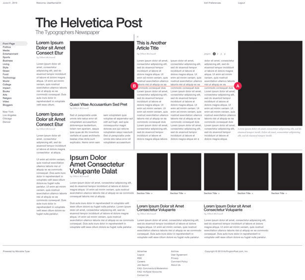
Word of warning
Good design is not the byproduct of a downloadable template or some grid generator that creates a “mathematically perfect” grid based on the Golden Ratio. They are useful tools (possibly), but proceed with caution.
Coming out of 2009, I saw the web design world at the edge of interactive, grid-based stagnation – defined by the downloadable 960, ruined by the cookie-cutter generation and a growing world of the copy + paste artists.
But with 2010 now halfway over, I feel I may have judged too early. Instead, we as interactive designers find ourselves at what is quite possibly the most exciting time in interactive to date.
Ajax, JavaScript, HTML5, CSS3 and the devices/browsers that support them are making us rethink the ‘box’ we work in. That enables us to explore in ways we haven’t been able to before.
To cut a long story short, the ability to explore newer, more progressive user experiences and layouts is here. We just need to start looking at the canvas differently.
Thanks to Miller Medeiros, web developer at Firstborn, who helped with the code samples provided throughout this tutorial and provided advice on when, where and how to implement these techniques.

The Creative Bloq team is made up of a group of art and design enthusiasts, and has changed and evolved since Creative Bloq began back in 2012. The current website team consists of eight full-time members of staff: Editor Georgia Coggan, Deputy Editor Rosie Hilder, Ecommerce Editor Beren Neale, Senior News Editor Daniel Piper, Editor, Digital Art and 3D Ian Dean, Tech Reviews Editor Erlingur Einarsson, Ecommerce Writer Beth Nicholls and Staff Writer Natalie Fear, as well as a roster of freelancers from around the world. The ImagineFX magazine team also pitch in, ensuring that content from leading digital art publication ImagineFX is represented on Creative Bloq.
