Hand-drawn web design
Illustrator Kyle Steed gives us an exclusive insight into how he developed his hand-drawn style for the web and what he learned along the way
Like any good story, this all happened once upon a time. More specifically though, that time
was the beginning of 2009. I was at a crossroads with myself, as a designer, and my website. I wanted something that felt like me and not like the thousands of other websites out there. Up until this point my website had only ever existed as a blog with some minor tweaks to the default theme and a bunch of personal ramblings. But we all have to start somewhere right? I always say you just have to put one foot in front of the other if you’re ever going to get better.
Be patient
I'm a believer that all good things come to those who wait. Nothing ever good comes from
rushing into something. The same thing applies when we design, either on the web or off. I
didn't just suddenly arrive at my new sense of hand-drawn web design over night. I can trace
the story back years before I ever knew about web design. All the way back to 2001 to be
precise. My journal back then was mainly scribbles and thoughts, but me being me I would
doodle all over the place. Over the years I have stayed pretty consistent with having a journal on or near me at all times. If for nothing else, it is therapeutic to keep a journal.
All those years of writing and doodling was preparation for that day when the light bulb switch turned on three years ago. You see, for some reason when I first entered the world of web design I was under the impression that everything had to be done on a computer. I put myself in a box. Not really sure why that is, but I guess the way I was introduced to web design was very methodical and pixelated. So it never occurred to me, at first, that there was another way to design for the web. And honestly, my first year of web design I was focused strictly on web standards and semantic markup more than the visual aesthetic. I was in this weird limbo state of designer and developer.
Article continues below 
Be honest
Of course, I’d be a fool to look back on my first job as a web designer and regret it. I learned
more about front-end development than I anticipated, because I didn’t even know what that term meant prior to taking the job. CSS, HTML, PHP, Java, XML, all these acronyms started to make sense to me. I was becoming proficient in writing my own CSS and HTML without the help of my code editor, thank you Mr Zeldman. In my free time I was becoming familiar with PHP by way of the Wordpress framework and the wonderful screencast videos of Chris Coyier. Yep, I was on my way to becoming the next CSS Rockstar... or so I thought.
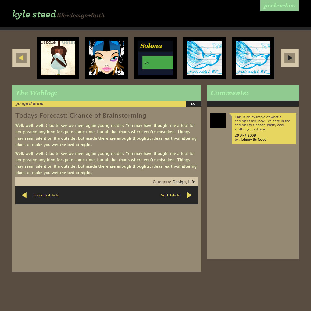
I had spent a solid month in Photoshop trying to design a new layout for my website. Big chunky blocks with huge button styles. Really large typography in the headers and plenty of thumbnails to show off recent work. But it was just blah. It was boring and void of any real character. If you could have killed that design, I mean like literally killed it, the gravestone would read, “Here lies just another boring web design. It didn’t mean anything to anyone.” And in a sense that’s what I did, I scratched the whole thing. Stuck a fork in it, ‘cuz it was done. I dusted off my sketchbook and started sketching what I wanted. And that’s when I created my first typeface, aptly named “Steed”.

Be progressive
The moment I pushed my new site out to the rest of the world I felt a great sigh of relief. Finally, something I could be proud of. A design that reflected my own personality and style. And this was just the beginning. I continued to pour over the pages in my sketchbook day after day with doodles and letters. A practice I still continue today. Staying consistent and progressive is the only way you’re going to get better.
From that one moment on things have never been the same for me when it comes to designing for the web. The way I approach design has changed as well I feel. Everything starts on paper these days. It’s much easier for me to get the ideas out of my head and onto paper before it ever reaches the computer. Sometimes I do feel it’s a bit tedious to draw something, scan something and save for the web. But I also think anything worth doing well is worth taking the time to do it right.
Sign up to Creative Bloq's daily newsletter, which brings you the latest news and inspiration from the worlds of art, design and technology.
My process
So now on to the good stuff, the part you’ve probably skipped the last seven paragraphs to read. The part where I tell you my secret recipe for making your website look like mine. You ready? Well here’s the secret... there is not secret. My process is not a mystery. You draw, you scan, you vectorise and then you “save for web” and - VOILA! - instant awesomeness pops out the other side.
Well okay, maybe not that easy. And maybe not that awesomes, at first, but if you keep practicing you’ll only get better. Here are some things I’ve learned along the way that might be of value to you in your own journey.
1. Start in pencil
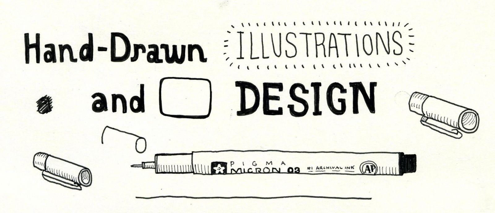
When I sit down and draw, specifically for the web, I like to start in pencil. Using paper and pencil/pen gives me the freedom to get all the bad ideas out first. It helps me visualise my ideas in a quick sketch and critique it in just a matter of seconds. This process to me is most important. I feel like this step should be applied to any design workflow, no matter if it’s on the web or not. Using pencil also allows me to do a bunch of rough sketches before I get the final smooth lines down that I desire.
2. Have your own style
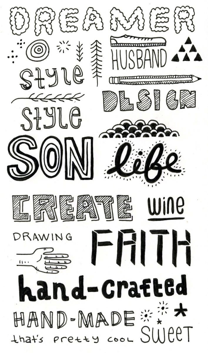
Smooth lines are the butter to my bread. If you look through my sketchbooks ten years ago all my drawings were super sketchy and rough. But if you look at my sketchbooks today you will see super clean and controlled lines. That didn’t just happen overnight. The clean and controlled lines are a product of years of experience plus finding out what my own personal style was. Don’t be afraid to have your own style. Maybe your style is more sketchy looking, or maybe it’s really polished pixels, and that’s okay too.
3. Find your own creative voice
This brings me to my last point, not everything should look the same. On the web or off it doesn’t matter. We each have our own unique creative voice. I don’t think I can stress this point enough. If you’re only trying to copy people then what does that say about your work? Take the time to find your own creative voice. Even if you aren’t happy with what you’re making, don’t worry it will get better and more refined over time. Practice does indeed make you better. I think it helps to remember that we all go through this journey together.
One of the last things I’d like to bring up is the topic of inspiration. It is always the one question I get asked over and over again. We, as people, are always looking for that next brush up against the creative forces that be. Sometimes it feels so far away and we loathe any work we try to produce. Other times we are overflowing with ideas and images that we just can’t help but smile.
I think inspiration is all around us, it’s not a difficult thing to find. The difficult thing, in my opinion, is learning how to recognise the inspiration we see everyday. I mean, sure, you can just punch a few letters into Google and find a million other websites to inspire you. But that’s not the kind of inspiration I’m talking about. I’m talking about looking at things in a different light, in a new way. Taking ideas from nature, architecture, books, music and learning how we can take examples and design principles found in other arenas of life and apply them to the web. That I feel is our greatest challenge as designers on the web.
The internet is still very young, so what does that say about the websites we’re making today? While it’s true we’ve made some pretty cool advances with technology, I think we haven’t even opened the door all the way to the possibilities of the web. But we’re getting there. We are the pioneers of what’s ahead, searching and exploring new ideas for those generations to come. Whether this so-called “hand-drawn style” is just a fad today or will become a way of design in the future, still remains unseen. But you can be sure that I’ll continue to make things by hand for as long as I can.

The Creative Bloq team is made up of a group of art and design enthusiasts, and has changed and evolved since Creative Bloq began back in 2012. The current website team consists of eight full-time members of staff: Editor Georgia Coggan, Deputy Editor Rosie Hilder, Ecommerce Editor Beren Neale, Senior News Editor Daniel Piper, Editor, Digital Art and 3D Ian Dean, Tech Reviews Editor Erlingur Einarsson, Ecommerce Writer Beth Nicholls and Staff Writer Natalie Fear, as well as a roster of freelancers from around the world. The ImagineFX magazine team also pitch in, ensuring that content from leading digital art publication ImagineFX is represented on Creative Bloq.
