The importance of whitespace in web design
Whitespace is key to an elegant design that's easy to navigate. Erik Boman explains how to sell it to clients, and how to make sure your padding and wide margins survive the development phase
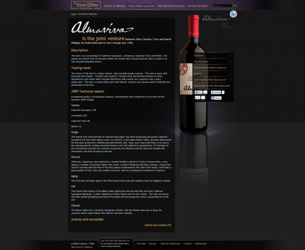
Defending whitespace in web design concepts can be hard, but it’s worth the fight because it makes websites easier to understand, quicker to interpret and, as a result, more profitable. Even though the empty space is an established and researched asset that can help turn cluttered websites into sleek conversion engines, arguing in favour of what cannot be seen is a challenge.
Real estate or breathing space
It’s easy to view websites as containers that should be brimming with content for maximum value. For this reason, whitespace has many names and labels: unused pixels, available real estate, strange gaps or weird empty areas. Bitter arguments and poor compromises have been sparked by misunderstandings and lack of defined reasons for why white spaces are important. Luke Wroblewski has documented the importance of whitespace and his struggles to protect it in the workflow.
Advantages for everyone
Ironically, disagreements over whitespace are often down to unawareness of its benefits. Clients want to inform, impress and generate revenue, and whitespace makes this more possible – but to some the idea is counterintuitive. For the sake of the client and good design in general, designers must explain the advantages.
Article continues belowTo do so, we must stay clear of vague arguments that make little sense to others. It’s difficult enough to argue for the absence of content in an information-cluttered environment. Knowing the facts is crucial, as is explaining them.
Here are few advantages outlined:
1. Whitespace speeds up interaction
Whitespace is key to get the message through and to make the visitor act on it. At its heart, it’s a matter of clarity and incentive: The users should see where to go, and be given a reason to take action.
But frustrated or confused users are less likely to respond the way websites owners hope. Visitors are typically in a hurry and don’t enjoy searching for the content they want. Instead, to accelerate and increase interactions, offer fewer options and present them with ample space around them. This prevents distractions that slow the visitor down.
2. Guide users around your page
Closely related to the above point, whitespace can steer the user to desired places on a page. Padding around objects frames them and draws attention to these areas. Several such elements arranged with care can guide the user from one place to another; for example, first to a header, on to a snippet of copy, and from there to call to actions (CTAs).
Sign up to Creative Bloq's daily newsletter, which brings you the latest news and inspiration from the worlds of art, design and technology.

3. Whitespace highlights CTAs
Experienced web users tend to ignore banners and, unsurprisingly, graphic items that look like them. Make links and buttons stand out to ensure visitors don’t snub them. Whitespace is perfect for this: Objects and copy framed by empty space are stressed and catch the eyes of users.
4. Cluttered means cluttered
There’s an essential difference between order and amount. Websites can have pixel-perfect layouts and margins so straight they put rulers to shame but still leave visitors puzzled.
A spotless visual structure is always desirable, but central to quick understanding is restraint. Limiting options can be just as important as aligning them to grids. This is a a rising trend, most likely down to the growing number of mobile users: The upshot of fewer options is often faster load times.
5. The see-saw effect
When considering whether or not to add more elements to a web page, it can be wise to think of the user as someone who can see only a restricted number of options. Obviously, this isn’t true, but it reflects the limited time an average visitor spends on a page.
More objects competing for attention means greater risk for distraction and confusion, which results in more time spent scanning the page – and less chance of users staying. For this reason, sidebars, banners and other options irrelevant to the content can lead to visitors leaving the website.
6. The colourfulness of whitespace
The key part of the word whitespace is ‘space’. The term is old and was coined in print design, where absence of content naturally meant white spaces. In web design, the expression refers to the space or distance between or inside objects, no matter what their colour.
It’s interchangeable with the more rarely used term ‘negative space’, which better explains the subject matter: Whitespace is the opposite of content, in the sense that it doesn’t attract attention to itself. For this reason, whitespace can be any colour as long as it helps to emphasise and frame other content.
7. Tidy equals trustworthy
There is a solid link between aesthetics and conversion. A visitor gauges a website’s professional level based on how it looks at a glance. Experience adds to this: To veteran users, evaluating a website’s apparent level of sophistication is second nature and is done in a flash.
What’s less well known is that ‘appealing’ translates into ‘dependable’, because good web design suggests reliability. Solid layouts, tantalising images, good colour schemes – all these elements add to the impression a website makes, but whitespace is especially important because it indicates expertise. Cluttered designs run the risk of striking users as cheap and suspect, while plentiful padding and whitespace signals quality and trustworthiness.
This is important for any website, but it’s crucial for conversion – an apparently unreliable website sees fewer transactions. In this sense, less really means more.
8. Avoid fuzzy expressions
Whitespace isn’t neat or nice; it’s effective and valuable. Fewer alternatives look tidier, but more importantly, they can lead to more interaction. Generous padding around links and CTAs doesn’t just make them look better; it makes visitors more likely to click on them. Proper line height is not lavish extravagance, but helps ensure that users read the copy.

Developing relations
Just because concepts include copious whitespace, the battle isn’t won: sometimes, layouts are passed on to developers, the website goes onto an internal stage – and looks very different to what the designer intended. Suddenly, the large margins you championed are gone. Vertical spacing? Not there. Padding to allow for easy tapping on touchscreens? Shrunk down to a pixel.
This is common and understandable: developers often work on tight deadlines and focus on functionality. They rarely expect designers to understand the full intricacies of coding, and likewise, designers shouldn’t expect developers to see abstract or obscure design features – especially if these features, as in this case, concern the invisible.
Designers and developers need to close this gap by co-operating better. Before office moods deteriorate to salt-in-your-coffee cup guerrilla wars, designers should ask themselves:
- Did wireframes and concepts highlight and emphasise padding, margins and line heights?
- Did we allow enough time for collaboration between designers and developers before coding started?
- Did the responsible designers tap into the work in progress to make sure all was going well?
Empty space isn’t fresh air that lets the web page breathe – it’s active space that makes the website better in every way. So if the aim is to make users take action, help them do so. They don’t need to see how it’s been achieved, but they’ll appreciate you for doing it.

The Creative Bloq team is made up of a group of art and design enthusiasts, and has changed and evolved since Creative Bloq began back in 2012. The current website team consists of eight full-time members of staff: Editor Georgia Coggan, Deputy Editor Rosie Hilder, Ecommerce Editor Beren Neale, Senior News Editor Daniel Piper, Editor, Digital Art and 3D Ian Dean, Tech Reviews Editor Erlingur Einarsson, Ecommerce Writer Beth Nicholls and Staff Writer Natalie Fear, as well as a roster of freelancers from around the world. The ImagineFX magazine team also pitch in, ensuring that content from leading digital art publication ImagineFX is represented on Creative Bloq.
