Discover the 10 hottest trends in website design
The world of web design is changing fast. Claudio Guglieri, art director at New York agency B-Reel, identifies 10 key trends you need to know about.
Sign up to Creative Bloq's daily newsletter, which brings you the latest news and inspiration from the worlds of art, design and technology.
You are now subscribed
Your newsletter sign-up was successful
Want to add more newsletters?
Website layout, meaning the positioning of its different components, is one of the earliest challenges a team faces in a project. It can be one of the hardest or one of the easiest decisions the team will make.
How you lay out your site is directly dictated by the purpose of the content, the needs of the user around that content, and of course the needs of the client who commission the work.
These three factors don’t always move in the same direction - so it’s the UX designer and the visual designer’s job to find the harmony between them. If you've got a new project, you might want to view it on a new display. Having best ultrawide monitor could help so see our guide.
Article continues belowFollow the trends
In addition to the theoretical aspect of it, the web design industry like any other creative field goes through phases, and these phases are defined by trends. These trends can be driven by new technological advances, new aesthetics or the pure desire of finding more efficient ways of presenting the content to the user, to name a few examples.
I’d like to believe that trends are always for the best and push everybody in the industry to step forward and make even better products. For instance, responsive web design started as a trend and in a short time it has become a necessary part of the design process.
Inspiring examples
Thinking about those ongoing trends and how they push for specific types of layouts, I’ve selected a few that I find interesting and highlighted a few examples to illustrate them. Keep in mind that those trends are present within the different examples, so you might identify more than one in a specific reference.
01. Hierarchy of content
A more descriptive name for this trend could be called “show me what I care about about when I care about it”. It represents the end of the obsessive focus on "related articles" and the unnecessary "you might be interested in this..." clutter around the content that you actually care about at that moment. That doesn't mean that curated content is a bad thing in itself of course; it still has room in your layout as long as it doesn’t get in front of what you are reading. Here are three great examples of this trend.
Sign up to Creative Bloq's daily newsletter, which brings you the latest news and inspiration from the worlds of art, design and technology.
Cartelle
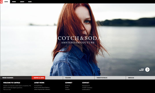
Dutch studio Cartelle's website has a vertical navigation, divided in sections that only appear when the user hovers over a specific area. This way the browser is filled entirely with what the user just clicked to see, not irrelevant content or unnecessary UI. When the user hovers over the menu this pushes the content away and places a black overlay on top of it so the user is completely focused on it.
The Great Discontent
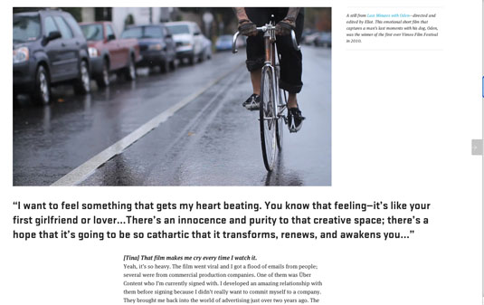
This online journal of interviews with creative people is plain, simple and neat; it couldn't be more straightforward. In terms of layout and UI, the design is entirely focused on the content. It starts with a big, beautiful, responsive marquee featuring the person interviewed to grab the user’s attention. And when scrolling down, it turns into a three-column structure, where the left and right columns support the main centered story.
Quartz
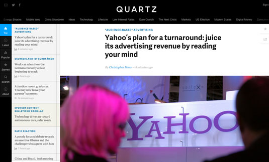
We've come a long way in web design when it comes to news sites. Remember the small screen resolutions, the requests to fit as many call to actions as you could above the fold, and don’t forget about the 300x250. The layout of Quartz, "a digitally native news outlet for the new global economy", is a million miles away from all of that. It succeeds in providing a large amount of information without the site ever seeming cluttered or overwhelming.
02. Full screen imagery
More and more websites are taking advantage of the increasing popularity of ultrawide monitors to show gorgeous imagery to full effect. Here are a couple of great examples.
Volvo Travel Guide
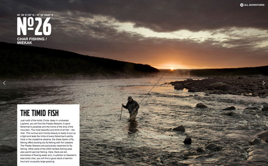
This site by North Kingdom for Volvo features a Travel Guide through Scandinavia with a really straightforward layout. After an initial selection of numbered items, the site just features a set of full-screen images with a short contextual text box. It’s interesting how they decided to play it safe and draw a box wrapping the text so both visual and textual content wouldn’t collide inside the layout. Merging both together would have lead to more, maybe unnecessary complications.
Golden State of Mind
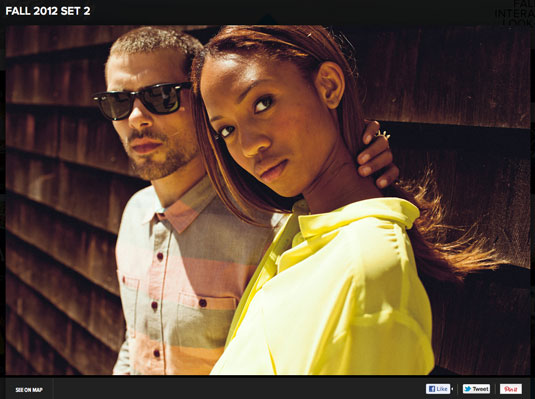
Golden State of Mind was built by JUXT Interactive to showcase "art, fashion and happenings live from California" and the rotating brand showcase makes full use of the screen, making great use of a selection of gorgeous photography.
03. Focus on touchscreens
More and more sites, in terms of layout and interactivity, feels like they were made solely for touchscreen devices. As tablets become cheaper and adoption becomes more widespread, this trend can only intensify. Here are a couple of choice examples.
USA Today
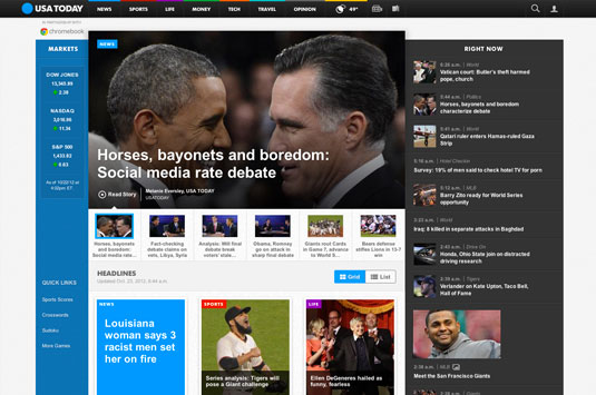
I was lucky enough to be around when this brief came in and the design of this site, for the newspaper USA Today, was started. What this site excels at is pushing what would normally be an experimental interaction to be the main metaphor behind the navigation. The idea of sliding cards to change from one main section to another really lets the user focus on the selected content at the time.
Ignition Creative Agency
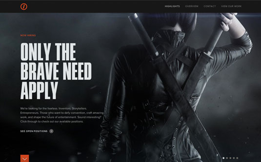
On creative agency Ignition’s website I almost feel more comfortable dragging than clicking or scrolling like you would in a touchscreen, and that’s the way this site works across all its sections. The site is fairly simple, but it has taken the traditional marquee area ‘above the fold’ to fill up the whole screen with one unique message. If the user decides to dive deeper into the site, the content is structured in columns you can either drag vertically or horizontally to go to a different section.
04. Back to the grid
Using the grid as a layout structure goes back to the beginning of the web, but the rise of responsive web design has seen a new emphasis on the use of grids. Here are two sites that show how to do it.
W+K Amsterdam
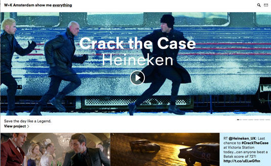
This site, created by Random Studio for fellow creative agency W+K Amsterdam, features a responsive full screen grid of content. In terms of layout it's remarkable how flexible the grid is. Regardless of its size, it accommodates the same content through really smooth transitions.
RVLT Revolution
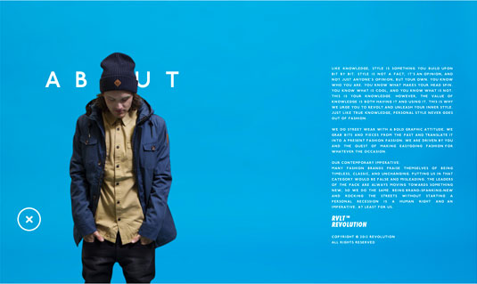
In the case of streetwear retailer RVLT's site, it's remarkable how clean and casual the grid has been made. There is a large number of shots of products that appear randomly in the initial grid but the user doesn’t discover them unless they really click through.
From a personal standpoint I really appreciate the risk they've taken in showing less and not showing everything all at once. Sometimes being more subtle can be more interesting.
05. Minimal content
The trend to show minimal content on a page is not about the aesthetic value of minimalism (although that may play a part). It's more about an approach that's focused around the user and enables them to take things one step at a time.
Domani Studios
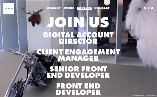
The site of New York-based Domani Studios basically reduces the layout to the minimum amount of content the user needs in each scenario. This trend can get a bit too extreme when taken too far but in general reducing the amount of call to actions in the layout helps to communicate a clear message.
AKQA
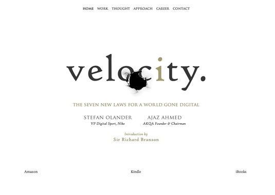
I’ve been a fan of this site since it launched, not just because international design agency AKQA is a great firm, but also because I can’t even imagine the amount of meetings that were necessary to make this site as simple as it looks. The site shows one unique piece of content at the time. It has reduced the amount of "blah blah blah" to the strictly necessary; condensing huge projects to three main statements of three lines each - "Insight", "Idea" and "Impact". The layout is completely tablet oriented, reducing clutter to a minimum.
06. Parallax scrolling craziness
The parallax scrolling trend has been around for a while now. As a designer I started loving it and eventually I was fed up with all the misuse of it. However there've been a few examples where this effect has been successfully used, really adding some value to the content featured on it.
TCM Summer under the Stars
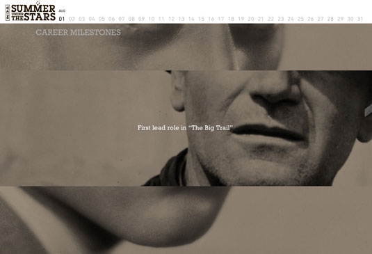
Movie channel TCM offers a really good looking example of a long scroll page layout linked to a timeline progression. As you scroll through, the filmography of the selected actor is displayed and then the agenda for the screening. What is actually interesting about this site is how it combines two ways of scrolling depending on how much detail the user wants to get from the movies shown. Try to click one of the movies and the layout, a single column scroll, will be vertically divided into three - the top and the bottom pagination call-outs and the centre the active content.
Sony Tablet
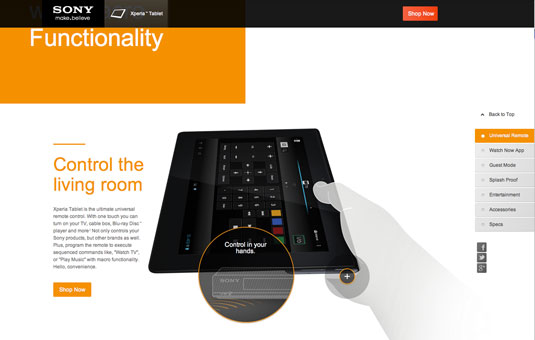
This website came out in the middle of the parallax fever and started a newer trend within this already saturated group. Basically it featured a unique device in the centre of the composition that was animated as the user would scroll down through the content around it. From a layout standpoint, it’s structured as a long scroll page with vertically distributed blocks of content. It came up as an example of a drastically improved version of the parallax and masking solution.
07. Parallax animation
Parallax animation is a subset of parallax scrolling, although where one begins and another ends can be argued over endlessly... However you define it, though, parallax animation has obvious usefulness for movie sites, as this great example shows.
Paranorman the Movie
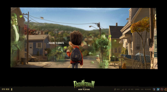
The website created for the zombie comedy movie Paranorman is by far one of the most justified examples of parallax animation in a website. This site takes you through the movie universe seamlessly, loading new scenes as you move through. The UI elements in the layout have been reduced to the minimum as the scrolling logic takes you through the site smoothly. As a hidden gem, the site has a menu activated upon clicking that takes over the whole screen.
08. Fullscreen marquees
A good picture can speak a thousand words, and so full screen marquees have come as a breath of fresh air on many news and blog sites. Here are a couple of recent examples.
FastCoDesign
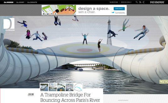
Design blog FastCoDesign combines a top area that adjusts its height to your screen size, but always hints the beginning of the promoted post at the very bottom. By doing that, it is showing right away that the site has been drastically updated with new content, as each new post completely shapes the look of what the user will see first on their homepage.
GEOX Amphibiox
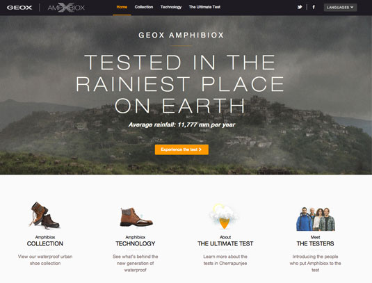
In a similar way to how FastCoDesign uses a resizable marquee area, this site, selling "a new generation of urban waterproof shoes" combines the best of a well structured content site with a marquee that, upon clicking, expands to the size of the screen. What's remarkable is how they decided not to jump out of the site but decided to keep the experience within the framework.
09. Focus on storytelling
If you want to convey a brand message, one of the best ways is to tell a story, and web designers are coming up with more and more ways to create inventive and engaging narratives. Here are two great examples of the trend.
Cadillac ATS vs The World
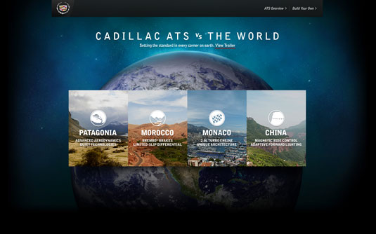
Firstborn Multimedia has created a website that makes you forget about the technology and lets the user focus on the story. From a layout perspective it starts with a selection of four stories and lets you explore them by using a long scroll/timeline structure where the users can get more information by clicking on the call outs that will expand and take over the screen. It makes a great use of contextual tips along the way so users can either scroll or click through the content adjusting the size of the layout of the screen.
VOLVO FH
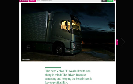
Made by the company I work for, B-Reel, this site features a single column of storytelling on each page, supported by pictures, videos and interactive components along the way. From a layout perspective it tells one story at the time, it makes an amazing use of the typography to establish a clear hierarchy and keeps the user interface to the minimum. Don’t miss the “Overview” button at the top where you can see a visual map of the site.
10. Editorial influence
Web design and editorial design are constantly looking at each other and getting closer in terms of aesthetics and layout. Here are a couple of great examples.
DUJOUR
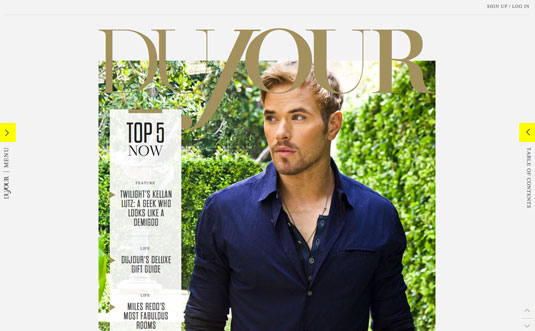
Dujour by Code And Theory is a "new national magazine with targeted local content". The site has a fairly simple layout consisting of a beautiful magazine looking marquee area, a content area structured in one unique column, a hidden contextual menu on the left (generic) and a visual index on the right.
Design Week Portland
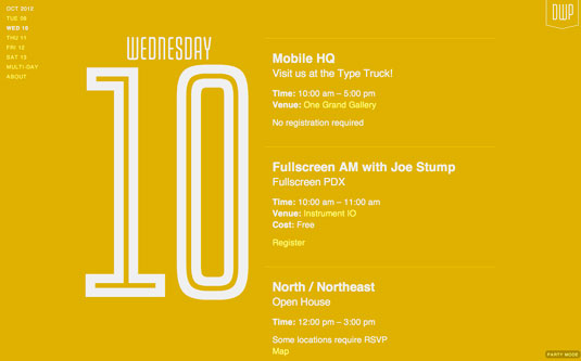
As a slightly different example of editorial influence, take the website created for the recent Design Week in Portland, starting with an marquee area that takes over your screen size to transition into a really simple double columns schedule that cycles through as you scroll down dividing the screen into day on the left and agenda on the right. Its simplicity, plain colors and big bold typography are clearly inspired by the print media.
Claudio Guglieri is currently an art director at the international digital agency B-Reel in NYC. Previously an art director at Fantasy Interactive, he's responsible for leading and crafting interactive experiences for clients like Google, EA CNN, Nickelodeon, the History Channel, Range Rover and Microsoft. Follow him at @claudioguglieri.
For more web design tips, check out these features:
- Web design training: the top online tools
- 30 web design secrets to boost your skills
- 40 amazing examples of HTML5

The Creative Bloq team is made up of a group of art and design enthusiasts, and has changed and evolved since Creative Bloq began back in 2012. The current website team consists of eight full-time members of staff: Editor Georgia Coggan, Deputy Editor Rosie Hilder, Ecommerce Editor Beren Neale, Senior News Editor Daniel Piper, Editor, Digital Art and 3D Ian Dean, Tech Reviews Editor Erlingur Einarsson, Ecommerce Writer Beth Nicholls and Staff Writer Natalie Fear, as well as a roster of freelancers from around the world. The ImagineFX magazine team also pitch in, ensuring that content from leading digital art publication ImagineFX is represented on Creative Bloq.
