
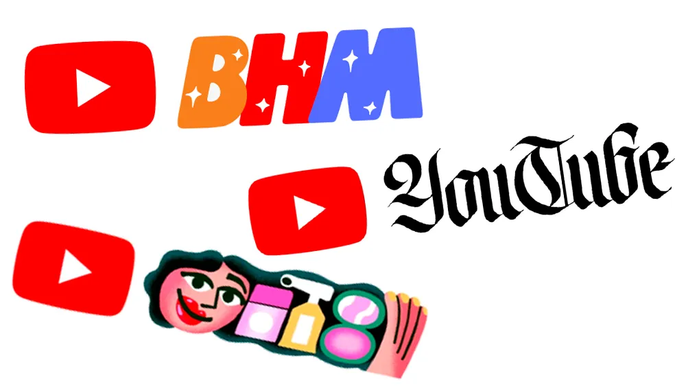
YouTube has form when it comes to playing with its logo, as we saw in our You Tube logo history. We've seen the video platform drop special edition designs for the likes of Black History Month and World Calligraphy Day. But it looks like YouTube might have made an altogether more subtle tweak towards the end of last year – and one that's a little more permanent.
Back in 2024, for reasons seemingly unknown to anyone, YouTube made a subtle change to the colour of the playback bar, with the bar fading from deep red to a slightly pinker shade. Because of the gradient, that change was easy to spot. But it turns out YouTube also made the logo pinker in October – and people are still only just noticing the change.
did Youtube change the colour of their logo to be just a tad pinker or am I going crazy? (alternatively: was this a thing that happened a long time ago but I am blind and only noticed now?)October 18, 2024
They changed the logo toofrom r/youtube
While the change isn't so obvious in isolation, it's clearer when comparing the 'new' logo with the old one. And it's confirmed when comparing hex codes; the original is pure red, #fe0000, while the new version is the slightly pinker #ff1a47.
It's curious that YouTube made this change without any kind of announcement. While a subtle colour tweak might seem insignificant, we've seen other tech brands such as Facebook make a big splash about similar changes. But with not a peep from YouTube on this one, we'll admit we hadn't even noticed until we spotted the threads on Reddit.
The silence from the brand has led social media users to speculate on the rationale behind the change. "Pink is a neutralising and calming colour, red is (or at least can be) the opposite. If I had to hazard a guess, outside of pure corporate stupidity this is some attempt to keep toxicity/negativity down," one Redditor comments. Another simply adds, "People trying to justify their jobs."
Whatever the reason, now we've seen it, we can't unsee it. And the unfavourable response online is hardly surprising – people don't tend to love changes to icons that live on their homescreens every day. We remember the response when Instagram made its logo very slightly brighter.

