The new plague ridden Duolingo logo is making me sad
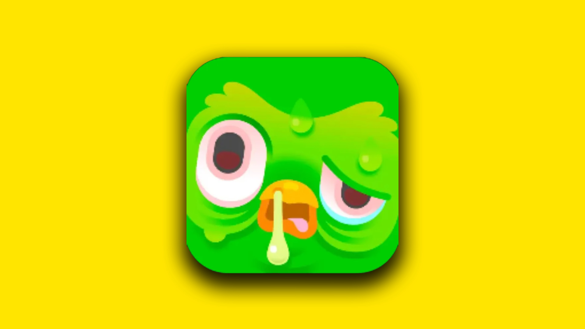
"Duo is quite literally sick of reminding everyone to do their lessons!"

Sign up to Creative Bloq's daily newsletter, which brings you the latest news and inspiration from the worlds of art, design and technology.
You are now subscribed
Your newsletter sign-up was successful
Want to add more newsletters?
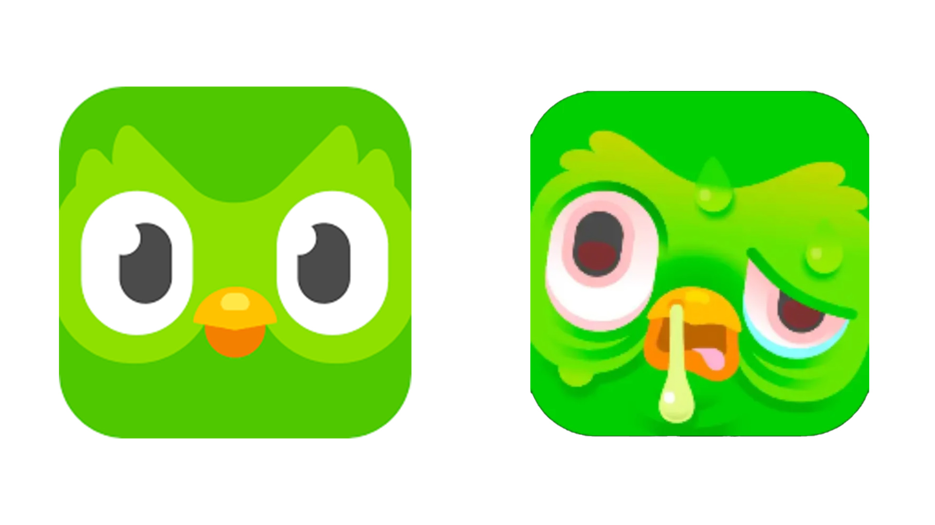
If you're an avid linguist, you might've noticed that the logo for language learning app Duolingo is looking a little different. Chirpy mascot Duo appears to be a bit under the weather, with a redesign that shows him looking practically plague-ridden, with red-rimmed eyes and a runny nose.
The bizarre icon refresh caught the attention of users, who were understandably quite concerned about the owl's sickly design makeover. While Duolingo doesn't shy away from spicing up its logo design now and then, this is certainly the most graphic and disturbing icon I've seen so far (and I'm hoping it won't be a fixture for much longer).

The current Duolingo logo is quite the departure from Duo's usual look., with sweat pouring down his feathery brow, watery bloodshot eyes and snot dripping from his beak. But why the dramatic change? The company explains "Duo is quite literally sick of reminding everyone to do their lessons!".
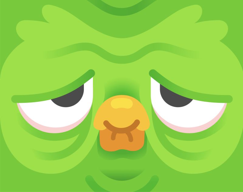
Article continues belowWhile Duolingo is known for its somewhat intense marketing tactics, this visceral guilt-tripping ploy has really ruffled my feathers. It's not the first time we've seen the iconic app icon transform, as earlier this year Duo underwent a similar transformation, appearing sad and downtrodden from users' lack of language learning discipline. The design soon returned back to normal so hopefully Duo makes a speedy recovery – I can't stare into his ailing eyes any longer.

This isn't the only dramatic logo change that has failed to fly with fans recently – the new Absolute Batman logo was roasted by fans for its "chonker" of a design. For more design inspiration, check out this AI App's logo that has a clever hidden meaning.
Sign up to Creative Bloq's daily newsletter, which brings you the latest news and inspiration from the worlds of art, design and technology.

Natalie Fear is Creative Bloq's staff writer. With an eye for trending topics and a passion for internet culture, she brings you the latest in art and design news. Natalie also runs Creative Bloq’s 5 Questions series, spotlighting diverse talent across the creative industries. Outside of work, she loves all things literature and music (although she’s partial to a spot of TikTok brain rot).
