Beyoncé’s elegant whisky packaging is a smooth sip of luxury
Queen B is more than a one-trick pony.

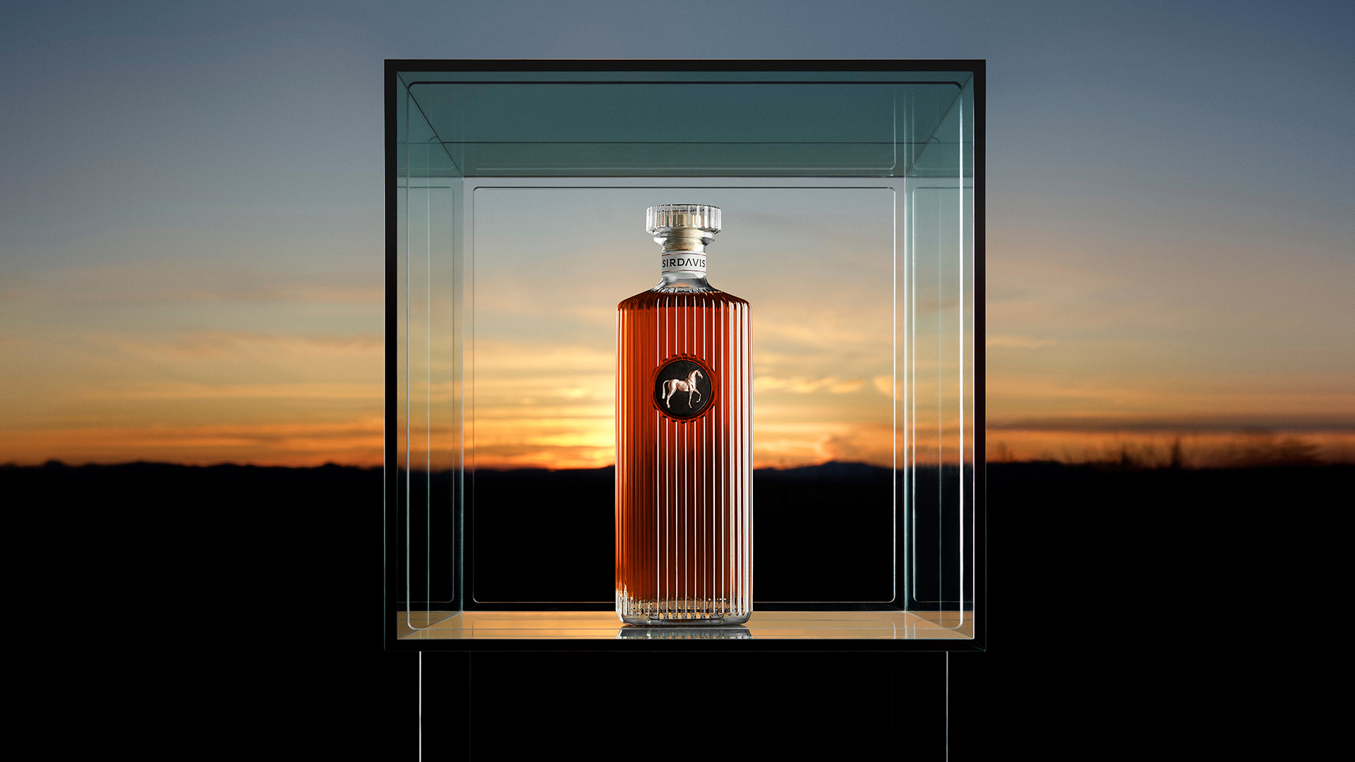
After the overwhelming success of her Cowboy Carter album earlier this year, global singing sensation Beyoncé has unveiled her own whisky brand inspired by her southern roots. SirDavis is an artfully crafted spirit boasting a refined design that elevates it from the typical celeb-affiliated alcohol market, proving that Queen B is more than a one-trick pony.
With heritage at its core, SirDavis is a celebration of Beyoncé's cultural roots, combining timeless design with contemporary class. While whisky packaging design can run the risk of relying on convention, SirDavis' unique bottle design is an ornamental conversation piece that establishes itself as a sip of luxury designed to be savoured.

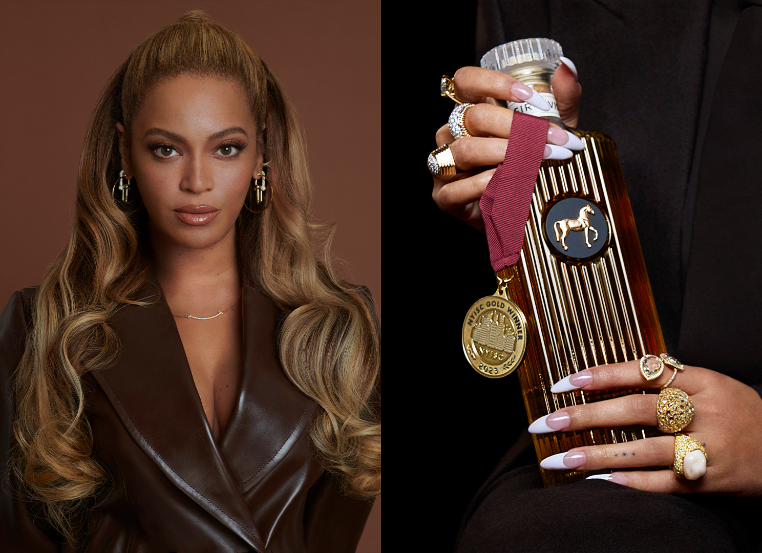
Created in collaboration with spirit-making icon Moët Hennessy, Beyoncé's custom whisky has an elegant feel with its fluted glass bottle and bold horse emblem accented in gold. Appearing on the iconic Cowboy Carter album cover, the stylised horse motif is a nod to the heritage of black rodeo culture – a persistent cultural theme that carries across to the whisky's branding. The name SirDavis references the singer's great grandfather Davis Hogue – a successful moonshiner in the days of Prohibition.
Article continues belowA sleek and subtle serif wordmark adds a complementary flourish to the design, with the deconstructed detailing of the 'A' adding a contemporary touch. Inspired by the practices of Japanese distillery, the whisky itself is a sophisticated blend that has a timeless quality, crossing the confines of culture and tradition to produce a product that lives up to its elegant aesthetics.
A post shared by SirDavis (@sirdavis)
A photo posted by on
Celebrity product branding is a broad spectrum, but at its core, it succeeds best when it feels organic to its creator. Chef Matty Matheson's retro food packaging is arguably on the complete opposite end of the spectrum, yet it's unpretentious design lends to its authentic appeal. For more design inspiration, check out this adorable tomato packaging that puts the fun back into food-based product design.
Sign up to Creative Bloq's daily newsletter, which brings you the latest news and inspiration from the worlds of art, design and technology.

Natalie Fear is Creative Bloq's staff writer. With an eye for trending topics and a passion for internet culture, she brings you the latest in art and design news. Natalie also runs Creative Bloq’s 5 Questions series, spotlighting diverse talent across the creative industries. Outside of work, she loves all things literature and music (although she’s partial to a spot of TikTok brain rot).
