Creating multiple lighting setups in 14 steps
This walkthrough will help you to give a scene a range of lighting options that art directors and shading teams can experiment with.
Sign up to Creative Bloq's daily newsletter, which brings you the latest news and inspiration from the worlds of art, design and technology.
You are now subscribed
Your newsletter sign-up was successful
Want to add more newsletters?

As a sketch/colour artist for Pixar, my job involves creating colour and textural design for sets and characters, and lighting designs for sequences or particular shots. Unlike in illustration works, my focus is not on producing a finished painting that's pleasing to the eyes, but on generating images that support the story and the vision of the art director.
Because the story is constantly evolving, the sequences/shots, characters and sets I work on are often changed, and my paintings must change to match on the fly. On top of this, my paintings need to serve as reference for the shading team, so I would need at least two versions of the same painting: one to show the textures and local colours, and another to show the lighting.
In this workshop, I'll show you how I structure my layers and adjustment layers in my work assignments to best prepare for such changes, and take you through my steps for making changes when required.
Article continues belowThe goal of this workshop is to show you how designing for a movie (sequential images) is different from designing a single, standalone image: your image must take into consideration the big picture – the whole movie – and you need to be able to adjust the image to feed the needs of different departments.
01. Rough drawing
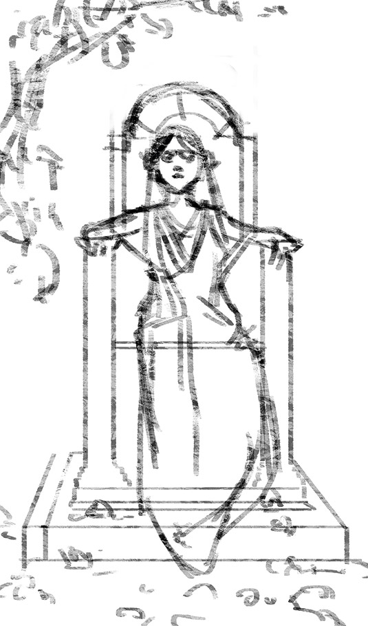
I'll use one character and a simple set with a flat-on angle, so deep space (perspective) is eliminated up to a point, because I know the different lightings I'll later create will seem more dynamic and different in contrast with this initial flat look. Ever since I took a trip to Tibet, I've yearned to create images that celebrate the brilliant colours I saw, so that's what I'll depict.
02. Shape blocking
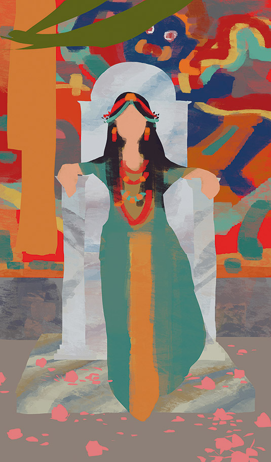
Using the Lasso tool, I select the different elements from back to front (such as the drape, chair back, seat and chair arms), and place them individually on different layers. This way, when a small change is required such as a colour change on the walls or value change on the chair, it could be adjusted quickly, without affecting other elements of the painting.
03. Colour/ material rough-in
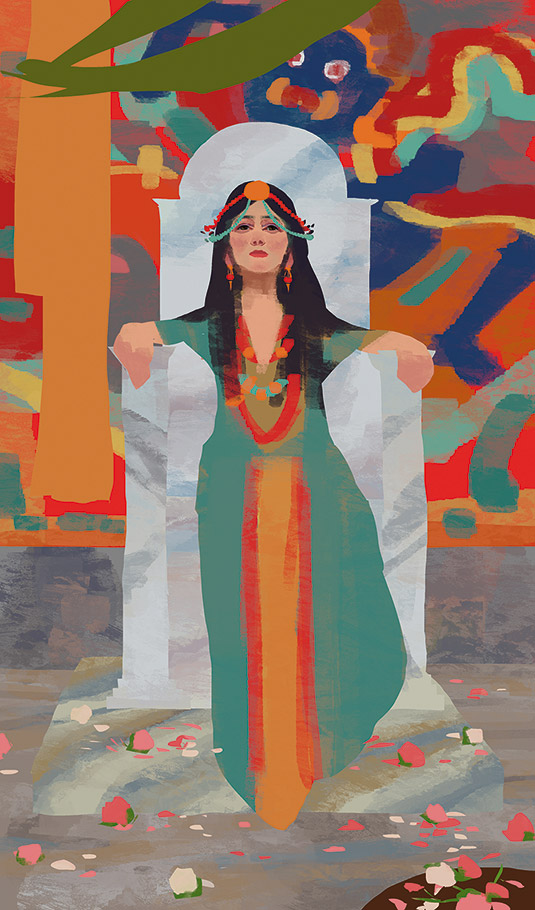
I often start by working all the layers up roughly, to adjust the colours and values as needed to create a harmonious image. I regularly use the option to lock transparent pixels on the different layers, so I can paint only within each of the elements. For the marble floor and throne, I'm drawing inspiration from Sir Lawrence Alma-Tadema's paintings.
Sign up to Creative Bloq's daily newsletter, which brings you the latest news and inspiration from the worlds of art, design and technology.
04. Shadow adjustment layer
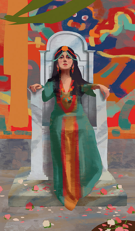
I add a Hue/Saturation layer, pull down the Lightness and push up the Saturation. Because I want to create an overcast lighting scenario to best show off the texture, the shadow in this lighting condition tends to be warmer than the light. I've tried to model out the form shadow and a soft cast shadow based on diffused light coming from the upper-right of the screen.
05. Add variations and modelling
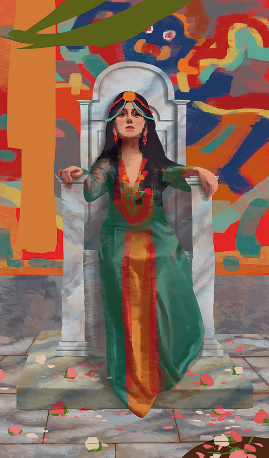
While adding shadow to the forms, I decide to make the sleeve of the dress a semi-transparent material. The key to indicating this effect is that the material is entirely visible only where it's bunched up; in other areas it has just a slight influence over the colours underneath. Following the forms underneath the dress, I also indicate the wrinkles and folds on the bottom.
06. Composition changes
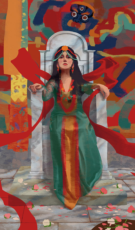
Now when I take a step back and examine the image, I notice that it has many vertical and horizontal lines, and is appearing too stiff and formal for my taste. So I add a free-flowing red shawl that stretches diagonally to the edges of the painting, to bring more dynamic energy into the composition.
07. Indicate materials in the image
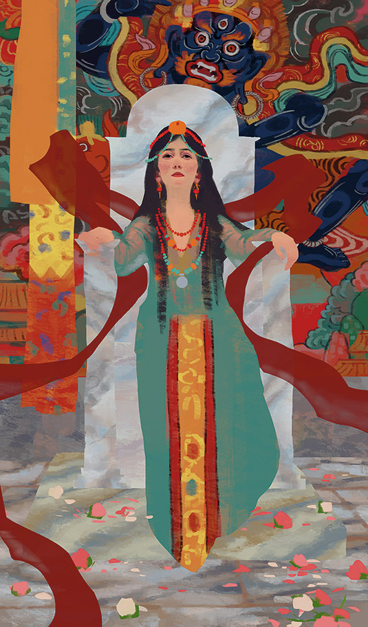
I now work on each element as much as possible at this point, to illustrate its materials or patterns. I focus particularly on the different types of materials and with them, different reflectiveness and translucency. I also pay attention to the tonal values within each element. I've taken off the shadow layer here to show you the close-to-final textures.
08. More refining of the scene
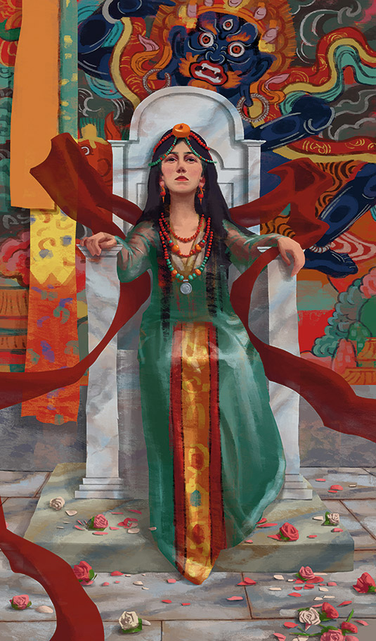
There's some awkwardness with her left arm (screen right), so I adjust it. I also finish the bottom of the drape, and the slight translucency of the shawl. Now the white light painting is done, and this would be a good painting now to show to the director. If okayed, it would be handed off to the set department, to serve as a shading target for all the materials on the set.
09. Create a dark interior lighting pass
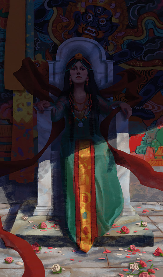
Next I provide a different lighting pass on top of the existing white light painting. Again, the goal isn't to create a final image, but a possible lighting scenario for this set. I thought a dark interior would be a good start to contrast with the white light version, so I add a Multiply layer with dark blue. I also create a layer mask on the layer, to erase out a path for the light.
10. Notice the colour of light transition areas
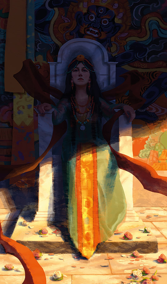
Next I create another layer on top of the Multiply layer, set the new layer to Linear Dodge mode and fill it with dark orange. I created a layer mask for it as well, to erase the light and reveal the dark interior, and both the form shadow and the shadows cast. Pay attention to the transition between the light and shadow, because it's often a more vibrant colour.
11. Adjust the shadow areas
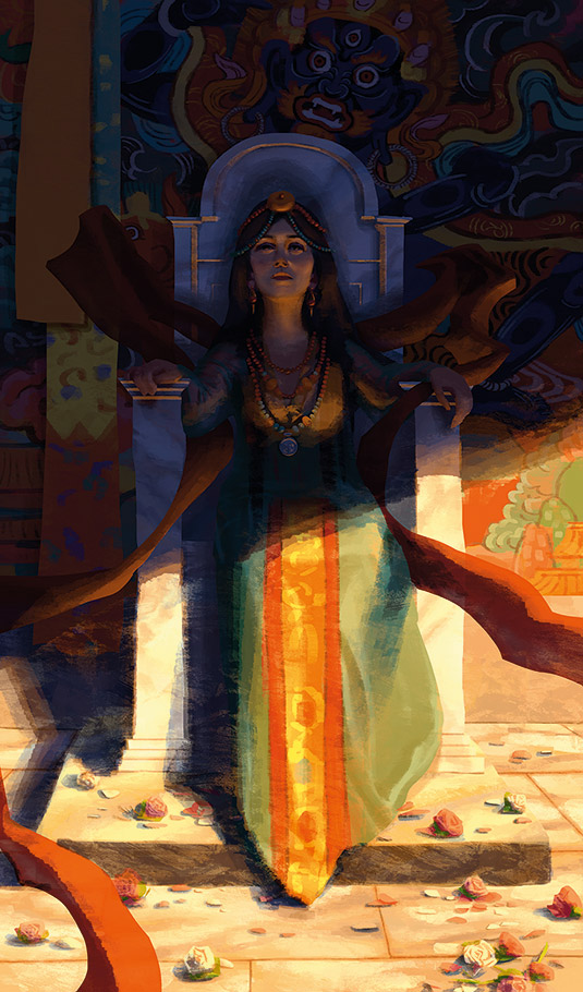
The warm light I created is so strong, in reality it would affect the objects in the shadow as well. So in this step I paint directly on the layer mask of the light layer, to bring in the warm influence on the bottom surfaces of the forms. I also copy out the shadow layer, and manually adjust the shadow shape so that it corresponds better to the new lighting.
12. Establish a dusk lighting pass
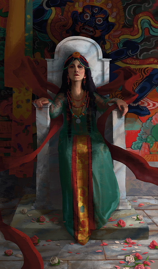
For this setup, I first adjust the shadow layer so the light is from the lower-right. Following the surfaces, I darken half of the face and extend a larger shadow area behind the throne on the left. Note how sharp the shadow is under the screen-right hand compared to the shadow on the drape, because the hand is closer to the light source and the throne it casts shadows on.
13. Bring in a dark red colour
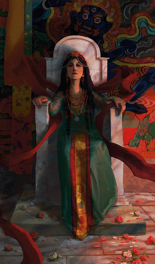
Next I create an Overlay layer with a dark red colour. I experiment with the layer mode and the colour to achieve the dusk light hue that I feel complements the colours in the image. I erase the red from the shadows. Following the bone structure, I refine the light shape and the shadow shape on the face. It helps to imagine that I'm turning on a physical light on the scene.
14. Take into account light from above
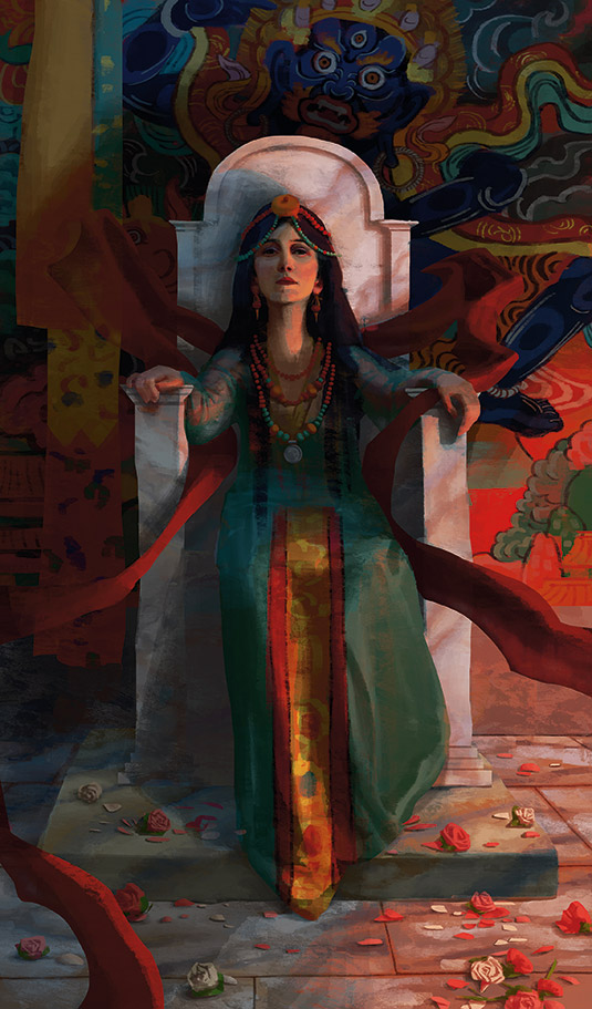
To soften the look of the piece, I decide to add a bluish top-down sky light above and in front of the figure. It influences the top surfaces in the image. It affects surfaces in the shadow as well, and is more noticeable on top than in the bottom. This is also an adjustment layer set to Soft Light, masked by painting on its layer mask. The colour could be adjusted to fit the painting.
This article was originally published in ImagineFX magazine issue 130.
