10 stunning card art illustrations
Discover some of the hugely talented artists behind Shadows Over Innistrad, the latest card set from Magic: The Gathering.
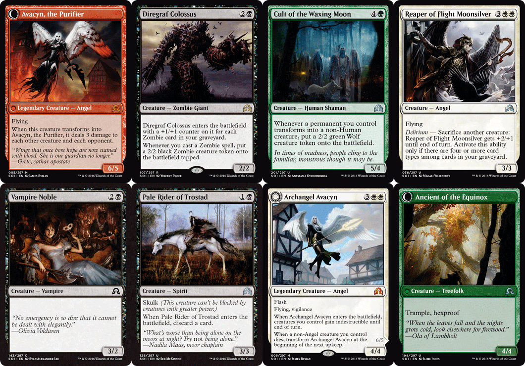
Populated with werewolves, vampires and the shambling dead, the new Shadows Over Innistrad cards from Magic: The Gathering are on the dark side. Armed with a description from the art director and the Innistrad style guide, it was up to Magic’s team of artists to bring the plane’s horde of nightmares to life.
Despite each illustration having to achieve specific storytelling goals, there was always room for creative interpretation. “It’s the illustrator’s job to expand on the prompt, to find new, exciting ways to portray the scene without contradicting the art description,” says Ryan Pancoast, the artist behind several cards in the new series.
It’s the illustrator’s job to find new, exciting ways to portray the scene without contradicting the art description
Ryan Pancoast
“Something frightening or unsettling doesn’t need to be unequivocally evil. It’s more how the viewer is unsure if it is or isn’t,” says Seb McKinnon, the creator of notably uncanny cards.
Article continues belowAs a master of terror, McKinnon knows how to get under the player’s skin. “That in-between state, both intriguing and terrifying, is the kind of creepiness I respond to,” he says. “Subtlety is everything.”
“Overall, I think fans and art directors react more to clever and appropriate usage of that freedom,” adds artist Ryan Alexander Lee. “The choices made have to be in service to the success of the game.” Here are some of the most striking pieces from the new set...
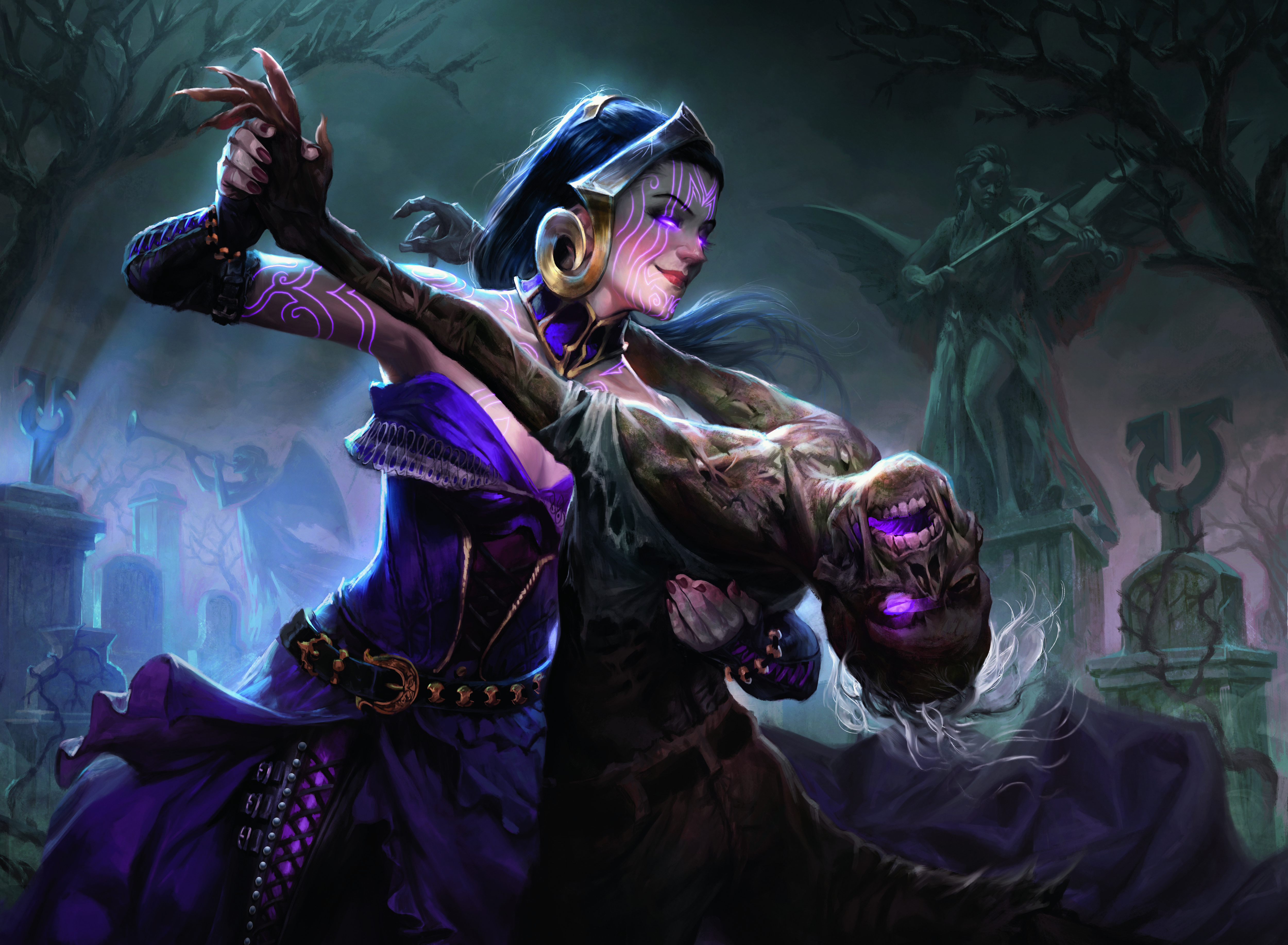
01. Will Murai – Macabre Waltz
Artist Will Murai was behind this striking piece, featuring heretical healer Liliana Vess. Her colour palette comprises many hues of purples and gold, contrasted with her dark hair and pale skin. “I wanted her to pop in the scene, so I imagined a strong focused spotlight making her porcelain-like skin contrast with the bluish/greenish hues in the cemetery,” Murai explains. “All of that would also go with the classic look and feel for the Black mana, which is at the core of Magic’s visual identity.”
Murai reveals that working for Magic is very satisfying as he’s always had the creative freedom to suggest and push the limits of the storytelling: “I’ve yet to be in a situation where I felt creatively constrained while working with this team. I believe that, as professionals, we need to understand the product we’re working on, and know the audience that it’s aimed at. But we can still toy with ideas of where to take an illustration.”
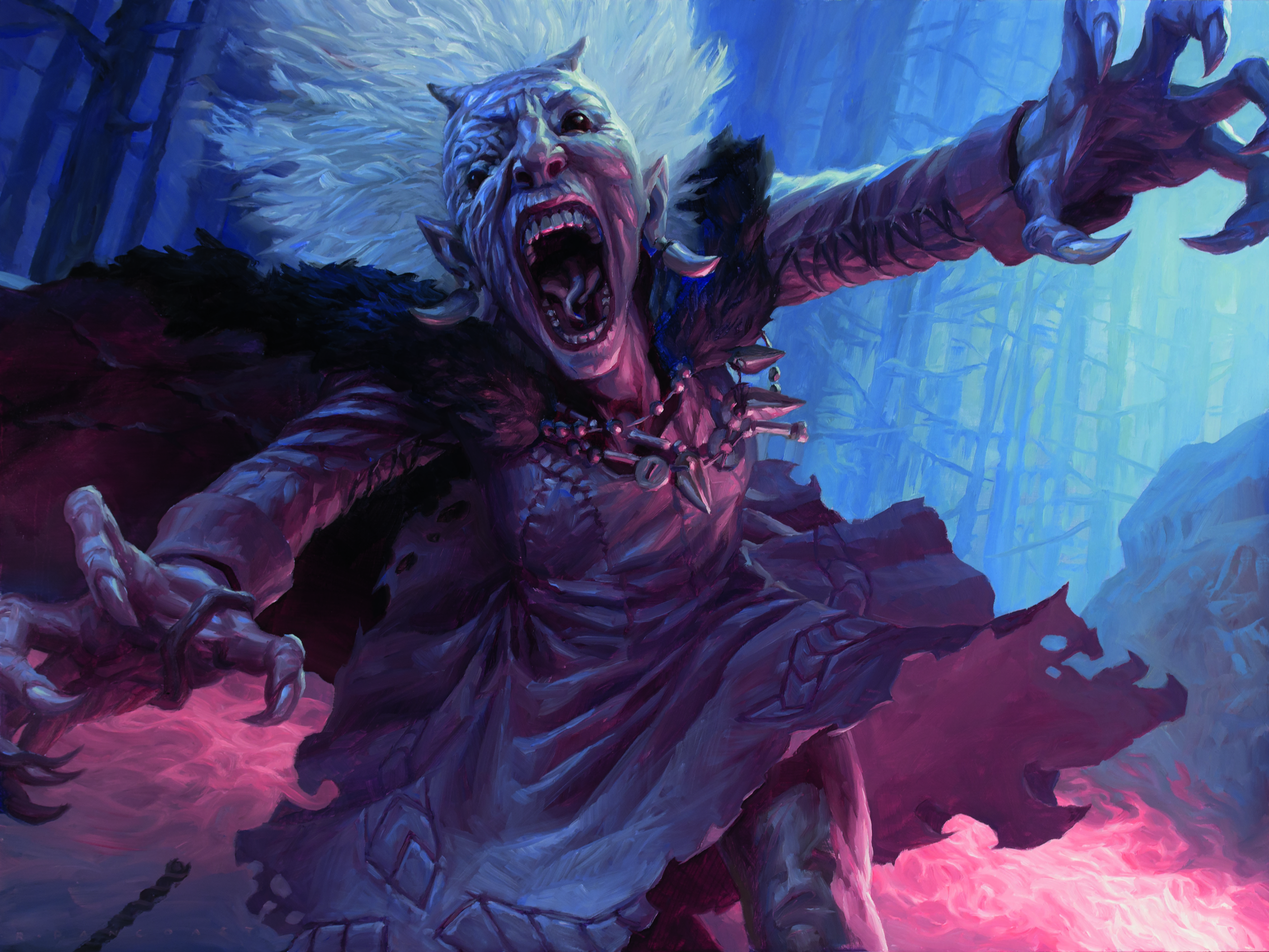
02. Ryan Pancoast – Demon-Possessed Witch
“Demon-Possessed Witch is scary and demonic in ways that are very specific to the story of Shadows Over Innistrad, including the sunken, mutated face which also appears in illustrations by other artists,” artist Ryan Pancoast reveals.
He wanted the Demon-Possessed Witch to be right in the viewer’s face. “The idea of claustrophobia and sudden surprises is key to the aesthetic of Innistrad, so her face and mouth are enlarged and her hands intersect the border of the painting. Her whole body is tilted to take up most of the frame. There’s only room for a few background elements: her discarded walking stick and the flames roaring unnaturally from her smashed lantern, which cast the classic monster lighting on her face. I took some photo reference for this piece, but largely the elements are invented purely to create something scary.”
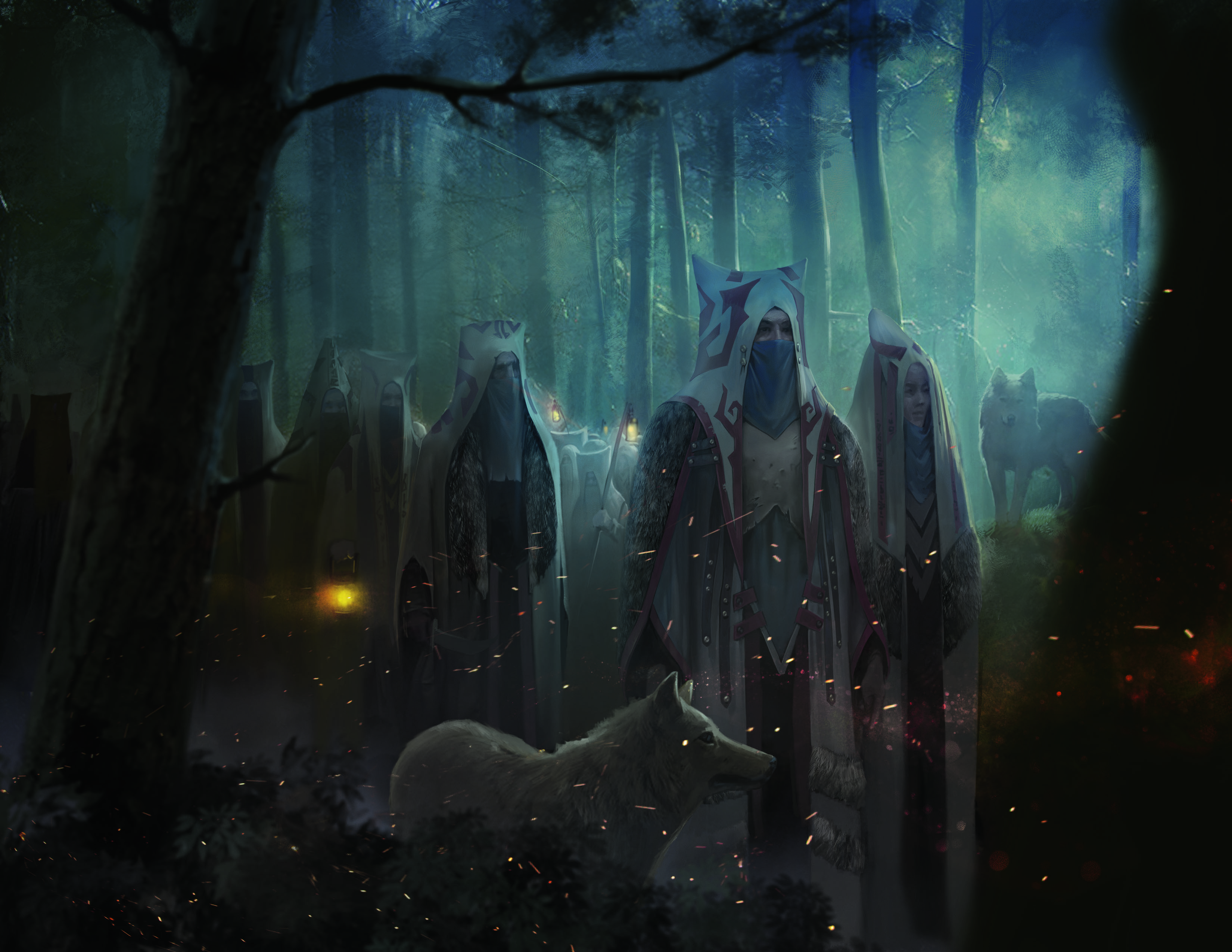
03. Anastasia Ovchinnikova – Cult of the Waxing Moon
Artist Anastasia Ovchinnikova did some research on different cults to help add a air of realism to her illustration, but, unsurprisingly she found the main style direction in the Magic: The Gathering world guide. “With helpful guidance from Jeremy Jarvis I was able to create the look of these characters and the whole scene” she explains.
“There are some strict rules about the overall look of illustrations and the style [in Magic: The Gathering] the quality, level of finish, no ridiculous exaggerations. But luckily I’m working in the same style and I have the same rules for my personal works.”

04. Magali Villeneuve – Reaper of Flight
Magali Villeneuve began her piece with the mood terms that were given to her: gothic, melancholy, dark. “Gothic was the main word here,” she says. “For armour design, I looked for ideas in architecture and found inspiration in religious monuments’ facades. For wings, I looked into crows first, for colour and texture. Then extrapolated the shape to give them a more aggressive, long, pointy look.”
Villeneuve used Photoshop on a Wacom Intuos 5 Touch and a pretty limited variety of brushes. “The first layers of colour was painted with a round Hard brush. Once all main colours, lights and shades were defined, I placed textures to keep the image from looking too soft and clean. Then I painted the whole image all over again, using both a Hard brush with softer edges, and square, Hard, textured brushes.”
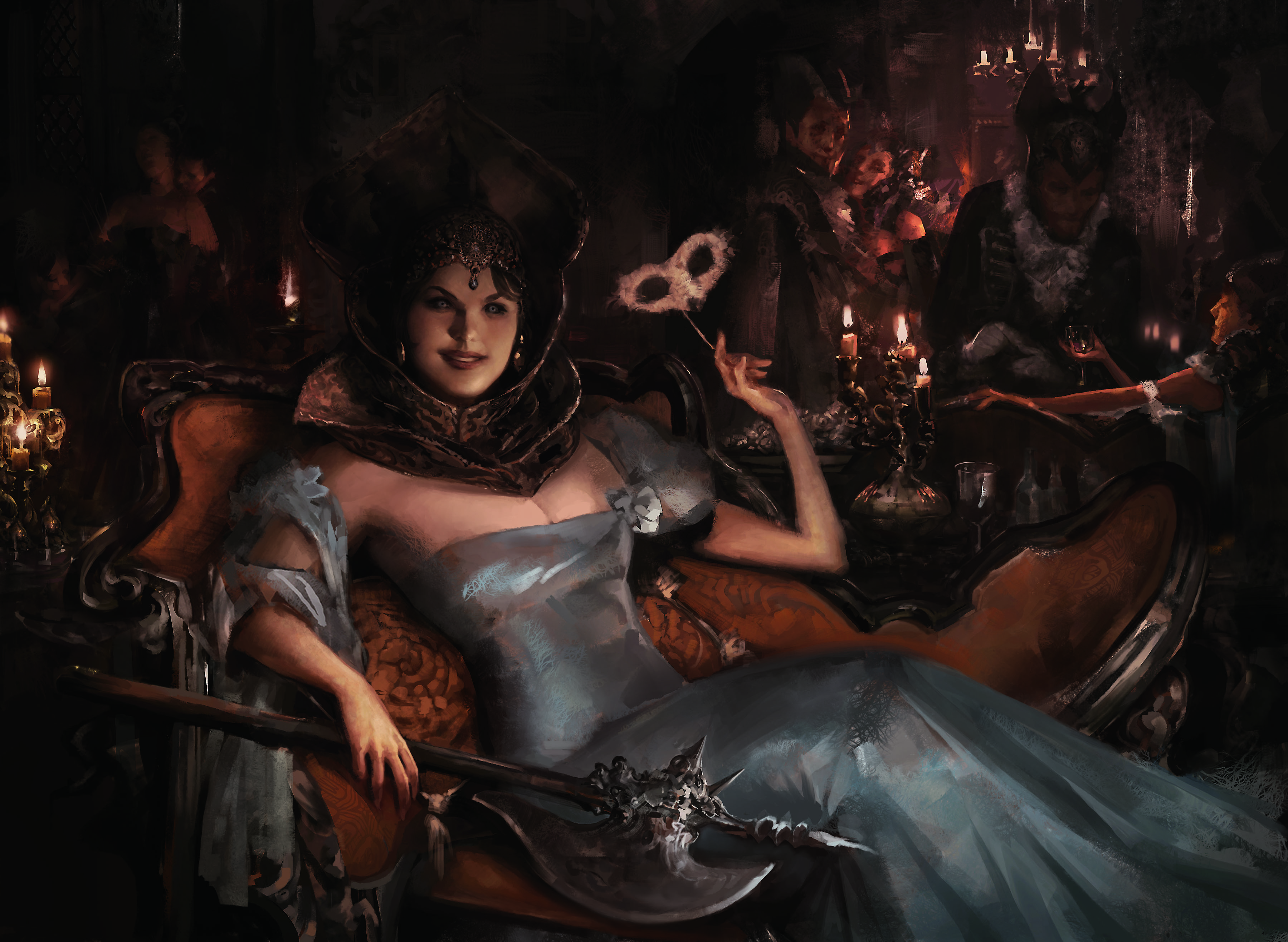
05. Ryan Alexander Lee – Vampire Noble
To achieve the look of an oil painting, artist Ryan Alexander Lee sought out and gathered the highest resolution images of oil paintings by Old Masters that he could find for reference, specifically Zorn and Sargent.
“I spent a lot of time studying their brushwork and how they layered the paint and moved from shadow into light. I did my best to recreate or mimic this process, while resisting the urge to use shortcuts afforded by working digitally.”
Lee says there’s often a detailed brief for Magic: The Gathering cards, “but artists are given a lot of flexibility to come up with something that lends itself to enriching the card’s overall flavour.”
“With Shadows Over Innistrad, artists were given a bit more wiggle room with the violence. But overall, I think fans – and art directors – react more to clever and appropriate usage of that freedom. You don’t want to be offensive or over the top, and your choices have to be in service to the success of the game. Implying with less can often amount to so much more.”
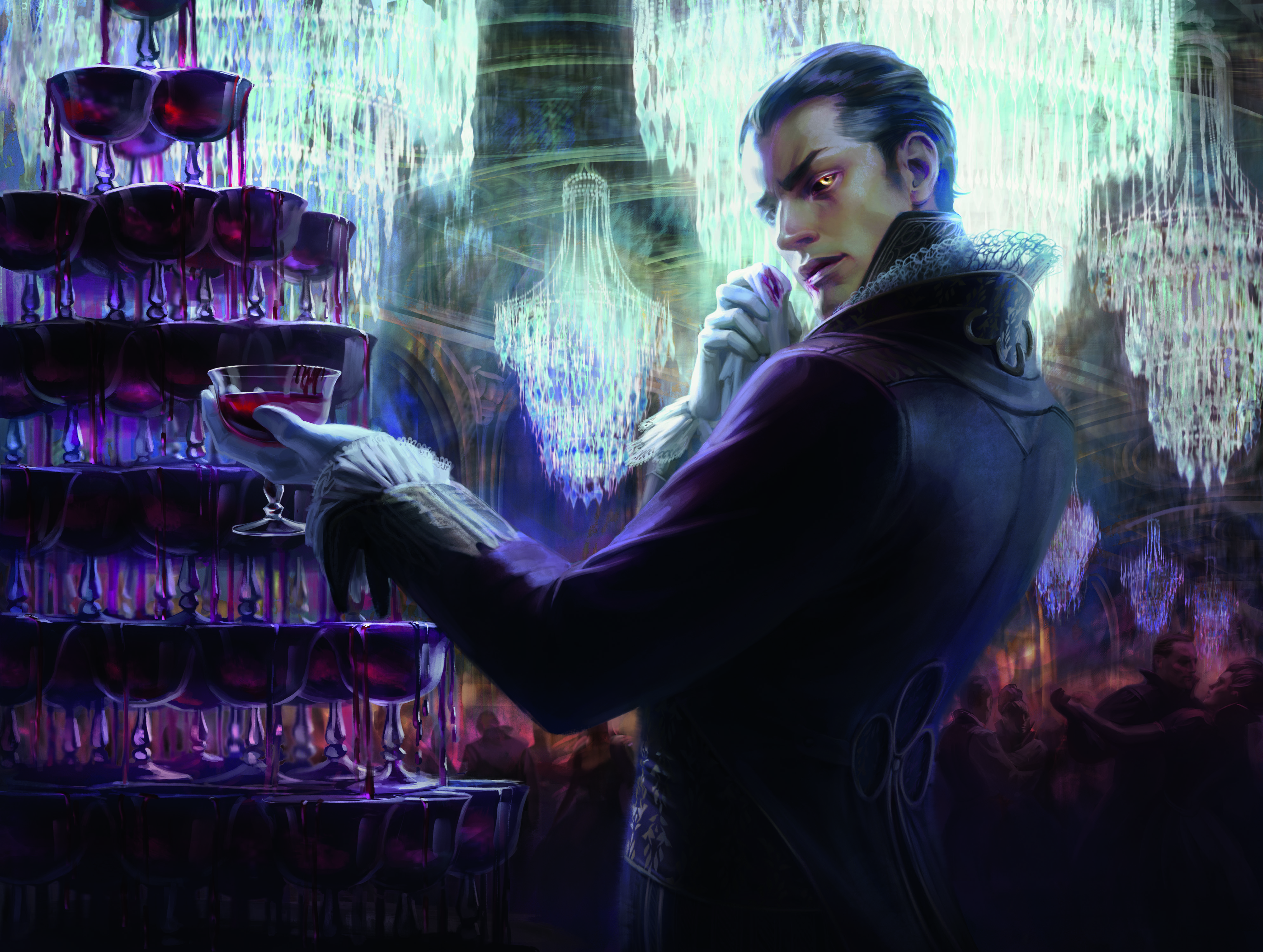
06. Anna Steinbauer – Indulgent Aristocrat
In her initial sketch, Anna Steinbauer simply scribbled around with various brushes to indicate the chandeliers, but liked the effect it made. “I struggled a bit to replicate this in the final painting and I ended up overlaying brushstrokes and even some old paintings of mine to achieve some randomness and an illusion of detail in the background. The chandeliers could have required a ton of time to render, but I painted only a few differently shaped crystal pieces and then arranged them with copy and paste.”
For the glass tower Anna attempted to come up with something equally as time-saving, but couldn’t so that was pretty much just a lot of painting! The best thing about working on Magic: The Gathering, Steinbauer reveals, is seeing all the incredible work other artists have done when a set is released. “It inevitably pushes you to try harder.”
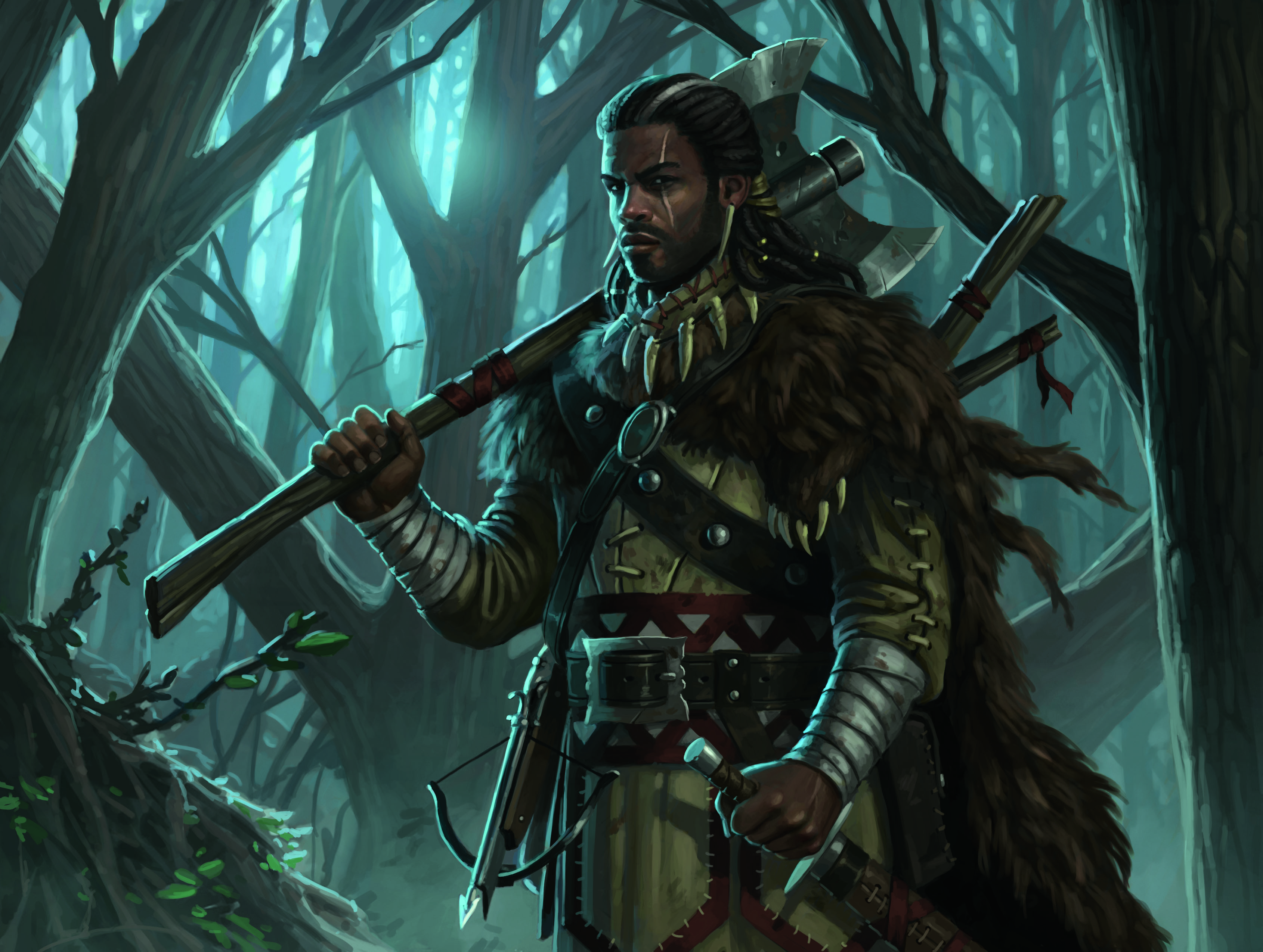
07. Craig Spearing – Solitary Hunter
Artist Craig Spearing drew on historical reference to help perfect the look of his hunter.
“The description called for a woodsman, so his attire is reminiscent of an 18th century French trapper in North America (with some fantasy creative licence – it’s not particularly historically accurate),” Spearing explains. “His weapons are wood and basic steel, no filigree, purely utilitarian for daily use.”
Spearing wanted to focus on the costume details and his stern expression, instead of a full body shot. “I zoomed into the upper half of the figure. Compositions for Magic always need to read clearly at small size, so the figure silhouette is big and bold. This was for a double-sided card; the forest environment, palette, and lighting are the same as One of the Pack, the image on the flip side. The scar across his eye and white streak in his hair are also mirrored in his werewolf form.”
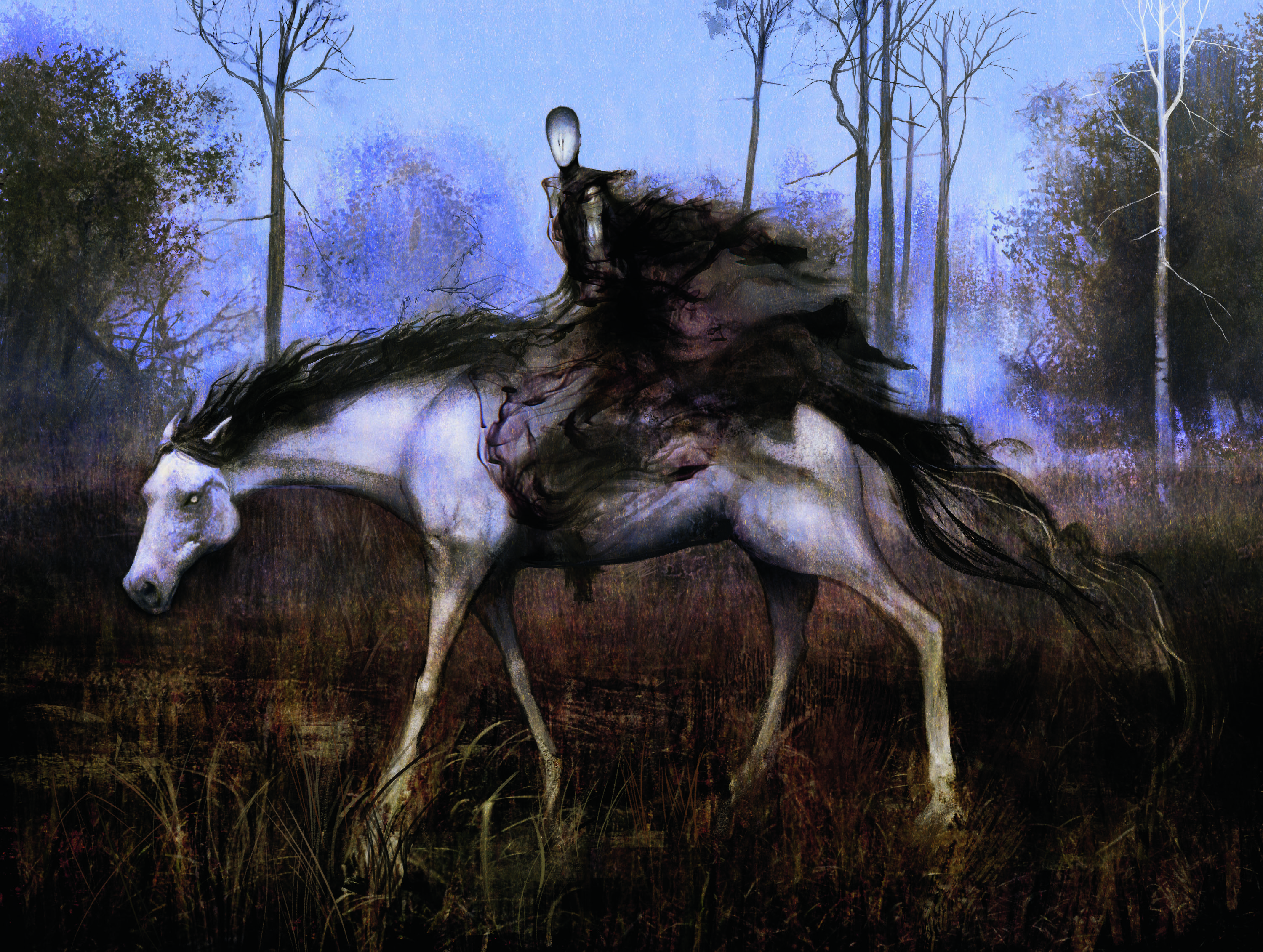
08. Seb McKinnon – Pale Rider of Trostad
Inspired by the work of Alan Lee, Seb McKinnon says the artist is why he became an illustrator in the first place. “He’ll always be number one for me. But these days, I’m very much inspired by artists James Jean, Ivan Solyaev and John Bauer. And moody, mysterious or eerie images in general.”
For his Pale Rider, McKinnon worked entirely digitally achieving the rider’s smoky effect with photo-manipulation of black ink dropped in water on Multiply mode in Photoshop. He then used the Smudge tool to make everything flow together.
McKinnon believes that the secret to a creepy image is “not about a disturbing or gory subject matter, but rather an attempt to portray the unknown, the middle point between innocence, pure beauty and darkness. There’s a difference between creepy and full-out horror.”
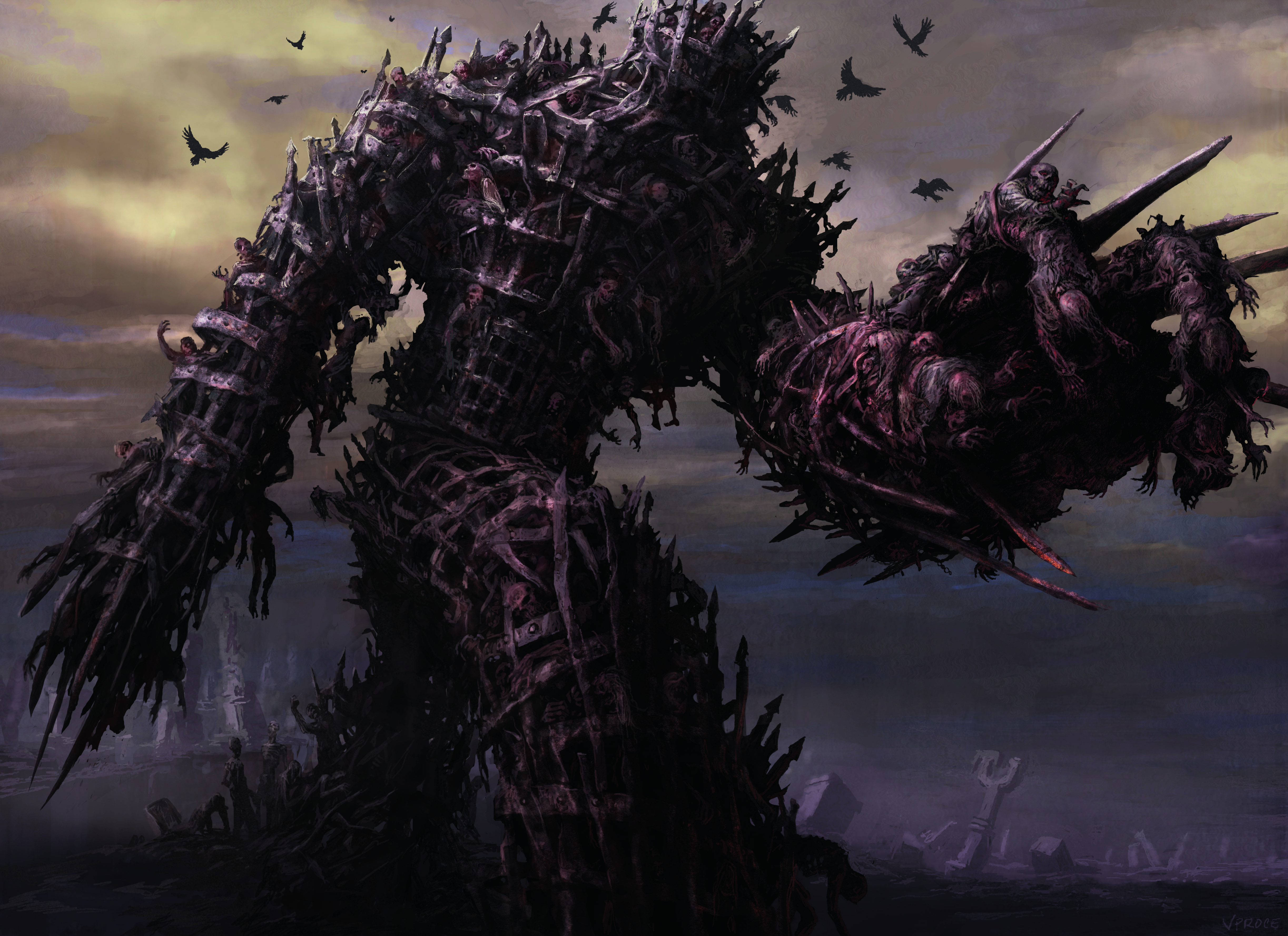
09. Vincent Proce – Diregraf Colossus
“Like with most M:TG cards I do, I start with a bunch of preliminary sketches in pencil. Then I scan into Photoshop and finish,” reveals artist Vincent Proce.
Proce took influence from an earlier image he painted for the first Innistrad set called Maw of Mire. “It was a bunch of corpses emerging from a flooded, swamp cemetery in the form of gigantic hands, grabbing on to an Avacyn church and pulling it into the muck. I really like doing masses of twisted bodies and every opportunity I get to do them I take my time and savour it,” Proce explains.
“There was a piece of concept art done for Diregraf Colossus also, by the incredible Wayne Reynolds, while we were on the push for this set in Seattle. I think I did a pretty good job in preserving Wayne’s iron gates, binding the creature together, while adding my twisted and bloody bodies of Maw of Mire.”
He believes Magic expects him to push the gruesome factor to the limits when they get him to do a card for them. “I have a lot of gruesome cards! There is only one time that I’ve been asked to remove a disgusting element in a sketch, and that was when I had the most prominent character in my Bile Blight card vomiting blood and guts.”

10. James Ryman – Archangel Avacyn, Avacyn the Purifier
James Ryman created the imagery for Avacyn in the Shadows Over Innistrad set, capturing her pure, angelic self as well as her “purifier” powerfully demonic form.
“Being the person asked to paint Avacyn herself is as high pressure an assignment as any contained in this set” explains Magic: the Gathering senior art director Jeremy Jarvis. “Not only did James deliver big-time, but he also did most of the heavy lifting in creating her incredible new look.”
Sign up to Creative Bloq's daily newsletter, which brings you the latest news and inspiration from the worlds of art, design and technology.

Dom Carter is a freelance writer who specialises in art and design. Formerly a staff writer for Creative Bloq, his work has also appeared on Creative Boom and in the pages of ImagineFX, Computer Arts, 3D World, and .net. He has been a D&AD New Blood judge, and has a particular interest in picture books.
