6 form UX patterns – and when to avoid them
Discover the benefits of certain form UX patterns, and also their pitfalls.

Sign up to Creative Bloq's daily newsletter, which brings you the latest news and inspiration from the worlds of art, design and technology.
You are now subscribed
Your newsletter sign-up was successful
Want to add more newsletters?
Boring, boring forms. Love them or hate them (and let's face it, you hate them), they're an inescapable part of almost every web build, and whether you're building full-blown online shops (like our inspiring examples of ecommerce websites) or straightforward corporate sites (perhaps using a great website builder), sooner or later you'll have to make some forms.
We can hardly blame designers for trying to come up with innovative ways to make them more interesting, but how many of these form trends actually hold up in terms of usability? Let's take a look at some common form UX patterns, starting with forms inside modals.
Looking for more web design advice? See our pick of top web hosting services.
Article continues below01. Form modals
Placing forms inside modals and having them appear dynamically seems like an obvious solution to an otherwise overly complex situation. After all, forms don't take up any significant amount of space, so why do they need their own dedicated URL? Actually, there are several reasons.
Accessibility. The most important reason is that if we're making modals accessible (and obviously we should be), then they should be easily dismissed by hitting the ESC key or by clicking the modal's whitespace. Now with the modals being easily dismissed, it would be an inconvenience (not to mention counter-accessible) to accidentally dismiss the modal (and the unsubmitted form data) halfway through filling out the form.
Customer support. Besides accessibility, combining forms with modals and essentially not hosting the form at a dedicated URL means customer service representatives can't link to these forms during communications, which makes things very difficult for both customers and customer service representatives.
Password managers (either in-browser or as standalone apps) sometimes remember login details on a screen-by-screen basis, so if the user is able to log in from wherever they are in the app or website, it may be difficult to retrieve their login details if said details were saved when the user was at a different URL.
Sign up to Creative Bloq's daily newsletter, which brings you the latest news and inspiration from the worlds of art, design and technology.
Solution: don't render forms inside modals. Rendering forms inside modals comes with more issues than it solves and although some forms are so basic that it makes the screen look virtually empty, users filling out forms are unlikely to care. You're a user too, so you already know that the immediate response to a form is, 'I hope this doesn't take long,' not, 'this form doesn't look interesting enough'. Prioritise helping users move onto what they really came for.
02. Unsemantic markup

Elements aren't all created equal. Semantic markup ensures that there are different code markups for every occasion; for example, even though a standard input field may look the same as an email field, app and browser vendors know the difference and their behaviour is duly adapted depending on what the expected input is.
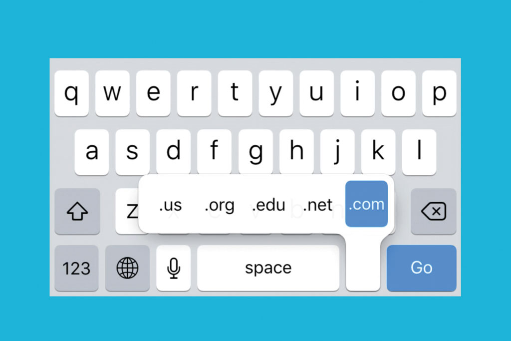
Focused email fields on mobile will display a version of the keyboard where the @ symbol is immediately available, whereas standard input fields won't behave like this. Just to reinforce the concept, password fields will visibly replace user input with asterisks – for security reasons – and URL fields will display .com on the keyboard, for convenience.
But because these differences are so subtle, semantics are often forgotten about, especially by designers who aren't aware of these differences due to not being involved in 'the code side'.
Solution: implement semantic markup. Without the use of semantic markup, users are unable to reap these time-saving usability benefits, which is why I always recommend that designers communicate to developers how certain UI elements should behave, either during handoff or otherwise.
Developers and designers should also beware of hiding input fields (i.e. <input type="hidden"> or equivalent), a concept used for progressive disclosure or collecting information that's accessible without the user specifically offering it (such as location, accessed server-side). Hidden input fields essentially have no type at the time autofill comes into effect, resulting in it being skipped over entirely.
03. Split forms

Split forms are long forms broken down into sections; for example, one section for delivery address and another section for billing information. This concept actually makes total sense and has been used (successfully) for a really long time.
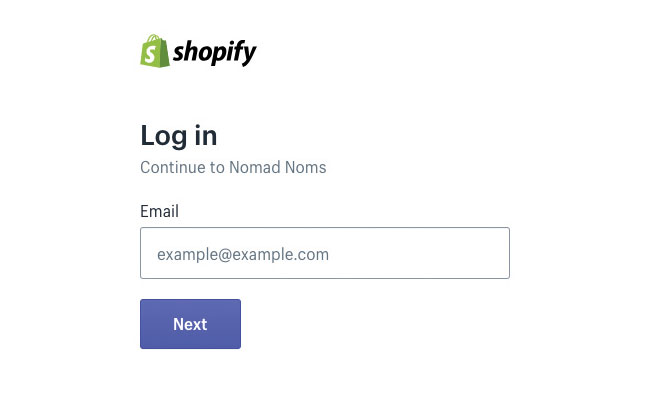
Naturally, the main benefit of form splitting is the reduction in cognitive overload; however the misuse of form splitting can actually have an adverse effect. For instance, when implemented with login forms, forcing users to flow through two steps when there's only one field in each step (email and password) is unnecessary, not to mention the fact it breaks the autocomplete benefits.
Autocomplete works in harmony with other input fields. For instance, when users type in their email address to log in, the password field will conveniently autocomplete with the correct combination saved for that email address but when dividing related fields into different steps, the browser cannot autocomplete what isn't there. Autofill may save the day but the outcome really depends on the browser making the correct assumptions (i.e. if the user has multiple logins for the same website or app, the browser may choose the wrong combination).
Solution: Make forms boring!
Forms are boring and they always will be. Rather than trying to make them interesting, the most user-centred design decision we can make about forms is to make them quicker and easier to use. When it comes to form splitting, the best implementation of the technique is to use it only when dividing up unrelated fields.
04. Magic links

Staying on the topic of login forms, magic links are a new-ish trend where after inputting the email address, the user is emailed a link that will automatically log them in. If you've ever used Slack, you'll already be familiar with the concept, which, on mobile, saves you having to type in your password.
Some may say the concept is a bit tiresome, as the user has to actually switch app to log in, although admittedly the UX flow is a little better than receiving temporary login details that the user needs to copy into said application in order to log in. In addition to breaking autofill and/or autocomplete, unfamiliar conventions can be confusing for users.
Solution: Make magic links optional or secondary. There's not much wrong with magic links and they can certainly be useful to mobile users who would rather not type; however the convention makes too many assumptions about how the user has their email set up. To ensure the best results, make magic links optional.
05. Two-factor authentication
Two-factor authentication (or 2FA) is something of a double-edged sword. On one hand, it increases security by asking users to approve login attempts via SMS, email or some kind of 2FA authentication app; on the other hand, it forces users to approve login attempts via SMS, email or some kind of 2FA authentication app – urgh!
As human psychology dictates, we're more concerned with the problems we have right now, so it's difficult to care about the benefits of security until our account has actually been hacked. Most users don't want 2FA until they need it.
Solution: Don't enforce 2FA or, at the very least, offer convenient ways to enforce it, such as via WiFi or email.
If 2FA isn't required, at least make it optional (i.e. the user has to switch it on via the settings of said app or website).
Let's say that the user is abroad. They won't have access to their day-to-day mobile data; however, they may have access to WiFi, so email or a 2FA auth app such as Google Authenticator would be much more convenient than SMS-based authentication. And if the user can turn it off temporarily, even better!
06. Dynamic placeholders
Input labels have a really unfair reputation because they can make forms look clunky and we're taught to believe that less is more. But this isn't one of those times. A common UI design trend over the last few years is to have the placeholder text transition into the label when the input field is clicked. However placeholders and input labels actually serve two very different functions and one cannot replace the other, no matter how cool you might think the animation looks.
Placeholders are used to show the user what is considered an acceptable value, whereas a label is simply a short description of what the input field is for. Here's an example combination:
Label: "Name" Placeholder: "John Doe"
If your short-term memory isn't fantastic, you have likely had a moment at some point where you've forgotten what you were supposed to type halfway through filling out a form field. It's a very common scenario.
Solution: Keep at least the label visible at all times. By keeping the label visible, you can ensure form fields remain easy to fill out correctly, even for users with different accessibility needs or for individuals under an increased cognitive load in noisy, distracting or stressful environments.
Got a bunch of new ideas? Keep them safe in cloud storage.
This article was originally published in issue 318 of net, the world's best-selling magazine for web designers and developers. Buy issue 318 here or subscribe here.
Related articles:
Previously a design blog editor at Toptal and SitePoint, and before that a freelance product/UX designer and web developer for several years, Daniel Schwarz now advocates for better UX design alongside industry leaders such as InVision, Adobe, Net Magazine, and more. In his free time, Daniel loves gaming, café culture and Wikipedia, and also travels perpetually when there isn’t a pandemic.
