10 rules for making user-friendly web forms
Discover some solutions to create forms that won't drive your users up the wall.

Despite the evolution of human-computer interaction, forms still remain one of the most important types of interaction for users. People who use your application or website have a particular goal, and often the one thing standing between the user and their goal is a form. Every day, we use them for our essential activities – to complete purchases, to sign up for social networks, to provide feedback on a product we've bought, and more – they're a huge part of user experience.
As a result, it's very important for us to be able to complete online forms quickly and without confusion. The less effort we have to spend, the happier we are. As designers and developers, we should strive to produce faster, easier and more productive form experiences for our users.
In the second of my two articles exploring how to build better forms (find the first one here), here are my 10 tips to design forms that are user-friendly. Not quite what you're looking for? You might need our guides to the top website builder or cloud storage service.
Article continues below01. Only ask what's required
Cutting the amount of required information makes the form easier to fill out. You should always question why and how the information you request is being used. Try to minimise the number of fields as much as possible, because every field you add to a form will affect its conversion rate. Limiting the number of questions and fields make your form less loaded, especially when you request a lot of information from your users.
02. Order the fields logically

It's helpful to think of a form as being similar to a conversation. Like any normal conversation, it should be represented by a logical communication between two parties: a person and your app. Details should be asked for in an order that is logical from a user's perspective, not that of the application or database. For example, it's unusual to ask for someone's address before their name.
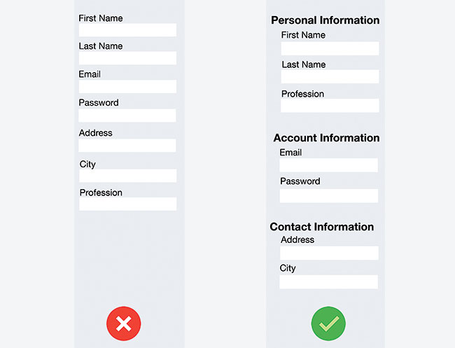
It's also very important to group related questions in blocks, so the flow from one set of questions to the next will better resemble a conversation. Grouping related fields also helps users make sense of the information they must fill in.
Pictured above are examples of two registration forms. Long forms can feel overwhelming if you don't group related fields – compare the form on the left to the improved version on the right.
Sign up to Creative Bloq's daily newsletter, which brings you the latest news and inspiration from the worlds of art, design and technology.
Grouping needs to be carried out visually as well as in the code. For example, you could use the <fieldset> and <legend> elements to associate related form controls:
<fieldset>
  <legend>Personal Information:</legend>
  <div>
    <label for="first_name">First Name</label>
    <input type="text" name="first_name" id="first_name">
  </div>
  <div>
    <label for="last_name">Last Name</label>
    <input type="text" name="last_name" id="last_name">
  </div>
    <label for="gender">Profession</label>
    <input type="text" name="profession" id="profession">
  </div>
</fieldset>
03. Keep labels short
Field labels tell users what the corresponding input fields mean. Clear label text is one of the primary ways to make UIs more accessible. Labels tell the user the purpose of the field, but they aren't help texts. Therefore, ensuring they scan easily is a priority – you should design succinct, short and descriptive labels (keep them to a word or two).
04. Don't duplicate fields

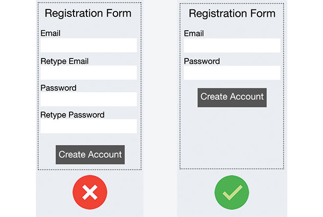
This problem is particularly common for registration forms: almost everyone has come across a form that requires you to type an email address or password twice. Historically, this was designed to prevent mistyping errors. However, most users simply copy-pasted the necessary field whenever the app allowed it. And if the original field's data contained an error, it was duplicated.
05. Highlight optional fields
Ideally, it's best to have no optional fields. In line with rule number 1, if a piece of information is not required, there's no point in wasting a user's time. But if you do use them, you should clearly distinguish which input fields cannot be left blank. Usually a small mark like an asterisk (*) or 'optional' label is enough.
06. Be careful with defaults
Avoid including a static default unless you believe a large portion of your users (eg. 90 per cent) will select that value – particularly if it's a required field. Why? With this approach you're likely to introduce errors because people scan forms quickly online. Don't assume they will take the time to parse through all the choices. They may blithely skip by something that already has a value.
The only exception for this point is smart defaults – like those that preselect the user's country based on their geolocation data – which can make completion of the form faster and more accurate. But you should still use these with caution, because users tend to leave preselected fields as they are.
07. Minimise the need for typing
Typing is a slow and error-prone process, and it's especially painful on a mobile, where users face the constraints of limited screen estate. And with more and more people using small screens, anything that can be done to prevent unnecessary typing will improve the user experience. Where appropriate, you can use features like autocomplete and prefill for data, so users only have to type in the bare minimum amount of information.
Filling out your address information is often the most cumbersome part of any online registration form, thanks to multiple fields, long names, and so on. Save your users from having to type in their entire address by implementing prefills for these fields. Libraries like Google Maps offer a simple JavaScript API to achieve this. You can find a working solution here.
08. Use real-time validation

In an ideal world, users fill in forms with necessary information and finish their job successfully, but in the real world, people often make mistakes. It's frustrating to go through the process of filling out an entire form only to find out at the point of submission that you've made an error.
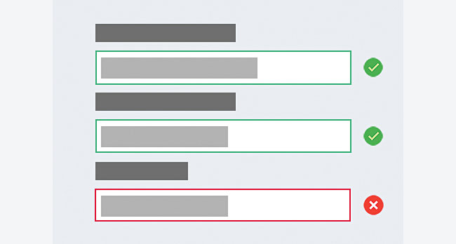
The right time to inform someone about the success or failure of the data they've provided is right after they submit the information. This is where real-time validation comes into play. It alerts users to mistakes straight away and makes it possible for them to correct them faster, without having to wait until they press the 'Submit' button.
And remember, validation shouldn't only tell users what they did wrong; it should also tell them what they're doing right. This gives users more confidence to move through the form.
Parsley is an excellent JavaScript form validation library. It is open source and UX-focused, so you can override almost every default behaviour to fit your exact needs. In the following code is a simple Parsley validation example for a 'Message' field. The field should be at least 20 characters, but no more than 100.
<label for="message">Message (20 chars min, 100 max) :</label>
<textarea id="message" class="form-control" name="message" data-parsley-trigger="keyup" data-parsley-minlength="20" data-parsley-maxlength="100" data-parsley-minlength-message="Come on! You need to enter at least a 20 character comment." data-parsley-validation-threshold="10"></textarea>
You can find the complete code sample here.
09. Avoid fixed input formats
The most common reason for forcing a fixed format is validation script limitation (the back end can't determine the format it needs), which in most cases is an implementation problem. Rather than forcing the format of something like a phone number during user input, you should make it possible to transform whatever the user enters into the format you want to display or store.
10. Don't use Reset buttons

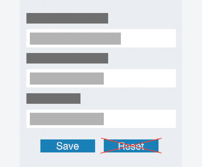
A Reset button almost never helps users. It's hard to imagine that someone would want a button that undoes all their work, let alone that they'd want that button to be sitting next to the button that saves it. The web would be a happier place if virtually all Reset buttons were removed.
Want to know how your users are responding to your website? A decent web hosting service will give you the analytics you need.
This article originally appeared in net, the magazine for professional web designers and developers. Subscribe to net here.
Related articles:
