6 magnificently minimal logos
These designs achieve a lot while keeping things simple.
A good logo has to achieve an awful lot with not very much collateral. It needs to be distinctive and memorable, it has to effectively communicate the identity and values of the brand that it represents, and it absolutely has to be versatile enough to work at every conceivable size, from browser favicons up to large-scale signage. That's a big ask.
A well thought-out minimal logo design can be the best way to meet all three criteria; the challenge can be coming up with an end result that hasn't been done before. The simpler a design, the more likely you are to find hundreds of similar creations ready to be confused with your client's brand.
It can be done, though, and if you get it right you'll have a brand identity that sticks in people's minds. Here are six logos that are utterly minimal but which still manage to be instantly recognisable.
01. Volkswagen
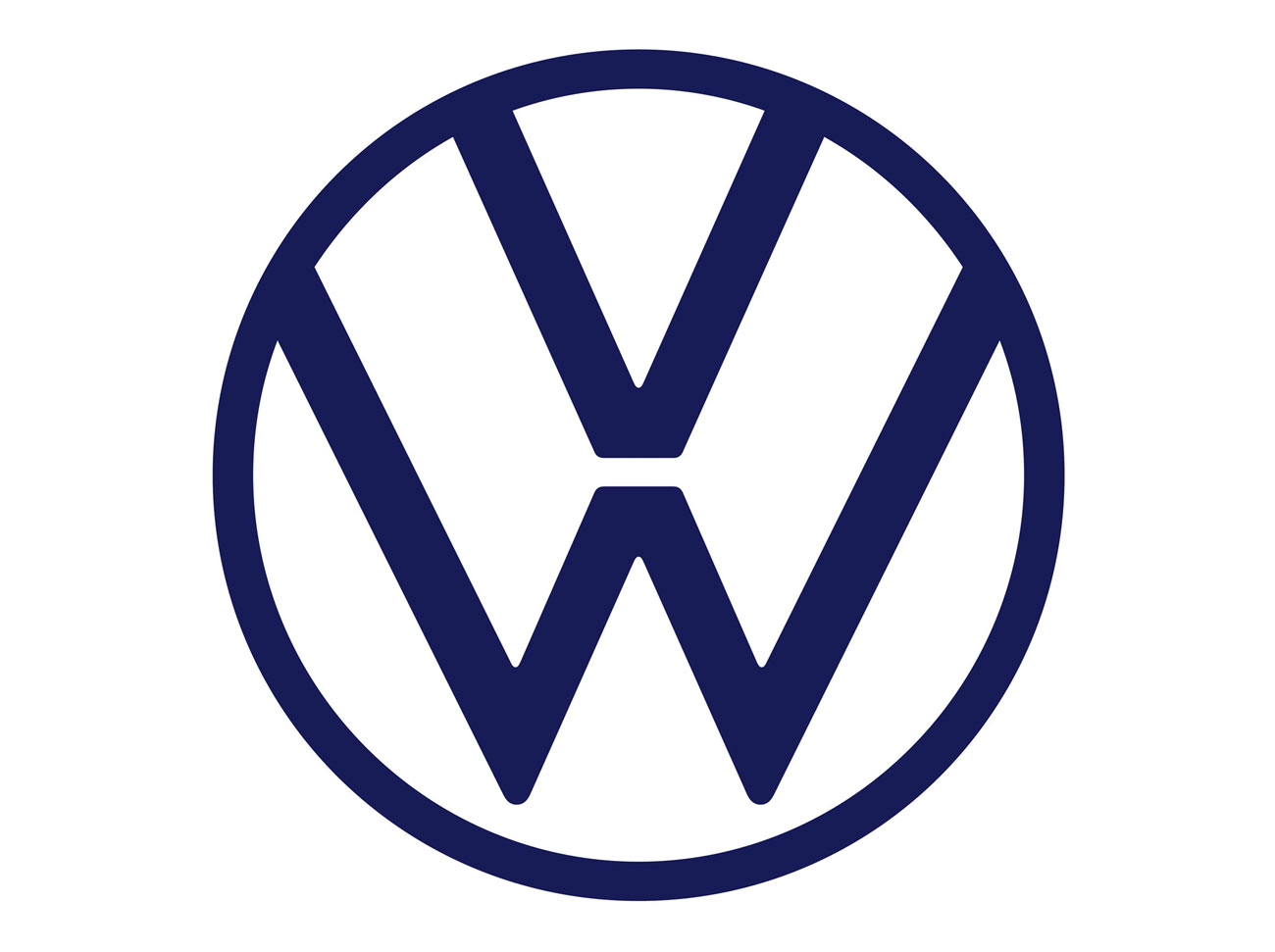
Probably the most complex of our selected designs, the Volkswagen logo is still beautifully minimal, especially in its latest iteration, launched last year. The distinctive monogram has been central to Volkswagen's branding since its launch before the Second World War; it originally featured additional ornamentation in similar style to the Nazi swastika, but this was quickly dropped after the war.
The logo's been tweaked various times over the years and until recently it was an unsightly, chunky work of non-minimal chrome and 3D edges. The latest version, however, takes it back to basics with a simplified flat design that's a lot more pleasing to the eye.
02. Red Hat
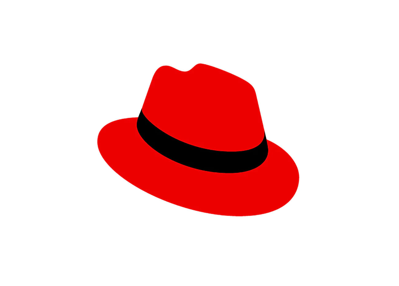
Red Hat isn't a name that's going to be familiar to most people, but it's one of the biggest names within the world of Linux. With a name like Red Hat (the company's named after the red lacrosse cap worn by one of its founders, Marc Ewing) it's obvious what the logo should be; each of its logos since 1995 has featured some kind of red hat.
The original 1995 logo – a stylised stovepipe hat – is probably the most minimal of the lot, but the most recent, developed with Pentagram's Paula Scher is a fine looker. It's an evolution of the long-standing Red Hat logo featuring a figure in a red fedora, reduced and refined to simple hat in a shade of red that works better across both light and dark backgrounds. It's all part of a larger branding system that you're not particularly likely to come across, but you'll know it whenever you see it.
03. Beats
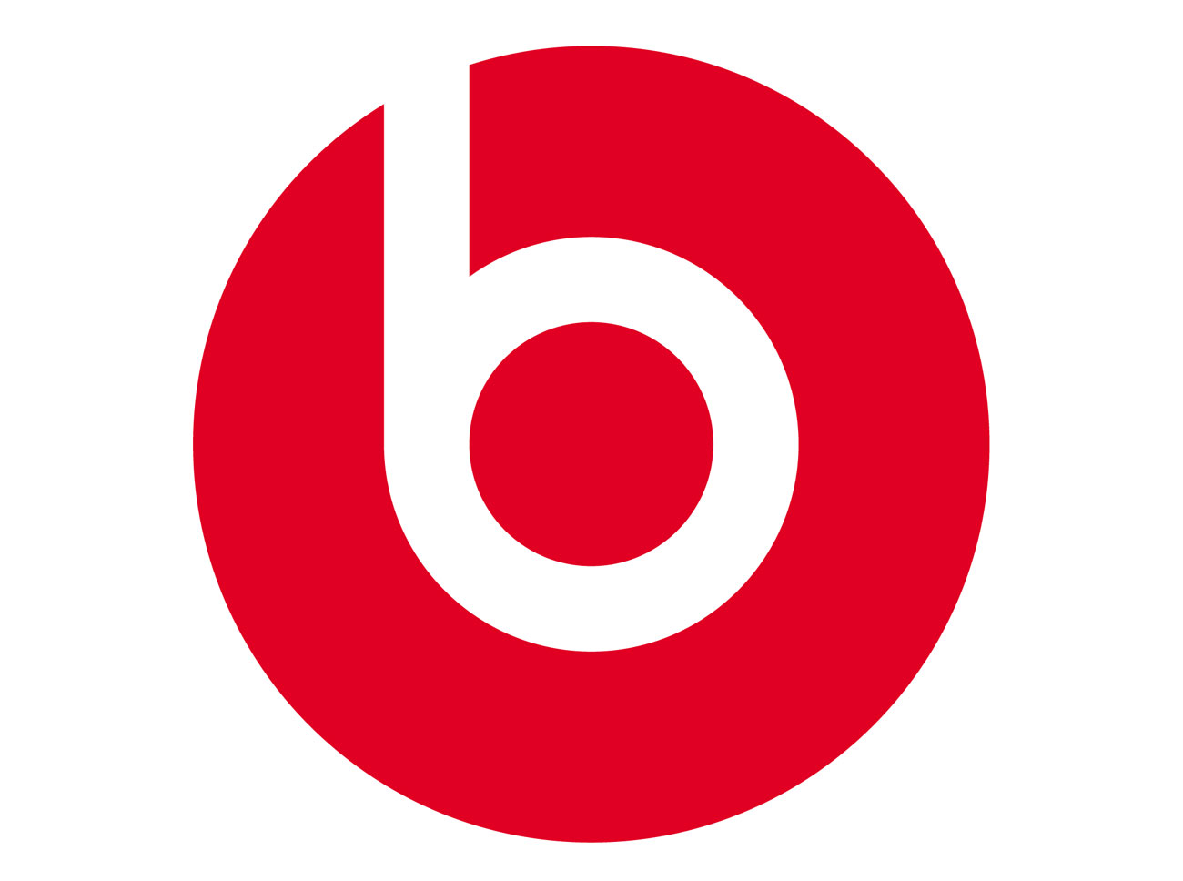
Love or hate the headphones it represents, it's hard to deny that the Beats logo does a lot of heavy lifting with minimal elements. A simple lower-case 'b' against a circular background, it not only signifies the Beats brand but also works as an abstract representation of someone actually wearing a pair of headphones.
Conceived as not only a high-performance audio brand but also as body art, Beats got its iconic look from Ammunition in San Francisco, which not only designed the hard-working logo, but also the headphones themselves and the whole brand identity and visual language.
04. Apple

The original Apple logo, created by Ronald Wayne, was the very opposite of minimal: an elaborate hand drawing of Sir Isaac Newton sitting under his apocryphal apple tree, with a fluttering banner pronouncing the company name, it was a piece of branding straight out of the 19th century and barely lasted a year.
The logo that we all know was designed by Rob Janoff in 1977, and it's a glorious example of a designer getting it right first time. Janoff didn't have any backup designs when he presented his work to Apple; he describes his simple silhouette of an apple with a bite taken out of it as the clearest bell of a visual he's ever had, and his confidence paid off. While the visual treatments of the Apple logo have evolved over the years, its iconic shape has remained untouched. You can find out more about Janoff's design here.
05. Mastercard
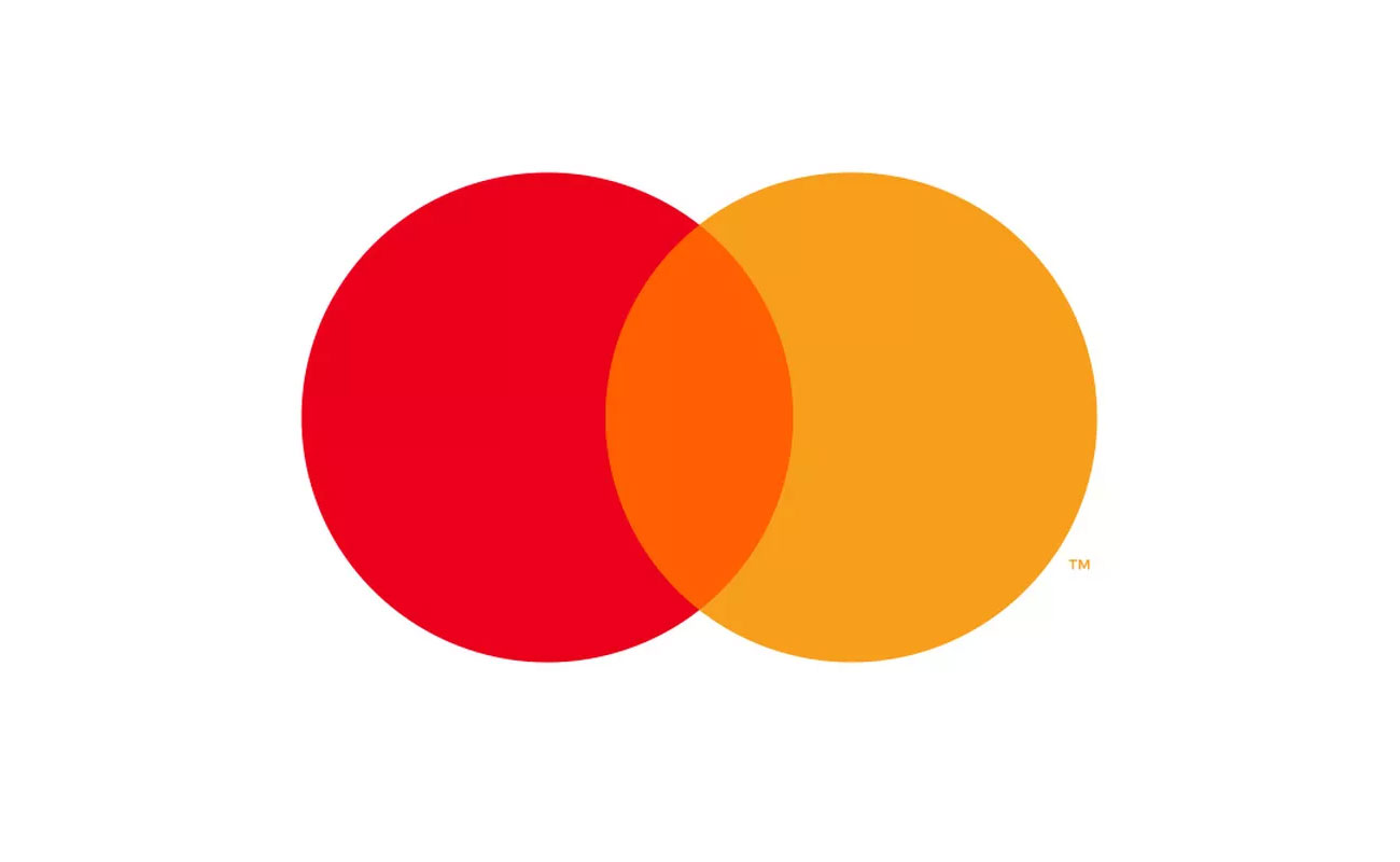
The Mastercard logo, consisting of a pair of overlapping circles, originated in 1968, and like Rob Janoff's Apple logo it's one whose silhouette has remained largely untouched over the years, while the inner details have been sporadically tweaked. From 1990 until 2016, the overlapping section in the middle consisted of interlocking lines – a striking look but one that's less suitable for modern usage as it doesn't scale gracefully across all its possible implementations.
Pentagram's 2016 redesign simplified the logo with a look reminiscent of the 1968 original, but with a more vibrant palette; a beautifully minimal look that works at all sizes. And then at the beginning of 2019 a refresh took things further, removing the Mastercard name from the design to create what's almost the ultimate minimal logo.
06. Nike
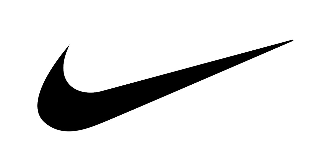
Of course if you really want the ultimate minimal logo, you'd be hard pushed to do better than Nike's swoosh. Famously created by design student Carolyn Davidson for a whole $35 (she was handsomely rewarded for her contribution to the Nike brand later on) the swoosh is a simple but unmistakable shape that demonstrates just how much you can achieve with well-executed stroke – or a pair of Bézier curves.
Inspired by a wing in reference to the Greek goddess of victory, Nike, the swoosh, like the most recent Mastercard logo, doesn't need any other Nike messaging to communicate exactly which brand it's talking about, and its elegant minimalism means that it scales effortlessly for all possible uses. For a logo designed back in 1971 which has undergone only minimal adjustment since then, that's quite an achievement.
Related articles:
Sign up to Creative Bloq's daily newsletter, which brings you the latest news and inspiration from the worlds of art, design and technology.
Jim McCauley is a writer, performer and cat-wrangler who started writing professionally way back in 1995 on PC Format magazine, and has been covering technology-related subjects ever since, whether it's hardware, software or videogames. A chance call in 2005 led to Jim taking charge of Computer Arts' website and developing an interest in the world of graphic design, and eventually led to a move over to the freshly-launched Creative Bloq in 2012. Jim now works as a freelance writer for sites including Creative Bloq, T3 and PetsRadar, specialising in design, technology, wellness and cats, while doing the occasional pantomime and street performance in Bath and designing posters for a local drama group on the side.
