Mid-century modern design has been an enduring trend since its conception and thanks to its timeless appeal, it doesn't seem to be fading anytime soon. While many of us are familiar with mid-century modern furniture like the iconic Eames chair and George Nelson's lighting, the wider world of mid-century modern graphic design is a fascinating era inspired by art and culture.
Looking into the style's origins, from its early conception to the designers and artists that refined it, here's a whistle-stop tour of everything you need to know about mid-century modern graphic design. For more inspiration, check out our collection of iconic Mid-century modernism examples and take a look at the best graphic design books on branding, logos, type and more.
Mid-century modern graphic design: history
Broadly speaking, the much-beloved mid-century modern period in graphic design began in the late 1930s. Augmented by the opening of the ‘New Bauhaus’ School of Design in Chicago in the early 1940s, it stretched to around 1970, through the height of the Swiss International Typographic Style.
The movement was not only a sum of great creative minds, but a melting pot of recent historical events that catalysed a sense of radicality and possibility in the world of art and design. By the 1930s, the Industrial Revolution and evolution in printing technology had long since transformed the world in terms of mechanised print; ushering in a new era for advertising and a global proliferation of printed posters and billboards.

The era’s stylistic and ideological precursor, modernism – in art, literature and design – had arrived earlier in the 20th century as a rejection of Victorian principles and its ornate, highly embellished aesthetics. Favoured, instead, was a more direct and simple visual language.
The direct informants of mid-century modern design style include:
- The striking geometric modes of Russian Constructivists like El Lissitzky and Alexander Rodchenko
- Bauhaus school graphic designers, such as László Moholy-Nagy and typographer Herbert Bayer
- The advertising poster works by Kurt Schwitters, an artist more commonly associated with the Dada movement

The beginnings of mid-century modernism fall just before the outbreak of the second world war in 1939. Many American designers who weren’t conscripted worked on poster designs as part of the war effort, including Joseph Binder, whose poster was used to promote enlistments in the US Army Air Corps, and Lester Beall, with his 1942 propaganda poster Don’t Let Him Down.
Wartime was crucial to the development of the design style of the era in another way. It meant that many European designers were forced to emigrate, taking influences from the various radical and avant-garde movements of their home countries with them.
Many of these designers landed in the US – namely in cities like LA, New York and Chicago – bringing with them both their talents, philosophies and ideas (disseminated through a combination of work, collaboration and teaching), and concurrently the printed matter that ultimately informed the mid-century modern style.

Post-war, the style was most commonly used across advertisements, book covers, record sleeves and the famed corporate identity work by those bastions of mid-century modernism Paul Rand, Massimo Vignelli, Herb Lubalin, and Alvin Cohen and Elaine Lustig Cohen.
Rand quipped that “You can’t criticise geometry, it’s never wrong.” His statement is a telling one about the stylistic qualities of the designs of the movement, which favour clean lines, bold shapes, bright colours and a certain flatness that sees the constituent elements pared down to basic visual forms for simple visual communication.
Today, these principles seem more relevant than ever: design increasingly has to cut through the noise of our vast and confusing landscape of imagery and messages. Hence, the simple, direct flatness that mid-century modernism held at its core is more relevant, and more striking, than ever.
Mid-century modern graphic design: visual elements
Mid-century modern graphic design has a similar aesthetic to flat design, using geometric shapes, clean lines, bright hues and earthly palettes to create bold, reductive images. Marked by its ability to distill complex concepts into simple visual forms, mid-century modern graphic design has a number of distinguishable visual characteristics…
Use of shape

Many designers opted to use combinations of simple geometric shapes – circles, squares, rectangles, triangles – in various permutations to form an overall composition broken down to its simplest forms. Think: Herbert Leupin’s colourful 1952 poster for Swiss fountain pen manufacturer Pelikan. Detailing is sparse; imagery is pared back to its most direct form.
Typical colour palettes

Colour palettes from the era aren’t uniform. They vary from in-your-face, nursery schoolish primary and secondary tones (reflecting the fine art around the era, such as the work of Piet Mondrian); to more earthy combinations of olive, paprika, and gold; to more chintzy patterning of mint green, fuchsia and turquoise.
The dynamic interplay of bright colours and jarringly arranged geometric shapes seen in artist Josef Albers’ work can be seen as perfectly analogous to the work of the designers at the time.
His 1963 book Interaction of Color presented a pioneering exploration of colour principles that echo the work of the mid-century modern graphic designers – if you read one book on colour, make it this one.
Typography

Type of the era draws heavily on that of two pivotal schools of design before and concurrent to it: the Bauhaus and the Switzerland-born International Typographic Style.
Like much Bauhaus graphic work, mid-century modern lettering often uses playful shape-based letterforms for impactful typographic poster designs. Meanwhile, the influence of Swiss designers is seen by the mid century use of grids, asymmetric layouts and text aligned flush left, ragged right (left justified).
Type was more often than not a clean, geometric sans serif, with popular typefaces including Univers and Frutiger, designed by Swiss typeface designer Adrian Frutiger, as exemplified in the soft sans serif of Paul Rand’s logo for American Broadcasting Corporation (ABC).
Such type was often used alone, against simple shapes or cutout photographic imagery; though designers were known to use slab serifs and “fat faces”, such as in Elaine Lustig Cohen’s 1956 paperback cover design for Meridian Books, where a playful polka-dot scheme is used alongside Thorowgood italic.
Three iconic mid-century modern designers
So who were the champions of mid-century modern design? What was their most famous work? And why were their work/ideas so important? Here are three iconic mid century graphic designers to look to for inspiration…
01. Paul Rand
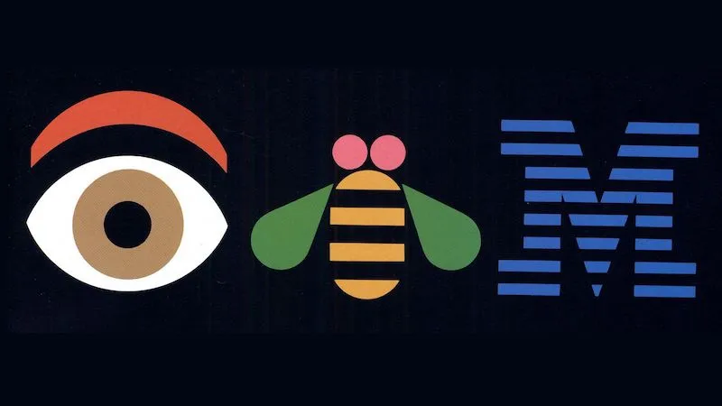
American art director and graphic designer Paul Rand turned the Swiss International Typographic Style into a vital tool in his corporate logo design arsenal. Rand created logos and packaging designs for companies including IBM, UPS, ABC and a whole load of other non-acronym-based brands, bringing a wild, newly creative and lively approach to such commissions.
John Dewey’s Art as Experience is said to have been a key text in shaping Rand’s theoretical standpoint, especially around the need for “functional-aesthetic perfection” in art and design. Art director and writer Steven Heller summed up Rand as “an enemy of mediocrity, a radical modernist”.
02. Cipe Pineles

In the male dominated landscape of 20th century design, Cipe Pineles carved a name for herself as one of the most exciting, prominent designers around, especially in the fields of editorial and print design.
As the first female art directors to work at a major magazine, Pineles created innovative work for publications including Glamour, Seventeen and Charm. The Austrian-born designer was hired as a designer at Vogue in the early 1930s. As the first female art director (in the US, at least) at Seventeen, Pineles broke new ground by commissioning fine artists to create illustrations for the publication, and Seymour Chwast was among the creatives she championed.
She also often created her own typography and illustrations for the magazines she worked for. Pineles was inducted into the Art Directors Club Hall of Fame in 1975.
03. Saul Bass

Though Saul Bass is responsible for iconic corporate logo designs including the 1969 Bell System logo, he’s most famous for his bold, and highly distinctive work on movie title sequences and film posters and worked with pretty much every major mid-20th century director, creating work for Alfred Hitchcock, Otto Preminger, Stanley Kubrick, Billy Wilder and Martin Scorsese.
His work is characterised by bright yet minimal use of colour, spiky silhouettes and hard-drawn typography and a brilliantly jarring sense of dynamism.
Mid-century modern graphic design resources
The Moderns: Midcentury American Graphic Design

Moderns: Midcentury American Graphic Design written by Greg D'Onofrio and Steven Heller offers a comprehensive, in-depth exploration of the men and women who invented and shaped mid-century modern graphic design in America.
As well as an in-depth introduction to the era, some 60 designers are profiled in the book's 336 pages, with generous illustrations and easy-to-read introductions to each creative and their work. This is a must-read for anyone interested in the graphic design of this period.

