Soothe the senses with clean and crisp imagery
Discover the new visual trend for calm, expansive imagery with plenty of room to breathe.
Sign up to Creative Bloq's daily newsletter, which brings you the latest news and inspiration from the worlds of art, design and technology.
You are now subscribed
Your newsletter sign-up was successful
Want to add more newsletters?
We've previously mentioned that the trend for authenticity in imagery, as noted by iStock, is on the wane. The real world can be depressing enough without being confronted by carefully stage-managed and edited representations of it in adverts, on print pages and online.
And while a reactive trend towards anti-authenticity is in full flow, teasing the senses with super-saturated tones and surreal, dramatic compositions, there's another visual movement going on that you need to know about, one that's less in your face and a whole lot more soothing to the senses.
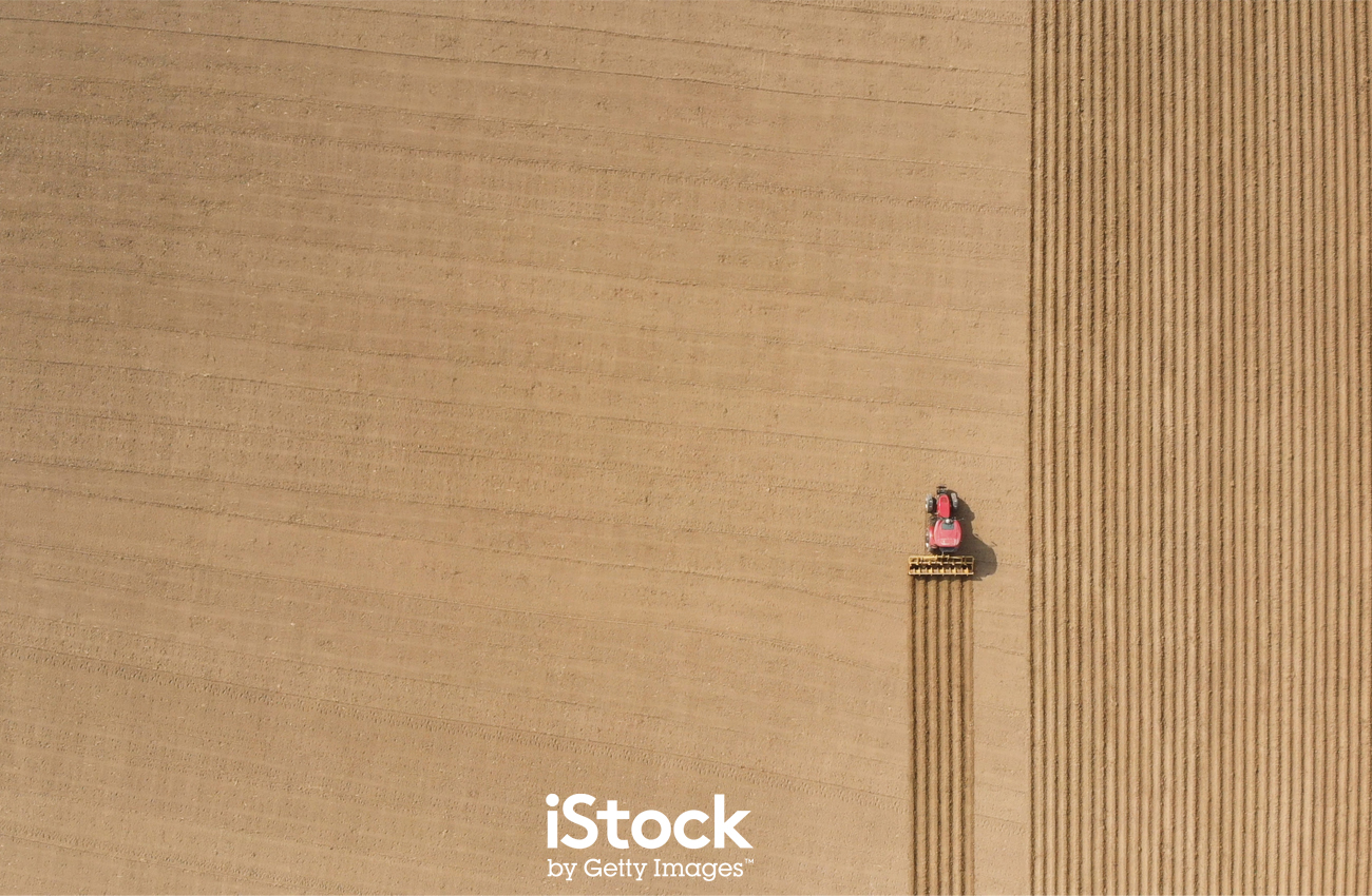
Designers have long been aware of the value of white space. Rather than overload a page or a spread with stuff, leaving sections of a layout empty can bring balance to a design and also draw attention to the important elements. It looks good and readers feel the benefit, too; a layout with plenty of white space is much easier on the eye than one where every square inch is crammed with content.
Article continues belowAnd the idea of white space works just as well in photography and illustration too, and that's the focus of this current trend identified by the experts at iStock by Getty Images. It's a movement towards clean and crisp imagery, featuring open and expansive shots with plenty of room to breathe.
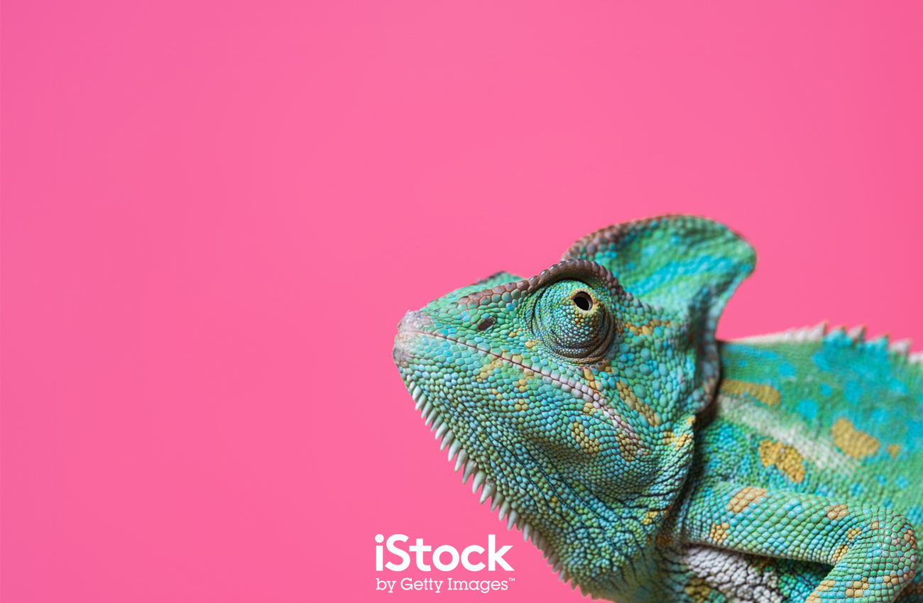
You can see it in shots that, rather than zoom right in on the subject, instead pull out to let what's often a very simple backdrop become part of the composition. It's a calming alternative to over-composed, cluttered imagery that overloads the senses and leaves little room for interpretation.
It's also a trend that's being fed by advances in technology; the rise in drone photography makes it much easier to take wide overhead shots that reduce the landscape to broad, impressionistic brush strokes, and people to minimal dabs of colour. When life feels overwrought, imagery like this can literally give the viewer a whole new perspective on life.

Clean, crisp imagery can provide an oasis of calm respite in a world where we're constantly being bombarded by content, and with its simplified colour palettes and copy space it also provides opportunities for designers to try out new and eye-pleasing ways to work their magic, whether they're working on print spreads or searching for full-screen background images for websites.
Sign up to Creative Bloq's daily newsletter, which brings you the latest news and inspiration from the worlds of art, design and technology.
Alongside its soothing aesthetic, there's another advantage to this clean and crisp trend, and that's down to the sea change over recent years in how we consume content. In the past designers could rely on their work being seen at full size, whether it was in print or online on desktop monitors. Today, however, your work is increasingly likely to be viewed on mobile devices, and while mobile screens are becoming ever-larger, they're still relatively tiny.
For rich, detail-heavy imagery, this is a problem, because once it's been squeezed onto a mobile screen it's going to lose much of its impact. Web layouts can be incredibly busy, packed with content and ads all clamouring for your attention, and with so much visual noise going on you need your imagery to pack all the impact that it can muster.
That's where some well-chosen, impeccably-framed visual simplicity is worth its weight in gold. It cuts through the clutter and gets your message across instantly, rather than being just one more voice in the visual hubbub.
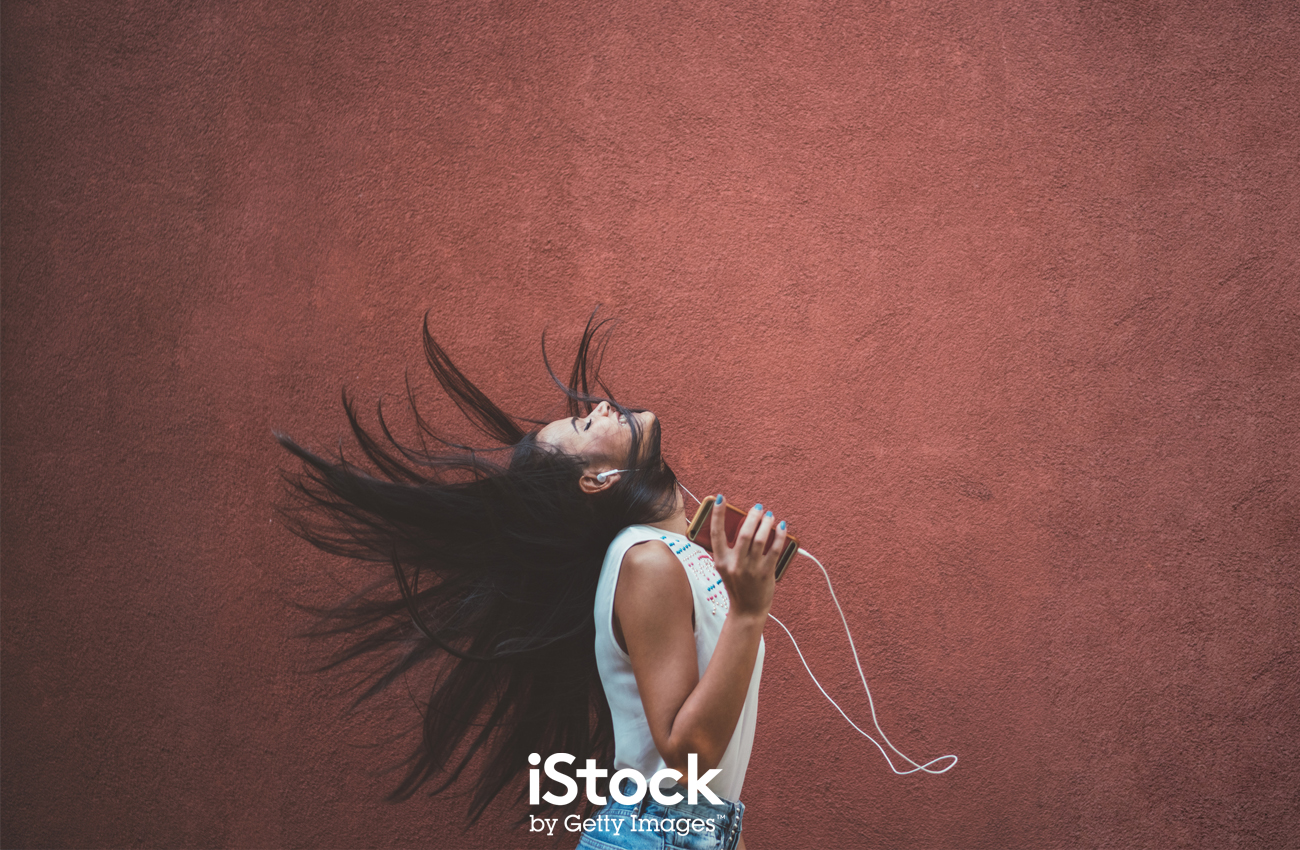
If you want to take advantage of this trend and bring some calm to your designs, iStock can help you with a vast collection of imagery that won't swamp the senses. Save 10% off any credit pack by using the ISTOCK10 code before 30 September 2019.
If you'd like to read more of the trends identified by iStock & Getty Images, you can read about them here.
Jim McCauley is a writer, performer and cat-wrangler who started writing professionally way back in 1995 on PC Format magazine, and has been covering technology-related subjects ever since, whether it's hardware, software or videogames. A chance call in 2005 led to Jim taking charge of Computer Arts' website and developing an interest in the world of graphic design, and eventually led to a move over to the freshly-launched Creative Bloq in 2012. Jim now works as a freelance writer for sites including Creative Bloq, T3 and PetsRadar, specialising in design, technology, wellness and cats, while doing the occasional pantomime and street performance in Bath and designing posters for a local drama group on the side.
