8 cool annual report designs
Annual reports don't have to be dull. Take a look at these inventive examples for inspiration.
Sign up to Creative Bloq's daily newsletter, which brings you the latest news and inspiration from the worlds of art, design and technology.
You are now subscribed
Your newsletter sign-up was successful
Want to add more newsletters?
Five times a week
CreativeBloq
Sign up to Creative Bloq's daily newsletter, which brings you the latest news and inspiration from the worlds of art, design and technology.
Once a week
By Design
Sign up to Creative Bloq's daily newsletter, which brings you the latest news and inspiration from the worlds of art, design and technology.
Once a week
State of the Art
Sign up to Creative Bloq's daily newsletter, which brings you the latest news and inspiration from the worlds of art, design and technology.
Seasonal (around events)
Brand Impact Awards
Sign up to Creative Bloq's daily newsletter, which brings you the latest news and inspiration from the worlds of art, design and technology.
Annual reports are something of a staple for graphic designers, and they've gained a bit of a reputation as the kind of project that pays the bills and paves the way for more exciting work. But annual reports don't have to be dull. With a little imagination, you can create something you'll be proud to put into your design portfolio.
In the following examples, designers have put in a little extra effort to turn reams of data and dry stats into something altogether more beautiful that expresses the brand it's been designed for. These annual reports stand out thanks to creative print effects, interesting new formats or quirky design touches. For more tips on working with data, take a look at our roundup of the best infographics.
01. Chung Ying Theatre Company 2018
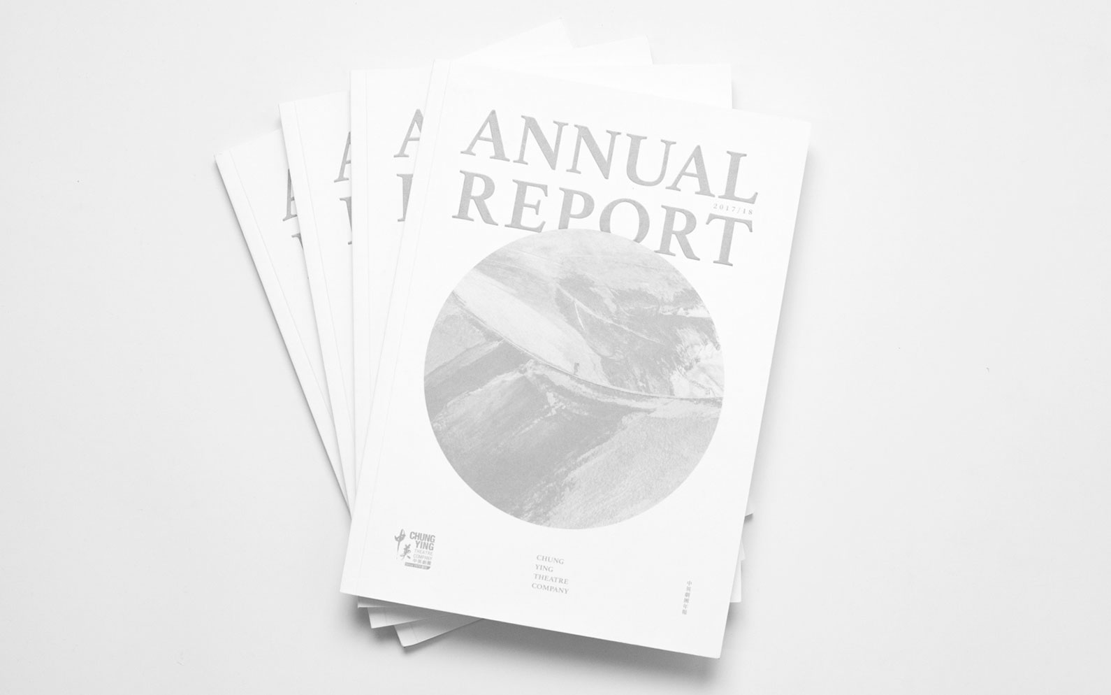
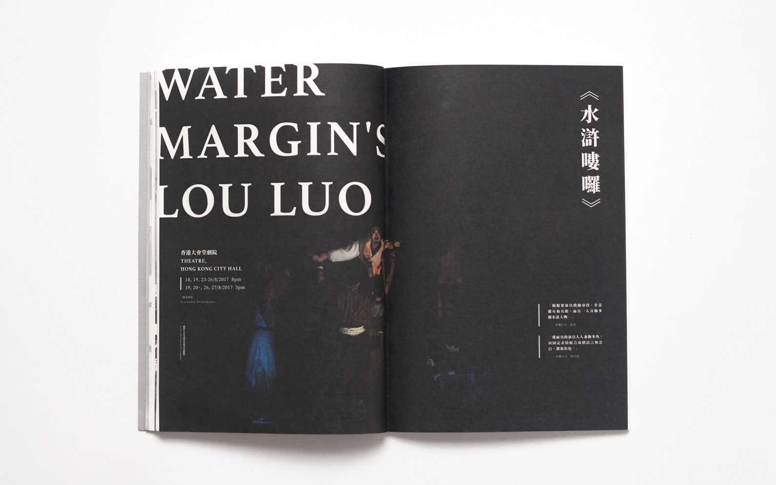
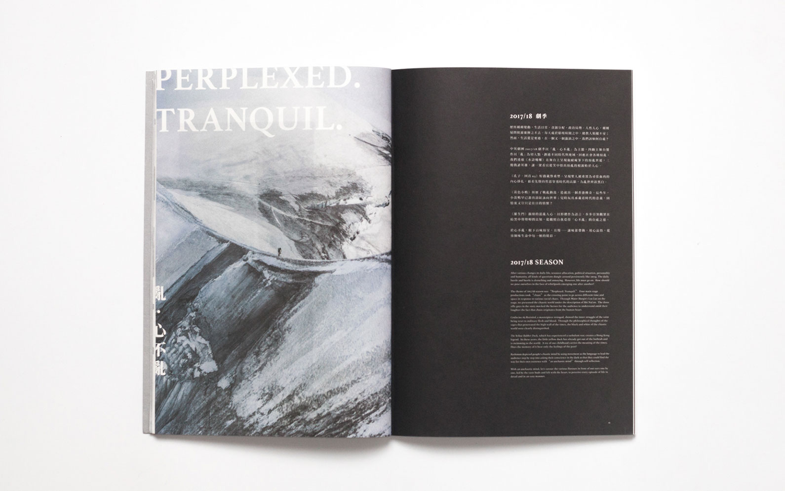
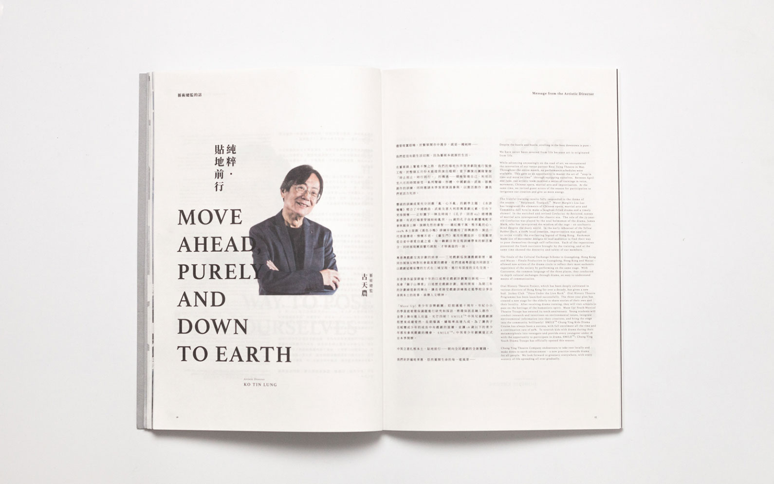
Hong Kong-based Orange Chan Design put together this striking annual report for Chung Ying Theatre Company using Adobe Illustrator and InDesign. The bold, experimental use of typography is what really helps this stand out; the page layouts combine Chinese and Latin characters with headlines that are oversized, misaligned or set at jaunty angles. A mainly greyscale colour palette helps ensure the brochure always looks balanced and clean.
02. YWCA USA
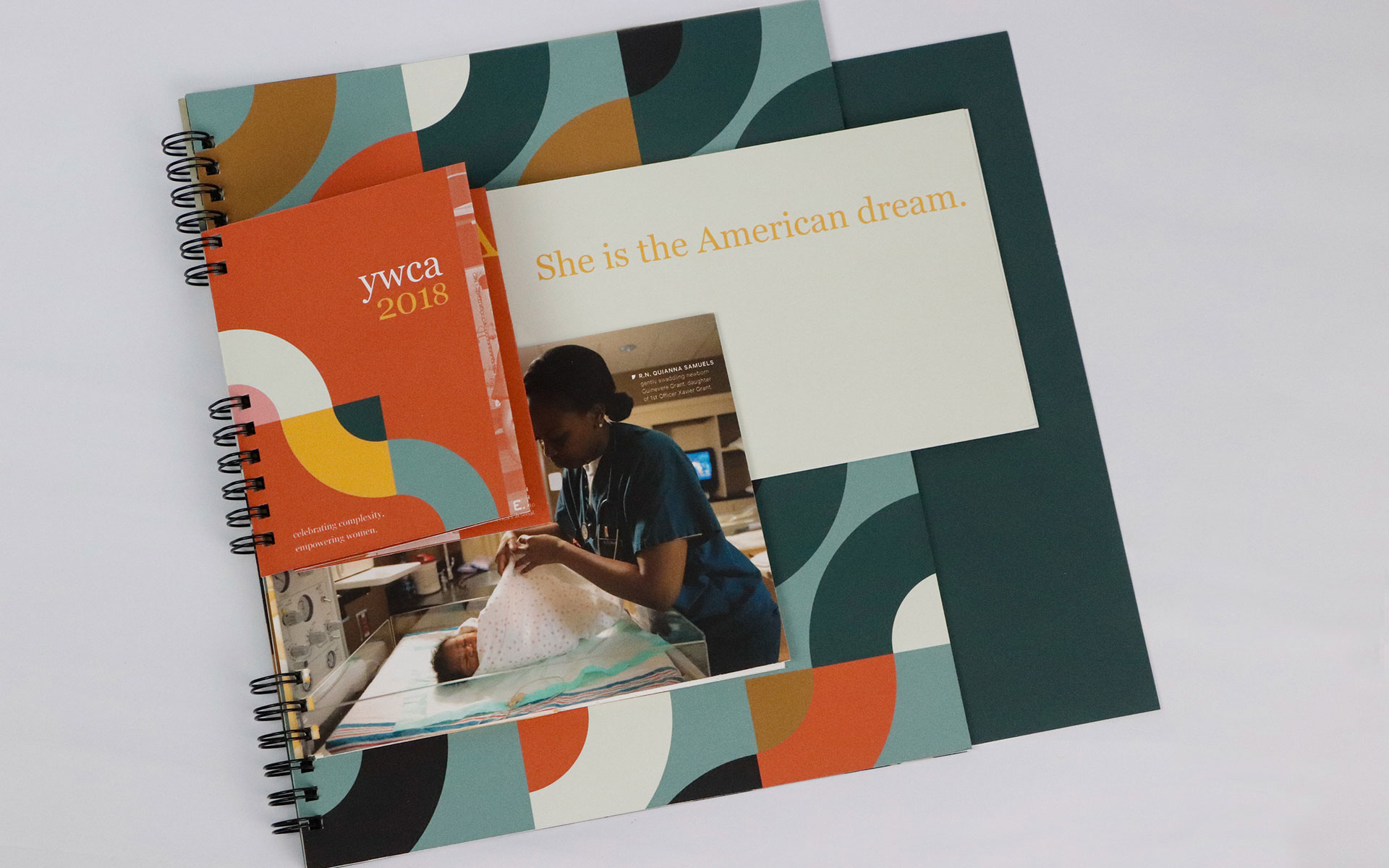
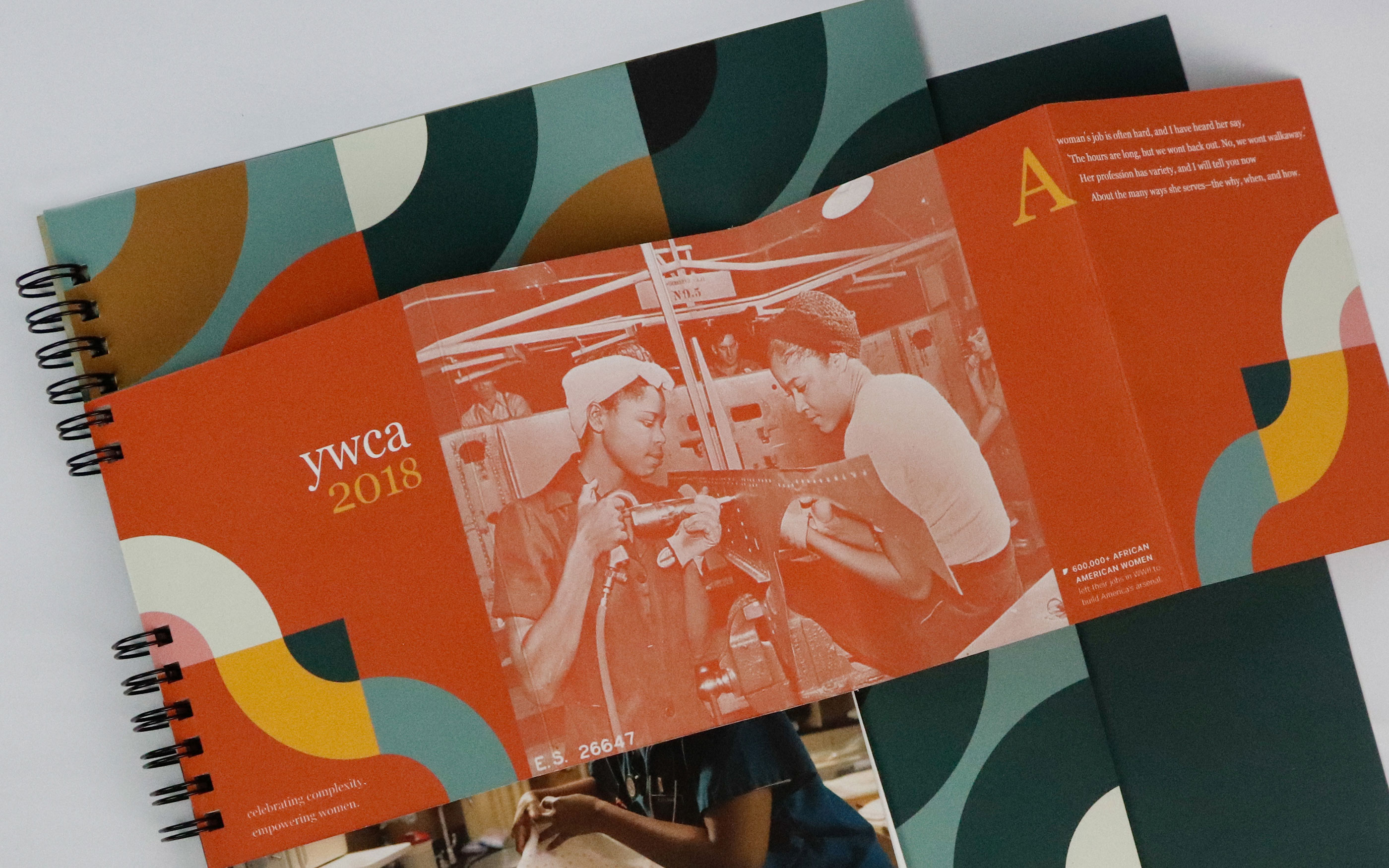
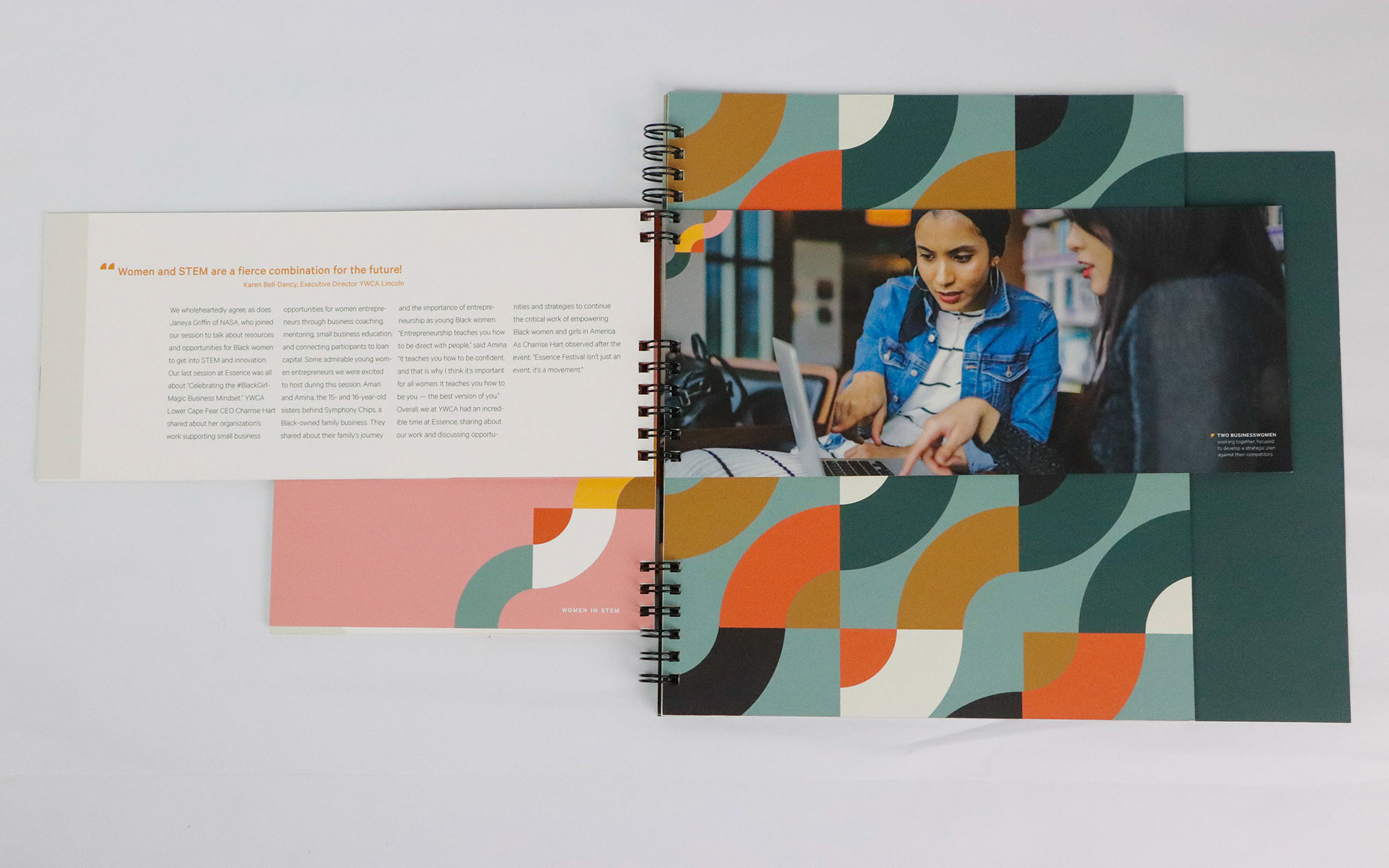

YWCA USA is an organisation dedicated to eliminating racism and empowering women. This brochure, by graphic designer Sharon Mathew, pushes the boundaries of what you'd expect from an annual report design. Elements of different shapes and sizes are combined, with a colourful wave pattern helping to visually connect each of the elements. "This brochure aims to reflect the intricacies of women – such as through its complex binding/sizing and the structured yet organic use of shapes," explains Mathew on Behance.
03. Neenah Paper Inc.
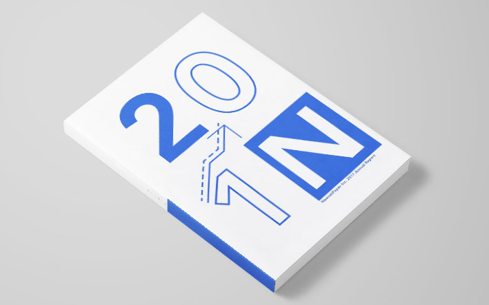
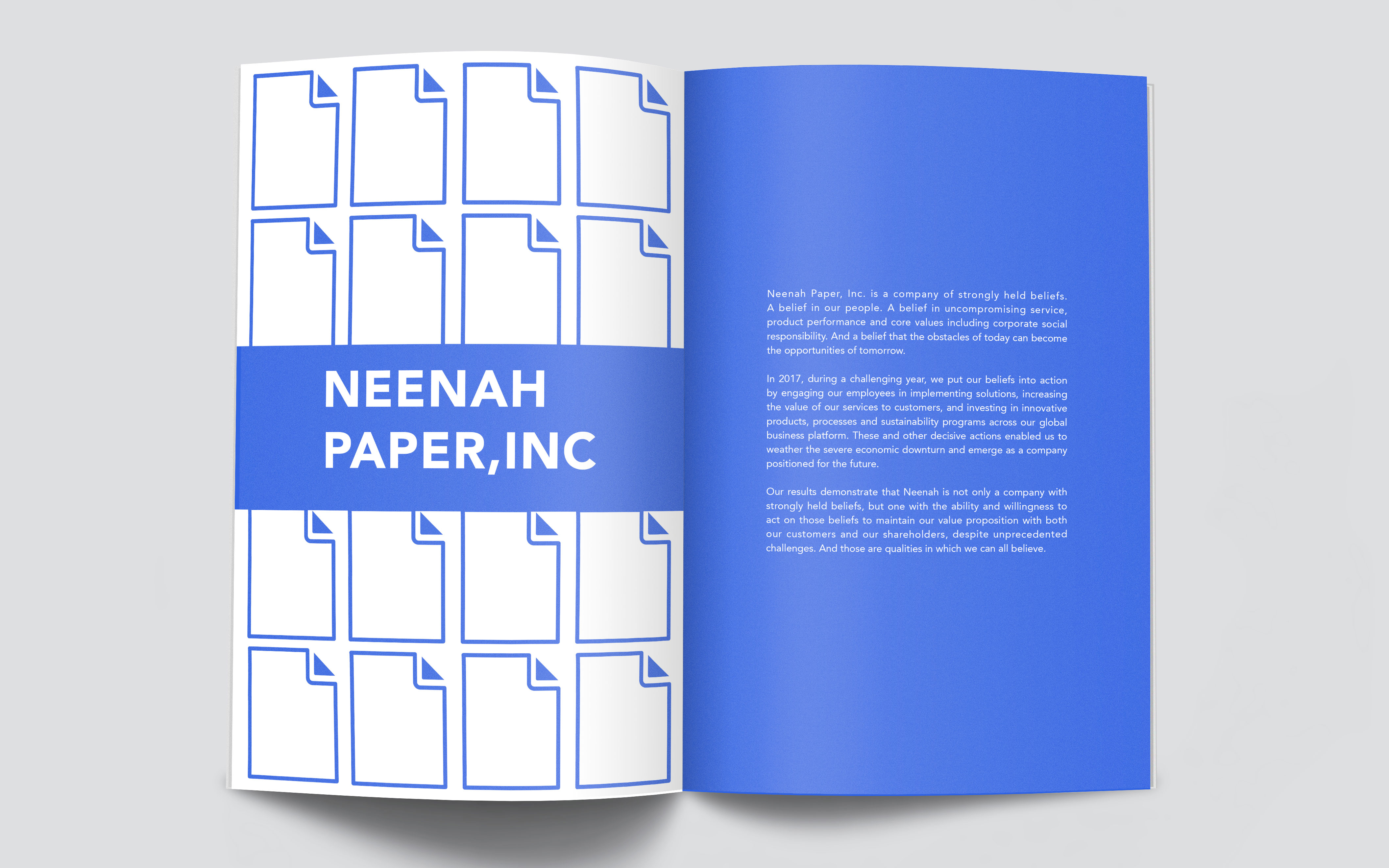
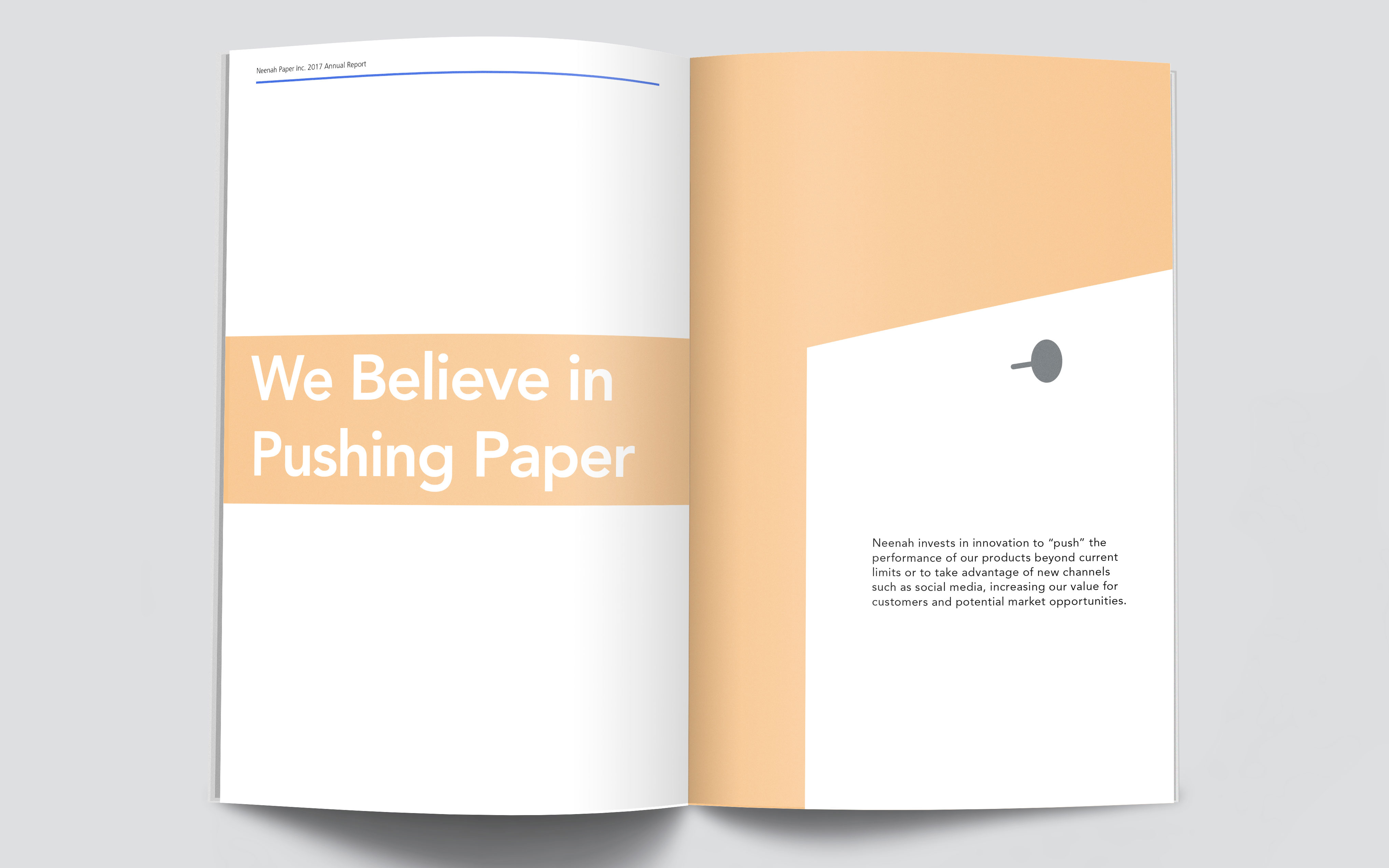
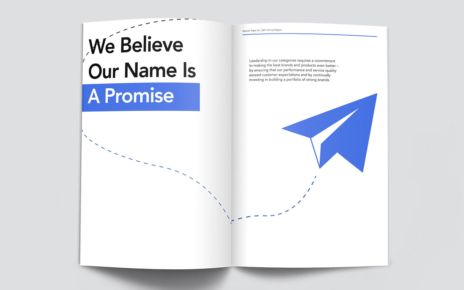
Designer May Moon created this 64-page 2018 annual report for premium paper company Neenah Paper. Moon kept things neat with simple character illustrations and a minimal colour palette of mainly peach and a vibrant blue. Large, graphic illustrations enliven the section openers and help break up the content.
04. Toronto International Film Festival
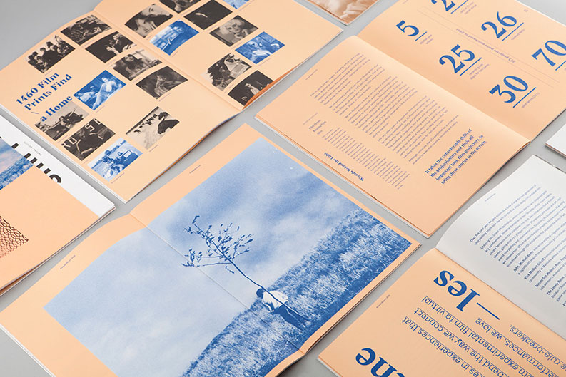
Guaranteed to catch the eye with its limited, on-trend palette, the 2017 annual report for the Toronto International Film Festival (TIFF) was conceived as a love letter to cinema and an ode to a respected cinematic organisations. Blok Design paired bold verbs with unexpected concepts – such as 'Inspire time' and 'Shift dreams/reality' – to capture TIFF's spirit, and to inform the rest of the annual report's cinematic design.
05. O’right Corporate Social Responsibility Report
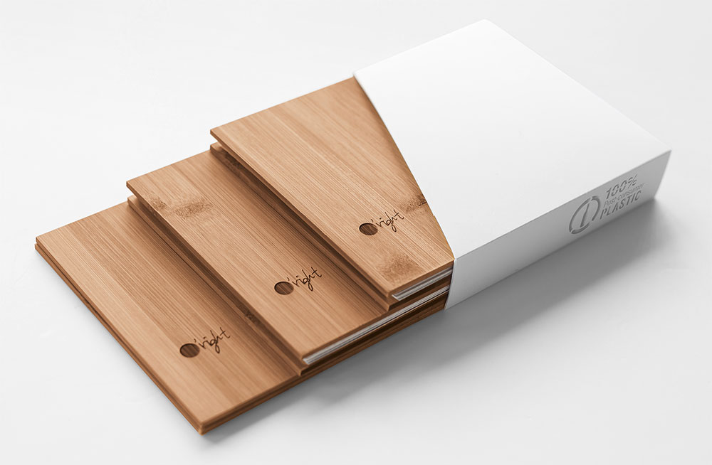
Taiwanese haircare brand O-right is committed to sustainability, which it illustrates in this sumptuous yet environmentally friendly report, produced in-house. Packaged in 100 per cent recycled plastic and bamboo covers, the Red Dot Design Award-winning report is comprised of three booklets focusing on the responsible use of soils, oceans and forests, with handmade bindings and hand-drawn habitat art on the back.
Sign up to Creative Bloq's daily newsletter, which brings you the latest news and inspiration from the worlds of art, design and technology.
06. Kickstarter
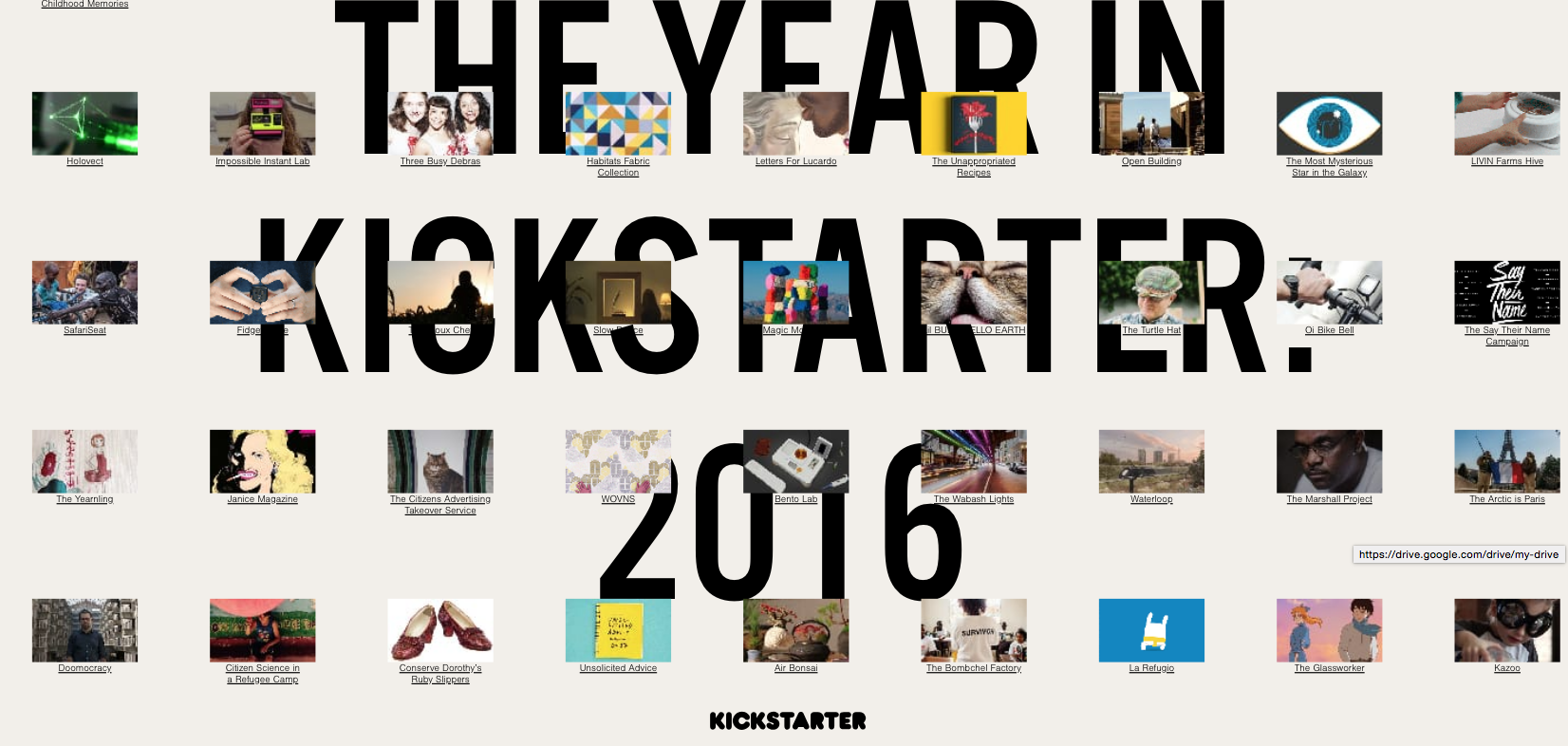
Kickstarter has a tradition of shunning printed reports, and back in 2016 it decided to present its 2016 annual report as a fully interactive website. The creation shows off Kickstarter's highlights of the year through a combination of eye-catching headlines and figures, big visuals and simple hand-drawn animations, with links through for readers to explore more.
07. Flywheel
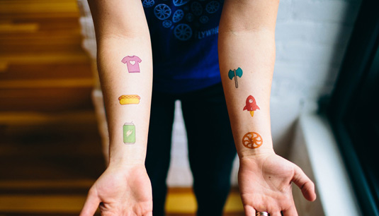
2015 was an epic year for the Wordpress hosting and management platform Flywheel, with one of the co-founders getting the company's logo permanently tattooed onto his forearm. To celebrate this cool act of commitment, Flywheel whipped up a free set of temporary tattoos to sum up what the company had done that year, and offered them alongside its annual report. Having set that precedent, it followed up in 2016 with a competition to win a free designers T-shirt on its 2016 annual report page, itself a beautiful parallax scrolling web page.
08. Seguros Pelayo
An innovative take on reporting facts, figures and other corporate information from the now defunct studio Biografica, this annual report from back in 2012 for Spanish insurance firm Seguros Pelayo featured everything from cut-out figures to an impromptu papercraft football match, all delivered in stop-motion animation. This is a great example of how a slick delivery can make even the most straightforward information appear more engaging.
Related articles:
- The best free fonts
- The best print adverts
- 33 beautiful examples of paper art

Kerrie Hughes is a frequent contributor to Creative Bloq, and was once its editor. One of the original CB crew, Kerrie joined the team back in 2013 after moving from her role as staff writer on 3D World. Since then she's written regularly for other creative publications such as ImagineFX, Computer Arts and Digital Camera World. After a stint working for the police, Kerrie is back reviewing creative tech for creative professionals.
