How to design a top-quality icon
Eugeniu Clim, interaction designer at ustwo, brings you a masterclass in icon design – including how to tackle the challenge of building upon an existing icon style like the agency did for the Tesco Hudl tablet.
Sign up to Creative Bloq's daily newsletter, which brings you the latest news and inspiration from the worlds of art, design and technology.
You are now subscribed
Your newsletter sign-up was successful
Want to add more newsletters?
What does it take to create a good icon? Well, of course, for quick inspiration you could do a Google image search and create a simplified version of a common object associated with the icon's function, or you could even take a look on Iconfinder.

"Keep in mind that this is a short-term fix only," says Eugeniu Clim, interaction designer at leading UI/UX agency ustwo. "To achieve consistently good results with icon design, it's important to stick to the proper process." Clim goes on to say that the icon design process unsurprisingly has similarities with the widely used user-centered design process (click here for more info).
Ustwo was hired to design and implement a world-class user experience for Tesco's new Hudl 7in Android tablet. Part of this was designing an effective icon system. So with that in mind, let's look at Clim's three-step process for designing icons.
Article continues below01. Discovery Stage
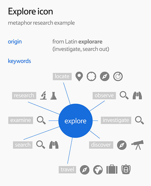
This is where you analyse the brief, define keywords for each icon and then try to find the perfect representation or a metaphor for those keywords. You'll be looking for images and symbols that have a direct association with the concepts you need to communicate.
Real-world objects should be depicted in their most recognisable manner, with activities shown as actions performed on related objects. For more complex concepts, abstract shapes, and symbols will help. With rough sketches and ideas of what to draw for each icon you'll be ready to begin the second phase.
02. Design Stage
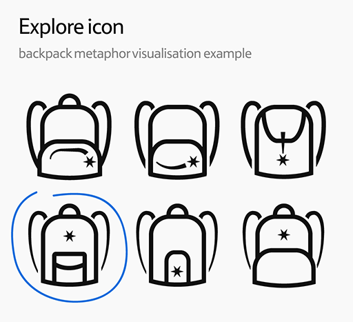
Where you separate the proverbial wheat from the chaff, as you bin the metaphors that don't work and visualise those that do. Mood boards will help convey the sought after look and feel, the visual style can then be decided upon, whether it's realistic or simple, 3D or flat for example.
The appropriate level of detail is crucial. If it's insufficient the outcome is likely to be a poor icon, which will in turn affect how easily recognised it is. Excessive detail will be a distraction and again affect how easily recognised the icon is. Once decided, the icons are ready for testing.
Sign up to Creative Bloq's daily newsletter, which brings you the latest news and inspiration from the worlds of art, design and technology.
03. Implementation Stage
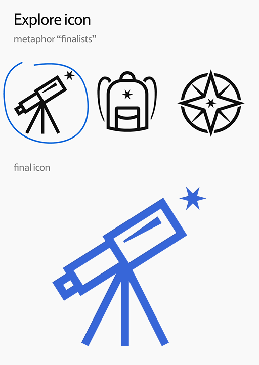
Where the icons are tested within the actual interface, feedback is gathered before heading back to the drawing board. This cycle is repeated until the final look is achieved (or until the tight deadline is met) and then exported. The saying, 'A painting is never finished, you just stop working on it' can be easily applied to the icons.
Building on existing icons
So the three-step process is relatively straightforward to follow, but what happens when you’re tasked to build upon an existing icon style? "This was the situation we faced with the icons for Tesco's Hudl tablet," says Clim. "The brand book we received contained icon examples in an established style that perfectly matched the brand visuals and we had to expand on it."
Clim continues: "In theory, matching an existing icon style instead of creating it from scratch is easier, as the discovery and a good part of the design stages have already been completed." However the Hudl job was a little more complex. "Without proper guidelines, extracting the visual style components and traits from icon examples can be similar in task to attempting to decode an unknown cipher.
"In a way you have to reverse engineer the existing style by looking for colours, line width, visual weight and corner radius, etc - basically all those little details that in the end create a 'family' feel for the icons," says Clim.
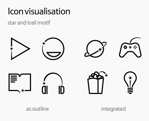
Another challenge was ensuring that the established style easily scaled to a variety of new motifs. "We distinguished two groups of icons by the star-trail style implementation: the first used the star and its trail applied to the icon outline, the other had the star-trail embedded within the motif," continues Clim.
"The second approach was obviously harder to nail, but we felt the star and the trail needed to be an integral part of the icon, instead of dictating the icon shape itself. We then applied the enhanced icon style to the new metaphors as well some of the existing ones. The outcome can be seen in the Hudl tablet launcher app."
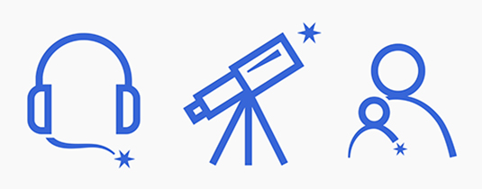
Following a systematic approach in icon design ensures a consistent end result and a strong logic behind it. "This is a must when selecting the choice of metaphor and your design decisions," emphasises Clim. "Firing up Photoshop and seeing how it goes isn’t the solution."
Here are Eugeniu Clim's top tips for creating brilliant icons for any usage…
01. Icons are not pictures
This is something a lot of designers tend to forget. By focusing mostly on aesthetics and adding a lot of unnecessary details you may actually make the icon less recognisable! The famous principle of form follows function should be applied here, too. The icon should be simple and recognisable at a glance.
02. Not all icons are created equally
Some metaphors are difficult enough to explain in words, let alone illustrate. So be prepared that certain icons will be more obvious than others. It's perfectly normal for users to have to become familiar with certain icons, and if by the second encounter those icons are easily recognised, then your mission has been accomplished.
03. Do your research
Nailing the right metaphor can be difficult. Sometimes you'll need to dig deep and research to come up with something truly worthy. Search thesaurus.com and synonyms.com for icon-related keywords. Run those keywords against images.google.com and iconfinder.com to see how they are expressed graphically. Use sites like designspiration.net and behance.net for visual style mood boards.
04. Know the context
Knowing the context of the icon usage is crucial. Ask the client for interface screenshots or the possibility to test the icons within the UI. Designing icons without seeing how they look in situ is like colouring in, in the dark.
05. Sketch early
Sketching saves a lot of time as it instantly shows which metaphors are worth exploring further and which should be scrapped. Sketches and drawings are a great way to get inspired, but it makes sense, especially when you're working on smaller icons, to sketch directly in Illustrator/Photoshop. Paper sketches obviously don’t capture how the icon will behave on screen in real size.
06. Beware of obsolete metaphors
Some icon metaphors age gracefully, representing a certain functionality even when the real world object it visually refers to is no longer in mainstream use. A good example of this is the old reel movie camera, which is used a lot as a video chat icon. Other metaphors don’t get better with time, for example the floppy disk motif to signify the saving of data and a CD motif used to access a music library. Avoid dying metaphors.
07. Start big or start small?
There are two approaches for deciding on the initial size when drawing an icon. The first is to start with the biggest size - the logic being that it requires the highest level of detail, therefore making it easier to downscale and simplify. The second approach is to start with the default size used in the interface, and then upscale/downscale from there.
08. Create an icon family
Instead of trying to design each icon as a separate entity, think of the icon as a part of one family. Be consistent with details like outline thickness, corner radius, shadows, colours and so on. Also be consistent with metaphors when working on related icons, as all this will pay off when the icons are utilised within the interface, providing a uniform look and feel.
09. Trust your eyes
Icons come in various shapes and sizes from tall and short, to thick and narrow - so making them fill the entire icon area is a mistake. Instead they must be individually scaled to ensure uniform visual weight, and the same goes for alignment. On some occasions centring the icon optically would mean moving it off the geometrical centre, so trust your eyes and not necessarily pixel value.
10. Test icons in group
Group testing is the easiest way to spot problematic icons. Just place all the icons together and any alignment/visual weight issues will become immediately obvious. Another tip is to slightly blur the icons to test their recognisablity at a glance.
11. Be prepared
Finally, be prepared to stand up for all your design decisions. Icon design is prone to design by committee with everyone involved usually having a strong and often contradictory opinion on the matter. The final choice can be dictated by politics and unfortunately not the design process. But do all you can!
Words: Rob Carney
Liked this? Read these!
- Free icon sets for designers
- Free graphic design software available to you right now!
- The 100 best free fonts
Do you have any tips to add? Go ahead and share them with us in the comments below.

The Creative Bloq team is made up of a group of art and design enthusiasts, and has changed and evolved since Creative Bloq began back in 2012. The current website team consists of eight full-time members of staff: Editor Georgia Coggan, Deputy Editor Rosie Hilder, Ecommerce Editor Beren Neale, Senior News Editor Daniel Piper, Editor, Digital Art and 3D Ian Dean, Tech Reviews Editor Erlingur Einarsson, Ecommerce Writer Beth Nicholls and Staff Writer Natalie Fear, as well as a roster of freelancers from around the world. The ImagineFX magazine team also pitch in, ensuring that content from leading digital art publication ImagineFX is represented on Creative Bloq.
