How to create a layered parallax effect on your site
Create impact on your homepage with motion effects.

Sign up to Creative Bloq's daily newsletter, which brings you the latest news and inspiration from the worlds of art, design and technology.
You are now subscribed
Your newsletter sign-up was successful
Want to add more newsletters?
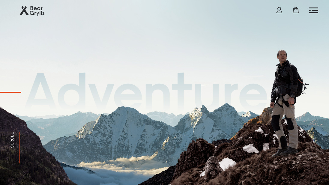
Parallax motion, the concept of moving layers at different speeds, has been used for years in animation. The official website of Bear Grylls (one of our favourite parallax scrolling sites), takes the effect in new and interesting directions. The background mountains scale down into position, while fading up so that they become fully opaque, and in the background of the page, the text ‘adventure’ rises up into place behind the mountains as it fades in.
For more inspiring motion effects, check out our guide to the best CSS animations and how to code them.
The Bear Grylls site design is the work of UK creative marketing agency Outpost, and with a target audience ranging from 16 to 55 years of age, and over 7 million followers worldwide, they had a serious task on their hands.
Article continues below"The main feature of the website was the homepage; we wanted visitors to literally jump into the screen and join Bear on his adventures," explain co-founder Chris Wilcock and creative director Dan Williams. "To achieve this, we utilised some clever transitions, coupled with edited videos, dramatic imagery and the overall language on the site."
See the site in action at www.beargrylls.com. In this article, we'll explain how to recreate the effect on your own sites. Start by downloading the tutorial files.
01. Create the scaling effect
The structure to allow all of the animating content to work is relatively simple. A wrapper holds everything, and hides any overflow content. Then there are essentially three layers of div tags over the top.
<div class="wrapper">
	<div class="pos text"></div>
	<div class="pos mountain1"></div>
	<div class="pos mountain2"></div>
</div>
02. Start the CSS
To make the design, the background gradient image will be added to the body and set to fill the size of screen. The wrapper holds all of the layers, and the overflow for content is hidden so that scaling effects can be applied.
Sign up to Creative Bloq's daily newsletter, which brings you the latest news and inspiration from the worlds of art, design and technology.
body {
		margin: 0;
		padding: 0;
		height: 100%;
		background: url(img/bg.jpg)
		center center;
		background-size: cover;
	}
	.wrapper {
		width: 100vw;
		height: 100vh;
		position: relative;
		overflow: hidden;
	}
03. Position each layer
The next code ensures that each layer is positioned absolutely, one over the other, inside the wrapper. The size of this fills the viewport width and height so the images fill the screen.
.pos {
		position: absolute;
		top: 0;
		left: 0;
		width: 100vw;
		height: 100vh;
	}
04. Add the text
The text class really just adds the right image, and sets its start position before animating it into place using the moveUp keyframes that will be added in the final step.
.text {
		background: url(img/text.png)
		center center;
		background-size: cover;
		transform: translate3d(0, 30px, 0);
		opacity: 0;
		animation: moveUp 1.8s ease-out;
		animation-fill-mode: forwards;
	}
05. Animate the first mountain
The first mountain is the one further away from the screen, and this will get a small scaling that will be animated. The opacity of all the layers is also set low so that they appear in place.
.mountain1 {
		background: url(img/mountain1.png)
		center center;
		background-size: cover;
		transform: scale3d(1.1, 1.1, 1.1);
		opacity: 0.2;
		animation: scaler 1s ease-out;
		animation-fill-mode: forwards;
	}
06. Animate the foreground mountain
The mountain for the foreground is almost identical to the other mountain — it just does much more of a scale into place. Both mountains share the ‘scaler’ keyframes for their animation.
.mountain2 {
		background: url(img/mountain2.png)
		center center;
		background-size: cover;
		transform: scale3d(1.3, 1.3, 1.3);
		opacity: 0.1;
		animation: scaler 1.2s ease-out;
		animation-fill-mode: forwards;
	}
07. Add keyframe animation
The keyframes are now created that specifies that. at the end state of the movement, this end state will be held in place. The text is moved up, and the mountains are scaled down, to fit into the design.
@keyframes moveUp {
		100% {
			transform: translate3d(0, 0, 0);
			opacity: 1;
		}
	}

@keyframes scaler {
		100% {
			transform: scale3d(1, 1, 1);
			opacity: 1;
		}
} 
This article was originally published in issue 289 of Web Designer – on sale now. Subscribe here.
Read more:

Web Designer is the premier magazine for aspiring online creatives and industry professionals. The monthly title offers cutting-edge practical projects spanning XHTML, CSS, Flash and WordPress as well as hosting features and interviews with the web community’s most influential people. Each issue also has a dedicated Industry section covering news and views from the trade, website showcases featuring the finest design talent and a free CD of valuable resources.
