Dos and don'ts for delightful web animations
Golden rules for mastering motion in your UI designs.

Sign up to Creative Bloq's daily newsletter, which brings you the latest news and inspiration from the worlds of art, design and technology.
You are now subscribed
Your newsletter sign-up was successful
Want to add more newsletters?
We're finally getting to a stage where brands are recognising the power of web animation. We've already gathered together the best CSS animation examples and shown you how to code them, but in this article we're going to share some top tips for getting more from motion in your UI design projects.
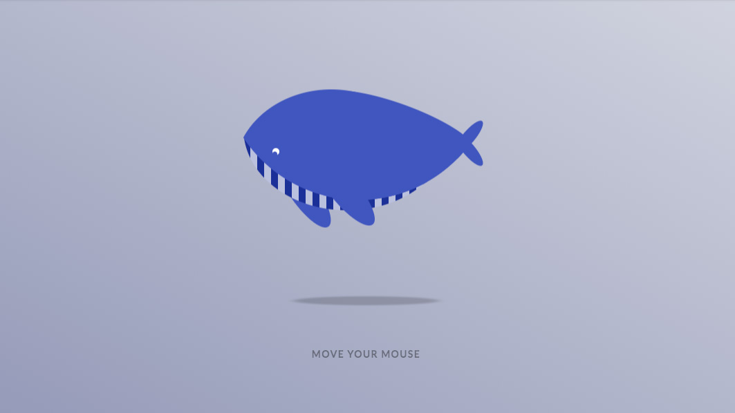
Lisi Linhart is a creative developer who specialises in creating interactive, moving things on the web (see the colour-changing whale above in action). At Pixel Pioneers, she took to the stage to explain to the audience how to keep animations performant across browsers, and showcase the different animation options we have on the web today. We caught up with her afterwards to hear some more top tips.
DO keep things consistent with design systems
Linhart has noticed a rise in the use of design systems to help control the use of animation across a project. These systems outline and define the kinds of animation that appear in different types of page within a site – for example, on the product pages.
Article continues below"Consistency is getting more important, and having an overall view of all your animations is also important," Linhart summarises.
DON'T include animations for the sake of it
"A lot of people incorporate animations but they don't think about the usability of the animations," says Linhart. "Figuring out what goal an animation has and if it is actually useful is very important, instead of just building an animation to have an animation."
Design systems can be beneficial in this regard, too. When you decide the different types of motion, they are linked to the different purposes within the interface.
DO consider different devices
Depending on the role animation is going to play in your product, you can introduce different approaches based on device used. For desktop experiences you could add effects that react to mouse events, for example, while a mobile experience might have animations triggered by the movement of the device.
Sign up to Creative Bloq's daily newsletter, which brings you the latest news and inspiration from the worlds of art, design and technology.
Alternatively, you might want to keep things simple, says Linhart, and create global animations that are tied to the workflow and are appropriate regardless of the device being used.
DON'T force animations on users
There are a number of reasons why a user might want to turn off motion – for example, parallax scrolling can cause motion sickness. Users that don't want UI animations can select a reduced motion experience in their browser. Thanks to the Web Animations API, it's now easy to provide an alternate experience using JavaScript; you can stop animations within your design, or skip them all animations to their ending state. Animations are great, but don't force them on people that don't want them!
DO pay attention to existing mental models
There are certain mental models, based on real-world physics, that dictate how we expect objects to behave and how we react to certain movements. For example, a wiggly motion will trigger a user's attention, while a slow fade will often go unnoticed.
"Animation can be used in combination with mental models, and you can use them to make your animation look better or to explain something," says Linhart. A good place to start is with the classic 12 principles of animation.
DON'T forget your audience
The number of animations you include in your interface should be strongly influenced by the audience you're aiming for, says Linhart. While lots of bouncy motion might help keep a young audience engaged and excited by your product, an older audience might find it distracting and off-putting as they try to absorb the content at their own pace.
DO stick to Transform and Opacity
Linhart explains that there are four animation types that can be processed cheaply using CSS: changing an object's position, scaling it up or down, rotating it, and altering its changing opacity (fading in and out). Of these, CSS Transform and Opacity are the most performant. Bear this knowledge in mind when designing your UI animations, for smooth and user-friendly experiences.
DON'T make animations too long
Getting the timing of your animations right is all-important. "You shouldn't time animations too long, because your user is trying to do something, and if you have really long animation timings, that will hinder them," points our Linhart. "So keeping the animations short in interfaces is important."
There's a caveat though: if you're animating a transition, you might go for a slower animation, so as not to attract unnecessary attention.
Read more:

Ruth spent a couple of years as Deputy Editor of Creative Bloq, and has also either worked on or written for almost all of the site's former and current design print titles, from Computer Arts to ImagineFX. She now spends her days reviewing small appliances as the Homes Editor at TechRadar, but still occasionally writes about design on a freelance basis in her spare time.
