Figma is a graphics tool for UI designers. It has a simple interface and enables you to collaborate on work with your teammates. If you want to work offline, you can choose to use the desktop app. Alternatively, Figma works on any operating system (hello, Windows), so you don't have to install anything at all. And getting started is easy – you can import your previous layout designs from Sketch.
In Figma, you can create everything you need for your interface, from illustrated vector icons to custom layouts. Multiplayer editing could save much time for design teams, as it means all team members can work on the same layout at the same time. And these aren't even all of its great features.
In this tutorial I'll show you how to get set up with Figma, then walk through how to create a mobile app screen, step-by-step. In this case, we'll be designing the dashboard for a fictional statistics app. When you're done, you'll be able to create different interfaces in Figma and work on them with your team in real time.
01. Sign up
First of all, you need to sign up at www.figma.com. Decide if you want to use the tool in your browser or download the desktop app. To download the desktop version, go to the hamburger menu in the top left corner and click on 'Get desktop app' .
02. Create an artboard and grid
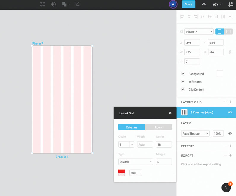
Hit A to create an artboard. You can choose one of the presets or create your own custom size. For this project, we're going to use Phone > iPhone 7 (375x667px) . To create a grid, first select the artboard. Then on the right-hand sidebar find 'Layout grid' and press '+'. Set up column count: 6, gutter: 16, margins: 8 and type: Stretch.
03. Draw a rectangle for the background
Let's start with the background. Press R to bring up the Rectangle tool and draw a rectangle #5F98FA with no borders. Set the dimensions to 375x363 using the properties panel on the right hand side.
04. Add a status bar
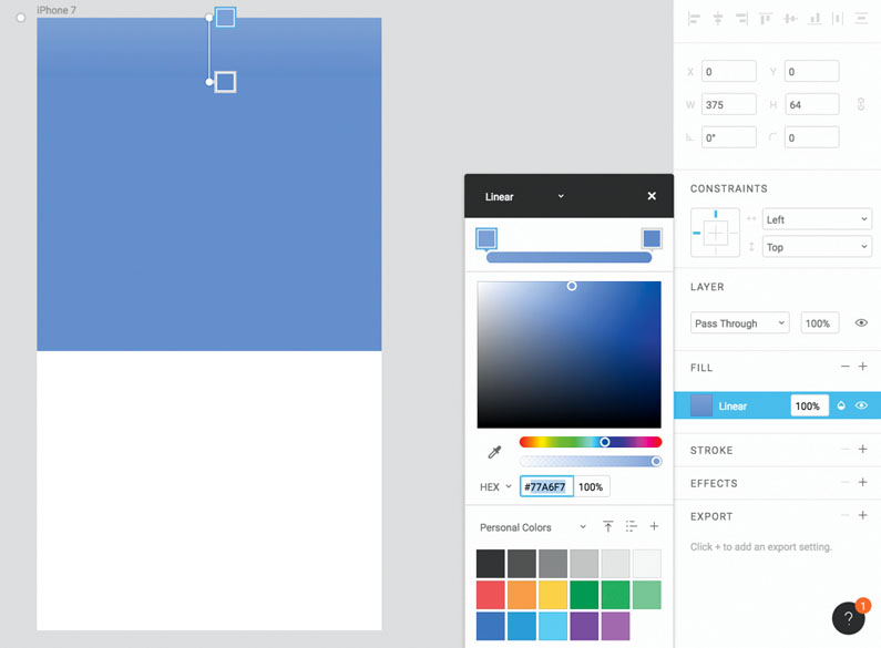
Next we want to place a status bar at the top of the screen. Press R to set width: 375, height: 64, position (x:0; y:0). For our navigation bar let's set the gradient fill using the property inspector panel on the right. Find the 'Fill' option, press on the colour preview and select 'Linear' from the drop-down menu. The colour at the top should be #77A6F7, and at the bottom #5A93F5 (opacity 100 per cent for both).
05. Import an iOS status bar
Unfortunately, Figma doesn't include iOS UI elements by default. However, there is a file called 'Sample File', which is an iOS app design, so we can borrow the status bar from that. Copy out the light status bar option, paste it into the current file and place it at (x: 0; y:0). Using the Text tool (T), click on your artboard to add a header to the navigation bar. I've gone for Avenir Heavy, 15px, #FFFFFF. Align the heading by horizontal centre, y: 33.
06. Create a back icon
On the left of the navigation bar should be a 'back' icon. I'm going to create this from scratch. Create a rectangle 14x14px, add 45-degree rotation, x:14; y:43. Duplicate this rectangle and place it at x:18; y:43. Select both rectangles and under the top menu go to Boolean groups > Subtract selection. After that, go back into Boolean groups > Flatten selection, or press cmd+E.
07. Finish the arrow icon
Our arrow icon is almost done. Now we just need to set the width and height to numeric values – in my case width: 12px; height: 20px. The final step is to set the fill colour to #FFFFFF.
08. Create a graph
Now we are going to create a graph. First, we will put in some guidelines. Select the Rectangle tool (R) and set x:24 y:147; width: 1; height: 166; fill colour #B3DCFF and opacity 20%.
Duplicate this rectangle four times with 80px margins. On the bottom of each guideline, we need to add a date label using text layers ('Feb 2', 'Feb 9', 'Feb 16', 'Feb 23', 'Mar 1'). I have used Avenir Medium, at 11px, #C1D8FF.
09. Make the data line
Using the Pen tool (P) we need to create a vector to represent the data line. Click and drag to create a Bézier point. This shape should have a 4px stroke and no fill, #FFFFFF.
Let's add a drop shadow to help the line stand out: click the '+' on the Effects section and choose 'Drop shadow'. Use following settings to make a smooth and elegant shadow: blur: 3px, y: 7px, #2951FF, opacity: 100%.
10. Add detail to the graph

At the points where the guidelines intersect with the data line we are going to add circles. This time we'll use the Ellipse tool (O), which you'll find in the drop-down menu accompanying the Rectangle tool. Draw 8x8px circles on each intersection and set the fill colour to #5F98FA. We need to add a stroke: click on the '+' button next to the stroke section, set weight: 2px and align: Center.
11. Final touches
To finish the graph section, we just need to add values to our intersection points. With the Text tool (T) select Avenir Black, 11px, #1F4991.
12. Three informative boxes
Below the line graph we are going to create three cells that display more information. Using the Text tool (T) let's create our first heading: 'Estimated value of your shares': x:16; y:391, Avenir Medium, 15px, #5D7EB6. To the right of the cell place the value '$1,115', text style: Avenir Heavy, 22px, #5F98FA, text alignment: left, x: 287; y: 387.
13. Making a separator
Draw a rectangle that is 1px in height and spans the full width of the screen (#F5F5F5; x: 0; y: 435) – this will act as the separator between the cells. Select the heading, value and separator and create a group (cmd+G).
14. Adding headings
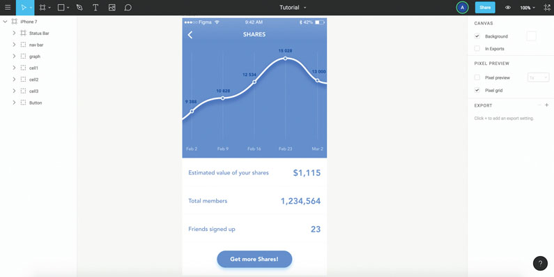
Duplicate this group so you have three groups with 24px vertical distance between them. Change second heading to 'Total members' and the third group heading to 'Friends signed up' and update the relevant values.
15. Draw and align another rectangle
Now we're going to add a call to action. Draw a rectangle below the last cell, width: 195; height: 44, Y-axis distance from the last separator 21px.
Using the Align tools, line up the rectangle by horizontal centre. Then set the fill colour to #5F98FA and roundness to 22 (you'll find this field after 'Rotation' in the Properties panel). After that add a drop shadow effect (colour: #ABDAFF; opacity: 100%; y: 5; blur: 11).
16. Put some text on the button
Add text to the button using the Text tool (T): 'Get more Shares!' Set this in Avenir Black, 15px, #FFFFFF. Align the text by the centre of the button. Finally, group all elements together and name them up properly.
17. Make it responsive
Now we are going to adjust our layout so it's responsive to different iPhones (320x568, 375x667 and 414x736). To do this we have to use constraints, which you'll find under the Properties menu on the right.
18. Getting the layout right
If you select 'Left' or 'Right' on the horizontal drop-down, the group will pin to your chosen side of the screen, and will not stretch. If you select 'Center', the group or layer will stretch so it fills the width of the screen. We need to make the status bar float in place, so we want the 'Right&left' option (or hold down 'cmd' and click the left and right bars on the diagram).
19. Test it
Let's try this out. With the status bar selected, hit the 'Right&Left' option. Select an artboard and, instead of iPhone 7, choose iPhone 7 Plus. It works properly even if you select the iPhone SE size.
20. Check each layer
Let's consider the rest of the layers. For the navigation bar background, we want to use 'Right+Left'. For navigation bar title: 'Center'. For back arrow icon, it's best to use the 'Left' option – this way the arrow will be pinned to left side of the screen.
21. Set the line graph
Now let's set the line graph. For the guidelines, dates and intersection circles, we want to use 'Center'. For the data line and background, we'll use 'Right&Left'. In the extra data section we want to use 'Left' for each title, 'Right' for each value, and 'Right&Left' for the separator lines. For the CTA button group let's set 'Center'.
22. Set the vertical constraints
The final step is to set the vertical constraints. The status bar, navigation bar, data line and intersection circles and associated titles should be set to 'Top'. The background of graph, dates and guidelines should be set to 'Center'. Each group of extra data should be set to vertical 'Center', and the CTA button group should be set to 'Bottom'.
23. Make it work for each screen size
Let's duplicate the artboard two times, and set one to the size of an iPhone 7 Plus and the other to the size on an iPhone SE. On the Plus version, you'll need to reduce the gap between the last cell of extra information and the CTA button by selecting the cells group and increasing its height from 195 to 225. On the SE version you'll see that information cells overflow the CTA button, so we have to select the cells group and reduce its height to 150.
24. All done!
Hey, congrats! We have finished the whole app screen in Figma. For now just check everything is done, and you can sit back and feel like an expert.
This article was originally featured in net magazine issue 288; buy it here.
Related articles:
