How to build complex layouts using CSS
Employ the power of CSS Grid Layout to create eye-catching magazine-style page designs.
Sign up to Creative Bloq's daily newsletter, which brings you the latest news and inspiration from the worlds of art, design and technology.
You are now subscribed
Your newsletter sign-up was successful
Want to add more newsletters?
Layout for the web has always been limited, there really has never been anything truly dedicated to making content easy to display in a format that makes sense.
Back in the '90s when the web first took hold, designers who were used to laying out content on a grid, found the only way to get the same result in the browser was to use the table. Merging cells led to complex website layouts, but this played havoc with accessibility and SEO. Fast forward and today there are all manner of ways to place content with floats, flexible boxes and so on.
CSS3 has really pushed the capabilities of the web forward and since 2014 there has been CSS Grid Layout. This currently has 75 per cent browser support, so it’s getting to the point when it’s time to give it serious consideration. Zurb’s Foundation 6 framework has got on board and is using that to power its grid.
Article continues belowThis tutorial will focus on creating a magazine-style feature that will show you how to perfect responsive web design for medium and small screen sizes. For other web design resources, see our guides to the best website builder and web hosting services.
Download the tutorial files here (and save them in secure cloud storage).
01. Get started
Open the file ‘grid1.html’ from the start folder in the project files. The HTML layout for this has five div tags, simply named item1–5 as CSS classes. These will be the content placed into the grid. The container wrapping this will define the grid, which will have four columns.
<div class="container">
  <div class="item1">item 1</div>
  <div class="item2">item 2</div>
  <div class="item3">item 3</div>
  <div class="item4">item 4</div>
  <div class="item5">item 5</div>
</div>
02. Check CSS for the grid
Looking in the head section you can see that the 'container' has been told to be laid out as a grid, with auto height for the rows, while the columns are to be set to four with each set to 25 per cent of the browser. Check this in the browser and you will see that each item is automatically assigned the next available grid position.
Sign up to Creative Bloq's daily newsletter, which brings you the latest news and inspiration from the worlds of art, design and technology.
.container {
  display: grid;
  grid-template-rows: auto;
  grid-template-columns: repeat(4, 25%); }
03. Define grid positions
Now take a look at the 'grid2.html' file. It's the same as the first file, except 'item1' and 'item2' are given specific positions. The first is positioned in row 1 and ends before row 2. The column starts at 1 and ends at 3 so it spans two columns. The second starts at column 3 and takes the next two columns. The remaining items fill the next available grid slots.
.item1 {
  grid-row-start: 1;
  grid-row-end: 2;
  grid-column-start: 1;
  grid-column-end: 3;
}
.item2 {
  grid-row-start: 1;
  grid-row-end: 2;
  grid-column-start: 3;
  grid-column-end: 5;
}
04. Use a grid template
Open 'grid3.html' and look at the body of the HTML. You'll see that there is a layout with a header, sidebar, main content section and a footer. You can add more text into the content to see what happens when this is placed in. The grid will use a template feature to make these sections into a layout.
<div class="container">
  <div class="header">Header</div>
  <div class="sidebar">Sidebar</div>
  <div class="content">Content</div>
  <div class="footer">Footer</div>
</div>
05. Define the template
Look at the CSS for the container. It is again defined as a grid. The top row will be 200px high, the middle will be auto-sized and the last row will be 100px high. The columns are set to be 33 per cent wide and to autofill the rest. The template states the header will fill both columns. The next row will be the sidebar in the first column and the content in the next. The footer goes across both.
.container {
  display: grid;
  grid-template-rows: 200px auto 100px;
  grid-template-columns: 33% auto;
  grid-template-areas:
  "header header"
  "sidebar content"
"footer footer"; } 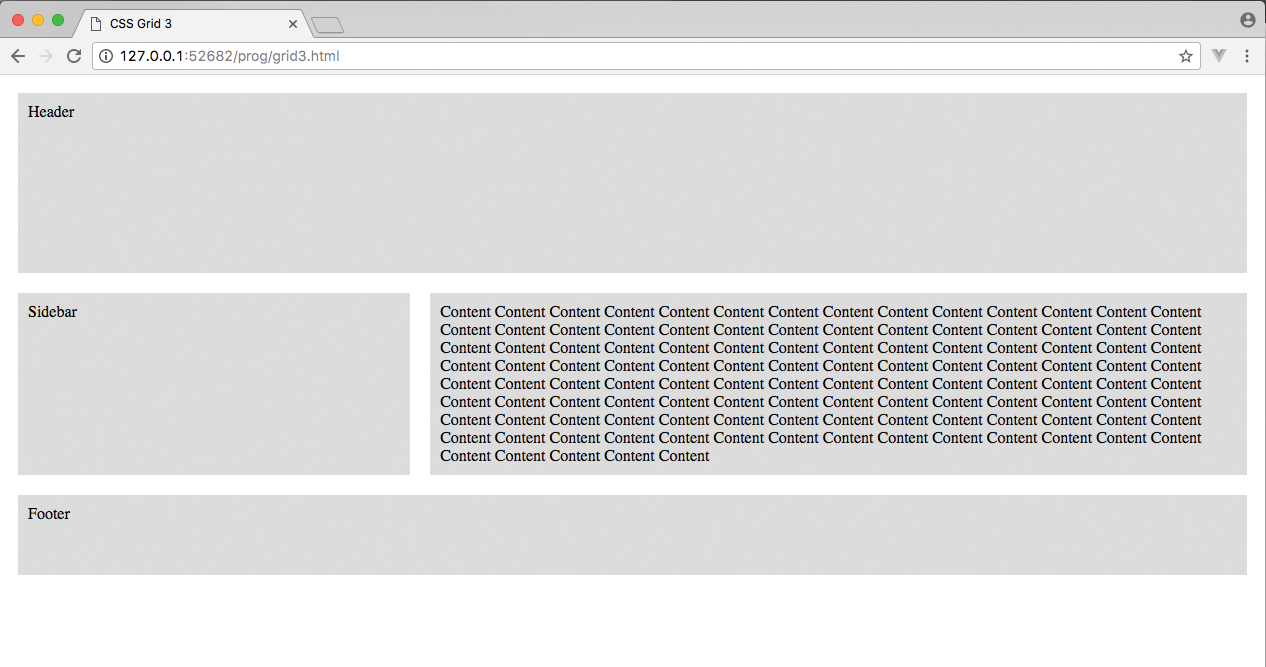
06. Link the template to the class
To link up the class to the template, the code shown here defines this. Each grid area is named and the link is created. The content isn't shown here, but it's in the 'grid3.html' document. Look at this in the browser to see the layout of the grid. Because two columns are defined, the template needs two areas in each of the inverted commas.
.header {
  grid-area: header;
}
.sidebar {
  grid-area: sidebar;
}
.footer {
  grid-area: footer; }
07. Make it responsive
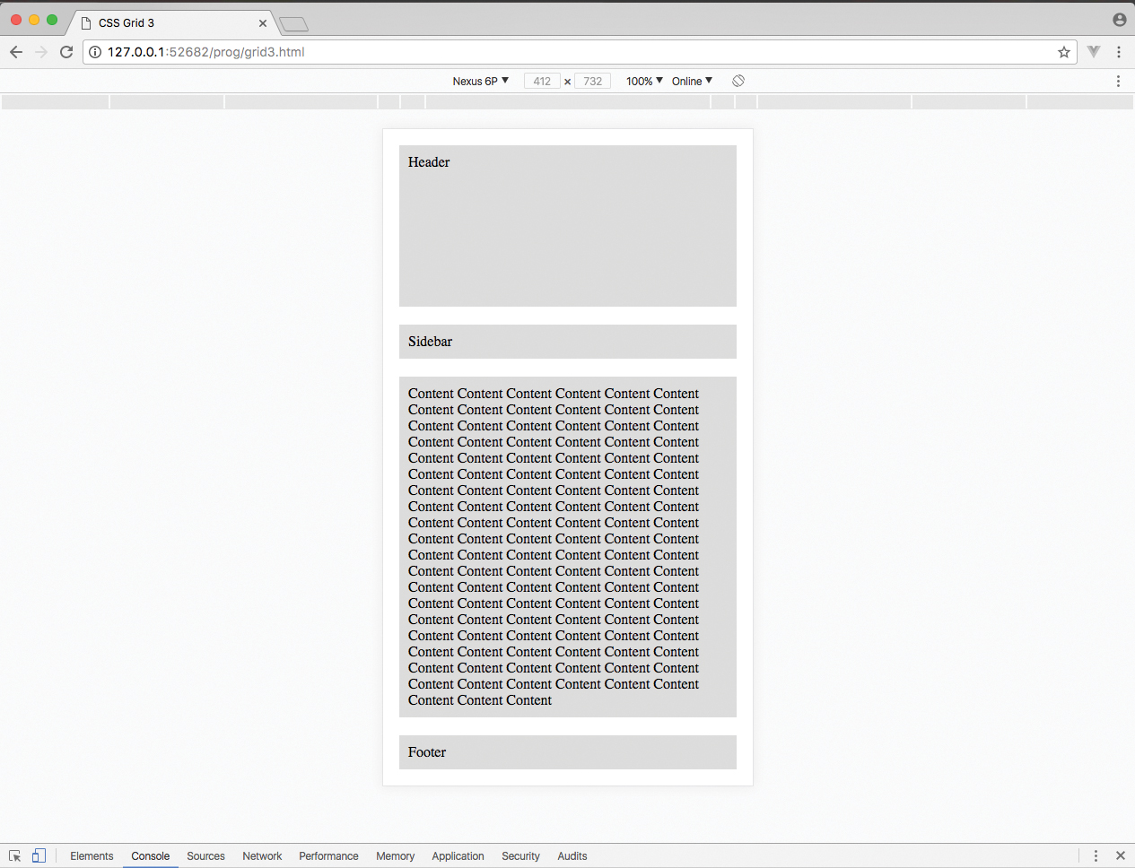
To make 'grid3.html' responsive, a media query is inserted and the top row is kept at 200 per cent, while the remaining rows will automatically be sized. There is only one column, the full width, so the template has one word in each inverted comma to define the layout. These can easily be reordered without shifting any of the HTML.
@media screen and (max-width: 699px) {
  .container {
  display: grid;
  grid-template-rows: 200px auto;
  grid-template-columns: 100%;
  grid-template-areas: "header" "sidebar" "content" "footer";
  }
} 
08. Work on a real layout
Now open 'index.html' – all of the HTML for the content has already been created, as has some of the CSS for the design elements. Add this grid to the style tags in the head section. Doing so creates a three-column grid with the template for each section. Note the full-stop for the empty grid sections.
.container1 {
  width: 80%;
  margin: 0 auto;
  display: grid;
  grid-template-rows: auto;
  grid-template-columns: 33.3% 33.3% auto;
  grid-template-areas: "header header header" ". standfirst standfirst"". . article1" "focus pullquote pullquote" "article2 article2 .";
}
09. Link up the template
As with the previous step, this links the header with the template. The header is told to span all three columns of the grid, then the standfirst is set to take two columns and have an empty column on the left. If you check the browser, that column is filled because the remaining content autofills the next available space – it won't do this when it's all set up, however.
.header {
  grid-area: header;
}
.standfirst {
  grid-area: standfirst;
}
10. Add the next areas
Now the first article, the pull quote and the focus image are placed into the design. The pull quote and image are side by side on the same row. At this stage, article2 hasn't been placed so it's taking the first available space on the grid which is next to the standfirst.
.article1 {
  grid-area: article1;
}
.pullquote {
  grid-area: pullquote;
}
.focus {
  grid-area: focus;
text-align: center; } 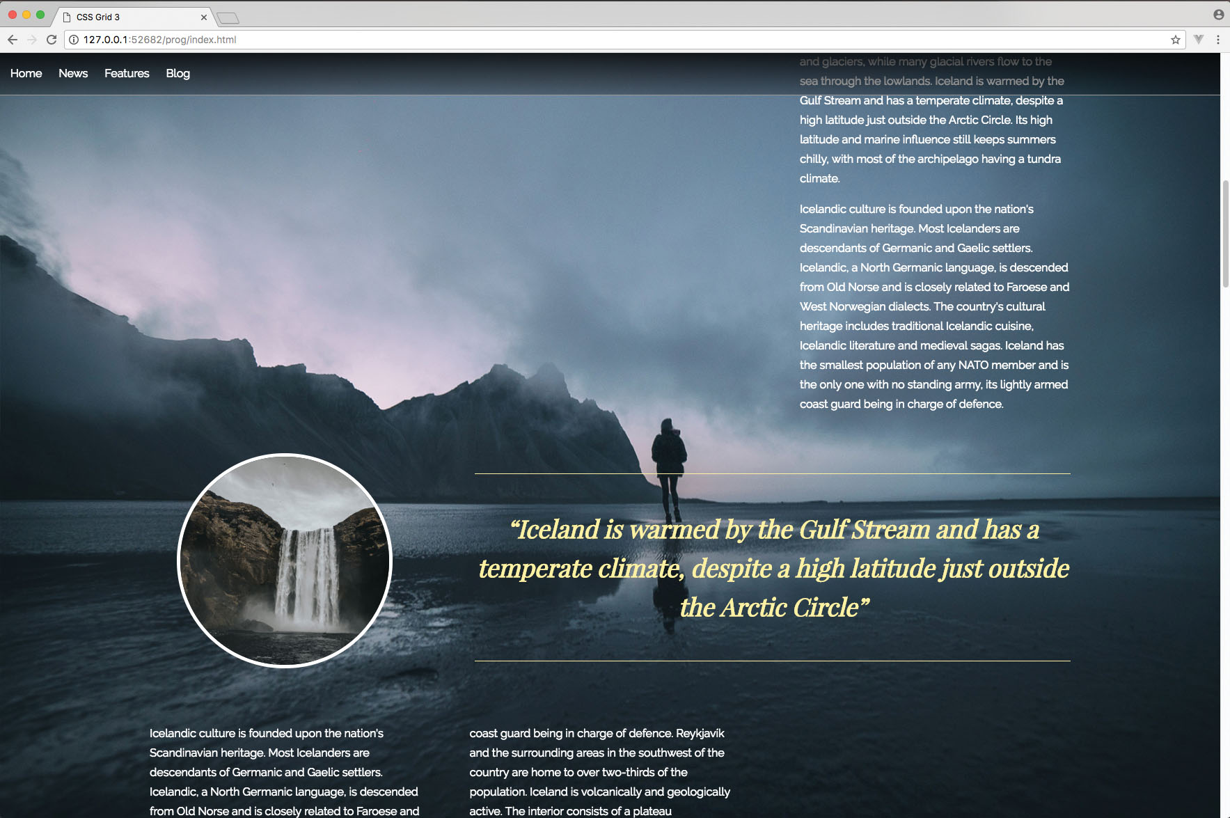
11. Finish the first grid
Adding the second article's CSS enables all of the first grid to be placed correctly. Looking at this in the browser will show that the layout works with the background image and creates the kind of layout seen in magazines, where the designer works around a large background image.
.article2 {
    grid-area: article2;
    column-gap: 65px;
    column-count: 2;
}
12. Add a white background
Before starting the second grid, you may wonder why there is a need for two grids. The reason being is that this grid is going to have a white full width background so this CSS will wrap the second grid. This is to give this section the feeling of a second page in the design.
.whitebg {
    padding: 100px 0;
    background-color: #ddd;
}
13. Make a second grid
The second grid is simpler than the first. There are three columns, with an automatic height on the rows. The content is going to fill a column each so there is no need to define the template areas. However, when the tablet design is added, this needs to switch to two columns, so a reflow is required and the names will be important.
.container2 {
    width: 80%;
    margin: 0 auto;
    display: grid;
    grid-template-rows: auto;
    grid-template-columns: 33.3% 33.3% auto;
    grid-template-areas: "img1 img2 article3";
} 
14. Add the columns
Each of the CSS classes in the second grid is told to link up with the relevant column, as defined in the grid template. The article text colour is changed just to make it stand out against the lighter background of this section. With only the footer to complete, the design of the magazine-style layout is almost in place.
.img1 {
  grid-area: img1;
}
.img2 {
    grid-area: img2;
}
.article3 {
  grid-area: article3;
  color: #333;
}
15. Perfect the foot of the page
Finishing off the page will place a full width div across the screen, which will be filled with a black colour and the text is just centred. This completes the desktop version of the design, but move the screen down below 1200px wide and the site starts to break.
.footer {
    background-color: #000;
    color: #999;
    text-align: center;
    padding: 50px 20px 100px;
}
16. Adjust for medium screen design
A media query is inserted here to look after the design when the width of the browser is less than 1200px. The code for Steps 17 and 18 will be placed inside the brackets where the comment is. This will be a case of changing both of the grids' layout structure.
@media screen and (max-width: 1200px) {
  /* code here */
}
17. Reflow the first grid
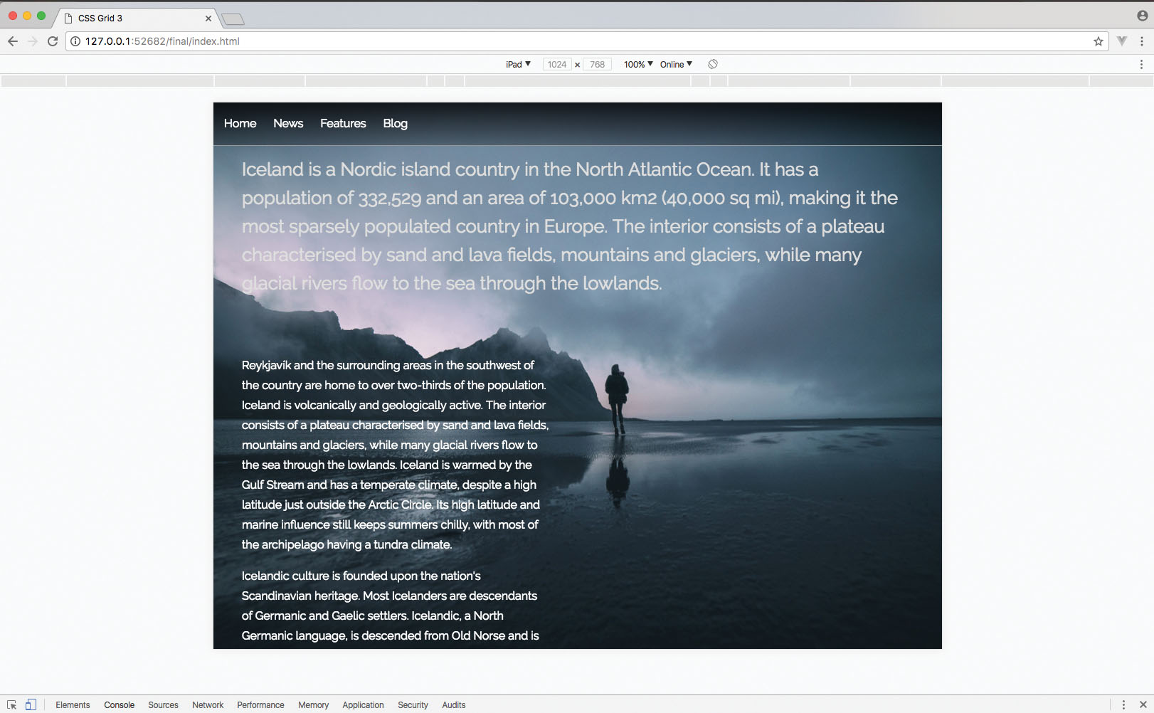
The first grid is set to now fill the full width of the browser with just two columns instead of three. The order of the sections is placed into the template, with the articles switching sides, since this fits in better with the background image at this screen size.
.container1 {
  width: 100%;
  grid-template-rows: auto;
  grid-template-columns: 50% 50%;
  grid-template-areas: "header header" "standfirst standfirst" "article1 ." "pullquote pullquote" "article2 focus";
  }
.article2 {
  column-count: 1;
} 
18. Test your layout
The second grid is also resized to take the full width of the browser and two columns added. The images are placed side by side on the row above the text so that it fits neatly onto the display. You can test this layout in the browser by resizing your browser below 1200px width.
.container2 {
  width: 100%;
  margin: 0 auto;
  grid-template-rows: auto;
  grid-template-columns: 50% 50%;
  grid-template-areas: "img1 img2" "article3 article3";
}
19. Tweak design for mobile
Any browser that has a width of less than 769px will get the code that is added in the final steps. All we need to do here is ensure that each of the grids has a single column layout so that the content can be viewed properly within the smaller space.
@media screen and (max-width: 768px) {
  /* final steps code here */
}
20. Check single column grid
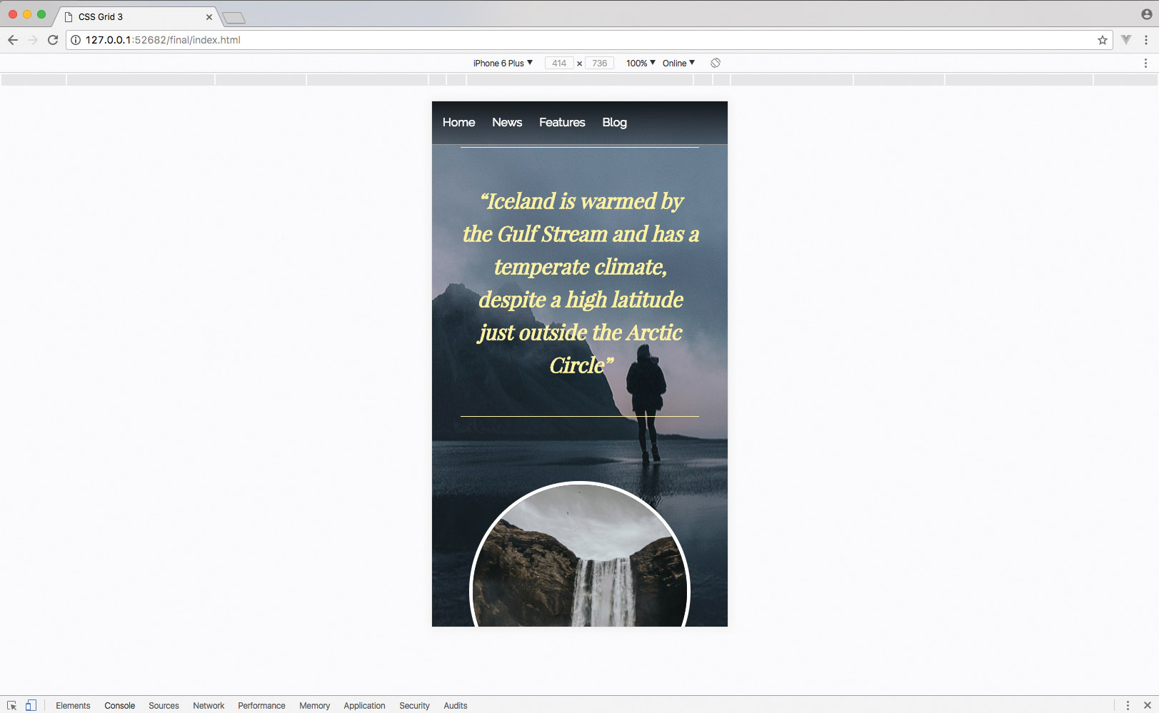
Now the first grid is set to a single column of 100 per cent of the browser's width and the order of the sections is added in the template areas. Check to see how the first part of the page is working on mobile screens.
.container1 {
  width: 100%;
  grid-template-rows: auto;
  grid-template-columns: 100%;
  grid-template-areas: "header" "standfirst" "article1" "pullquote" "focus" "article2";
} 
21. Finish the layout
Here, the second grid is also made to fill a single column and the layout of sections is defined. Now save the finished design and view it across different-sized screens to see the full layout capability of the CSS Grid and how easy it was to just reorder the content for different widths.
.container2 {
  width: 100%;
  margin: 0 auto;
  grid-template-rows: auto;
  grid-template-columns: 100%;
  grid-template-areas: "img1" "img2" "article3";
}
This article was originally published in creative web design magazine Web Designer. Buy issue 271 or subscribe.
Related articles:
Web Designer is the premier magazine for aspiring online creatives and industry professionals. The monthly title offers cutting-edge practical projects spanning XHTML, CSS, Flash and WordPress as well as hosting features and interviews with the web community’s most influential people. Each issue also has a dedicated Industry section covering news and views from the trade, website showcases featuring the finest design talent and a free CD of valuable resources.
