How to create manga with a Wild West twist
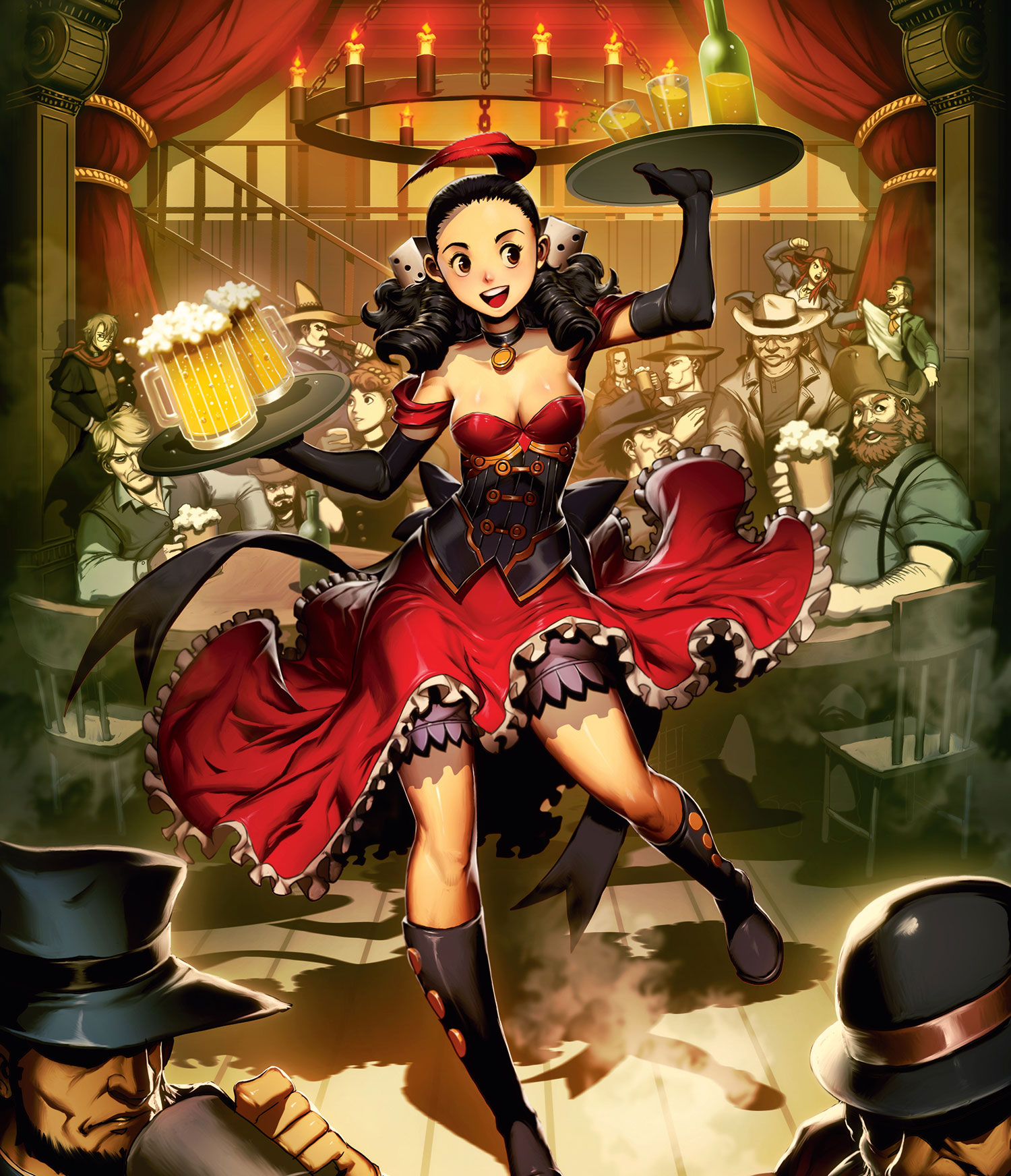
Westerns are something I’ve always loved. In this tutorial I’ll create an image in the typical manga style but set in a Wild West saloon. The main character, Rose, is a character in The Wanderer, a comic about the Old West I’m working on at the moment, to be released next year.
There are certain art styles where the main character is the centre of the action and the background is a secondary consideration, something to help bring out the character. But there are also illustrations where the background can be considered an extra character, because it also includes additional personality or represents an iconic or picturesque set. In this type of illustration you can often explore new ways to enrich a background.
Here, I’ll explain how to draw a background that not only contrasts with the character, but is also dynamic and expressive, with a multitude of characters, expressions and different atmospheres, as well as different textures in fabrics, glass or smoke.
Article continues belowIn this image we’ll take the depth of the stage and play with the scale of the characters in the scene. The lighting offers a different perspective on how close or far they are from the light sources. Finally, we’ll see some tips to generate background construction elements with the Lasso and Gradient tools, as well as create elements to depict in perspective with the Free Transform tool.
Download the files you'll need here.
01. Sketches, setting and pose
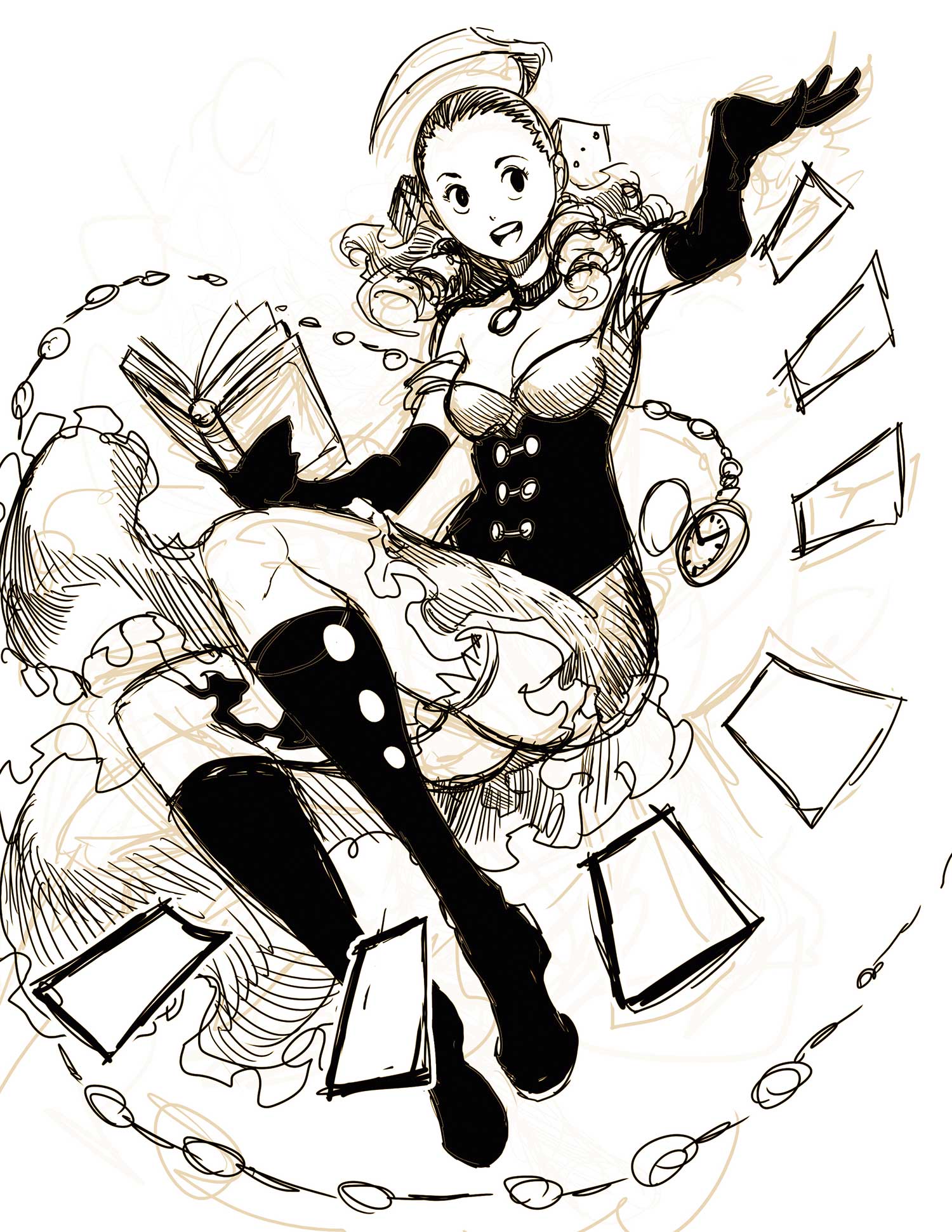
The Wild West has many possible locations and interesting scenarios. I make several sketches trying to find what will be the most interesting or the most striking, some focused on the character and others on the environment. I settle on the idea of drawing a classic Wild West canteen area, that features several characters and some action.
02. Inking the elements
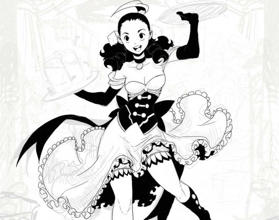
I do this part of the process quickly because everything will be covered by colour and much of the inking will be lost in the following steps. I focus on closed areas, where it’s easier to make selections with the Magic Wand than it will be later when detailing. I use the Lasso tool to make quick selections of areas, then fill them with the Paint Bucket tool as I’m inking away.
Sign up to Creative Bloq's daily newsletter, which brings you the latest news and inspiration from the worlds of art, design and technology.
03. Gradient and cel-shading
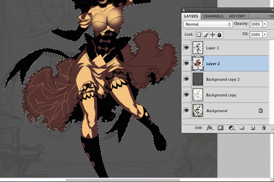
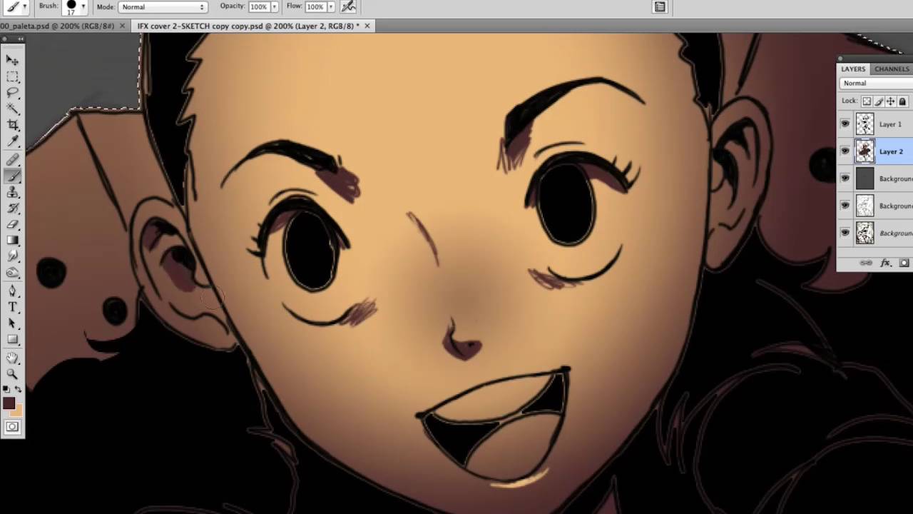
I use two tones for adding light and shade before getting into colour. I use the darker tone as a base, and add lighting with the lighter one. I use a Radial Gradient to apply volume to rounded parts of the image such as the face. I create light areas that later I’ll fill with paint using the Paint Bucket tool, achieving an appearance similar to traditional cel-shading. Over this, I’ll paint a halftone in a new layer set to 50 per cent Opacity.
04. Blending tones and adding shadows
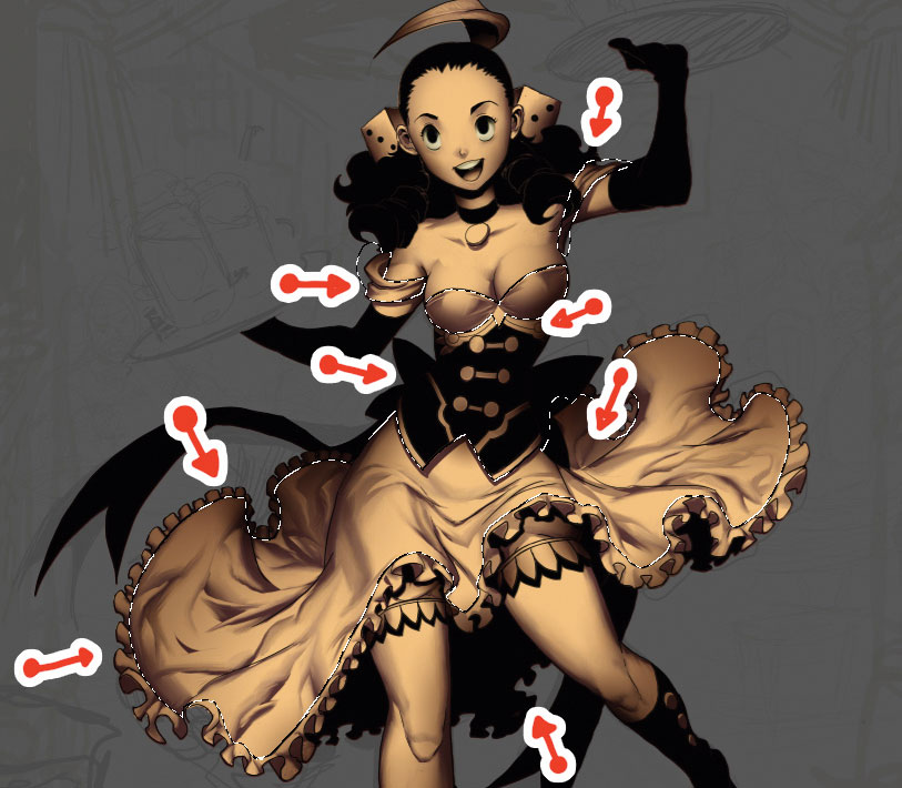
I flatten all the colour layers into one and use the Smudge tool with a textured brush for smooth blending, painting with this in one direction from top to bottom and side to side. This technique gives the image softness and volume, and adds dynamism to elements such as fabric – I love drawing fabrics moving. When this is done, I add shadows by selecting areas and applying a Radial Gradient with my base colour but in Multiply mode, applying this from outside to inside the image.
05. Colouring and balance
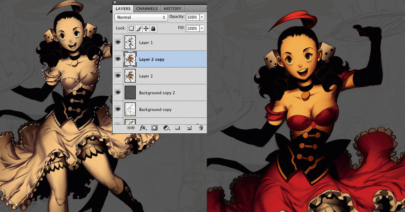
With volumes sorted, I turn to colouring my mono image, selecting areas that will have the same colour, using the Magic Wand tool. At this stage I add just large areas of colour – details will come later. I duplicate the character image, add a yellowish hue (Ctrl+U) and set the duplicate layer to Multiply mode with low Opacity for an antique look. I merge all the character layers and use Color Balance to better define a final colour.
06. Painting over ink
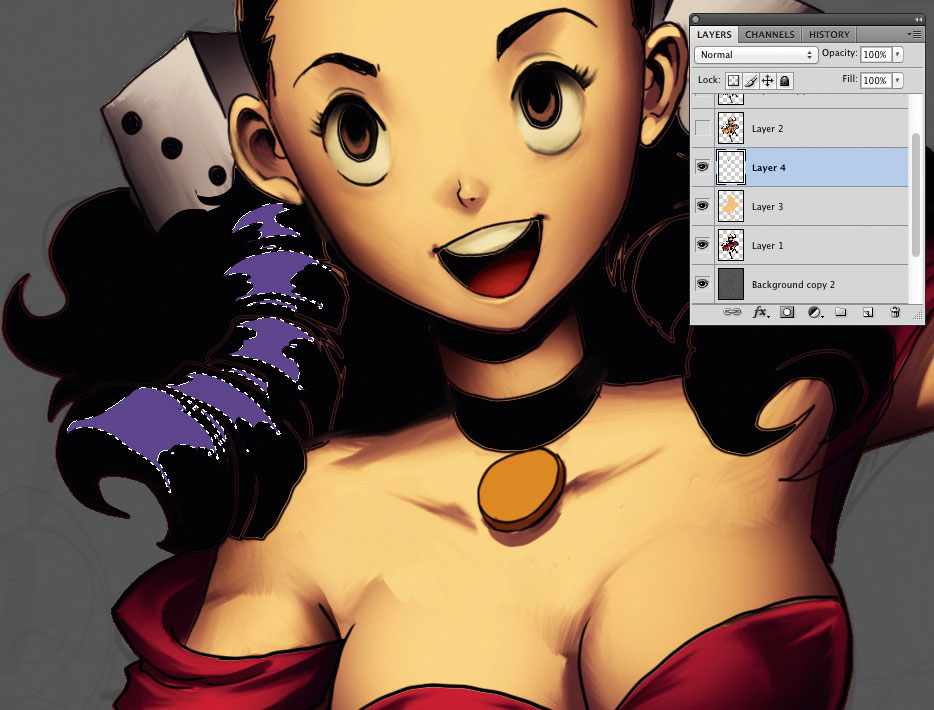
I begin adding details to black areas, such as clothing and hair. I create a new layer, which I place over the character layer, and select areas of hair and other elements with the Lasso tool. I fill these using a slightly lighter colour to show the contrast. Once these are defined, I convert the layer to the final colour (Ctrl+U) and repeat step four, blending to smooth for the final result. Then I merge the layer with the character’s layer.
07. Highlights and details
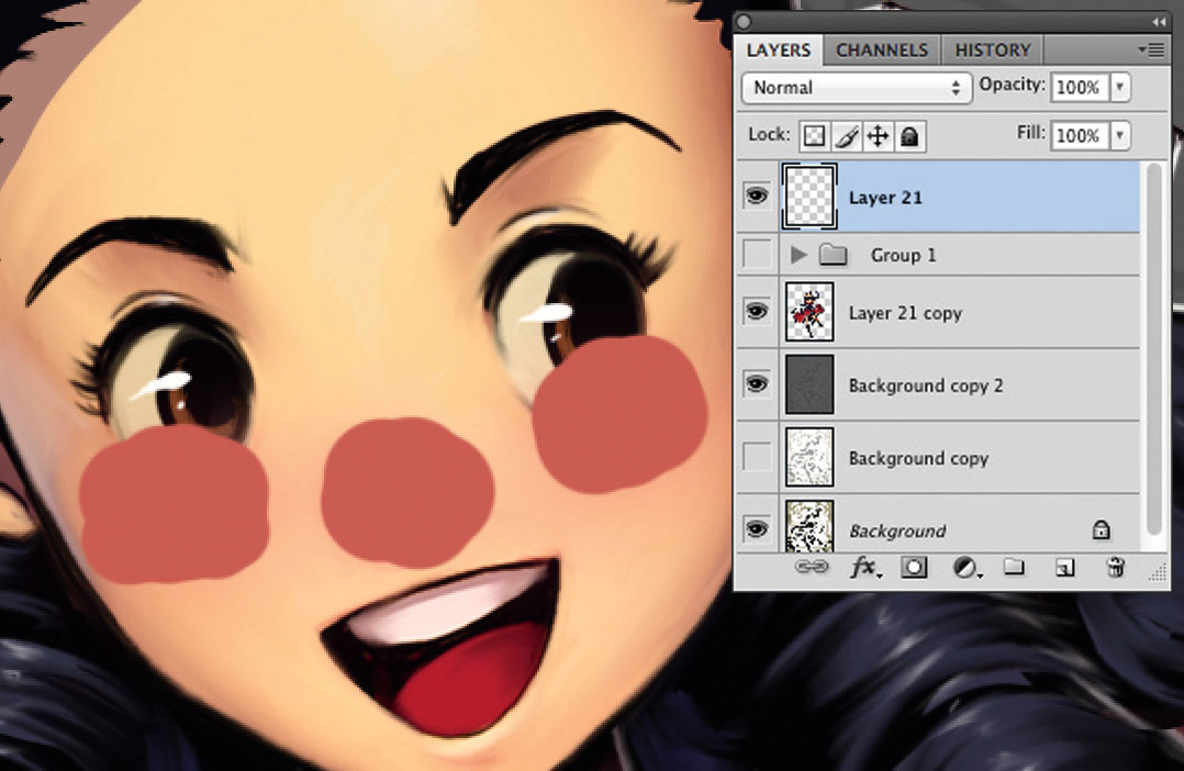
I begin adding details to clothes and other items, giving them additional volume and shine. I add secondary highlights interacting with the character – sometimes a bit of light can make a big difference. I add light to the hair on a separate layer, then merge it to the character’s layer. I use Liquify to fix physical details. On a new layer I paint her cheeks and nose in pink, then add Gaussian Blur and lower the Opacity to give her rosy cheeks.
08. Adding glasses and bottles
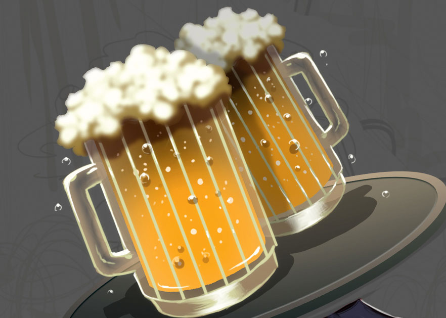
I don’t draw bottles as such. I do a Rectangular Marquee and modify it with the Lasso tool. I fill the selection with the Paint Bucket tool, add highlights using a Radial Gradient and then Colorize (Ctrl+U). With quick selections, I create the impression of liquids inside. I use the same process for the beer, making a selection to add foam, painting with a brush and then applying Gaussian Blur. Lastly, I add a few drops on the glasses and bottles for detail.
09. Background characters and personality
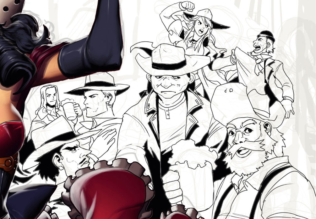
The setting is a bar, so I need to add some secondary characters to the background to add life, variety of design and expression. I need characters of different ages, ethnicity and sex, each one in different dress, pose and action. A fight in the background will help ground the bar in reality, as will chairs and tables for customers to enjoy a freshly tapped beer.
10. Characters and colour background
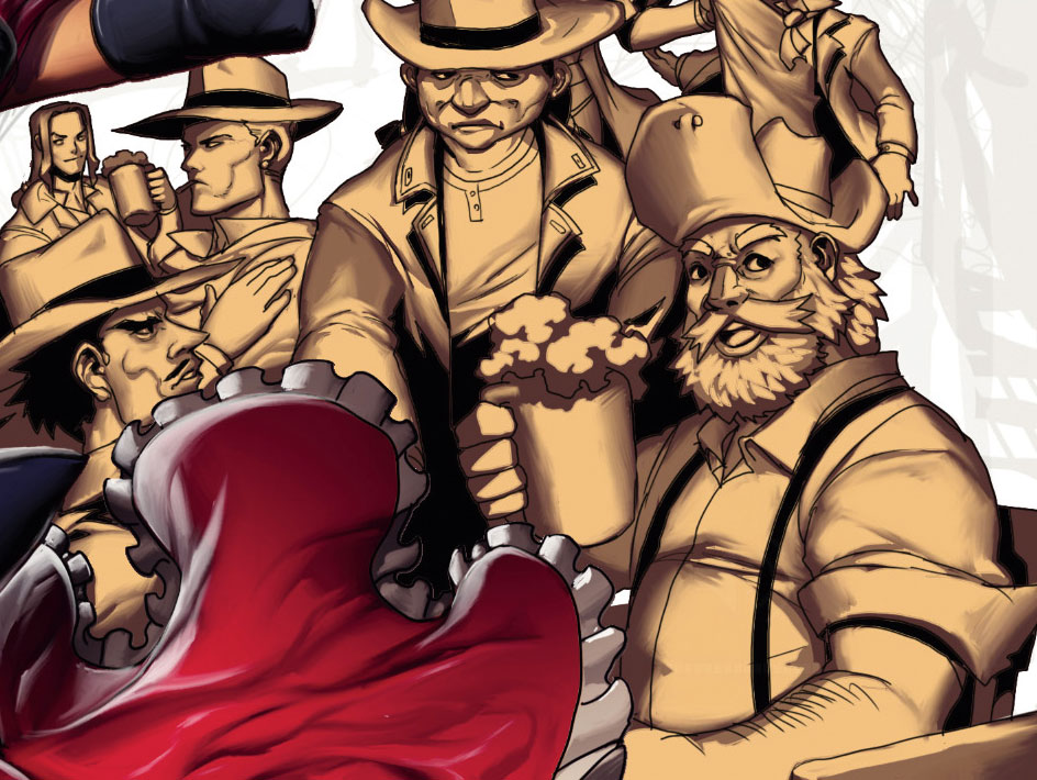
I paint the background characters in a similar way to steps three to five. I start with a base colour, and add highlights similar to the cel-shaded ones. I add a new layer at 50 per cent Opacity and paint on it with a light colour to achieve a halftone. Then I apply the Smudge tool lightly in some areas. I paint characters hoping that colour brings out their personalities, but I need to choose more muted and monochromatic colours, so Rose can stand out a little more.
11. Pillars and curtains
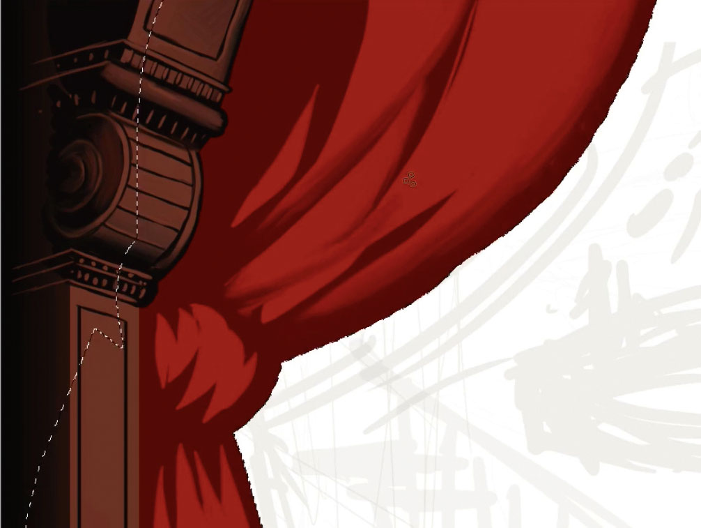
To make the pillars, I do a quick selection with the Rectangular Marquee tool, then add depth using the Gradient tool. I paint a few details, then bump up extra light for the look of a deep carving in the wood. For the curtains I make another selection, draw light areas and recolour them with Ctrl+U. I reselect the curtain area and add gradient shadows in different parts to create contrast between them. I merge both layers, then duplicate this to make the other pillar and curtains on the right.
12. Floor, staircases and chandeliers
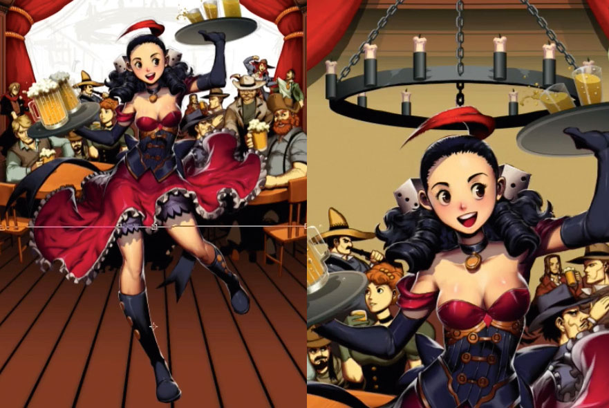
To create a wooden floor, I draw several vertical lines in a single layer, then use Free Transform to add perspective. I do the same for the handrail as well. I use the same pillar as in step 11 to create the roof and the wall, then use Bevel and Emboss for a small border. The chandelier is done with selections and the chains with Bevel and Emboss for quick volume. On a new layer I add a green tone and set the layer to Color mode.
13. Foreground characters and smoke
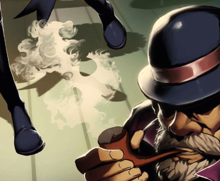
I add two characters in the foreground, both with heavy inks because they’re far away from my light sources. I add colours, then draw light bouncing in a new layer and duplicate it, adding Gaussian Blur to produce a fuzzy light. For smoke I use the Lasso tool, fill the silhouettes with a Gradient and use the Smudge tool to produce irregular shapes. Then I use Gaussian Blur to remove any hardness and make it look more ethereal.
14. Final edits to the scene
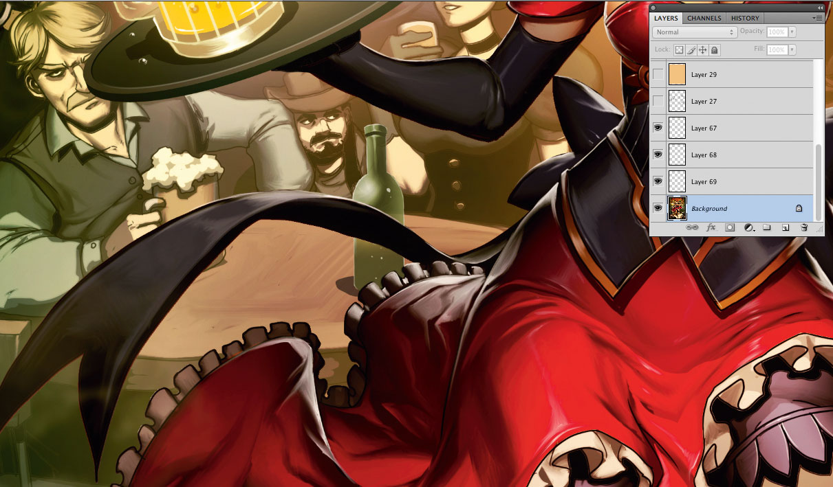
I tweak the colours a little with Color Balance (Ctrl+B) and correct the contrast with Levels. I alter some designs from previous phases that don’t look so good now, and clean up some inking errors. I add some extra items such as bottles on a table and some extra bounce light on the chandelier. I use the Blur tool in some areas, to add a slight blur and produce a greater sense of depth. After this I can call it a finished image.
This article originally appeared in ImagineFX issue 140; subscribe here!
Related articles:
