Illustrating a revamped League of Legends character
Riot Games artist Josh Smith reveals how he worked up this striking character illustration.

What started as a promotional comic from the stylus of Jason Chan, ended in this beautiful and dynamic 'splash' illustration of League of Legends character Poppy, Keeper of the Hammer. Based on Chan's comic original, illustrator Josh Smith takes us on a step-by-step guide to how he created this striking manga art image.
01. Clean and confident
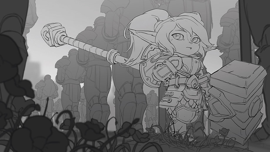
I originally drew this for the cover of Poppy's digital comic, but everyone was so smitten by it that we decided to make it her splash as well. In this step I have my composition and story locked in. I've found that a clean and confident drawing at this stage will make the rest of the process easier and more reliable.
02. Rough colour and lighting
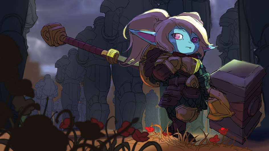
With the help of masks for the major pieces, I do a rough colour and lighting pass. My focus is on finding a mood that suits the story and champion. I'm looking for colours and setting up a lighting situation that makes me feel something, while also complementing Poppy's unique elements. This is the vision.
Article continues below03. An ambient occlusion pass
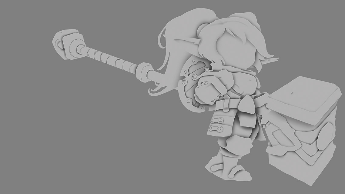
Next is an ambient occlusion pass. A term generally reserved for 3D renders, it refers to nooks and crannies light can't reach. By putting dark shadows with steep drop-off in areas two objects meet or overlap, I get an illusion of volume.
04. Block in cleaner light and colour
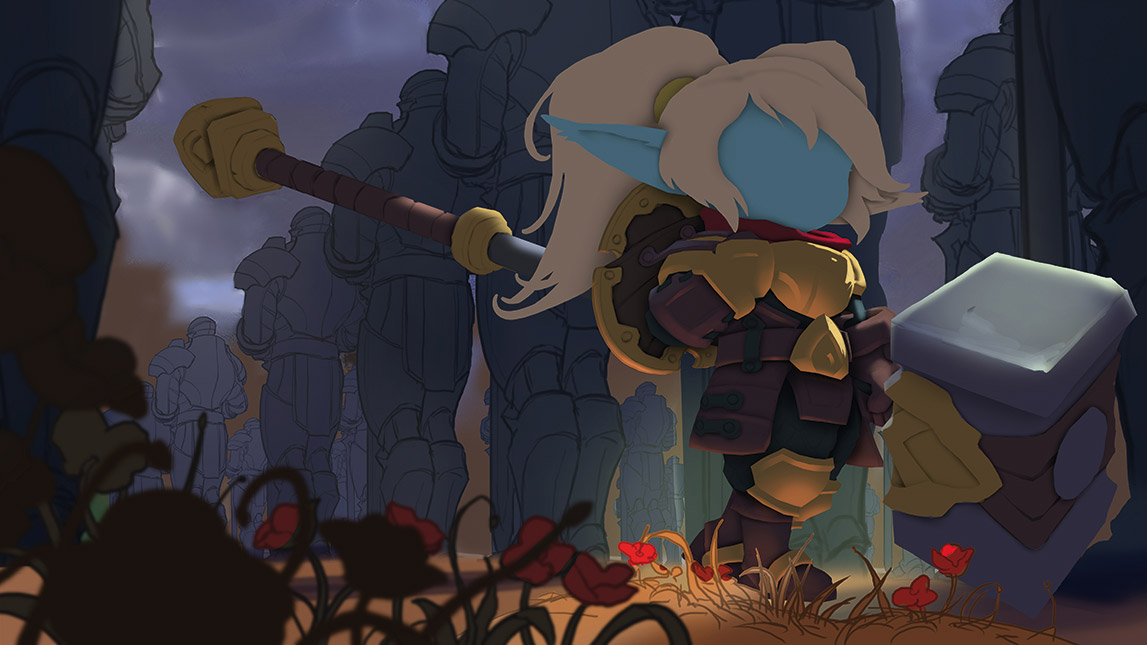
With my occlusion pass on a multiply layer above everything, I create masks to separate major materials. I then block in a cleaner version of the light and colour from step 2. I mask out and treat the background and soldiers in a similar way.
05. Refining details

I start to see the fruits of my labours. Masks keep me sane while I render materials, zooming out often. Once it looks clear and believable, I suck it up and keep painting. Our splash style is to feel like a photograph from a fantasy world, so I refine details further. Lastly, post-processing: light bloom, depth of field and colour adjustments.
This article was originally published in ImagineFX magazine issue 133. Buy it here.
Sign up to Creative Bloq's daily newsletter, which brings you the latest news and inspiration from the worlds of art, design and technology.
