Flowery funeral ad is blooming brilliant
Discover why I&S BBDO's ad for a funeral provider won them a prestigious design award.
Sign up to Creative Bloq's daily newsletter, which brings you the latest news and inspiration from the worlds of art, design and technology.
You are now subscribed
Your newsletter sign-up was successful
Want to add more newsletters?
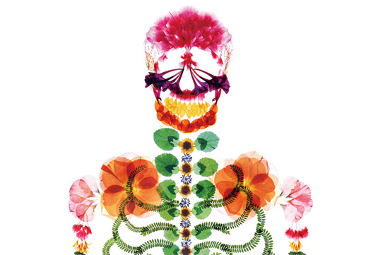
Funerals provide a chance for people to say goodbye to a loved one, and getting the tone right is crucial. In Japan, as in many countries, the ceremony is traditionally symbolised visually by black, with bright colours deemed highly inappropriate for such solemn proceedings.
However, after the 2011 Tōhoku earthquake and tsunami in Japan claimed the lives of thousands, funeral home Nishinihon Tenrei wanted to push tradition to one side, and asked Tokyo-based ad agency I&S BBDO to create a vibrant campaign to advertise its services.
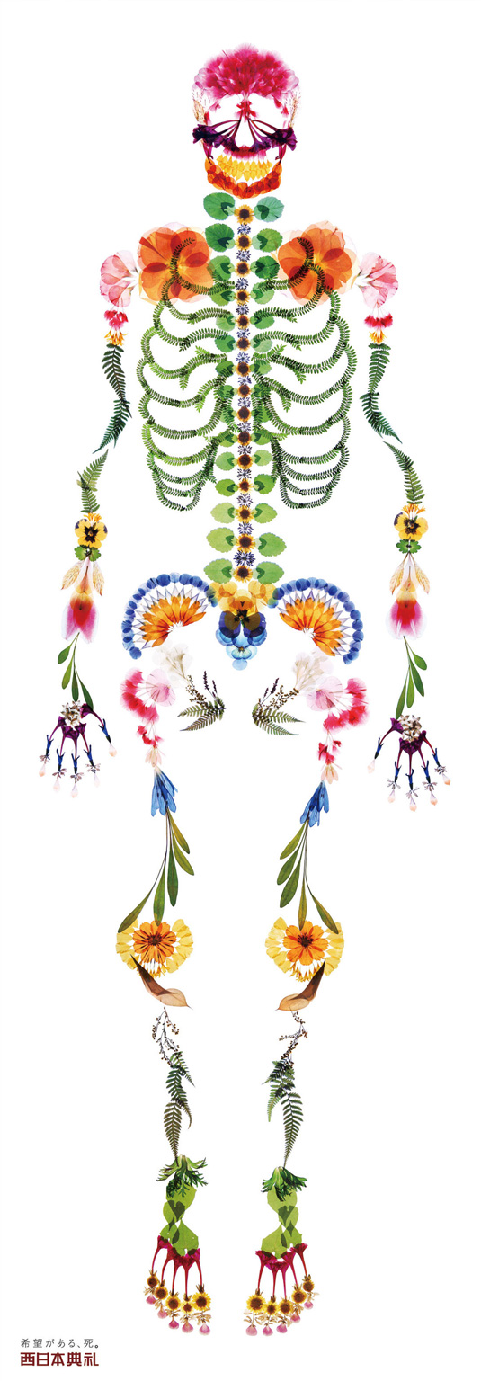
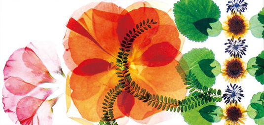
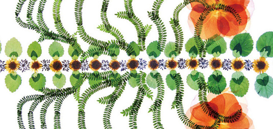
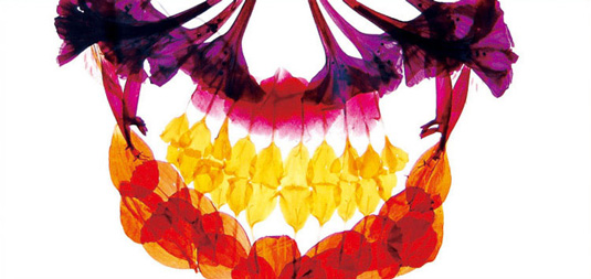
Wanting to portray funerals as not only a chance to grieve but as a celebration of life, the agency responded with this skeleton illustration made entirely from beautiful and brightly coloured pressed flowers. A daring move, the vibrant design proved extremely successful, going on to win a design merit award from the 2013 One Club Awards.
Article continues belowWorking on the campaign were creative director Mari Nishimura, copywriter Mari Nishimura, art director Naomi Hou and designer Naomi Hou. It is hard not to be inspired by not only the bold imagery but the courageous, left-field thinking that has gone into this.

Like this? Read these!
- Illustrator tutorials: amazing ideas to try today!
- Free Photoshop actions to create stunning effects
- Free Photoshop brushes every creative must have!
Have you seen an inspiring print ad? Let us know about it in the comments below...
Sign up to Creative Bloq's daily newsletter, which brings you the latest news and inspiration from the worlds of art, design and technology.

The Creative Bloq team is made up of a group of art and design enthusiasts, and has changed and evolved since Creative Bloq began back in 2012. The current website team consists of eight full-time members of staff: Editor Georgia Coggan, Deputy Editor Rosie Hilder, Ecommerce Editor Beren Neale, Senior News Editor Daniel Piper, Editor, Digital Art and 3D Ian Dean, Tech Reviews Editor Erlingur Einarsson, Ecommerce Writer Beth Nicholls and Staff Writer Natalie Fear, as well as a roster of freelancers from around the world. The ImagineFX magazine team also pitch in, ensuring that content from leading digital art publication ImagineFX is represented on Creative Bloq.
